-
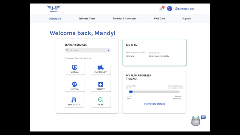
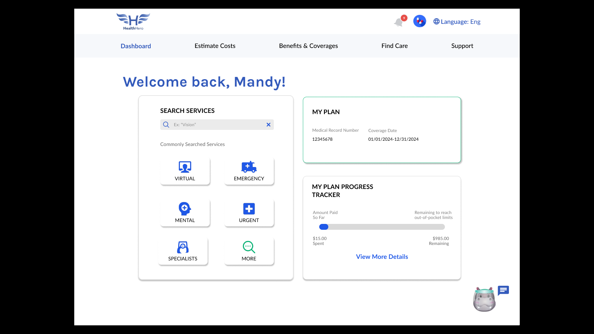
HealthHero Home Page
-
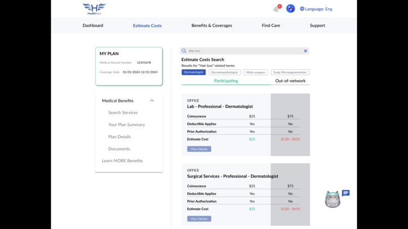
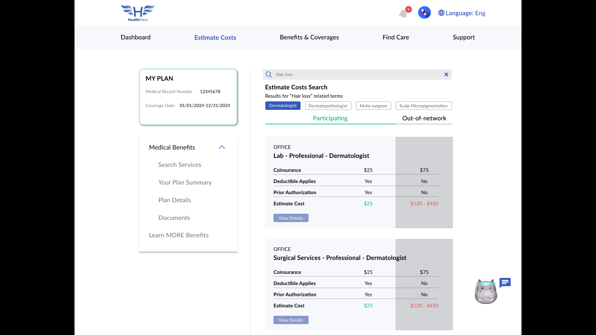
Cost Estimator
-
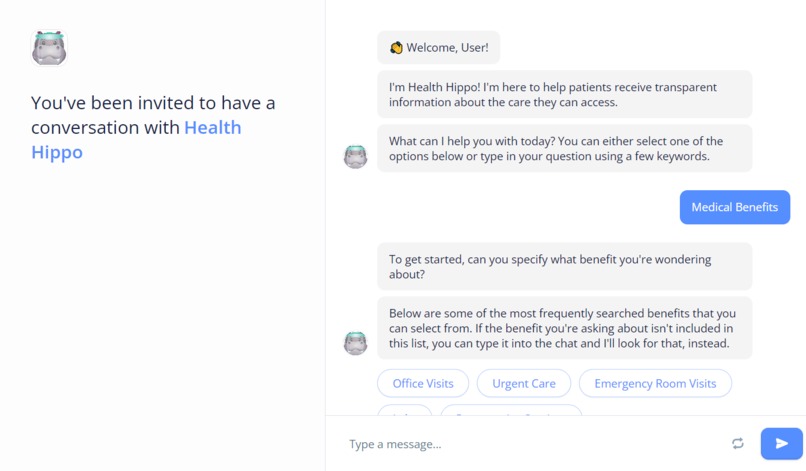
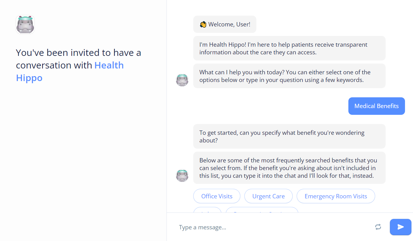
Heath Hippo, our chatbot assistant for HealthHero
-
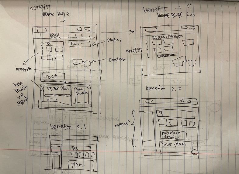
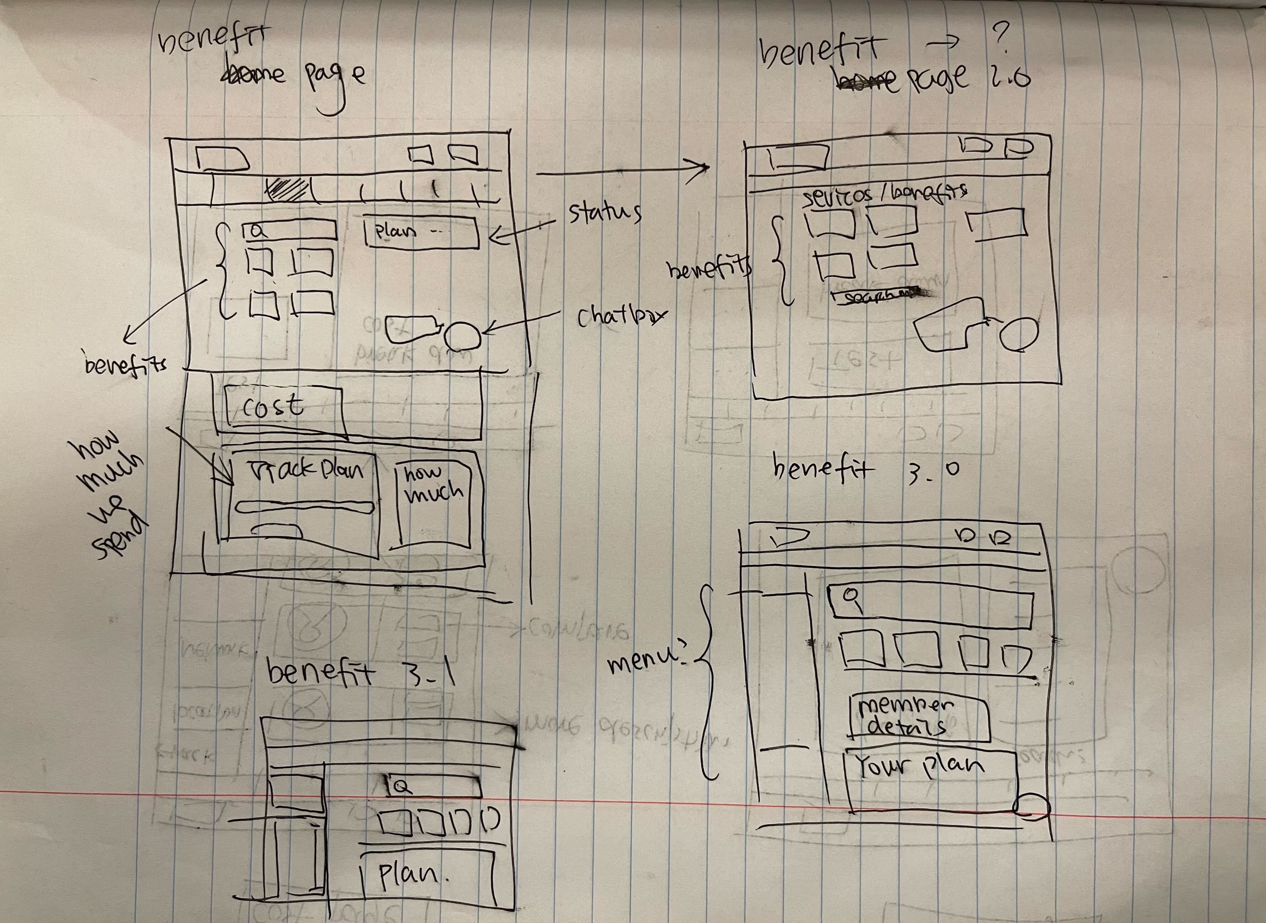
Lo-Fi Sketches
-
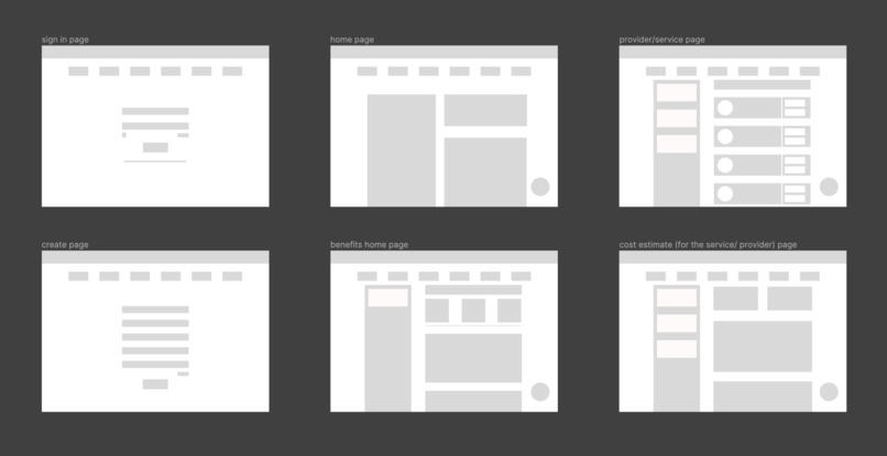
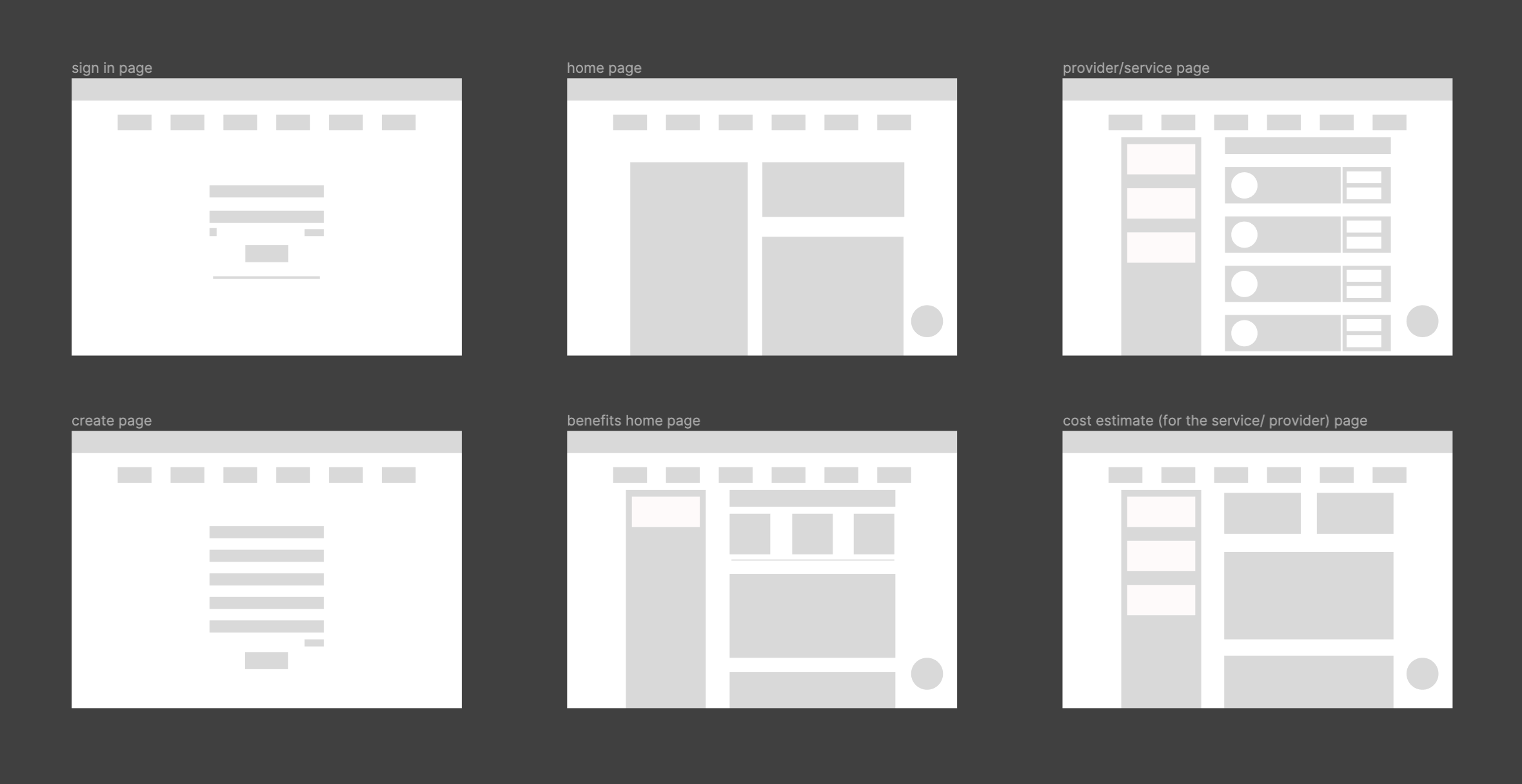
Mid-Fi
Inspiration
As of September 2023, over 15.2 million people are enrolled in Medi-Cal, California’s insurance plan for low-income individuals. Many Medi-Cal users are confused by what types of care they can receive with their coverage. Long wait times and a lack of information prevent patients from receiving the care they need. Based on our own experiences and that of other insurance recipients, we saw that healthcare provider platforms make it difficult for people to find relevant information regarding their insurance coverage and benefits.
What it does
HealthHero is a web-based platform that provides users with navigable tools to learn more about their coverage. It allows users to see an overview of their coverage, costs of services, and the steps towards getting specialized care. With our easy-to-navigate platform., users now have the healthcare information they need.
The Health Hero platform is supported by a chatbot named Health Hippo, who provides users with relevant answers specific to their healthcare inquiries within a few clicks. It offers users an overview of their coverage, user benefits, and health care. User feedback expressed a desire for direct answers, instead of the endless redirection and unclear answers that they often get from customer service representatives.
Fun Fact: Our chatbot Health Hippo is named after Hippocrates, who was known as the father of medicine! Additionally, the Hippocratic Oath is an oath taken by doctors to protect patients’ wellbeing. We designed HealthHero and Health Hippo to be a healthcare user’s tool for understanding their hard-earned healthcare and coverage, so that they may make proactive decisions about their wellbeing.
How we built it
Our team members each took a look at our respective healthcare provider platforms, to see which elements contributed towards a good user experience, and what was lacking in terms of information transparency. We found that despite the Santa Clara Family Health Plan (our team’s local Medi-Cal provider) having the least accessible information, Kaiser and Anthem also had pain points that prevent users from knowing costs upfront.
Conducting user research was key to gain a better understanding of user’s issues. We sent out a survey and conducted interviews with 3 Medi-Cal users. Once research was done, we created sketches of lo-fi prototypes for the web platform. We then made sure to incorporate key features that reflected the needs of health insurance web users. We created a grayscale mid-fi prototype to serve as the basis and layout guide for our hi-fi prototype. Our final hi-fi prototype makes use of carefully constructed components for ease of use, and we incorporated click-through elements to make a working prototype.
Our chatbot, which took inspiration from Anthem’s chatbot Sydney, was developed using Voiceflow. As we developed our chatbot, we made sure it reflected the website’s user flow.
Challenges we ran into
We had difficulty understanding the different healthcare terminology, which was a common sentiment echoed by our interviewees. It was also hard for us to find accurate out-of-network costs for those with Medi-Cal coverage, so we did our best to provide an estimate. Some features that we wanted to further explore included: a glossary with healthcare terminology, hoverable definitions for medical key words, and a direct price comparison tool for healthcare providers.
We primarily had two designers working on UI development, so we needed to compromise our individual ideas to form a design that reflected our group’s goal for a web platform. We also had a limited amount of time to go from low to mid to high fidelity, which was stressful. However, this experience will better prepare us with the fast-paced nature of the industry. We also would have liked to conduct hi-fi usability testing as well. The time constraints of one weekend also prevented us from addressing all concerns of our survey responders; however, we were able to concentrate on our key features.
Accomplishments that we're proud of
We conducted comprehensive research to gain a clear picture of user needs. We received a total of 33 responses over the course of a 24- hour period (during a weekend!), which was much more than we were expecting. We truly wanted our tool to be something that would empower users with their healthcare experience, and our research was able to inform each of our design choices.
We also had to shift gears several hours into our challenge as we focused our efforts towards a web platform for all insurance recipients; rather than a redesign of just the existing Santa Clara Family Health Plan website. This pivot ultimately helped us create a tool for achieving informational equity for all healthcare users, regardless of the insurance that a user may have.We were able to design some of the main features for our Health Hero web-based tool with straightforward and clean design that solve our user pain points. Finally, we were accomplished having a clickable and complete prototype for our portfolios.
What we learned
Although the hackathon experience was a challenging one, it allowed us to set our own goals and work towards them in a fast-paced yet fun environment. We were able to grow as a team through rapid ideation and communication of prototype suggestions. Through constantly editing our pages, we were taught the importance of documenting our work for reference purposes. We became familiar with using the auto-layout, grouping, and cross-platform linking tools on Figma.
What's next for HealthHero
As the movement for health equity continues, we want our users to be able to seamlessly receive the information they need during a cost-of-living crisis. We’re also hoping to find a way to connect Health Hippo with HealthHero to truly provide a synchronized health service. Ideally, Health Hippo would show up as a collapsible overlay on the HealthHero site.
Built With
- figma
- voiceflow
- wireframing


Log in or sign up for Devpost to join the conversation.