Inspiration
Healthcare claim costs continue to rise, yet providers and insurers often lack clear visibility into where inefficiencies occur. A large amount of valuable information is buried inside claims datasets, but without proper modeling and visualization, it’s difficult to identify high-cost providers, outlier patterns, or opportunities for savings. This project was inspired by the need for a transparent, data-driven tool that converts complex claim data into meaningful insights for cost optimization and risk assessment.
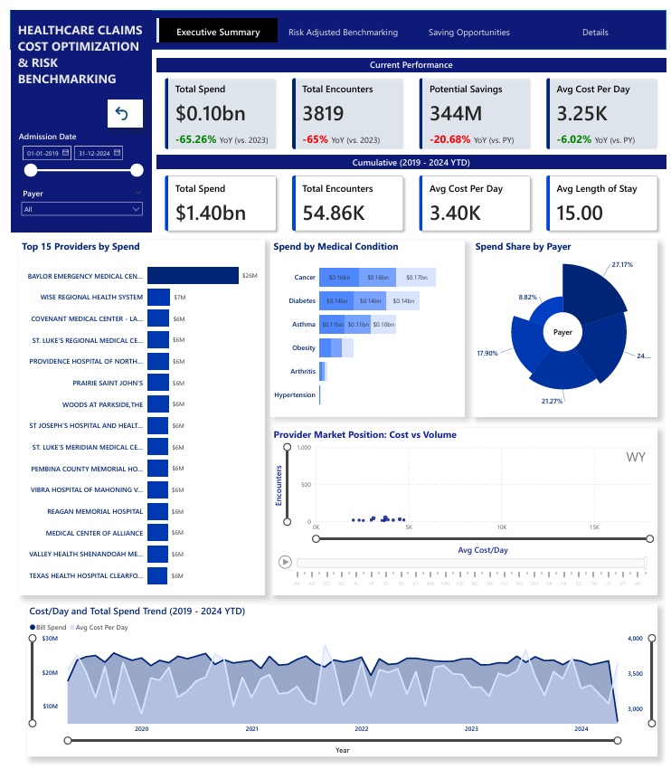
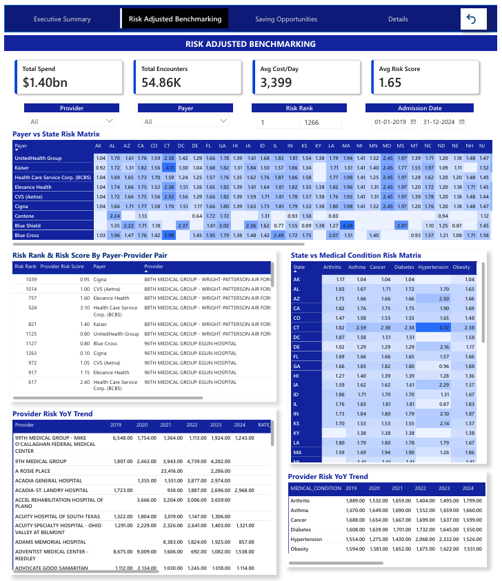
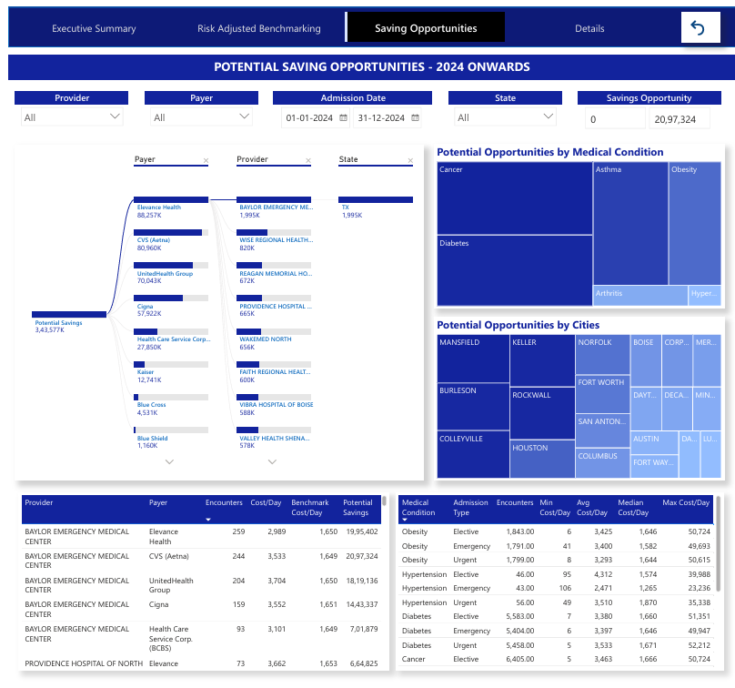
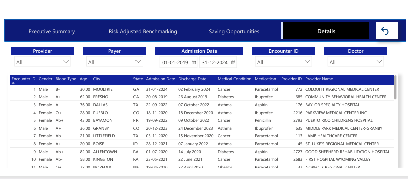
What it does The dashboard analyzes healthcare claim costs over multiple years, benchmarks provider performance, and highlights potential risk areas. It: Cleans and preprocesses raw claim data Builds analytical models to calculate cost metrics and provider risk scores Visualizes trends, outliers, and savings opportunities Enables interactive exploration through filters, comparisons, and drill-downs Ultimately, it helps users understand where costs are concentrated and how provider behavior impacts overall spending.
How I built it We built the solution using a modular, end-to-end data pipeline: Python for data cleaning, normalization, and preprocessing SQL for building analytical data models, aggregations, and provider benchmarks Power BI for designing an interactive risk and cost optimization dashboard Dataset and scripts organized for repeatability and scalability Each layer connects seamlessly: cleaned data flows into SQL models, which then feed the Power BI dashboard.
Challenges I ran into Handling missing, inconsistent, or poorly formatted data across multiple files Creating accurate provider-level metrics while avoiding skew from outliers Ensuring SQL models remained efficient with large datasets Balancing visual complexity vs. clarity in the dashboard Maintaining data security and role-based access considerations for sensitive information Despite these challenges, optimizing the modeling pipeline and refining dashboards helped produce a robust solution.
Accomplishments that I am proud of Successfully transforming raw claims data into a structured, analytics-ready dataset Designing a dashboard that gives clear, actionable insights into provider performance Building a scalable workflow that can easily incorporate new datasets Creating meaningful visualizations that reveal hidden trends and cost drivers Delivering a professional-grade analytics solution that mirrors real-world healthcare BI systems
What I learned Best practices for healthcare claims data normalization and cleaning Advanced SQL modeling techniques for multi-level provider analysis Designing dashboards that balance usability, detail, and performance How to evaluate cost, risk, and provider efficiency from a data science perspective Importance of data storytelling when communicating insights to stakeholders
What's next for Healthcare-Claims-Cost-Optimization-Provider-Risk-Dashboard Adding predictive modeling for provider risk scoring and cost forecasting Building automated ETL pipelines for scheduled data refreshes Expanding KPIs to include clinical outcomes and procedure-level cost insights Creating a web-accessible dashboard interface for scalable deployment
Built With
- aggregations
- analytics
- and-normalization-sql-?-analytical-modeling
- claims
- csv/flat
- drill-down-insights-pandas-?-data-manipulation-and-quality-checks-numpy-?-numerical-computation-and-data-transformation-sql-engine-(snowflake-/-postgresql-/-sql-server-/-any-rdbms)-?-data-modeling-and-storage-dax-(power-bi)-?-custom-measures
- files
- healthcare
- input
- kpi-calculations
- preprocessing
- provider-level-metrics-power-bi-?-interactive-dashboard
- python-?-data-cleaning
- trend
- visual-analytics


Log in or sign up for Devpost to join the conversation.