-

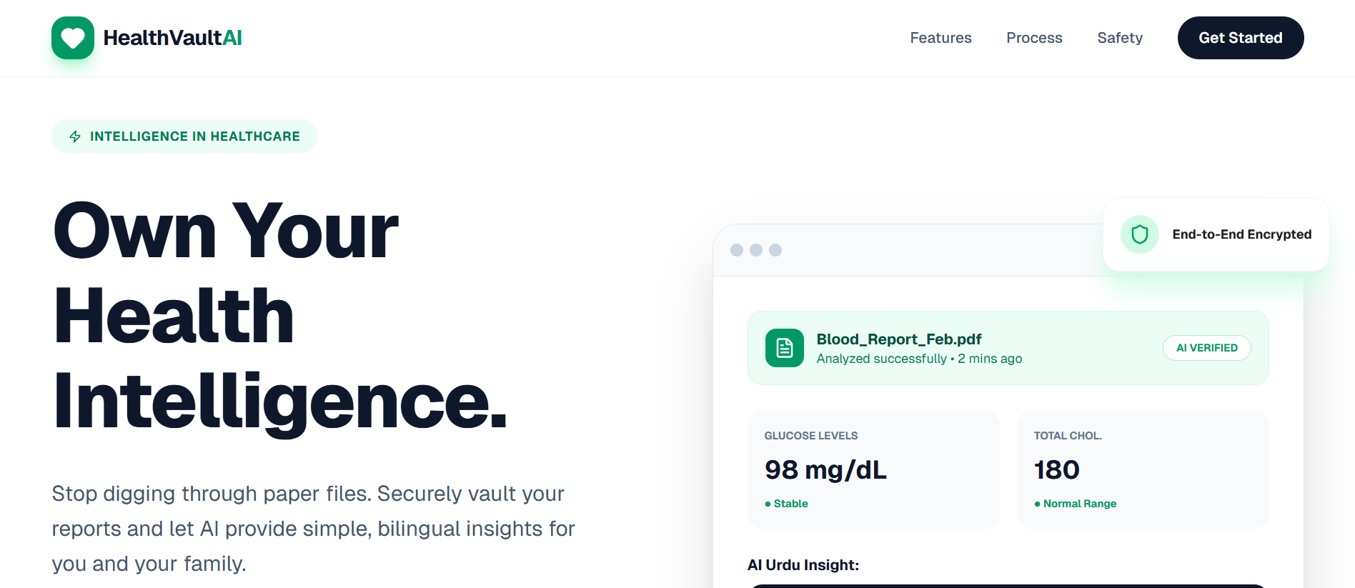
Landing Page
-
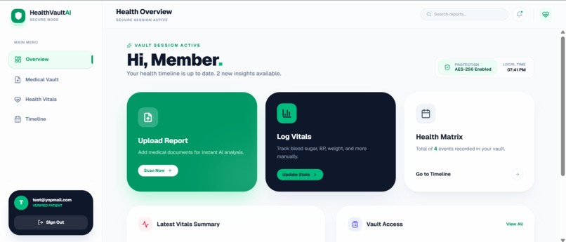
User Dashboard
-
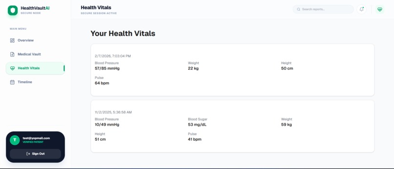
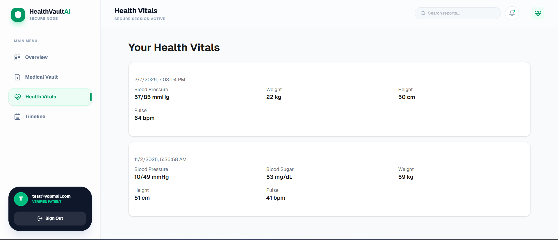
Health Vitals Page
-
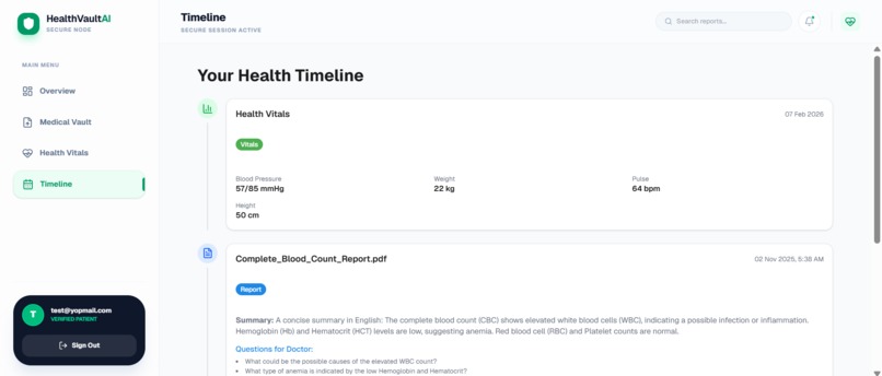
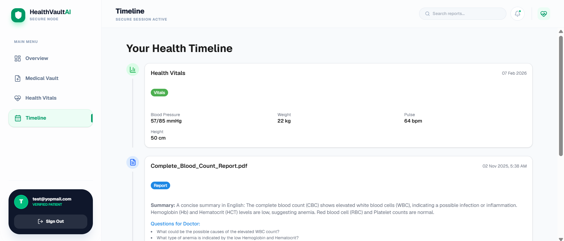
Reports Timeline Page
-
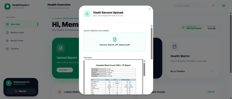
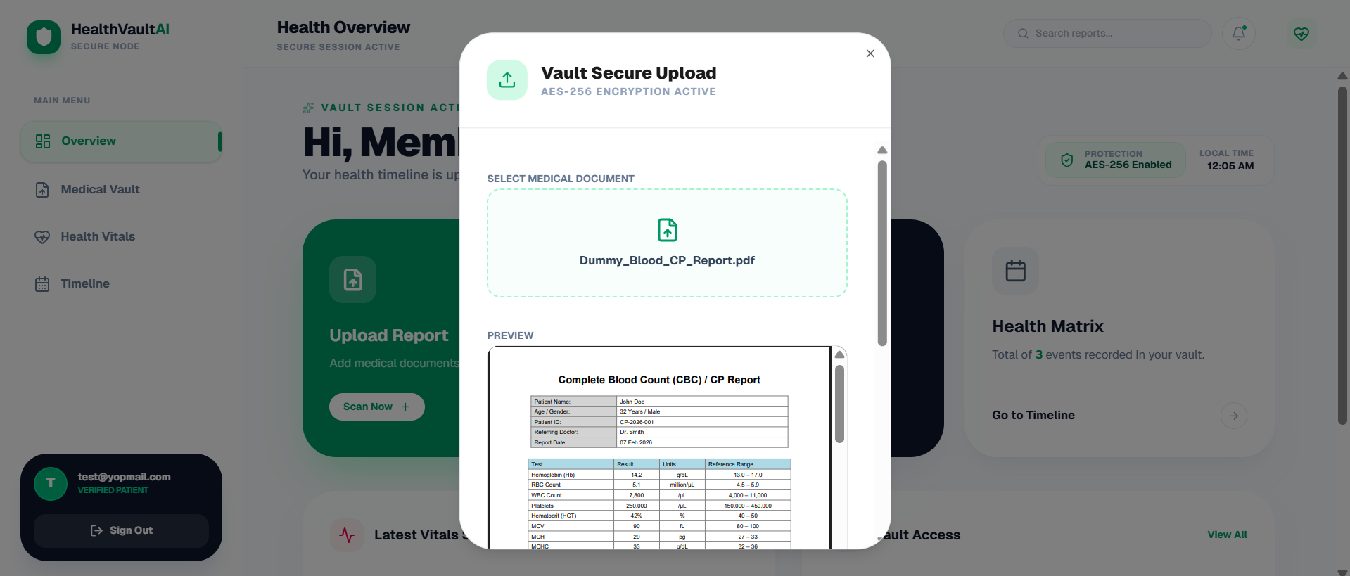
Upload Report Modal
-
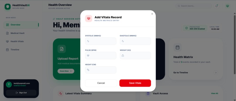
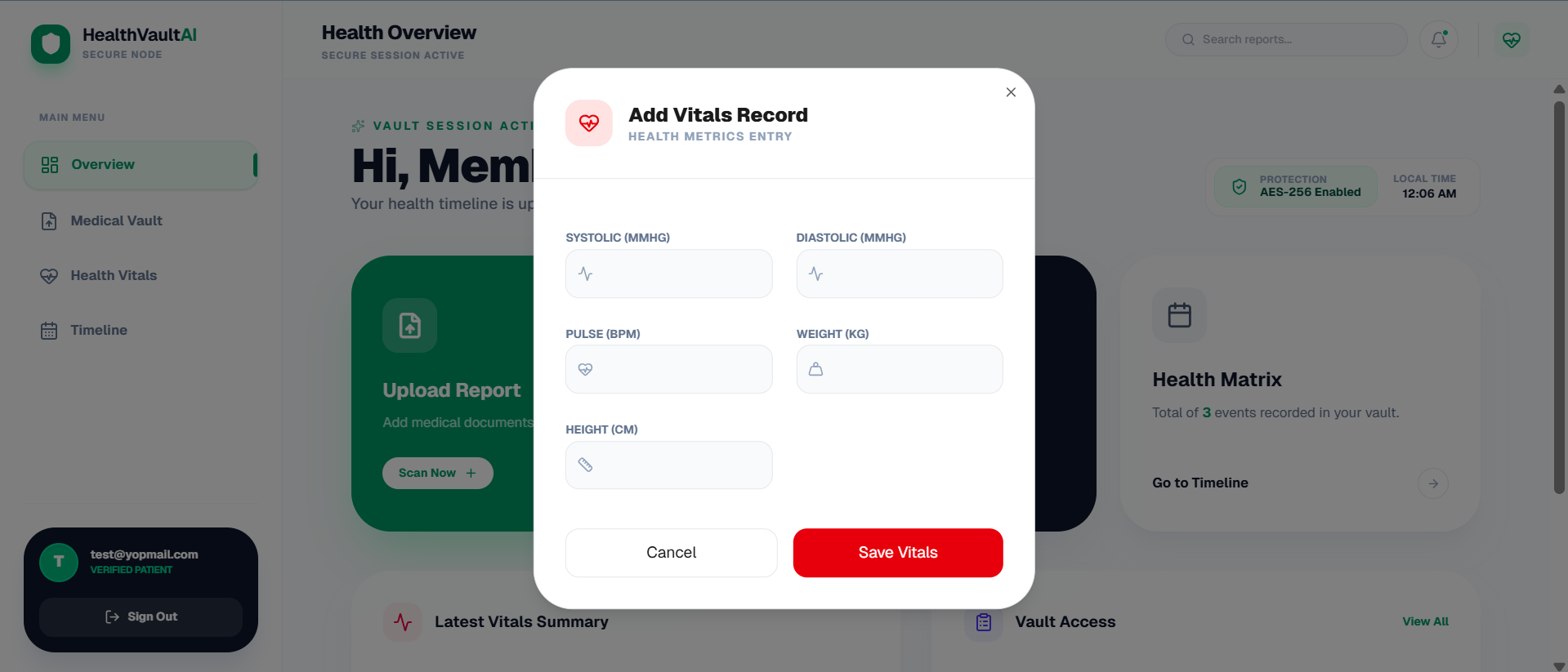
Add Vitals Modal (weight, blood pressure etc)

HealthVault AI - Project Structure & Documentation
HealthVault AI is a high-end, secure medical records platform designed to transform complex medical data into simplified, bilingual insights. The application leverages a "Vault" metaphor, combining aesthetics with empathetic healthcare design.
1. Project Overview
- Vision: Empowering patients to own their health intelligence.
- Primary Function: Secure storage of PDFs, manual logging of vitals (BP, Glucose), and AI-powered bilingual summaries (English/Roman Urdu).
- Design Language: Glassmorphism, encryption branding, emerald-focused palette, and premium rounded geometry.
2. Technology Stack
- Framework: Next JS 16.
- Styling: Tailwind CSS (Utility-first, custom glass effects).
- Icons: Lucide React (Consistently weighted for a technical look).
- State Management: React Hooks (
useState,useRef,useEffect). - Form Handling: React Hook Form.
- Navigation: State-based conditional rendering (Landing → Auth → OTP → Dashboard).
3. File Architecture
Core Files
layout.tsx: Entry point with some wrappers like ErrorBoundary and Query Client to communicate with the backend.page.tsx: Main Entry Point or Landing Page where user lands.global.css: The primary file for custom styles and TailwindCSS config.
Application Views
LandingPage.tsx: High-conversion hero section, feature grids, and process walkthrough.AuthPage.tsx: Dual-tab Login/Signup system with integrated security branding.VerifyOTPScreen.tsx: Security layer for vault access with auto-focusing 6-digit inputs.DashboardLayout.tsx: The "Shell" providing the sidebar, top navigation, and responsive mobile overlays.DashboardHomePage.tsx: Overview "Matrix" showing quick actions, latest vitals, and recent vault access.
Functional Modals
UploadReportModal.tsx: File drop-zone with PDF preview and metadata tagging.AddVitalsModal.tsx: Multi-category input system for blood pressure, sugar, weight, and heart rate.
UI Primitive Components (/components/ui)
- button.tsx: Multi-variant action components (emerald, outline, ghost).
- dialog.tsx: Custom modal primitive with backdrop-blur and escape-key handling.
- select.tsx: Robust manual dropdowns including Trigger, Content, and Item.
- input.tsx / label.tsx / textarea.tsx: Themed form controls with emerald focus rings.
4. Key Design Patterns
The "Vault" Aesthetic
- Glassmorphism: Use of
bg-white/80andbackdrop-blur-xlto create depth. - Depth & Shadows: Large, soft colored shadows (e.g.,
shadow-emerald-500/20) to highlight primary actions. - Typography: Plus Jakarta Sans for a modern, approachable yet professional feel.
Security Branding
- Visual Cues: Frequent use of ShieldCheck, Lock, and Zap icons.
- Encrypted Preview: PDF previews stylized with a slight grayscale/glass overlay to imply "Secure Processing."
5. User Flow
- Discovery: User interacts with the landing page.
- Onboarding: User creates an account (Auth) and confirms identity via email (OTP).
- Dashboard: User lands on the Overview Matrix.
- Action: User either uploads a report or logs a vital metric.
- Insight (AI Tier): Documents are analyzed to produce bilingual summaries.
6. Development Philosophy
- Minimal Dependencies: Relies on ESM imports to stay lightweight.
- Accessibility: Large touch targets (14px/16px inputs), high-contrast text, and responsive layouts.
- Performance: CSS-based animations (
animate-in,zoom-in,fade-in) for smooth transitions without heavy libraries.
7. Demo User
(Use this account if the Gemini rate limit is exceeded and AI report summaries are temporarily unavailable.)
- Email: test@yopmail.com
- Password: 123456
Built With
- express.js
- mongodb
- next.js
- tailwindcss

Log in or sign up for Devpost to join the conversation.