🌍 Health Insights Dashboard: Global Disease Trends
💡 Inspiration
My inspiration for creating the Health Insights Dashboard came from the realization that health data is often scattered and difficult to interpret. Reports and datasets exist, but they are usually static and lack an interactive way to connect disease trends with social and economic factors.
I wanted to build a platform that makes it easier to see the bigger picture — how income, healthcare access, and education levels influence global disease outcomes.
The COVID-19 pandemic emphasized how valuable real-time insights can be for public health decisions. This project grew out of that motivation — to build a tool that transforms raw health statistics into something visual, understandable, and meaningful for anyone interested in global wellness.
🩺 What it does
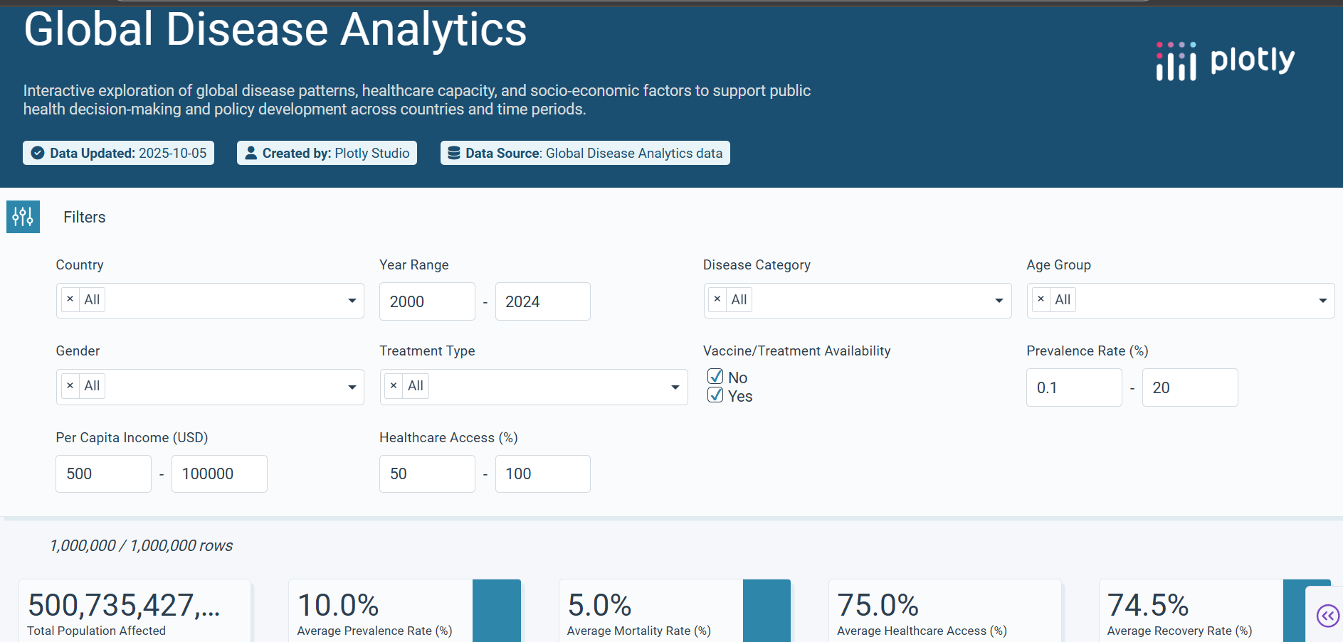
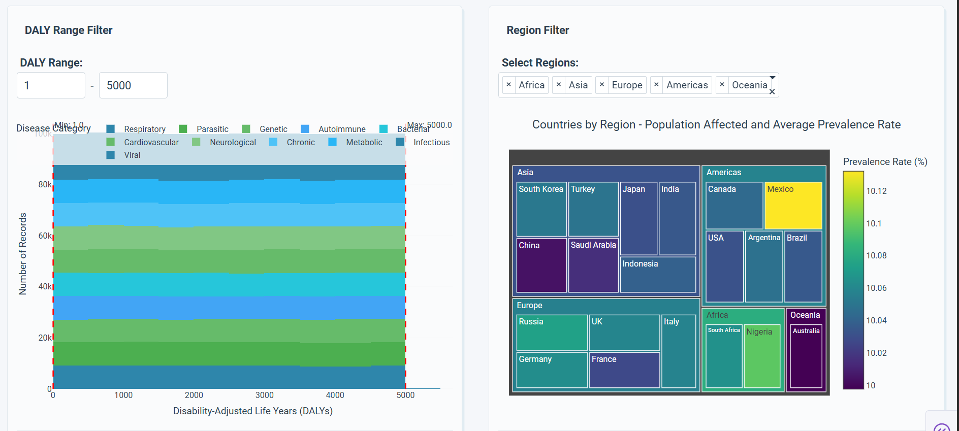
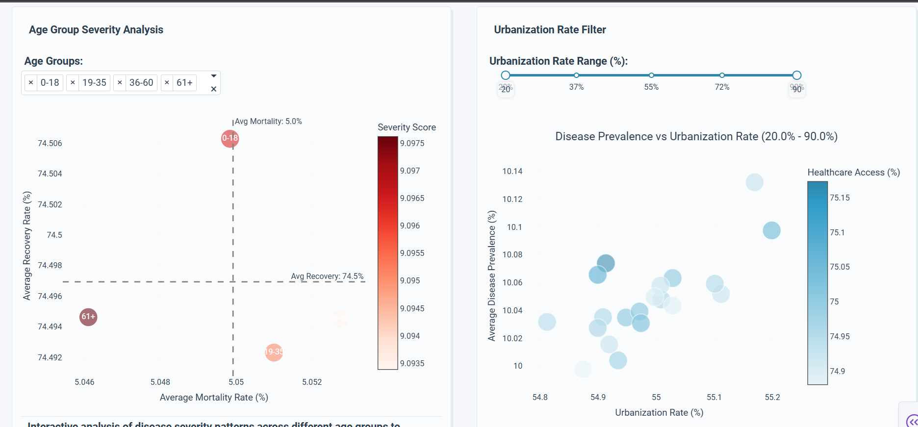
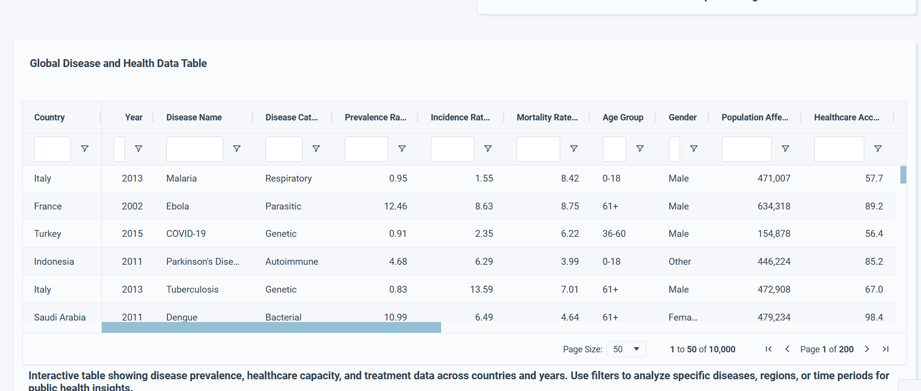
The Health Insights Dashboard is an interactive data application that allows users to explore and analyze disease patterns across multiple countries and years.
It enables users to:
- Track disease prevalence, incidence, and mortality from 2000 to 2024 for 20 major global diseases.
- Compare disease outcomes by country, gender, and age group.
- Examine how economic indicators (like income and education index) and healthcare factors (like access rate, doctors per 1000, and hospital beds) influence recovery and mortality.
- Filter dynamically using dropdowns and sliders for disease type, country, healthcare access, and more — all updating charts in real time.
The dashboard provides a comprehensive, data-driven view of global disease trends and helps identify where improvements in healthcare systems may be most needed.
⚙️ How I built it
I developed this dashboard using Plotly Studio, leveraging its AI-powered analytics features to generate and refine the layout interactively.
Process:
- Data Preparation:
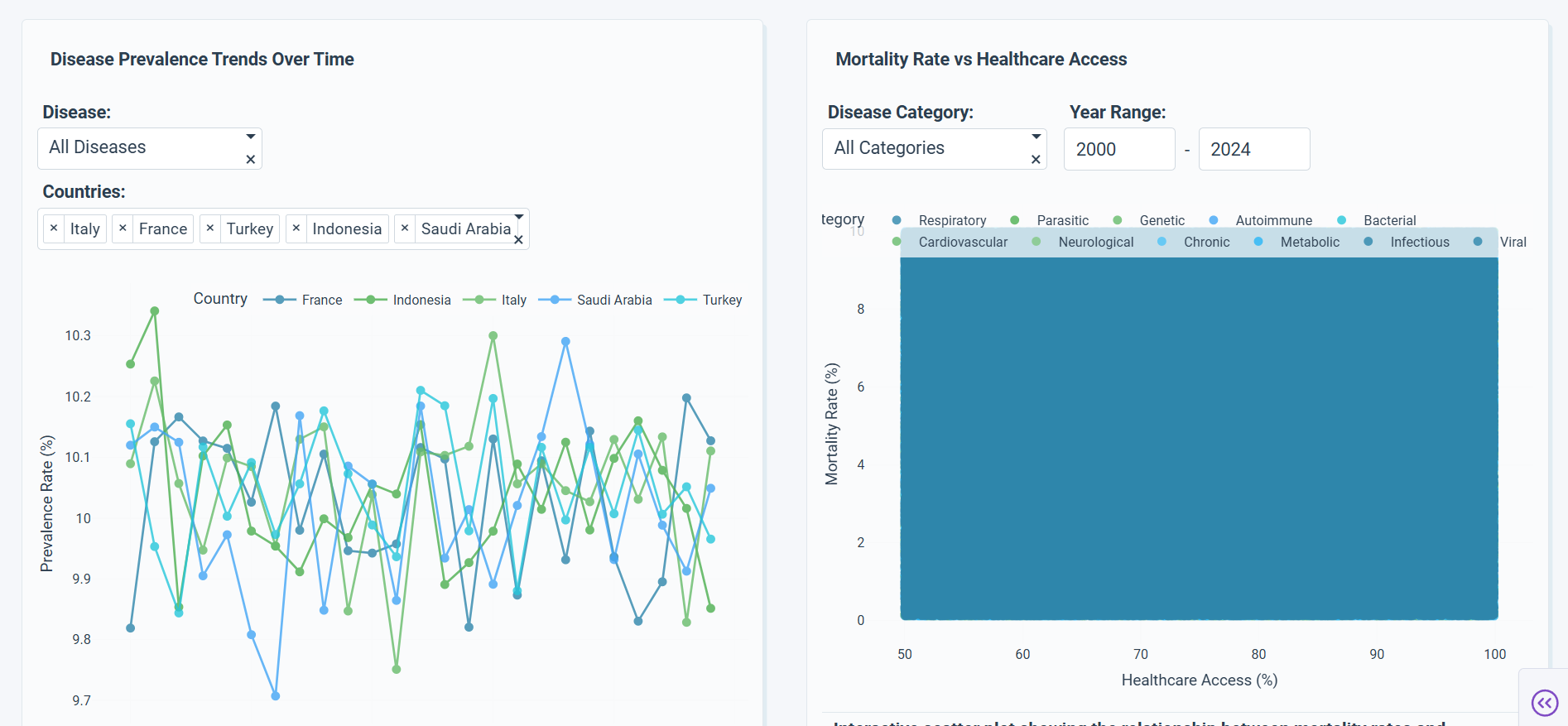
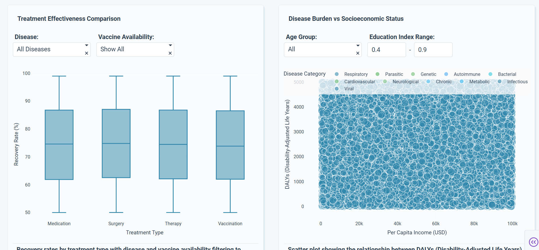
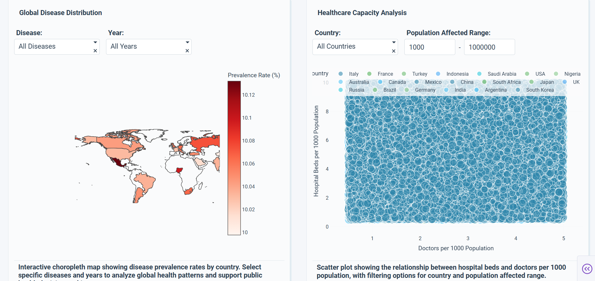
I cleaned and structured a dataset containing global disease metrics, healthcare infrastructure data, and socio-economic indicators for multiple countries. - Visualization Design:
I used Plotly Express to create line charts, scatter plots, box plots, and choropleth maps. Each chart focuses on a specific insight — such as mortality vs healthcare access or DALYs vs per capita income. - Interactivity:
I added global filters like year range, country, disease category, and treatment type to connect all charts dynamically. - Styling:
The app uses a calming blue-green healthcare theme, clear labels, and minimal visual clutter for better accessibility. - Deployment:
The final dashboard was deployed on Plotly Cloud, making it easy to share and explore from any device.
🚧 Challenges I ran into
One major challenge was managing large amounts of health data with missing or uneven values across countries.
Ensuring all filters updated smoothly across multiple charts required optimization and clean data modeling.
Designing a layout that remained informative yet uncluttered also took several iterations, especially when combining demographic and economic variables.
🏆 Accomplishments that I’m proud of
I’m proud that this project successfully combines data from multiple domains — health, economy, and infrastructure — into one unified dashboard.
Creating an app that allows interactive exploration of disease trends without writing extensive manual code felt rewarding.
I also achieved a clean and professional design that communicates complex relationships clearly, supporting data-driven insights for public health awareness.
📚 What I learned
Through this project, I learned how to guide agentic data generation in Plotly Studio using clear prompts and structured goals.
I deepened my understanding of data visualization, filtering logic, and the importance of data storytelling — turning statistics into insights people can act on.
Working with health data also gave me experience in handling incomplete datasets, normalizing different scales, and designing visuals for clarity and trust.
🔮 What’s next for Health Insights Dashboard
I plan to enhance the dashboard with:
- Predictive analytics to forecast future disease prevalence using regression or time-series models.
- API integration with WHO and World Bank data for automatic updates.
- Geospatial mapping to display hotspots and regional health disparities.
- AI-generated summaries that explain key insights dynamically.
- Downloadable reports for research or policy presentation.
This project is an ongoing effort to make global health information more accessible, insightful, and actionable.


Log in or sign up for Devpost to join the conversation.