-

logo
-
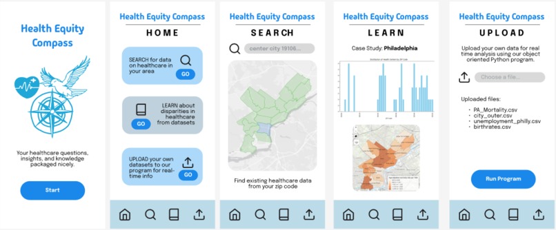
app interface
-
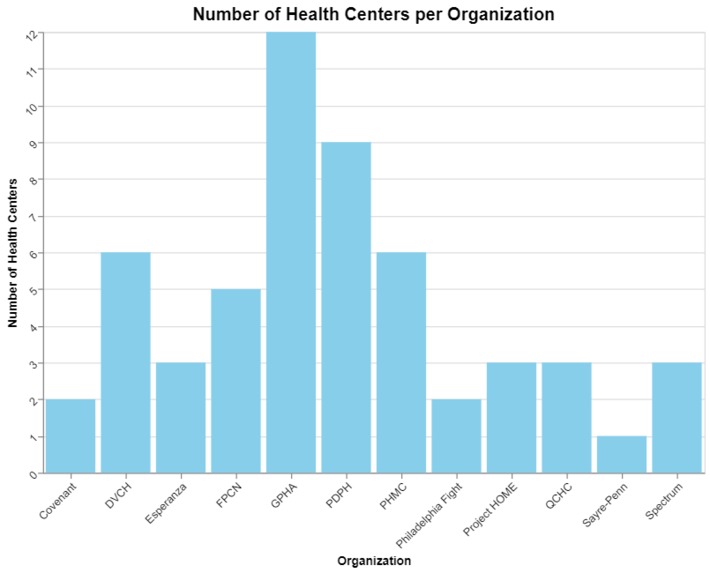
number of health centers per organization in Philadelphia
-

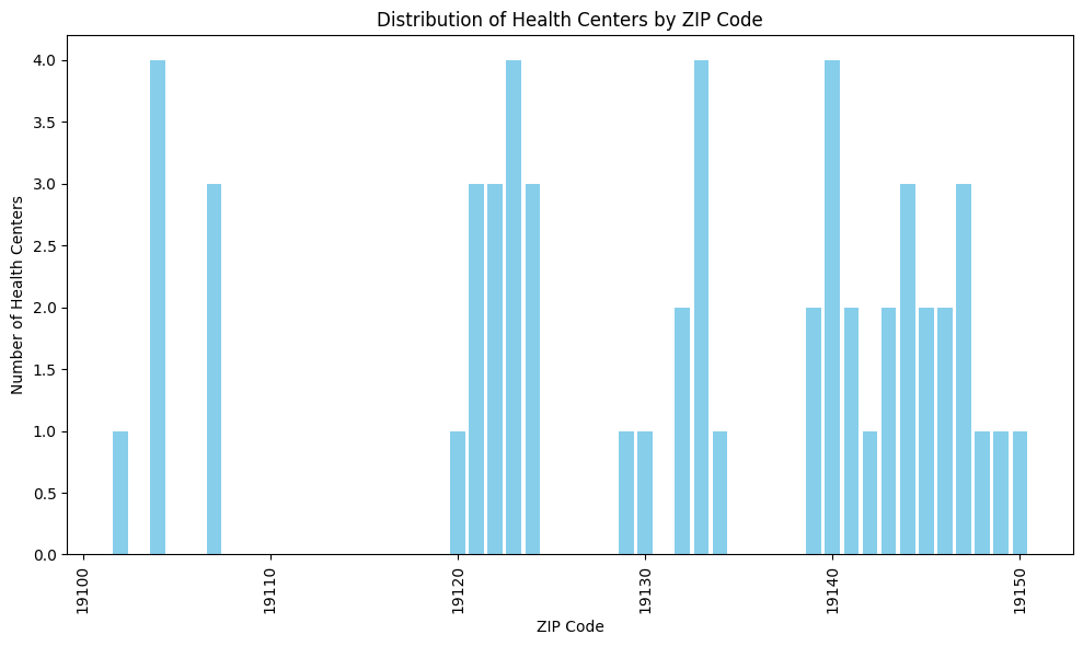
distribution of health centers by zip code in Philadelphia
-
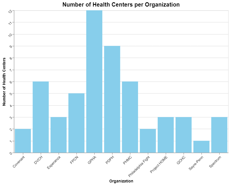
jupyter notebook in google colab for data analysis


Inspiration 💡
Our project, Health Equity Compass 🧭, is driven by the need to address healthcare disparities that disproportionately affect marginalized communities. Access to healthcare 🏥 is unequal across different demographics and regions, leading to disparities in health outcomes. We wanted to create a tool that helps visualize these inequities, offering public health organizations and policymakers actionable insights to improve healthcare access for all. This software is mainly targeted towards local government and public health organizations to educate and bring to light the disparities in access and quality of healthcare in local areas. The goal is to raise enough awareness as a call to action for the changemakers in our society to use their power to improve the wellbeing of the general public.
What it does ⚕️
Health Equity Compass 🧭 is an interactive platform designed to track and analyze healthcare disparities across different geographic regions. It allows users to:
- Explore healthcare center distribution across zip codes
- Upload their own data and receive analysis in real-time based on an automate Python script
- Compare population data with healthcare access to identify underserved communities
- Learn about case studies from existing datasets
- Search for specific regions or demographics to assess healthcare access
- View educational resources on health equity and actionable insights to promote better healthcare allocation
How we built it ⚒️
We used:
- Google Colab with Jupyter Notebooks to develop and run data analysis pipeline
- Python for data manipulation and analysis
- Pandas to clean and structure the datasets
- Scipy for conducting statistical analyses
- Geopandas for geospatial mapping of health centers
- Matplotlib and Seaborn to create visualizations that highlight disparities in healthcare access
Challenges we ran into 🚧
One of the major challenges we faced was aligning different data sources. Health centers were mapped by zip codes, while population data was segmented by census tracts. We had to find the most accurate and relevant data to our topic, and aggregating the data to find meaningful insights took great effort since we were comparing separate numbers, categories, and statistics. Determining the type of analysis, graphs, plots, and statistical tests was also a challenge on our part, as we had to take into account the type of data we were using, most of which was categorical, and apply the relevant test to draw conclusions from.
Accomplishments that we're proud of 🏆
We’re proud of successfully creating a tool that offers a clear visualization of healthcare disparities in Philadelphia, providing both general insights and the ability to zoom in on specific zip codes. We also integrated population and healthcare data to offer a more in-depth view of which communities are most affected by disparities. Finally, we implemented a file upload system that takes in user data and runs scripts in real time.
What we learned 💪
Throughout the project, we learned a lot about how systemic healthcare inequalities affect different demographics. We gained experience in working with large datasets and combining various tools such as Pandas, Scipy, and Geopandas to create meaningful visual representations. By running so many tests and visualizations, we gained stronger skills in using Python and its libraries to perform statistical analysis on datasets. Lastly, the process of geospatial mapping using real data taught us about the technical challenges involved in merging diverse data sources.
What's next for Health Equity Compass 🔮
Moving forward, we plan to expand Health Equity Compass 🧭 by:
- Integrating additional demographic data, including income levels, health outcomes, and poverty level
- Enhancing user interface and user experience for smoother navigation and better visualization
- Expanding the tool to cover more regions beyond Philadelphia
- Offering real-time updates and notifications when new healthcare data becomes available for the regions users are monitoring
- Partnering with public health departments to make our platform a tool for resource allocation and policy-making
Built With
- adobe-fresco
- figma
- geopandas
- matplotlib
- pandas
- python
- scipy
- seaborn
- visual-studio


Log in or sign up for Devpost to join the conversation.