Inspiration
Every New Yorker knows the moment: you round a corner, see the station entrance a block away, and have to decide right now. Walk, hurry, or let it go? Transit apps give you a countdown. They don't tell you whether you, standing here, can make it. And the countdown says nothing about the other thing New Yorkers get wrong every day: going down the wrong stairs. At many local stations the uptown and downtown platforms have separate entrances and no free way across inside. Pick the wrong side and you pay a second fare or miss the train.
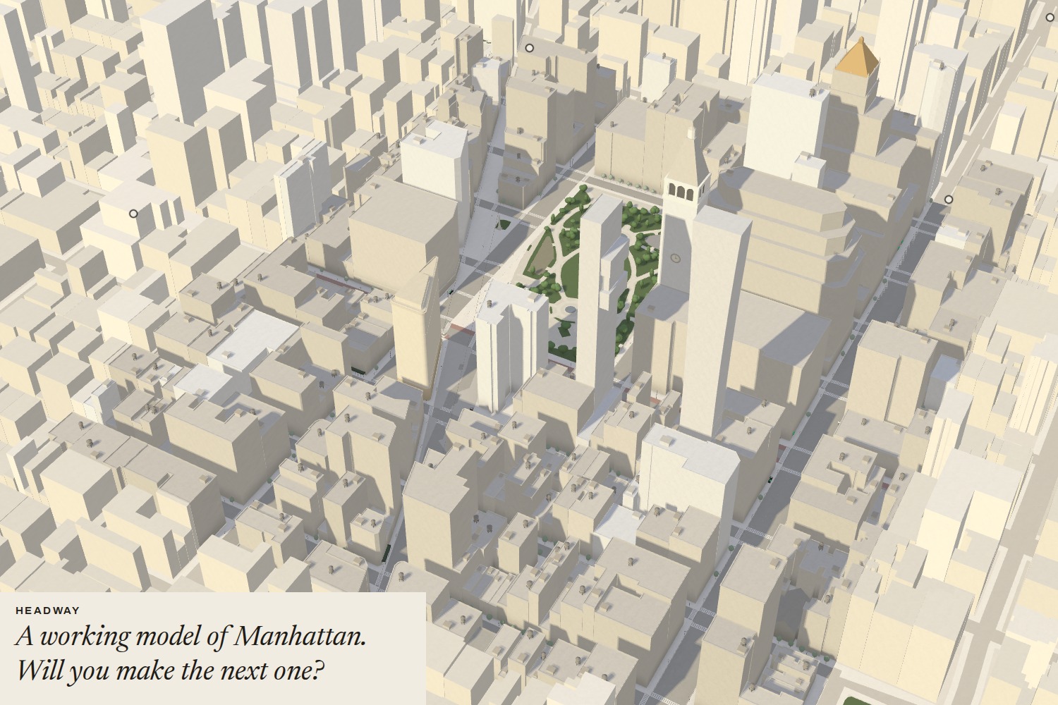
I also wanted it to feel like New York rather than a dashboard. The model is inspired by the Panorama of the City of New York at the Queens Museum, the huge handmade scale model generations of kids pressed their faces against. Headway asks: what if that model were alive?
What it does
Headway is a working model of Manhattan in your browser, like a museum piece on a table:
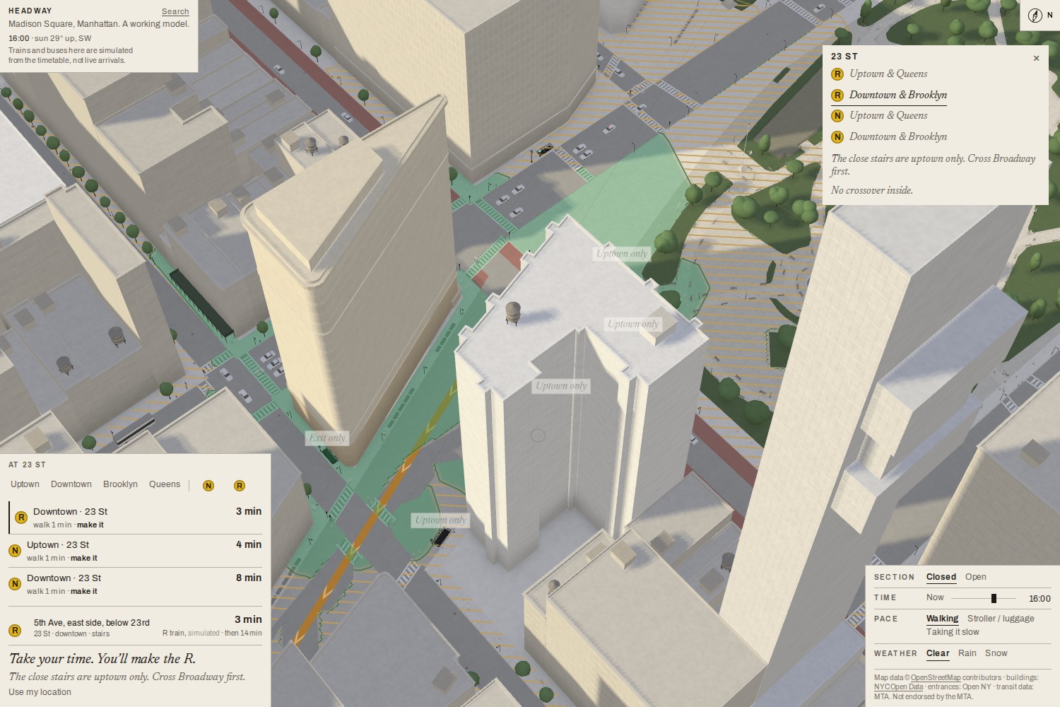
- Answer first. Open it and you get two or three plain rows: N Downtown · 23 St · 3 min · walk 2 min · make it.
- The light. Stand somewhere and pick a stop. A soft green wash on the sidewalks means walk, you'll make it; a hatched yellow means pick it up a little. Beyond that, let it go. The light is measured on the real walking network, with a wait at every avenue, and it shrinks as the train approaches.
- Which stairs. Choose a line and direction, and the right stairs light up while the wrong ones dim. At the 44 Manhattan stations with no free crossover, it says so: *"The close stairs are uptown only. Cross Broadway first."
- Live, and honest about it. Trains and buses come from the MTA's feeds. When a feed drops, the page says "Live data's not coming through. Showing the usual pattern." It never invents a countdown.
- Everyone's reach is different. Walking, stroller/luggage or taking it slow changes your range, and an elevator outage changes which entrances count.
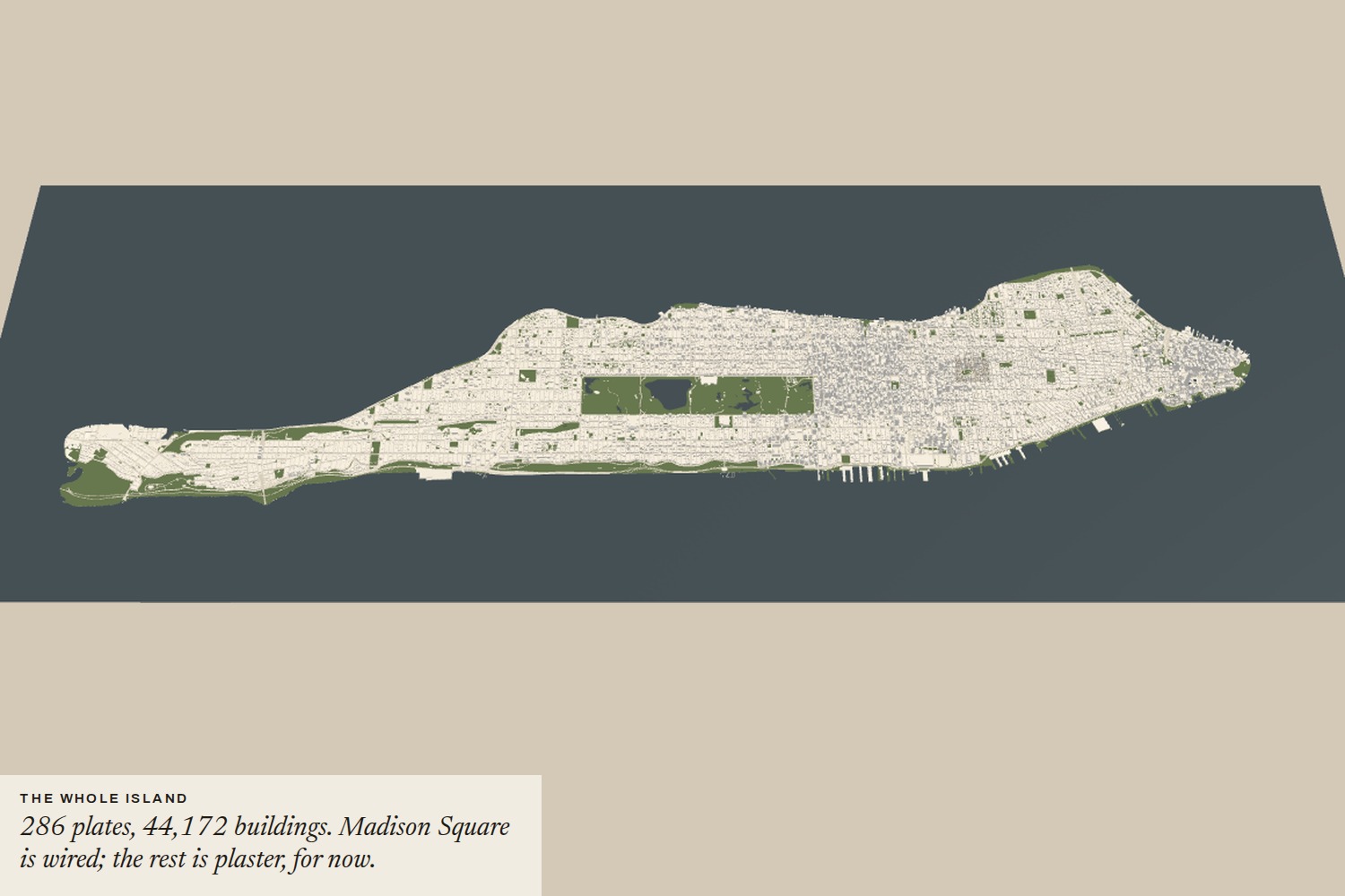
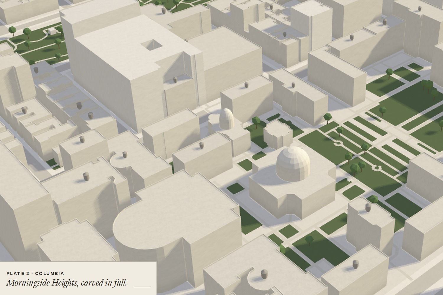
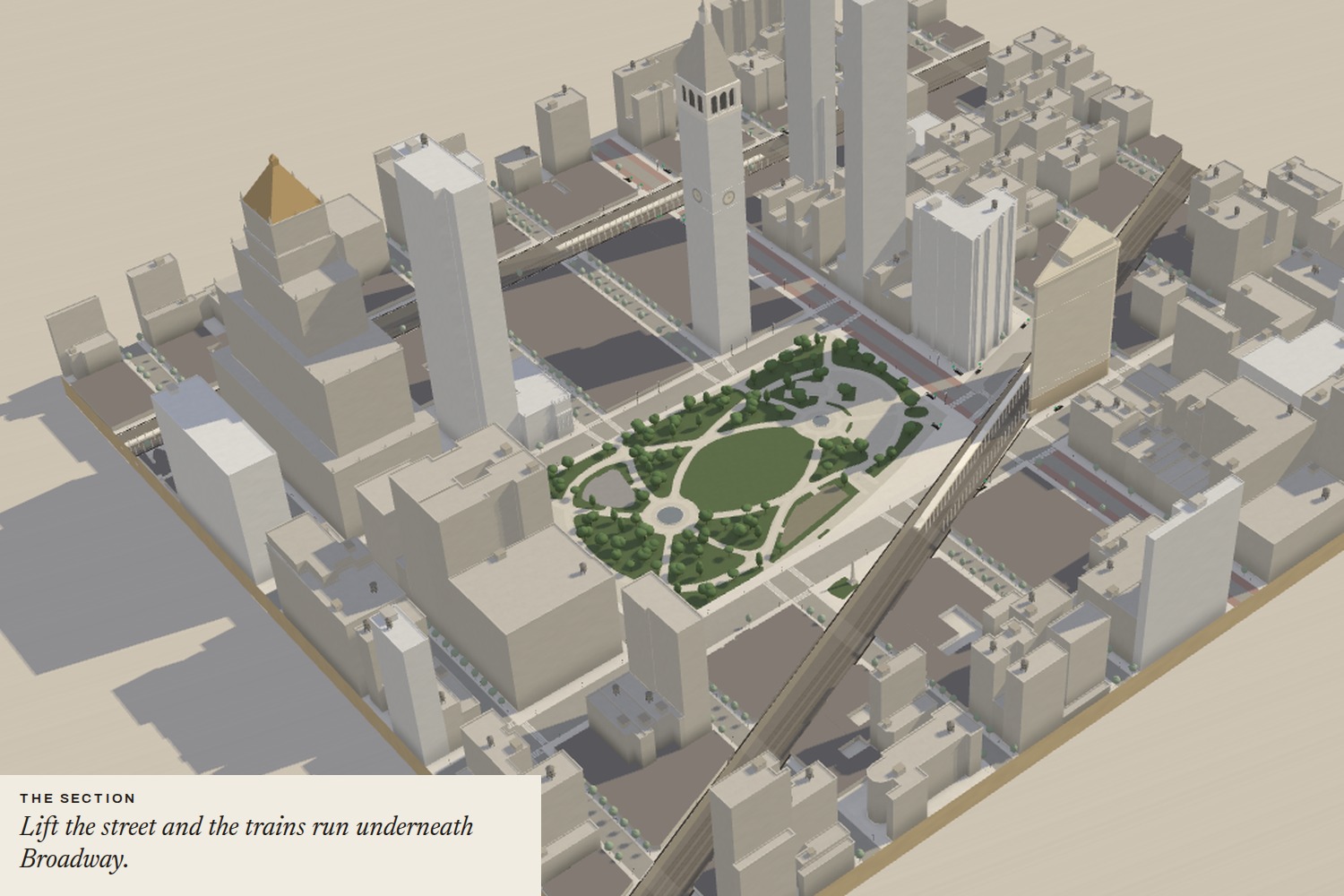
- The whole island. 286 plates of 500 m and 44,172 buildings. Madison Square (plate 1) is fully wired; Columbia (plate 2) is carved in full detail; the rest is streamed "plaster".
Copy is written the way a neighbor would say it: "Take your time. You'll make it." · "It happens. 6 min till the next."* · "Late one. Wait where the booth can see you."
How I built it
- Rendering: three.js in a single self-contained page, with no third-party requests at run time.
- Geography: OpenStreetMap streets, sidewalks and crossings; NYC Open Data footprints and roof heights; MTA entrances, elevators, GTFS stops and shapes. Everything is baked offline into compact static tiles.
- **Streaming the island: three levels of detail (near tiles, per-tile merged masses, 2 km super-tiles). The whole island draws in 16 draw calls, and phones stay within 150 draw calls and 600k triangles.
- Live data: a same-origin Cloudflare Pages Functions proxy decodes the subway GTFS-Realtime feeds, Bus Time, alerts and outages server-side, and caches them for 20–30 s. The Bus Time key lives only as a server secret, and a test fails the build if it appears anywhere in the site.
- One number for words and light: the sentence and the light are drawn from the same value, so they can't disagree:
t_{\text{avail}} = t_{\text{departure}} - t_{\text{now}} - t_{\text{stairs+turnstile}}
- Privacy: location is used only after a tap, stays on the device, and no request to the proxy carries it.
- Process: I directed the build as a series of written briefs executed with AI coding agents (Claude Code), with adversarial review passes, replay tests on recorded MTA feeds, and screenshot self-checks after every round.
Challenges
- Trains underground have no GPS. The subway feeds give predicted arrivals, not coordinates. Positions are interpolated along the track from those predictions, with hard rules: no teleporting, never moving backwards, bounded acceleration. A vehicle we haven't heard from fades instead of pretending.
- Footprints have one height. The Empire State Building became a block-sized slab 380 m tall. Ten supertalls are hand-made; a setback rule handles the rest.
- The wrong-stairs data. The MTA's station file and OpenStreetMap's stair signs disagreed at 15 stations. I checked the riskiest by hand and found that at Columbia the real wrong-stairs story is 110 St on the 1, not 116 St, which has a mezzanine.
- Phones. Performance budgets, a portrait screen, and GPS that drifts tens of meters between towers.
- Not looking like an app template. No rounded cards, gradients or neon. The interface is set like museum labels: hairlines, right angles, Archivo and Newsreader, and color only where it means something.
What I learned
- The hardest part of a transit tool isn't the data, it's honesty: saying live, timetable or simulated, and staying quiet when unsure. A wrong "cross the street" is worse than silence.
- A glance is the product. The answer has to come before you see.
- Real geography surprises you: Madison Square Park is nearly 2:1, not square, and Manhattan's grid runs about 29° off true north.
- Small, calm sentences carry more than any animation.
What's next
Wiring the light and live arrivals across every other plate of entire NYC, "leave by 8:42 for the 8:49 R", learning user's own walking pace on-device, and a replay mode: yesterday's rush hour in 60 seconds.


Log in or sign up for Devpost to join the conversation.