## Inspiration
Every student housing search comes down to the same blind trade-off: cheaper rent usually means a worse commute, but nobody finds out how much worse until they've already signed the lease and missed their first 8:30am class because the bus only comes every 30 minutes. Distance-to-campus on a map doesn't tell you that. A walk score doesn't tell you that. We wanted one honest number that does — built from the actual transit schedule, not a straight-line guess.
## What it does
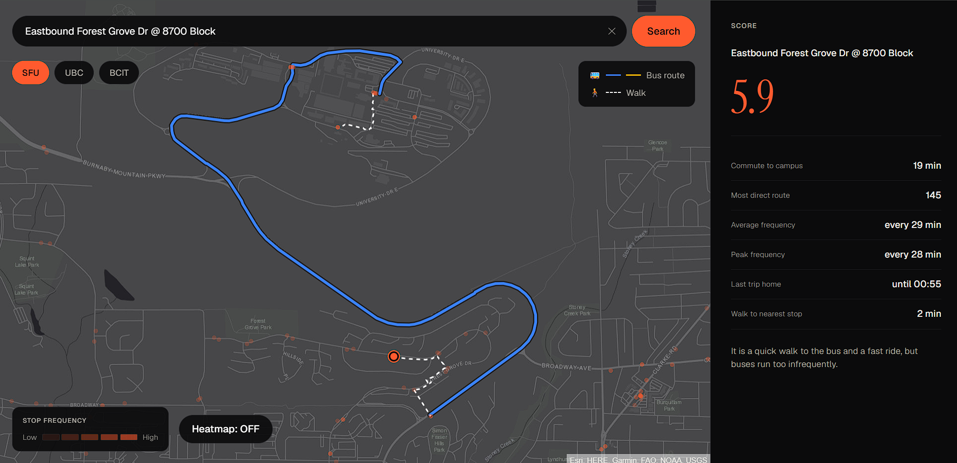
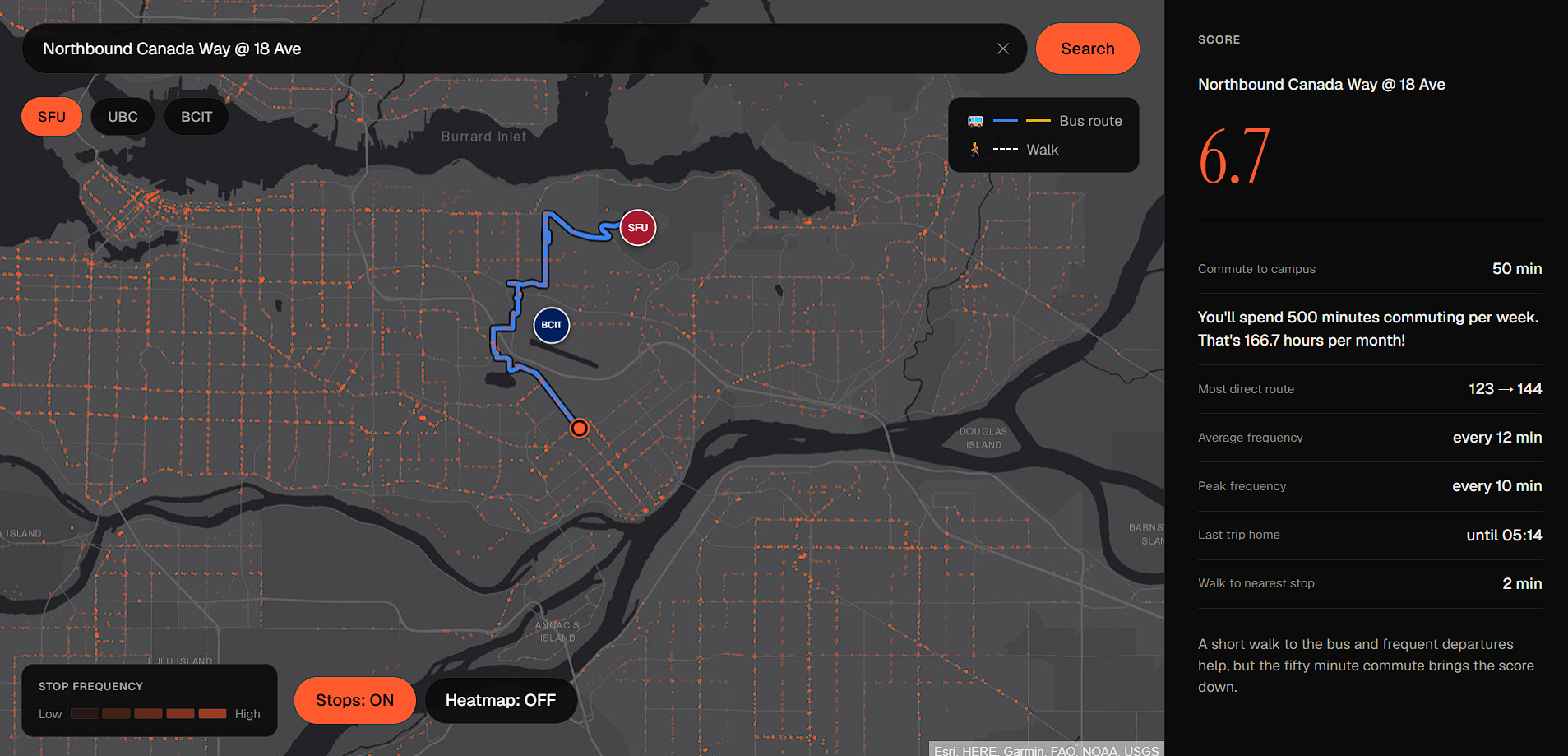
Search an address, or click any real bus stop on the map, and Headway scores it 0–10 for how well transit gets you to campus — then shows the route itself, drawn out: colored bus segments, dashed walking segments, and a plain-language verdict explaining why it scored that way (e.g. "Frequent service right at your doorstep makes up for the longer 47-minute ride").
The score is a weighted blend of four real factors:
$$ \text{score} = 0.3 \cdot C + 0.3 \cdot F + 0.2 \cdot L + 0.2 \cdot W $$
where $C$ is commute time, $F$ is bus frequency, $L$ is late-night service, and $W$ is walk distance to the nearest stop — each normalized to a 0–10 scale before weighting, so a single dominant factor can't silently drown out the others. You also get a toggleable heatmap showing scores across the whole region, not just the address you searched.
## How we built it
- Backend: Python + FastAPI, parsing TransLink's real published GTFS static feed (stops, routes, stop times, calendars) into stop-level frequency stats and a campus-commute graph
- Frontend: React + Vite + Tailwind, MapLibre GL for the map, route lines, and heatmap layer
- Geocoding: Nominatim, deliberately bounded to the Metro Vancouver bounding box — an address outside the region correctly returns "not found" instead of a wrong score
- The verdict sentence: Google Gemini (
gemini-flash-lite-latest), called as a second, separate request after the score — so the real number shows in ~2–3 seconds and only the one-line explanation shows a loading state while Gemini finishes (~2s) - The heatmap: a server-computed scored grid over Metro Vancouver, water-masked so it doesn't paint scores over Burrard Inlet, rather than a precomputed hex grid
- Design: one accent color, dark theme, Instrument Serif + Geist — built to be read in five seconds, matched against a Figma spec down to the pixel (72px score, specific grays, specific border colors)
Four people split cleanly along the data pipeline: GTFS ingestion and the transit graph, the scoring formula itself, the
map/search UI, and the landing page + narrative + QA — all four pieces had to agree on the same contract (stop_id in, score
out) to come together without anyone blocking anyone else.
## Challenges we ran into
- H3 doesn't build on Windows. The original plan used the H3 geospatial library for the heatmap grid. It fails via a CMake
toolchain error on Windows, and burning hours fighting a build toolchain mid-hackathon isn't worth it. We cut it and rebuilt the
heatmap as a plain server-computed grid of real
compute_score()calls instead — no H3 dependency at all, and arguably simpler. - A geocoding dead end. Clicking a bus stop on the map initially tried to re-geocode the stop's name (e.g. "Westbound S
Campus Rd @ Science Rd") as if it were a mailing address — and GTFS stop names aren't real addresses, so Nominatim correctly said
"not found" even though we already had the exact coordinates in hand. The fix was to let the score endpoint accept
lat/londirectly and skip geocoding entirely when the location is already known. - Free-tier API quotas are real. The first Gemini model we wired up has a 20-request/day free quota — we burned through it
during testing and hit
RESOURCE_EXHAUSTEDwith a 21-hour retry window. Switched to a lighter model with a separate quota pool, which turned out faster too (~2s vs ~5s) once we also discovered it rejects the "thinking" config parameter the heavier model accepted. - Three people editing the same map component, all night.
MapContainer.jsxand the backendroutes.pygot touched by three different people repeatedly — heatmap layer, route-line layer, stop-click handling, a stops visibility toggle — and every single merge resolved cleanly because each change was additive (a new layer, a new effect) rather than rewriting shared logic.
## Accomplishments that we're proud of
- Every number on screen comes from real data: real TransLink GTFS stops and schedules, real geocoding, real computed routes — nothing is mocked in the shipped product.
- The heatmap works without H3, which was supposed to be the hard, cuttable part.
- Zero unresolved merge conflicts across the whole build, despite heavy overlap on the same handful of files.
- A scoring tool that's willing to give an honest 5.9/10 and explain exactly why, instead of only ever telling you what you want to hear.
## What we learned
- GTFS is a deceptively large format — parsing it correctly (handling
calendar_dates.txtexceptions, late-night trips crossing midnight, stops with no weekday service at all) took far more edge-case handling than the happy path. - Picking an LLM isn't just about the model name — free-tier quota limits and parameter support (like "thinking" mode) differ per model and can break a feature that worked five minutes earlier.
- Splitting a slow API call (the Gemini verdict) from the fast one (the actual score) is a small architectural decision with an outsized UX payoff — the product feels instant even though part of it isn't.
- Real, boring geographic bounding — restricting geocoding to the region the data actually covers — prevents a whole category of confusing, hard-to-debug "it kind of works" states.
## What's next
- A compare tool: side-by-side scores for multiple listings
- Expand beyond SFU to UBC and BCIT as full first-class campuses
- Pixel-perfect water-masking on the heatmap (currently close, not exact, near coastlines)
- Deploy it somewhere real instead of
localhost

Log in or sign up for Devpost to join the conversation.