Inspiration
The dateline in the stories. And wanting to see if they could be consistently mapped.
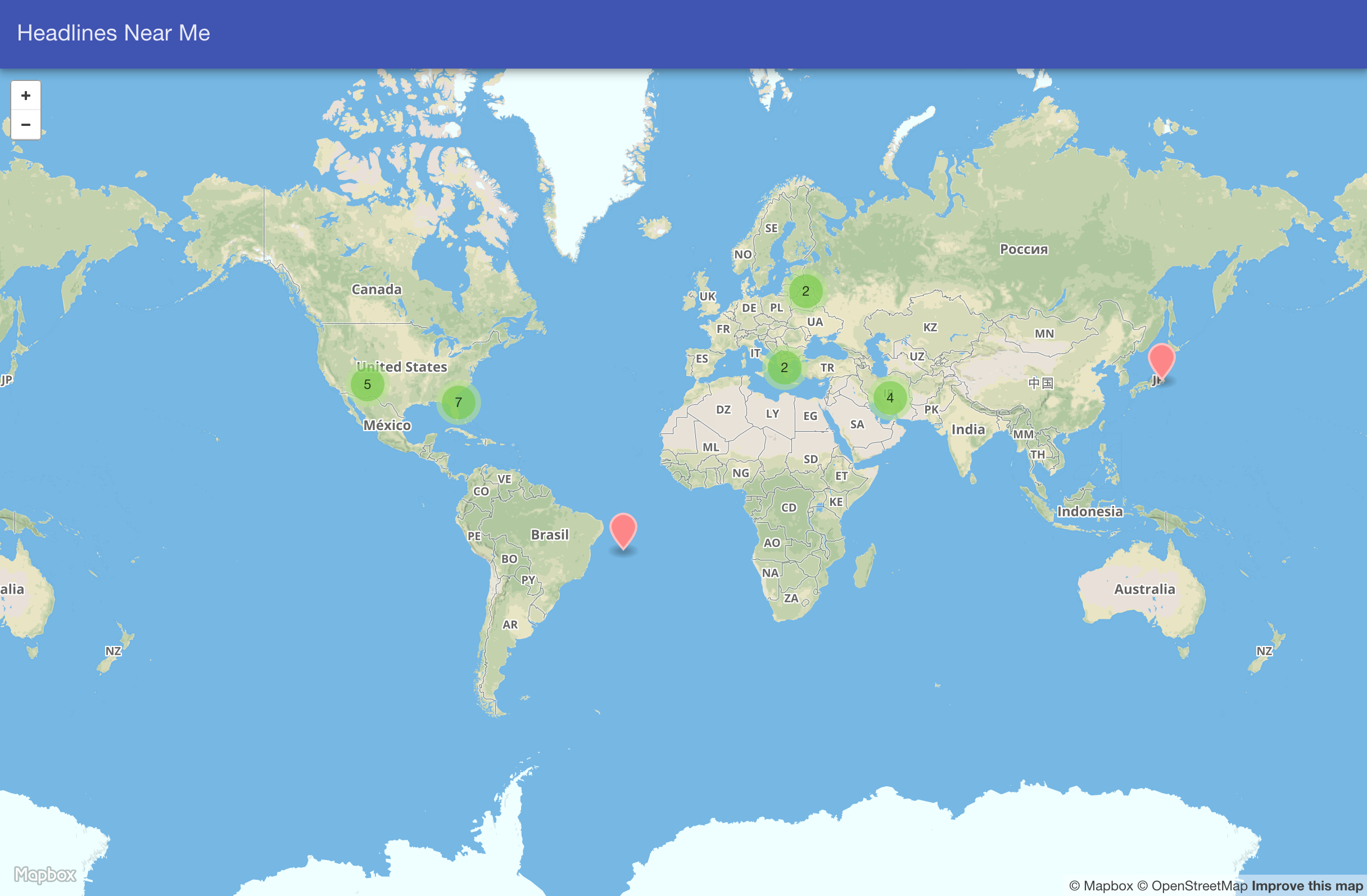
How it works
Using the New York Times RSS feed, I find the location of the stories and store them into a ClusterPoint database. I map them onto a Open Street Map, which shows where the stories are occuring. As a side effect, this also shows where the most coverage is happening, a good thing to keep in mind for fair and complete journalism.
Challenges I ran into
The datelines are often too generic, making it harder to map the specific location.
I was also focusing on locations near me. However, the map showcases where the most activity is happening and where the most coverage is coming from. Responsible journalism could be a pivot.
Accomplishments that I'm proud of
ClusterPoint and OpencStreet Maps work very well together.
What I learned
Mapping headlines can show where the most stories are happening. It can also show where stories are not happening.
What's next for Headlines Near Me
Including other feeds and allowing the front end to select the category of headlines. Maybe you just want to visual technology or science headlines.


Log in or sign up for Devpost to join the conversation.