Inspiration
Bright, cluttered and attention-grabbing designs are everywhere online, but many people find it difficult to focus on the content with these distractions. Our team was inspired to design a web interface that better serves the accessibility needs of those who struggle while navigating and reading webpages on the Internet, particularly focusing on those with ADHD.
With how critical the Internet is to studying, socializing, and staying informed in today’s world, ensuring that everyone is able to use it without struggle is an important, but often overlooked concern. Many existing web apps have limited accessibility options or are too complicated to setup and use. This website is a much-needed, friendly solution to reduce unnecessary visual stimuli and boost reading motivation and comprehension.
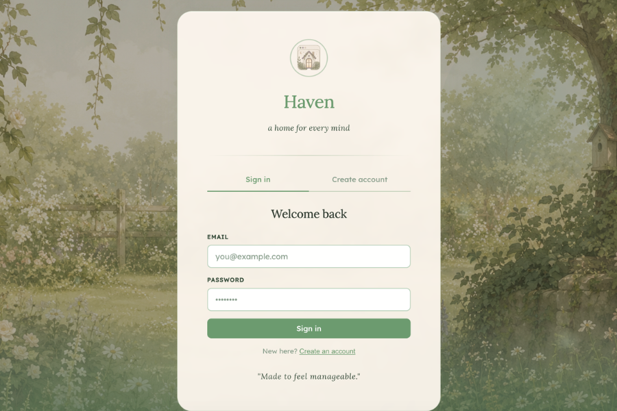
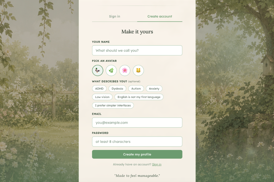
What it does
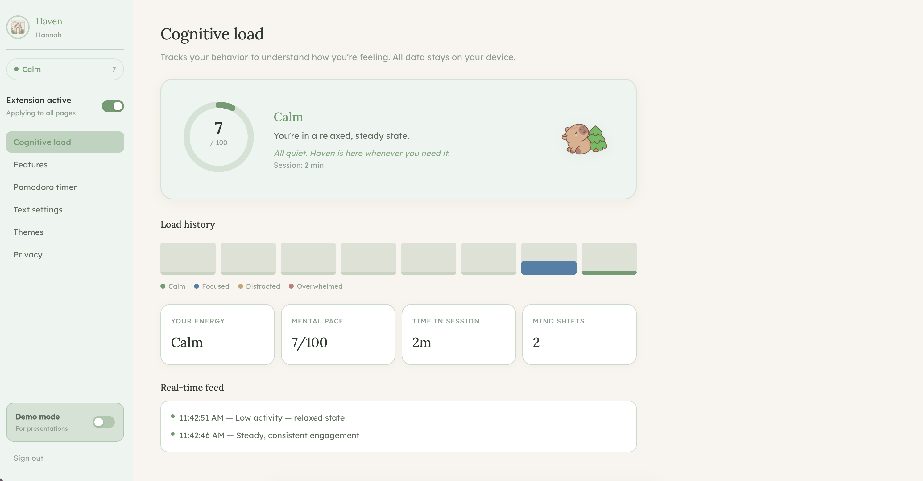
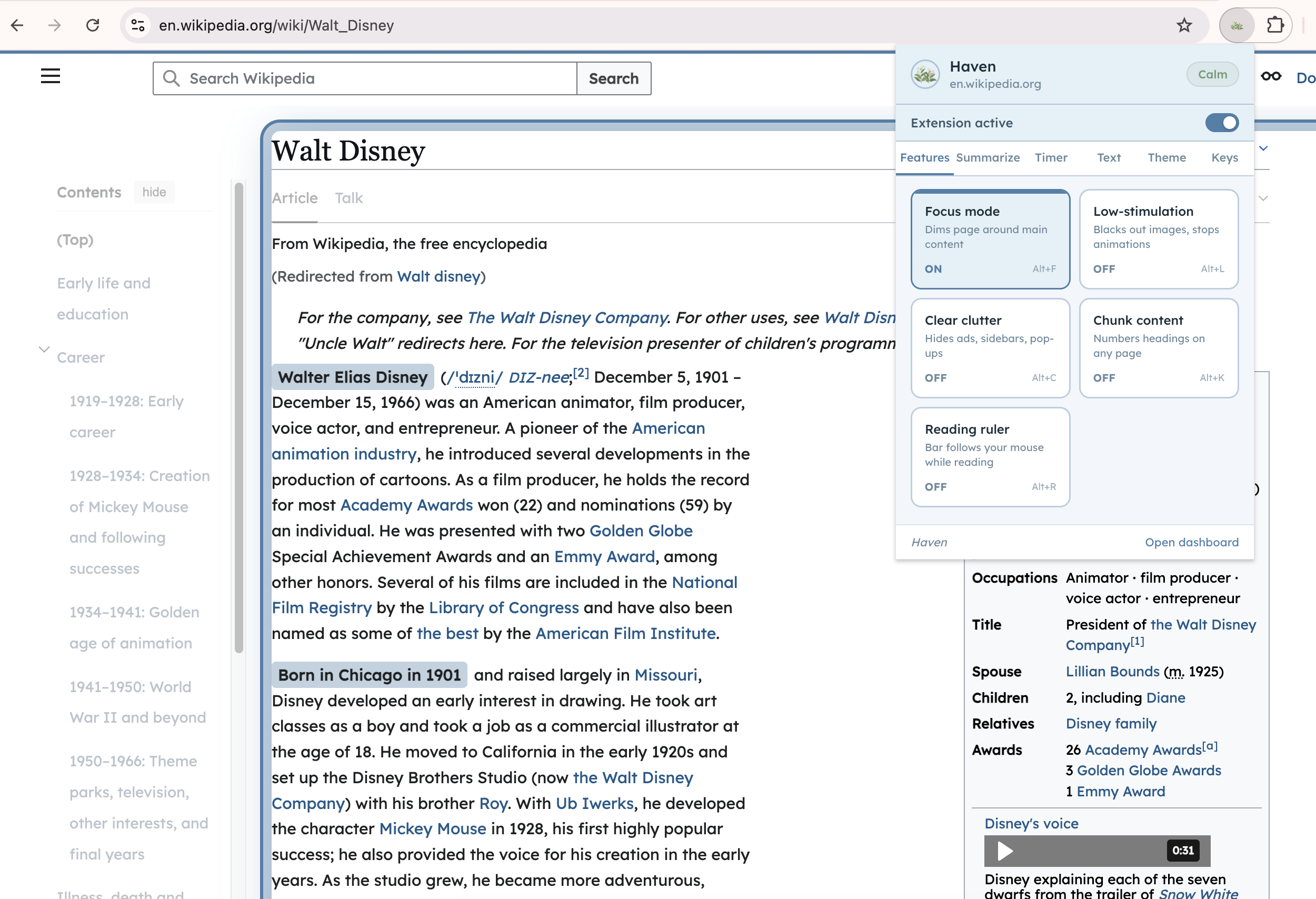
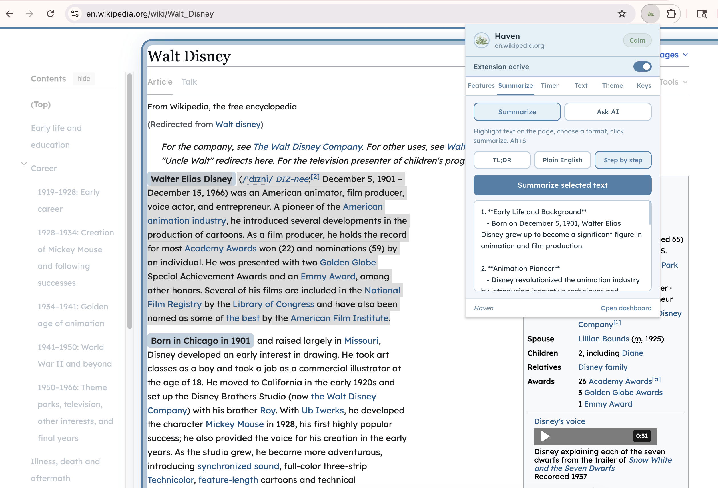
Haven is a Chrome extension paired with a personal dashboard that adapts any website to the user's cognitive needs in real time. When you install Haven, it quietly monitors your browsing behavior and estimates your current cognitive load, whether you're calm, focused, distracted, or overwhelmed. Based on that state, it can automatically adjust the page to help you stay on track.
Key features include:
Focus mode — dims everything except the main content and draws a calming border around it so your eyes know exactly where to look Low-stimulation mode — blacks out images and stops animations to reduce sensory overload Clear clutter — hides ads, sidebars, and pop-ups so only the content remains Reading ruler — a soft bar that follows your cursor to help track lines of text Chunk content — numbers every heading on the page to help break reading into manageable steps Pomodoro timer — runs in the background even when the popup is closed, with notifications when focus or break time ends AI chat — lets you ask questions about the page you're reading in plain, simple language Page summarizer — condenses selected text into a TL;DR, plain English, or step-by-step format Themes — soft, nature-inspired color palettes (sage, parchment, sky, dark moss) that replace harsh whites and blacks Text settings — adjustable font size, line spacing, column width, and dyslexia-friendly fonts
Everything is controlled from a clean, calming dashboard with a garden aesthetic — designed to feel like a safe, quiet space rather than another overwhelming interface.
How we built it
As a team, we began with a group brainstorming session to align on scope and direction, then split into two specialized groups to work in parallel. One team focused on the technical side, handling architecture and implementation. The tech stack we used is: Frontend : React, TypeScript, Vite, CSS Modules Backend / Database : Supabase (authentication + PostgreSQL db.) Chrome Extension : Manifest V3, Background Service Worker, Content Scripts, Chrome Storage API, Chrome Scripting API AI : OpenAI API (gpt-4o-mini) Deployment : Vercel, GitHub Languages : TypeScript, JavaScript, CSS, HTML
The other concentrated on UI design and accessibility research, studying specific visual impairments, user behavior, and established accessible design standards. They conveyed these findings to the rest of the team to inform the project's direction. This structure allowed us to move efficiently while maintaining a cohesive product vision.
Challenges we ran into
One of our biggest technical challenges was keeping the Pomodoro timer in sync between the Chrome extension popup and the dashboard. Chrome service workers can go inactive at any time, and the popup and dashboard are completely separate contexts so getting them to share a single source required diligent use of Chrome's storage APIs and message passing architecture. We also faced challenges making the extension's disable toggle truly revert pages to their original state. Haven injects CSS variables and style tags across many properties, and ensuring every single one was cleaned up on toggle-off, without breaking the page, required thorough testing across different websites.
Designing for neurodivergence also pushed us to think carefully about every visual decision. Colors, contrast, spacing, and motion all had to be intentional. Even our own UI had to meet the standards we were building for.
Accomplishments that we're proud of
We are especially proud of our grit and perseverance throughout this project, polishing the functionality and visuals as much as possible within this short timespan. We all committed to one specific vision and managed to bring it to life!
What we learned
We learned how much invisible design work goes into making something feel simple. Accessibility is not just about adding features — it's about removing friction at every step. We also learned a great deal about Chrome extension architecture, particularly the constraints of Manifest V3 service workers, and how to bridge the gap between an extension and a web app running in separate contexts. Most importantly, we learned that designing for neurodivergent users makes better products for everyone. Cleaner layouts, calmer colors, and reduced cognitive load benefit all users — not just those with diagnosed conditions.
What's next for Haven
We hope to expand Haven to serve a wider range of neurodivergence. It's important that we aid as many people as we can, in hopes of making the internet a safe and accessible place for everyone.
Presentation: https://canva.link/9s08ud26a64m1nj
Built With
- css
- html
- react
- supabase
- typescript
- vite

Log in or sign up for Devpost to join the conversation.