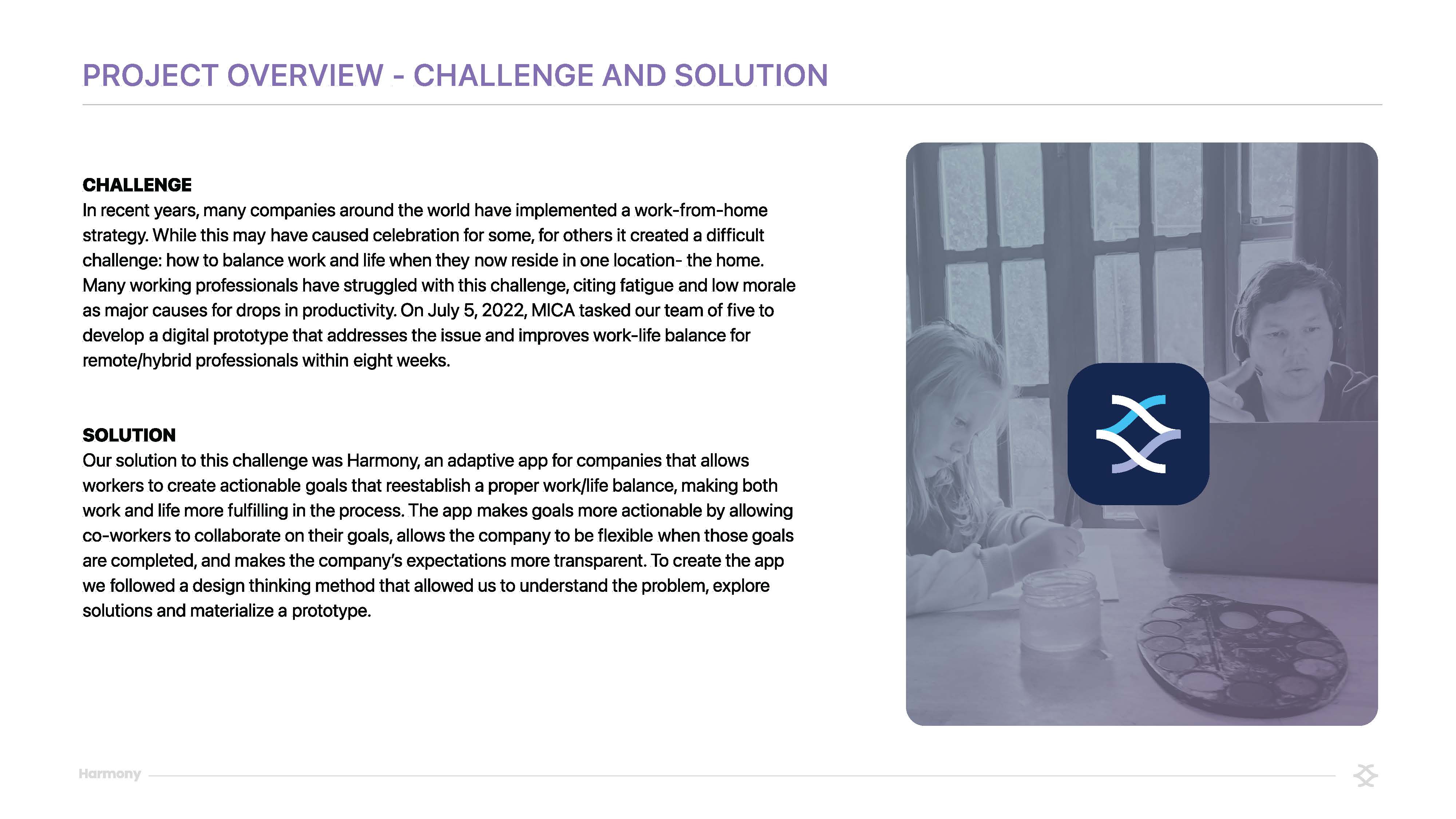

Challenge
In recent years, many companies around the world have implemented a work-from-home strategy. While this may have caused celebration for some, for others it created a difficult challenge: how to balance work and life when they now reside in one location- the home. Many working professionals have struggled with this challenge, citing fatigue and low morale as major causes for drops in productivity. On July 5, 2022, MICA tasked our team of five to develop a digital prototype that addresses the issue and improves work-life balance for remote/hybrid professionals within eight weeks.
Solution
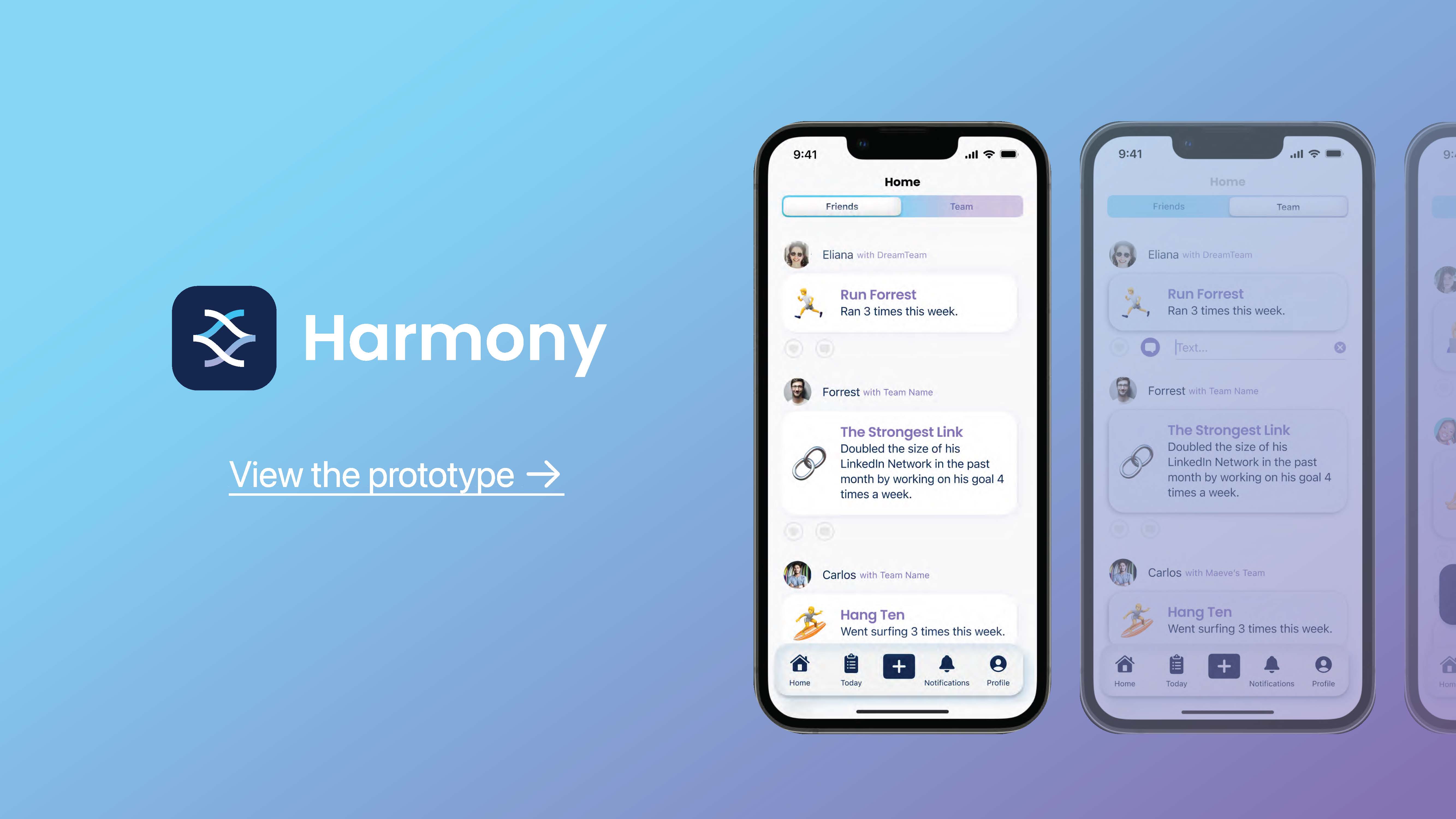
Our solution to this challenge was Harmony, an adaptive app for companies that allows workers to create actionable goals that reestablish a proper work/life balance, making both work and life more fulfilling in the process. The app makes goals more actionable by allowing co-workers to collaborate on their goals, allows the company to be flexible when those goals are completed, and makes the company’s expectations more transparent. To create the app we followed a design thinking method that allowed us to understand the problem, explore solutions and materialize a prototype.
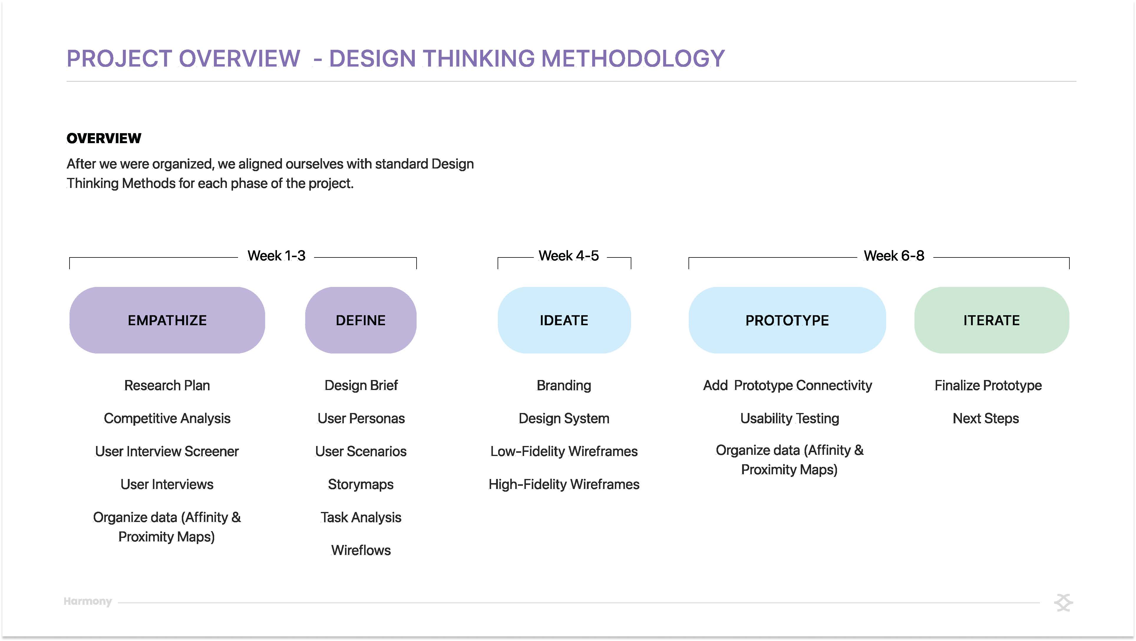
Process
- Empathize: We took stock of workers who have this work-from-home challenge. We completed Qualitative Research based on an in-depth Research Plan and a Competitive Analysis to understand workers' perceptions of our topic, pain points, and what they currently have at their disposal to overcome those pain points.
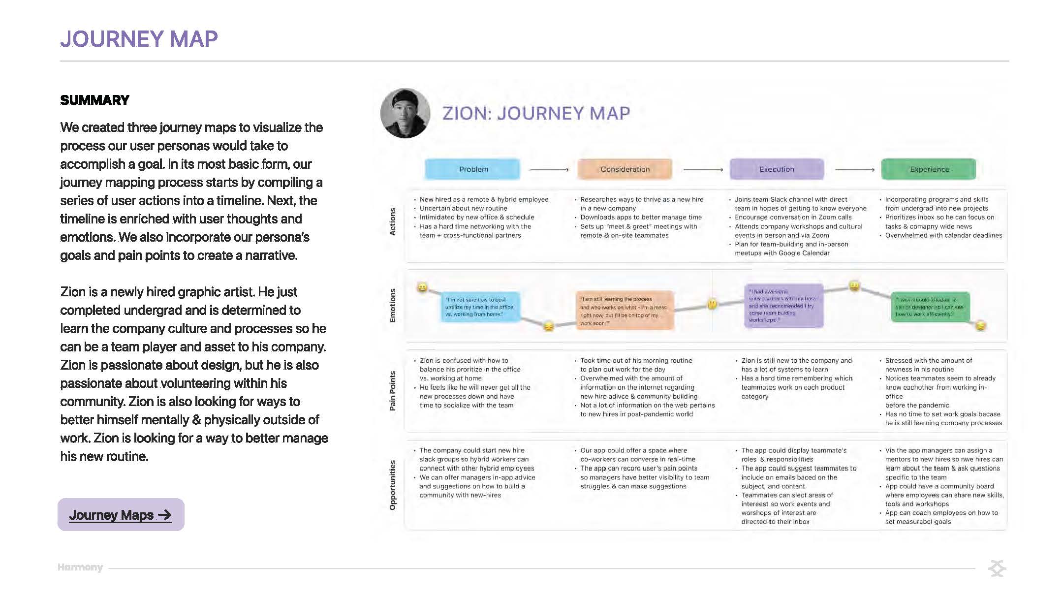
- Define: We then took this data and created an Affinity Map to organize what was collected. This was followed by the creation of a Proximity Map, which gave priority to ideas that were being generated for this project. While doing this, we also created User Personas, Storyboards, and User Journeys that distilled our interviewee's input and gave us more direction as we started to decide what features our users need.
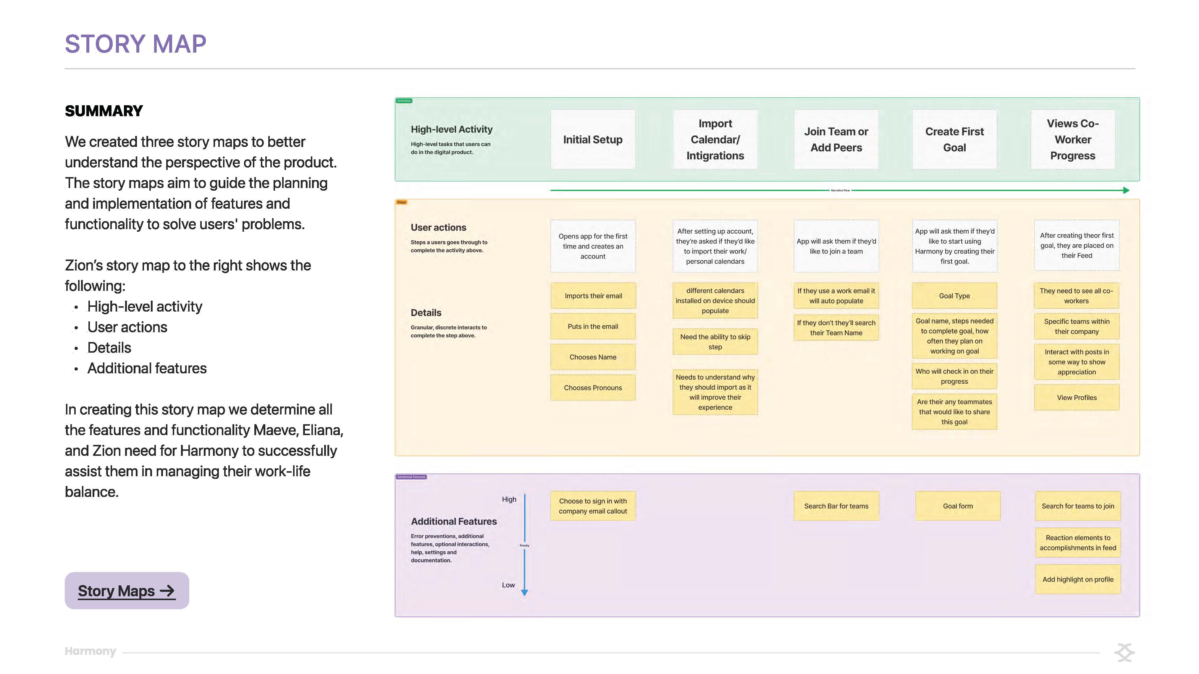
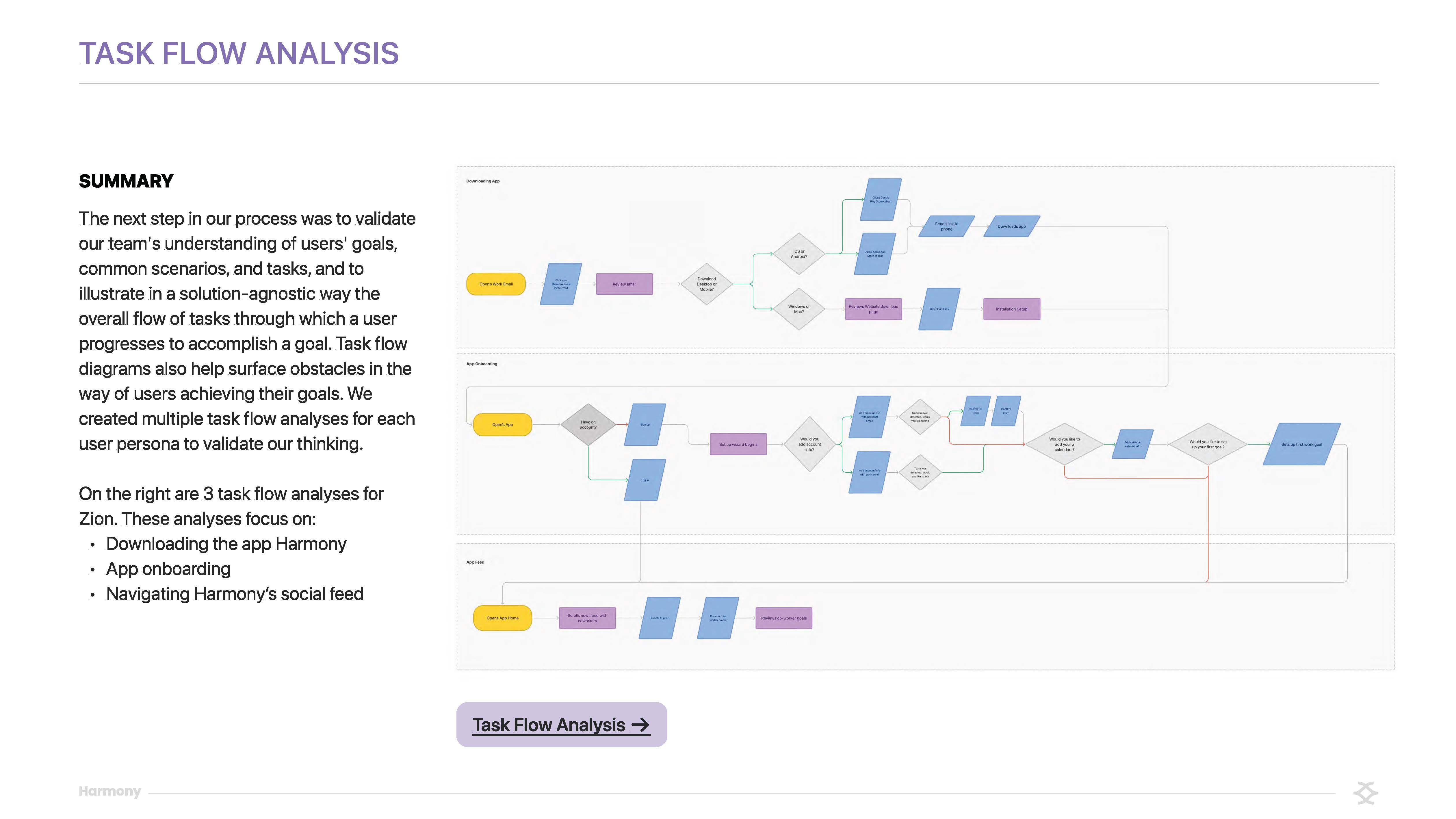
- Ideate: After we had a clear definition of our distinct user base’s goals, we started creating. The team got together and prioritized, based on the documentation above, our app’s key features. We then created User Flows, which evolved into low-fidelity wireframes. These low-fidelity wireframes were critiqued by our peers. We then refined the design system that we developed to bring these wireframes to a high-fidelity state.
- Prototype: From here, individual members of our team connected their separate flows together into one. We added animation, clickable buttons, and micro-interactions to bring our prototype to life.
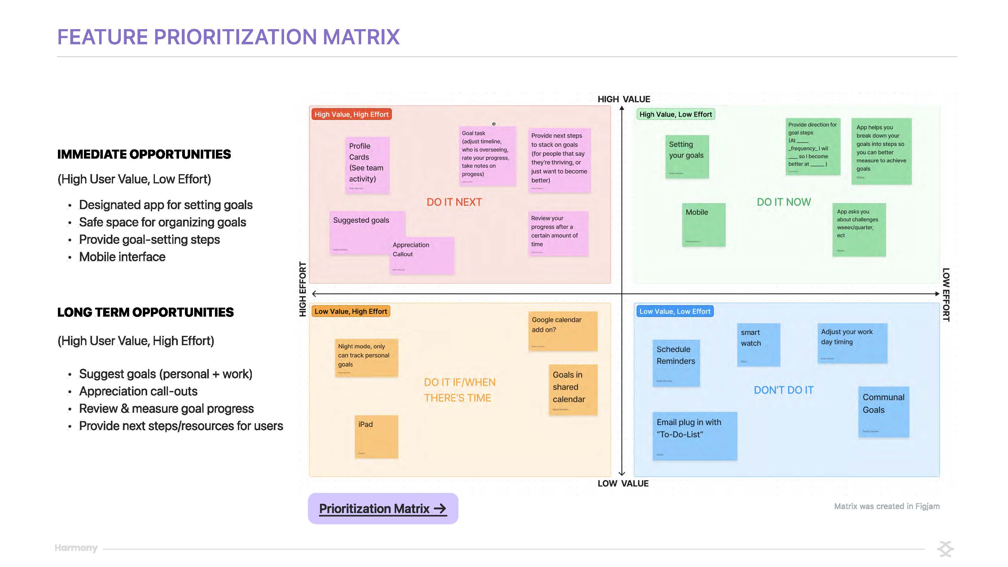
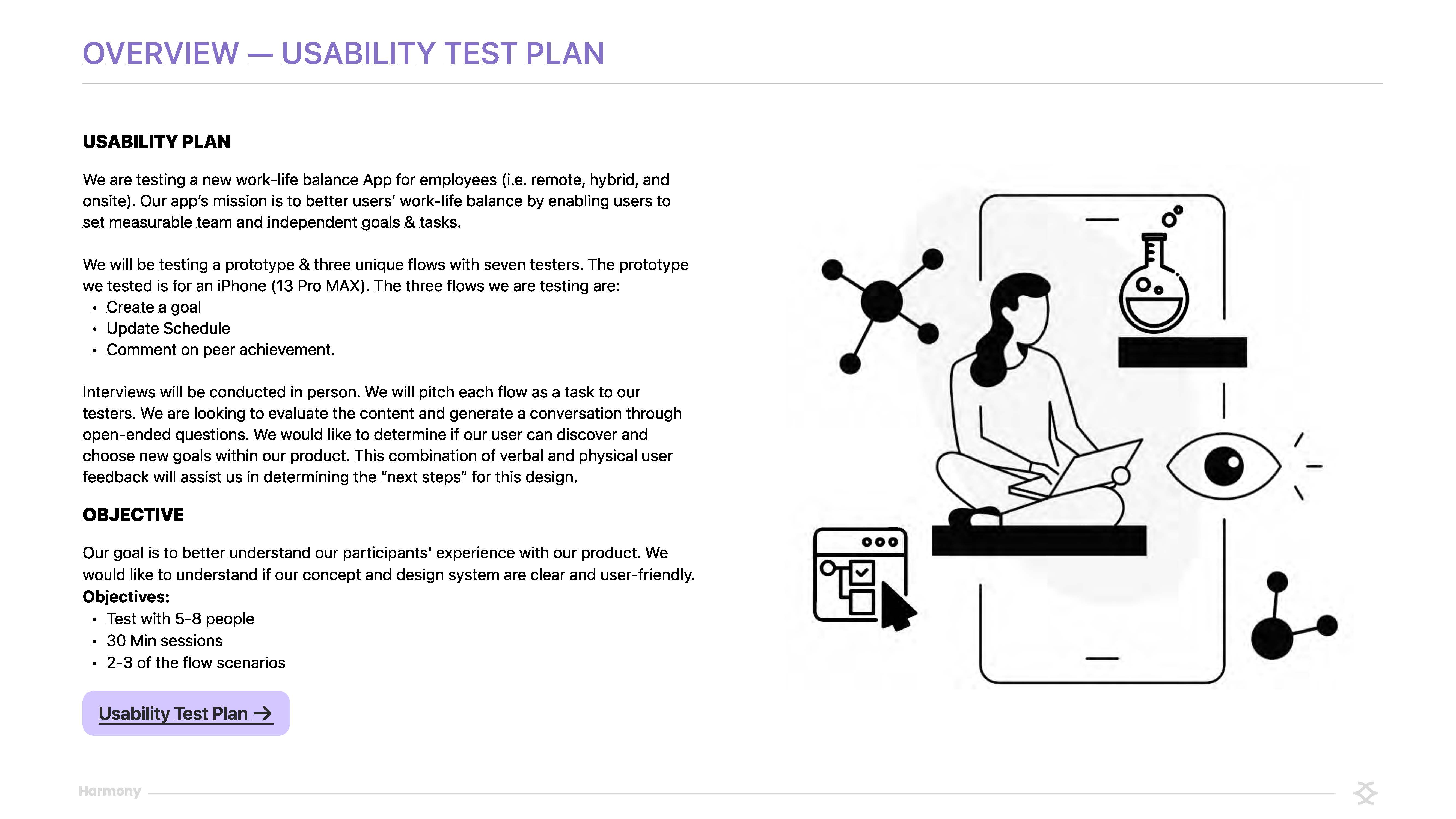
- Test: After our prototype was in a workable state, we followed up with a select few of our initial interviewees to have them test the prototype. To do this, we developed a usability test plan and distilled their input again into Affinity Maps_ and then into a Proximity Map to help us prioritize our next steps.
Results
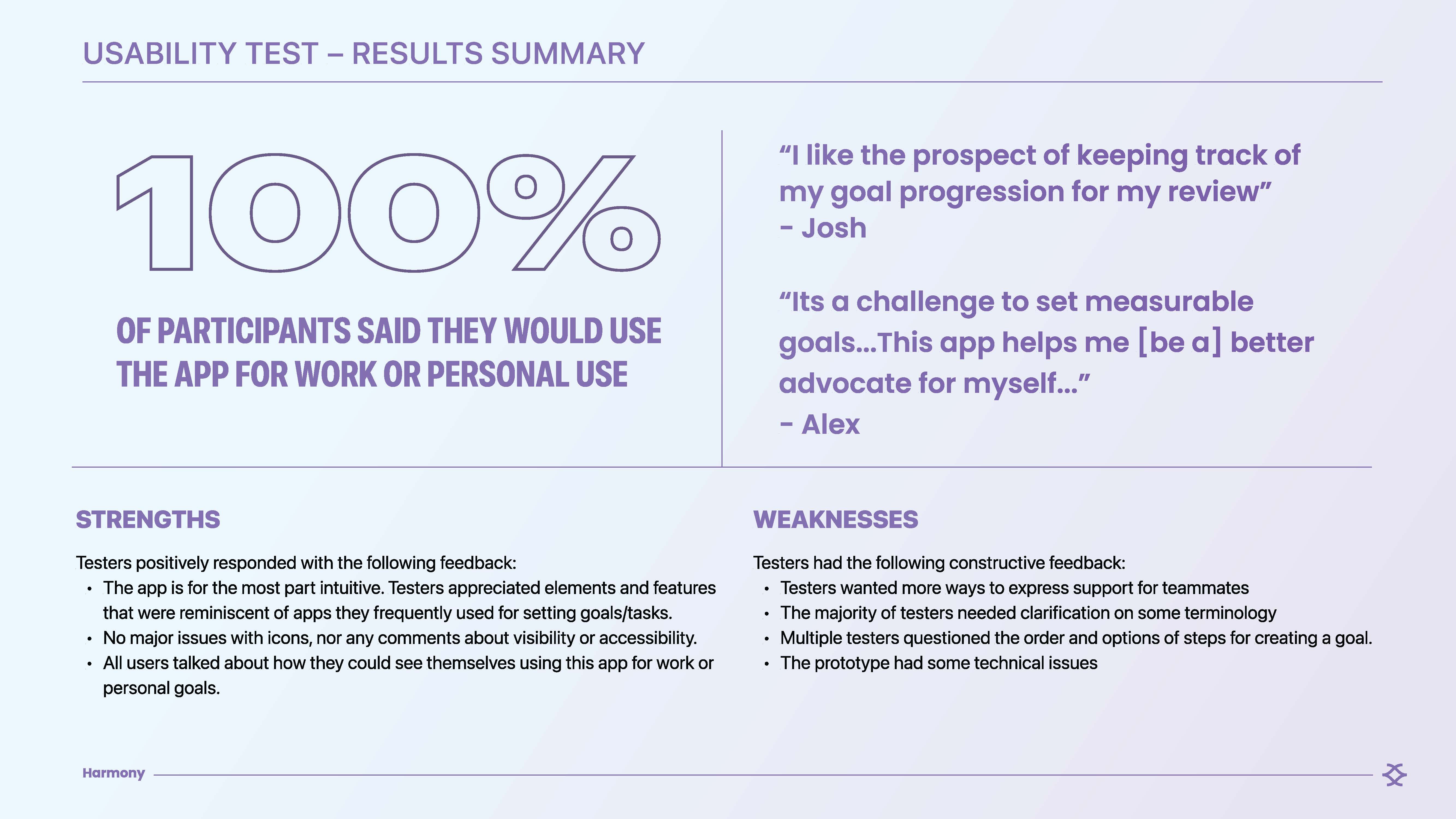
In our Usability Test, we received a sizable amount of positive feedback stemming from the app’s ability to make the workplace more collaborative, flexible, and transparent. Several users noted that this would help them provide positive data during their yearly reviews, make it easier to keep up with their team's quickly evolving schedules, and get inspired by their teammates' goal progression, amongst other things. Our next steps would be to focus on quality-of-life updates that users pointed out during testing, like honing in on naming conventions, making features visually align with the user's expectations, and expanding features that the scope of the project didn’t allow for. As a team, we learned how to manage a project within a lean framework like this. We learned how to keep a project in scope, what tools speed up collaboration, and what processes slow things down.
Built With
- figma
- notion

Log in or sign up for Devpost to join the conversation.