-
Web Application- Story Map
-
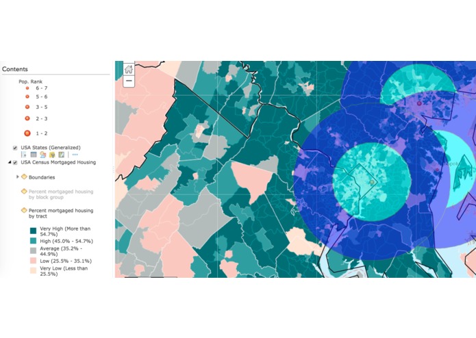
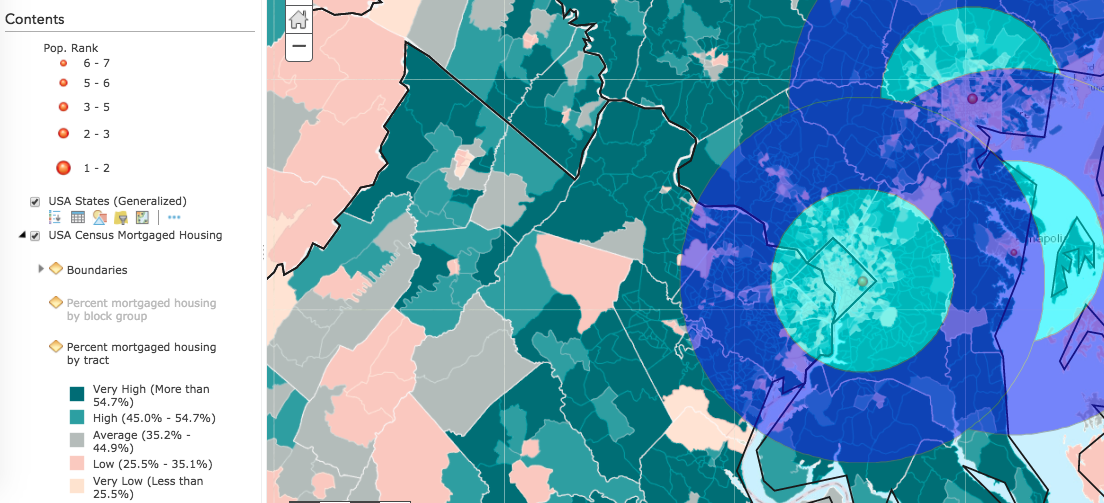
Map with Mortgage Layer and City Buffer Layer
Inspiration
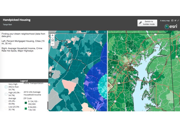
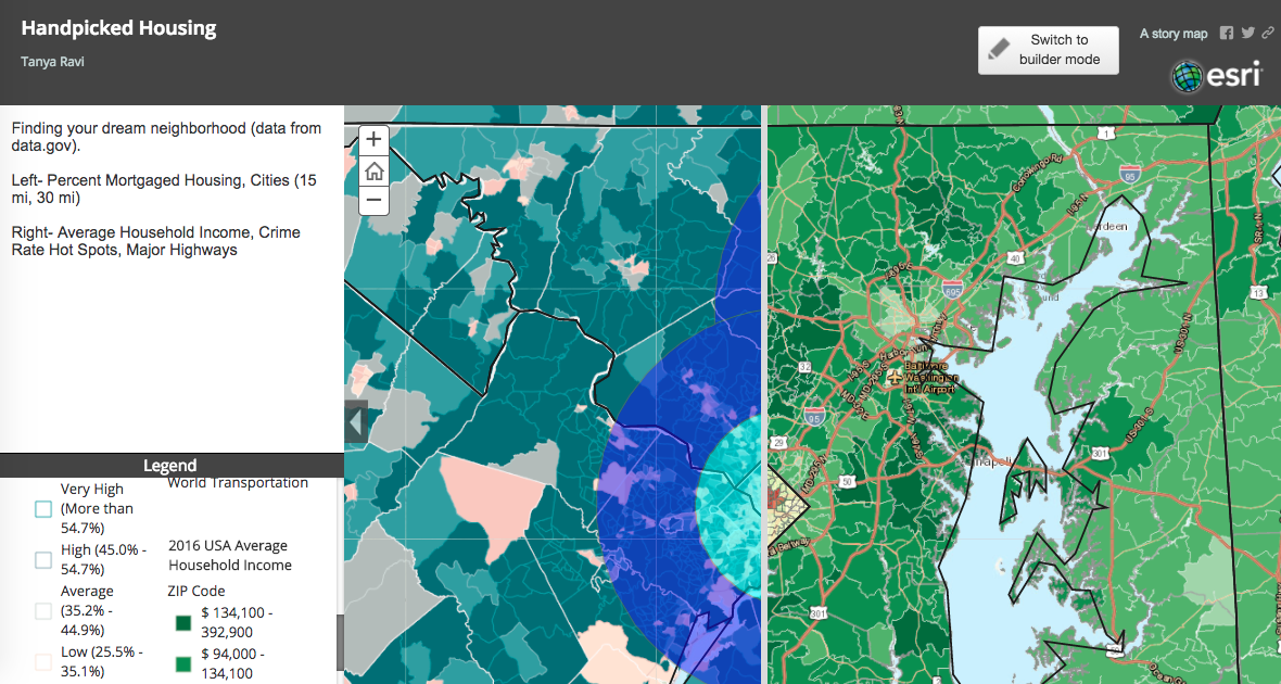
I was inspired by the idea of finding a way to layer this data to find optimal areas to live. I had worked with ArcGIS software in high school a little and thought it would be the best way to represent this data and find correlations within it.
What it does
The user can turn on and off various layers and find their ideal neighborhood. It allows people to select their preferred neighborhood characteristics and identifies areas that closely match their criteria, also you can select the area to trigger a pop-up that will provide more detailed information about the place.
How I built it
I built this using Esri's ArcGIS Online software and using a couple other Esri cartography tools.
Challenges I ran into
My biggest challenge was trying to utilize the Fannie Mae data, which I was ultimately unable to use. However, if I had had more time, I would have tried more methods to utilize this API.
Accomplishments that I'm proud of
I am proud of myself for creating so many layers using the data from various government websites such as data.gov and the US Census and making the data decipherable.
What I learned
I learned that layering various layers on top of each other makes for an unreadable map, so to attempt to separate the maps and also prioritize the information to figure out which layers are truly necessary over others.
What's next for L^3
As I work more on this project, I would use the Fannie Mae API to look at this data during the housing market decline between 2014 and 2016 as well as in other time frames.

Log in or sign up for Devpost to join the conversation.