-

Sample bar graph showing the unique token names owned by a wallet
-

Sample line graph showing the sales price over time of a slug
-

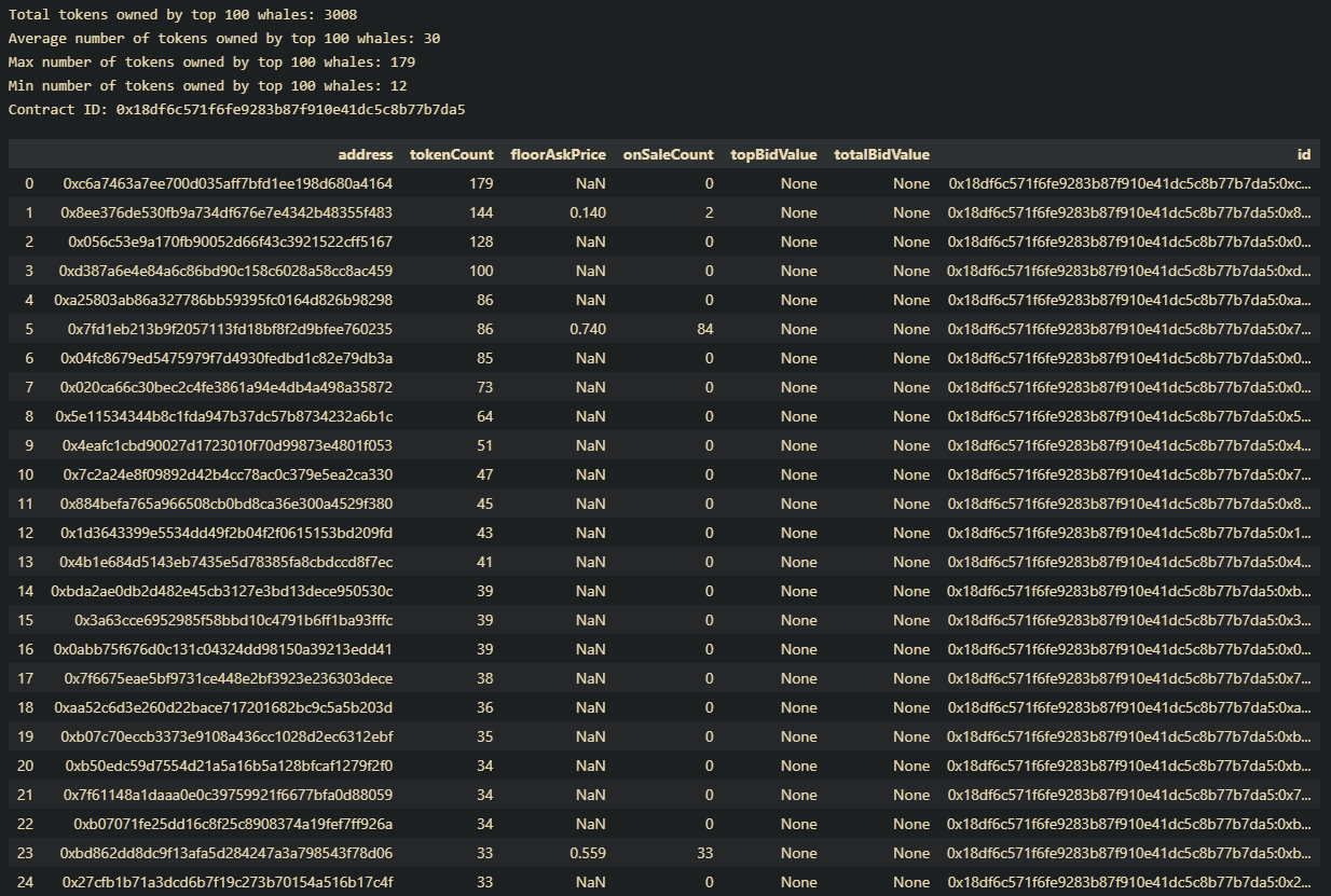
Sample table showing the top 100 wallets of a slug


Inspiration
We are part of a special interest group at NJIT's ACM chapter called SIG Data. We learn new topics about pandas every week with the goal to create a stock data analysis project and a stock price predictor project. We really enjoyed the Verbwire workshop and thought it would be a great start to use its API to create data visualizations using pandas.
What it does
Our project has three main functions. First, a wallet address can be input and a bar graph showing the count of unique token names owned by that wallet is displayed. Second, a slug can be input and a line graph showing the sales price over time is displayed. Finally, a slug can be input and a table with the top 100 wallets is displayed along with important summary statistics.
How we built it
We built our project using the Verbwire API, jupyter notebook, and python (pandas and matplotlib). Our data was extracted using the Verbwire API and was transformed from a JSON to a pandas dataframe. Using these dataframes, we were able to manipulate and visualize the data in order to display the most important information. We also created a website with a domain name created from domain.com and using PythonAnywhere and Flask. The goal of the website is to make the visualization interactive and more usable by users.
Challenges we ran into
Our team member with web development experience was unable to show up because of an emergency so our project was limited to the code on our Jupyter Notebook. Despite this challenge, we still attempted to make the basic structure for the website even though neither of us had any web development experience. Another challenge we ran into was reformatting the datetime column in our sales event function. The goal was to plot the sales event data using the original timestamps, but to have custom time intervals to make the axis easier to read and less cluttered. Unfortunately, we were unable to fix this issue, but we did find another work around that actually worked better than our original goal. We ended up adjusting the size of the plots to make the information more readable
Accomplishments that we're proud of
We were able to use the Verbwire API to extract and process data and transform response objects to a pandas dataframe despite having no past experience with APIs. We were also able to host a website even though we have no web development experience.
What we learned
How to use an API to access data. How to transform response objects to JSONs, and JSONs to pandas dataframes. How to create plots using matplotlib and adjust them to make the plot more readable. How to create and host a basic website using python-anywhere. How to properly structure a project in Jupyter Notebook. How to use Git to commit and push our changes to GitHub.
What's next for Hack the Whale
We plan to implement our data visualization code into our website in the next SIG Data meeting. From there we will expand the website so that it has more features.


Log in or sign up for Devpost to join the conversation.