-
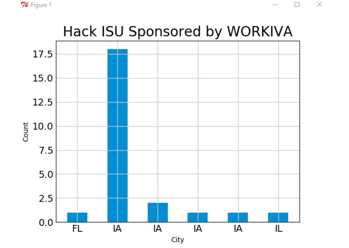
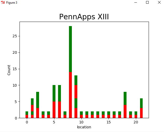
Location of hackathon
-
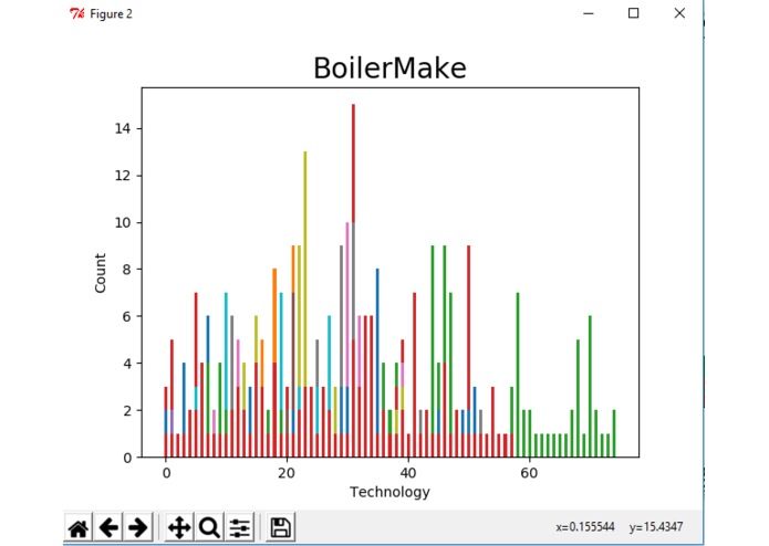
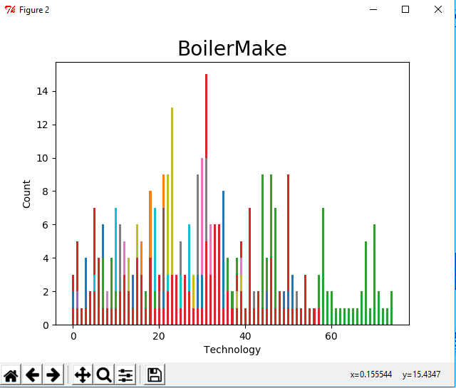
Technologies used in a hackathon
-
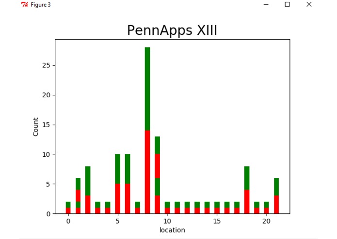
Winners to participants in a hackathon
Inspiration
There were five hackathons this weekend with North America itself. It was not easy to decide on which hackathon to attend. So we have decided to create a WebApp, which collects the data from devpost and mlh continuously, to visualize data from every hackathon.
What it does
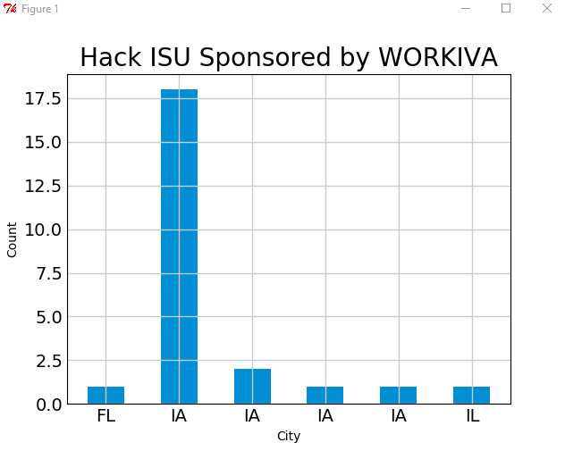
Plots several graphs from the data collected, Graphs plot the diversity of people attending a hackathon, technologies used in a hackathon, winner technologies, Win percentage for the hackathon and so on..
How we built it
We wanted to try the common gateway platform which was given by Rockwell Automation, so we have used it. And other technologies include python, matplotlib.
Challenges we ran into
Actually the collection of data and formatting it took much more time than expected, as there is no API available for devpost we had to parse the HTML pages to collect data, so we had to skip our thought of using HighChartsAPI to visualize data in web.
Accomplishments that we're proud of
We are able to visualize the data, of course, it is not as good as we have expected but we did it.
What we learned
Data collection takes a lot of time when an open API is not available. We have also learned to use common gateway platform.
What's next for Hack Stata
Inserting all the graphs onto the web.
Built With
- commongatewayplatform
- matplot
- python

Log in or sign up for Devpost to join the conversation.