-
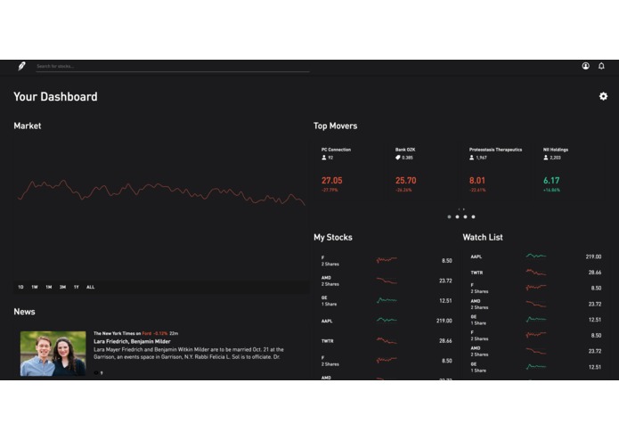
Close-to-finished product based on digital structure and wireframe.
-
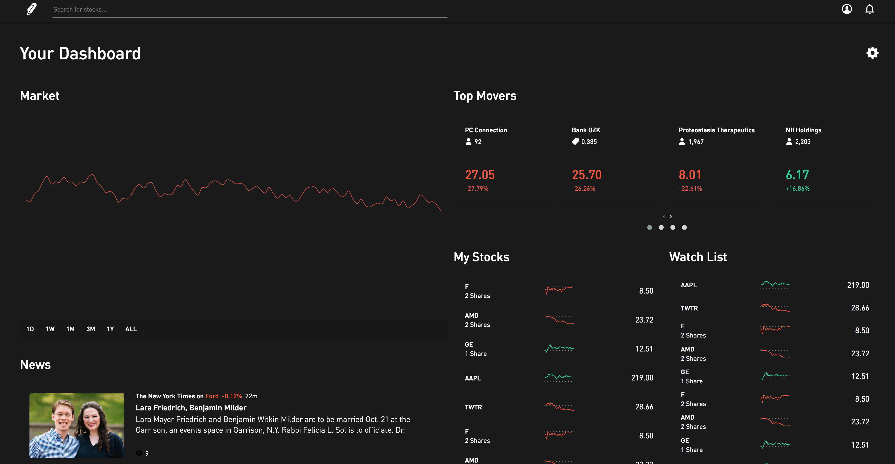
The digital wireframe coded in HTML and CSS.
Inspiration
Over the past few years, Robinhood has been known for its mobile presence, but that should not be a reason to ignore an enjoyable desktop experience. As users of the Robinhood platform, Ruth and I thought that it would be best to consider ways to improve the online interface. We quickly identified pain points: too much empty space on the page margins, endless scrolling due to enormous news feeds, and dumped, unlabeled data.
What it does
The improved UI for the Robinhood website features a unique drag-and-drop interface for users to put what matters most right at the top of their "Dashboard." The dashboard features widgets like "News," "Market," and other critical information sources for investors to stay on top of their financial holdings. The new design gives the user more room to examine dashboard data by eliminating large page margins and magnifying the elements that matter. Finally, the UI allows the user to eliminate unnecessary widgets to further focus on the things that matter most.
How I built it
The new interface is built entirely using HTML, CSS, and JavaScript/jQuery. Several libraries are included to improve functionality: OwlCarousel and Dragula.
Challenges I ran into
The hardest part of this challenge was placing the elements on the page so that they were flexible for dragging and dropping. It was also difficult to emulate the Robinhood website. Many of the styles available in the online stylesheet did not transfer over, so a lot of this prototype is custom code.
Accomplishments that I'm proud of
I am extremely proud of the fact that this prototype was developed without any frameworks. This is also the first time that we have ever worked on a drag-and-drop interface or one that demands user input for flexibility.
What I learned
I demo-ed my project for other people to give input, and I realize how much it matters to put yourself in the shoes of the user. I am not the user. I am not the user. I am not the user. I am not--
What's next for Hack-GT-UX-Challenge
This project has more to be desired and so many features ran across my mind while creating it! I would love to create new widgets for the dashboard to provide more flexibility for users. I would also like to make the search function much more streamlined by allowing users to type (without the textbook highlighted) and search for stocks. Stock "profile pages" will pop up in a modal where users can view information on companies and purchase stock as necessary. Clicking out of the modal gives you an immediate view of your dashboard. This workflow keeps true to the model of having what's important as the basis of the Robinhood web application.

Log in or sign up for Devpost to join the conversation.