-
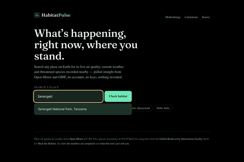
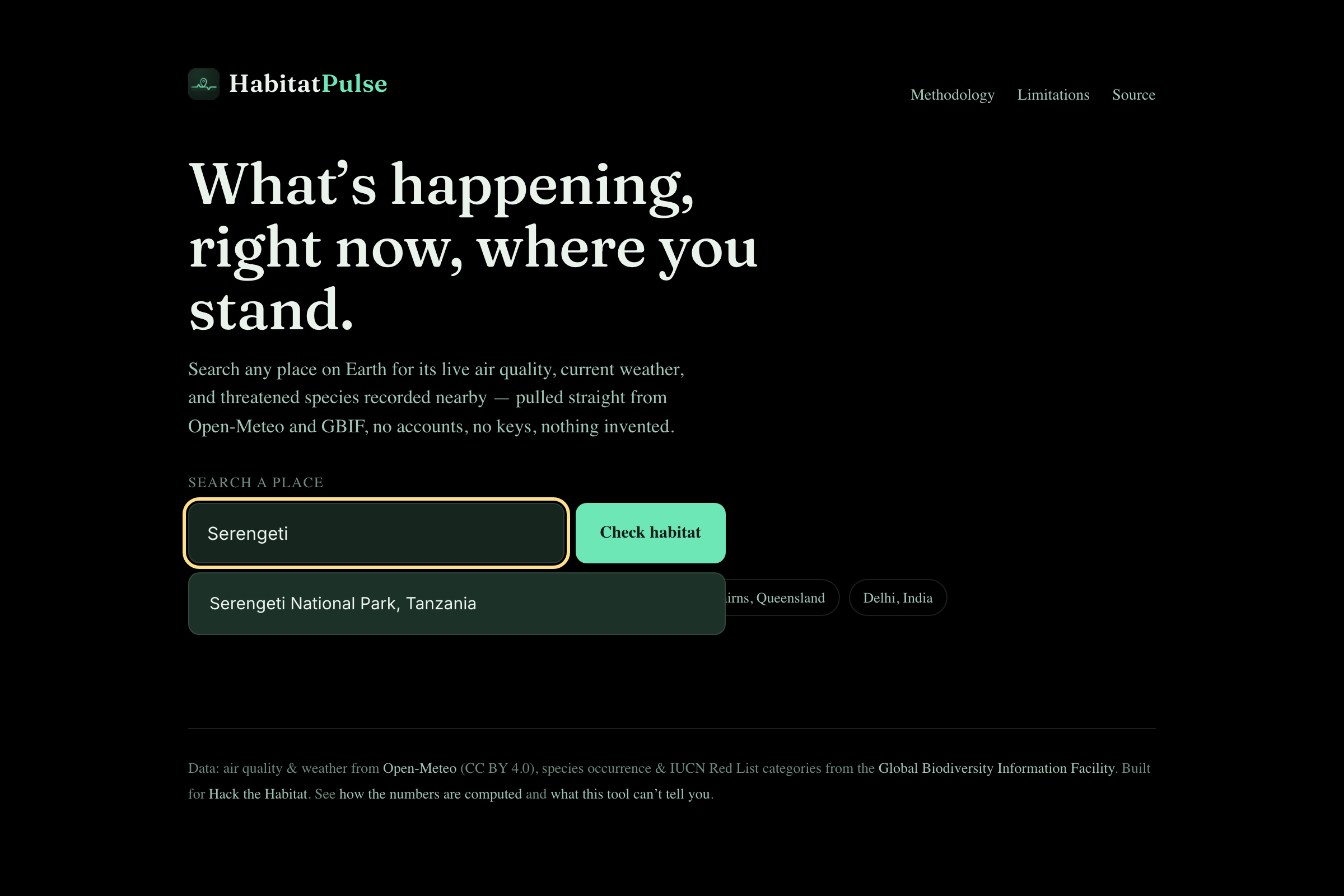
Live geocoding through Open-Meteo: The string "Serengeti" is translated into "Serengeti National Park, Tanzania". No accounts, no API keys.
-
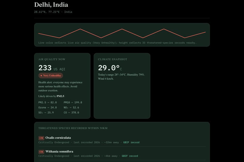
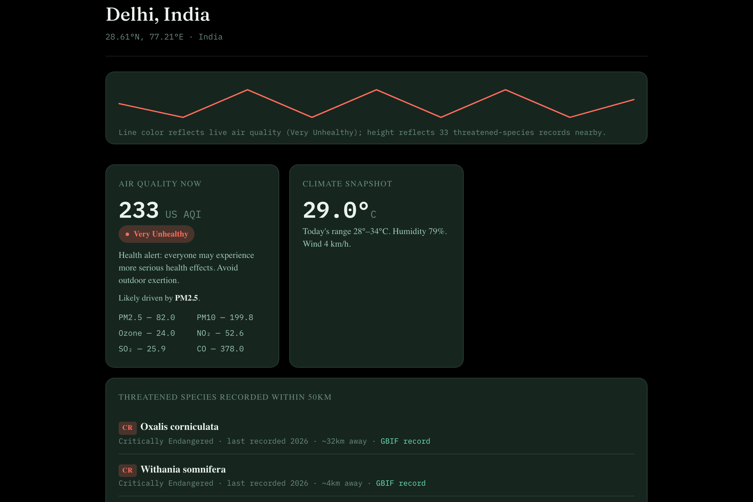
Air quality in Delhi today: 233 AQI, Very Unhealthy, based on PM2.5 — including the entire pollutant list, not just an AQI number.
-
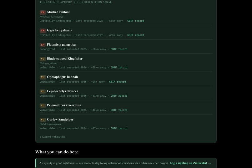
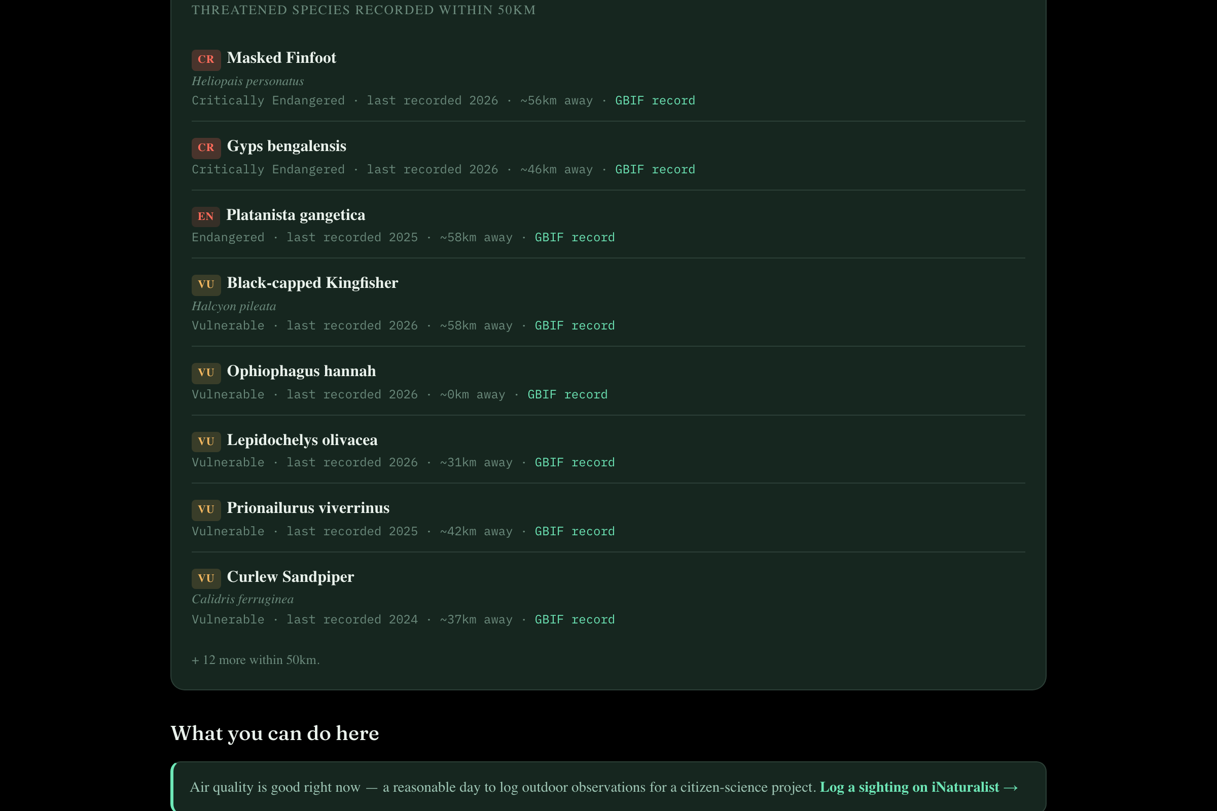
The Sundarbans: 20 IUCN-listed species within 50km, most endangered first. Masked Finfoot, King Cobra, river dolphin.
-
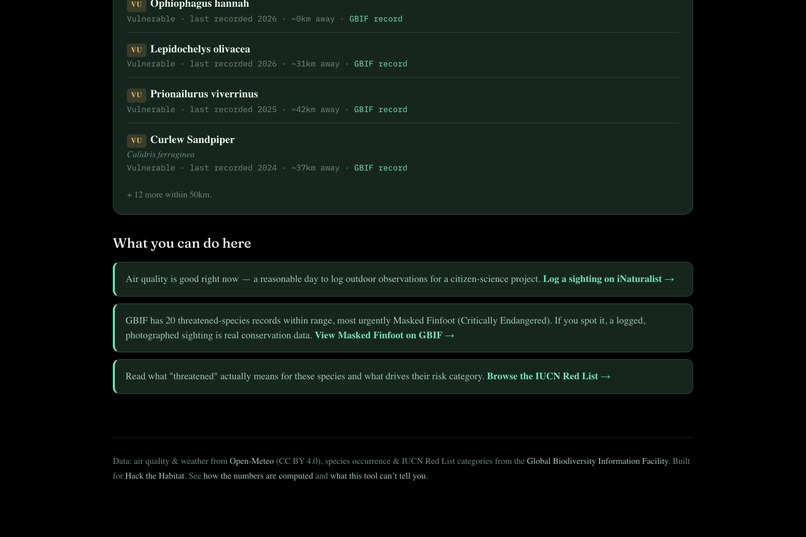
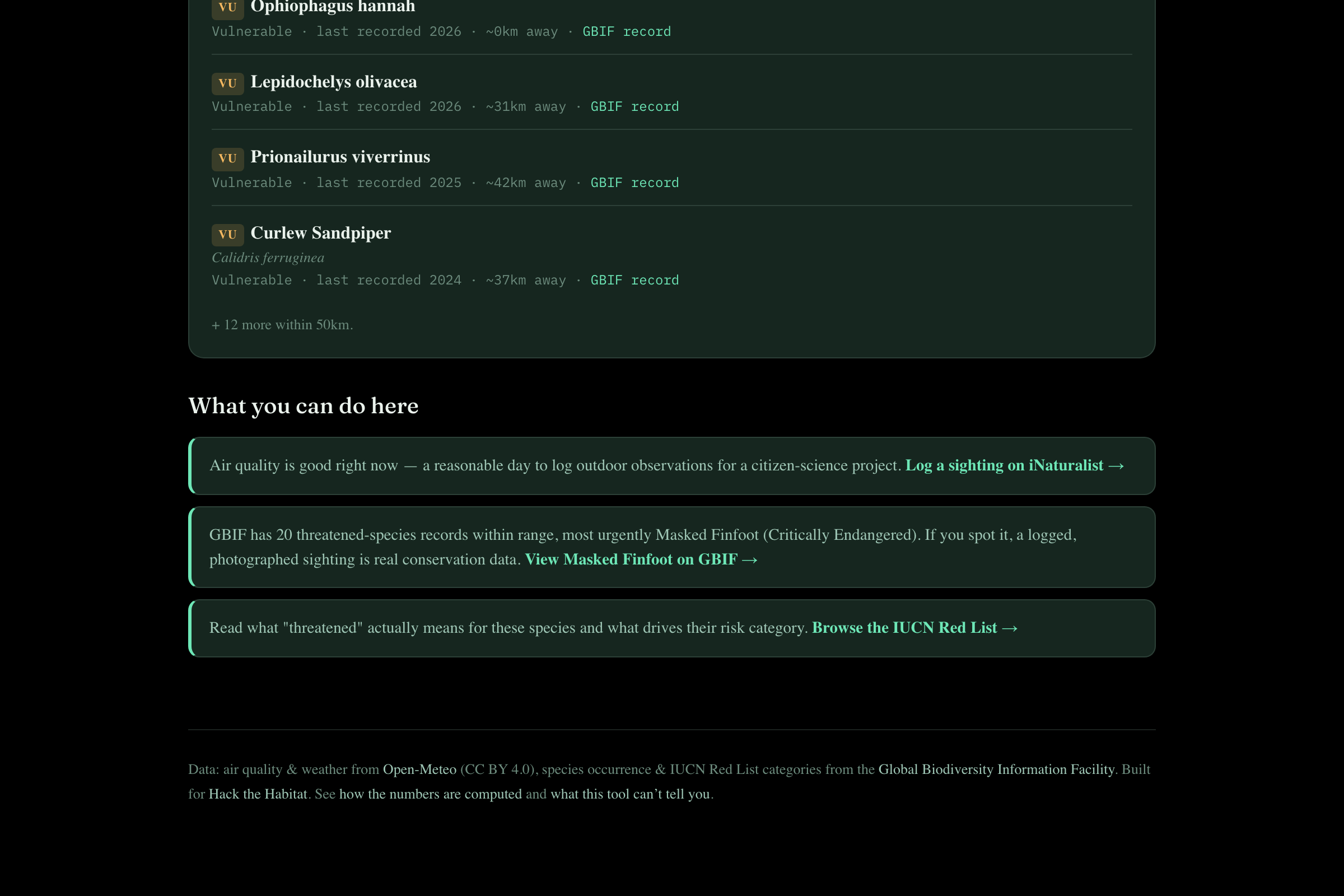
The action is driven by what has been discovered. Without the evidence, there is no action. No vague environmental rhetoric here.
-
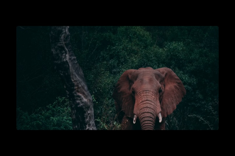
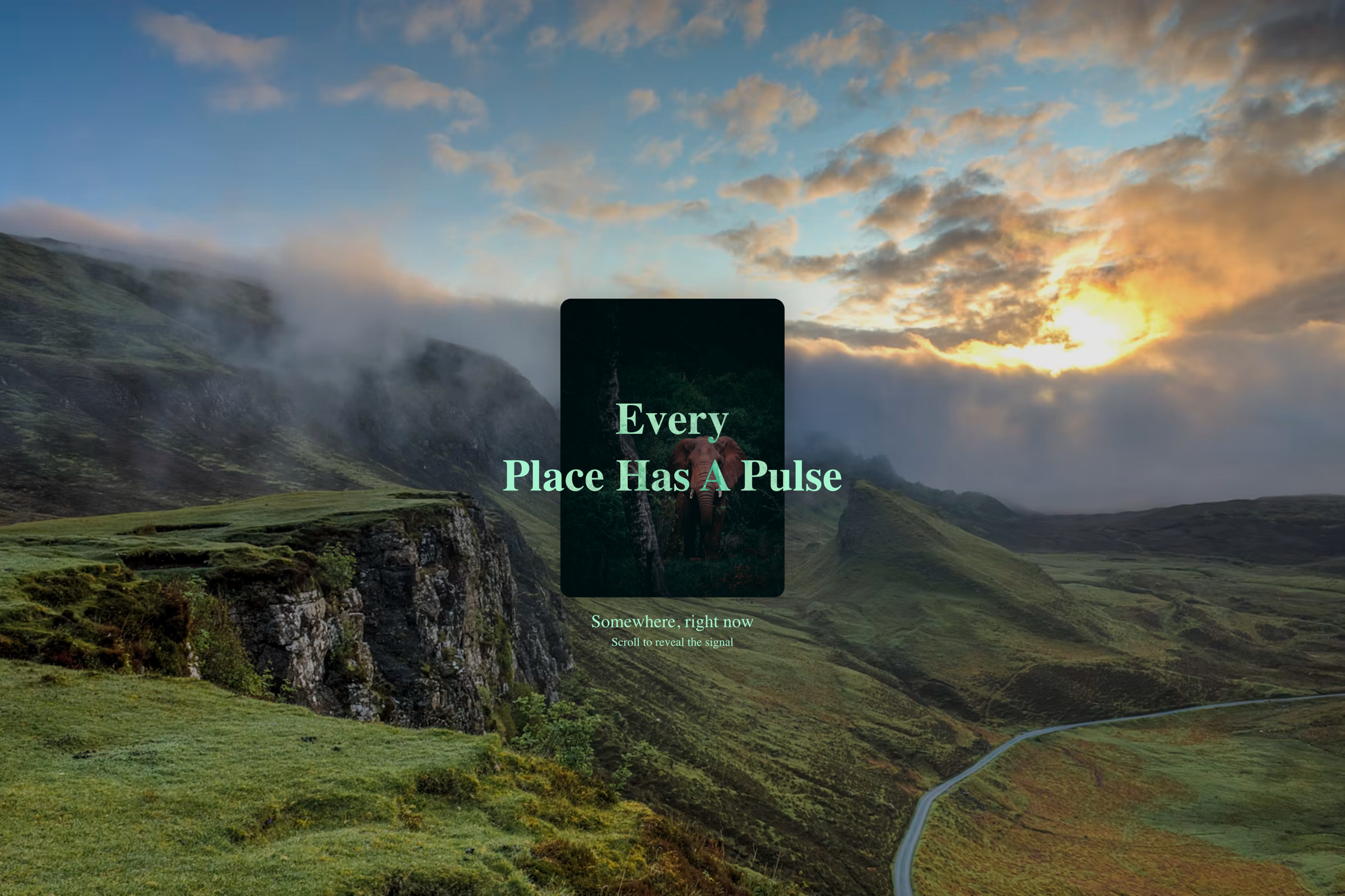
Expanded version. With prefers-reduced-motion activated, it opens instantly without the scroll-scrub function being enabled.
-
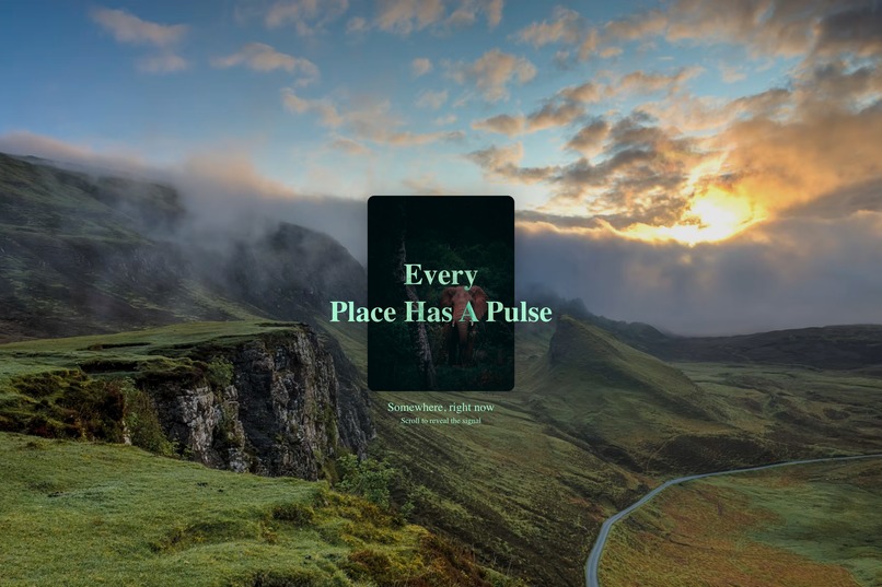
Every place has a pulse. The hero expands as you scroll, opening into the live tool underneath.
Inspiration
Many applications that attempt to bring environmental awareness tend to either simply spew data at the user without any explanation of context or simplify everything down to one "eco-score" that really means nothing at all. Neither of these solutions address the problem of an individual standing in a particular place wanting to know if what they are breathing is safe and if there is anything worth protecting nearby.
This is where Habitat Pulse comes into play.
What it does
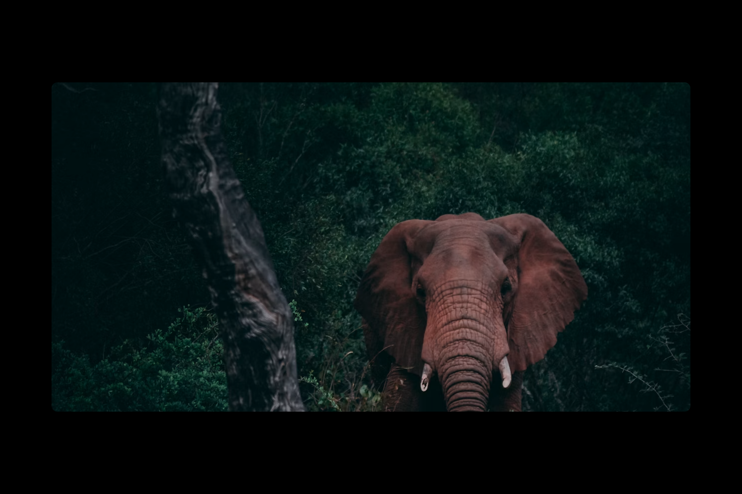
You are greeted with an expanded photo of an elephant in thick forest cover, which is the fastest disappearing type of habitat, before being directed to the tool itself. The results for any search (for a city, a park, a protected area) include:
Current air quality — including the live US AQI reading, human-friendly description of its health effects, and attempt at identifying the dominant pollutant.
A climate snapshot — showing current temperature, humidity, wind, and today’s range of forecasts.
The list of threatened species known to occur in 50km radius of your location — sorted by how threatened they are and filtered to Red List categories (from Critically Endangered to Near Threatened), using GBIF's occurrence data, each with its GBIF record.
Concrete recommendations of actions to take — never generic environmentalism, always relevant to findings of this particular search.
Finally, there is the animated "pulse" line graph representing the live signals concisely, where the color represents the air quality and height is proportional to local species' threat level, with a human-friendly caption below it.
There is intentionally no "habitat health score" here. Air quality of this very moment and several-years-long presence of species in this particular spot are two different metrics and cannot be combined into one score without distorting their meaning.
How we built it
Next.js 16 (App Router) running with React 19 and TypeScript, styled with Tailwind CSS v4 and built through the shadcn CLI, using framer-motion for the scroll-based expansion hero. It is a full static site deployed to GitHub Pages — zero server, backend, database. Every data call is a client call to free, keyless public APIs: Open-Meteo for geocoding, weather, and air quality, and GBIF for species occurrences filtered by IUCN Red List status.
The logic is intentionally separated from the render. All the domain logic lives in pure functions in lib/habitat/ — bounding box calculation, AQI determination, de-duping of species and their severity rating, and the mapping from observations to recommended actions — all tested through 44 tests in a Vitest suite.
Challenges we ran into
Bug in the live API that can only be detected using live verification: GBIF's iucnRedListCategory filter silently rejects a comma-separated string (CR,EN,VU,NT) — that pattern matches no records, verified against the real API by placing it in bounding boxes that contained 200k+ occurrences within range. The proper way to pass the four categories is as repeated parameters in the query. Before my verification, the species feature, the whole purpose of which is conservation part of the app, was silently displaying "no records found" everywhere, everywhere, indistinguishable from "genuine" zero. No amount of testing against the examples of documented API responses would have caught it; only the real call to the real API did. Fixed and now regression-tested by asserting the form of the URL.
"We don't know" and "we checked, there's nothing" are different assertions. Previously, both failed species request and request that returned zero species yielded the same message of "no threatened species found". Only the latter has earned that statement. The difference between null and [] is now preserved throughout the system and regression-tested.
Not overpromising: GBIF records are sightings in the past, not live status feed – a sighting in 2019 does not mean it's present now. That's explicitly stated on the UI rather than promising more certainty than is possible from the data.
One broken API doesn't break everything else. All three data sources are fetched in parallel using Promise.allSettled, and the UI displays successfully received ones and fails those that couldn't be fetched.
Longitude is not a uniformly sized unit. A naive bounding box defined in degrees would result in completely incorrect numbers near poles. The bounding box scales the size of the longitude portion by cos(latitude), unit-tested to that particular property.
"Skip the animation" is actually two decisions, not one. The right thing to do seemed to be honoring prefers-reduced-motion by pre-expanding the hero panel and leaving it expanded – but the hero panel had a scroll handler to re-collapse it if you tried scrolling up near the top, so a reduced motion user would still be scroll-jacked into animation they skipped! Properly fixing that required a second, separate decision not to even initialize the scrub handlers in reduced motion mode, separately unit-tested.
Accomplishments that we're proud of
The scroll animation. Upon loading the site, a photo enlarges as you scroll until it covers the whole screen and only then is the actual application revealed underneath. I implemented the scroll effect myself without relying on any external library and timed it in such a way so that the application appears right as the photo fully loads. This way the effect looks nice and doesn't affect performance.
I've solved all bugs discovered during testing. The most severe bug was in the GBIF search functionality where the app was making incorrect requests to get the species data, thus returning "no threatened species found" for each country on Earth which gave the illusion of an actual response from the server. I was able to detect it only after testing with the live API. Also, there was a card that created huge gaps when loaded on the page, a logo that worked locally but didn't work in the live app, an animation that would trap users with the disabled motion on, and a bug that made the shared link open in the middle of the animation rather than the beginning.
I noted all limitations of the application. In the file docs/LIMITATIONS.md there are ten straightforward limitations described. For instance, the species records contain historical sightings but not the live data and, in case the application says that there are no threatened species near you, this means that there is no research done in that particular region. Most of them are just facts about the dataset rather than the bugs, and many projects don't even disclose these facts.
What we learned
A large number is easy to produce and easy to lie about. I could have combined the air quality and species count into an abstracted "habitat score". However, they represent entirely different metrics measured at different intervals, so such an amalgamation would have made no sense. Separating them out was more tedious, but also more accurate.
A test can pass despite the functionality failing. My GBIF module passed all the unit tests I produced. Yet, it remained entirely non-functional. This happened because my tests were based on examples in the documentation, and the actual API behaves in a different way. There were no failures and no exceptions thrown - the whole species functionality was silently empty. I've changed that now to testing the actual API.
Accessibility involves more than one adjustment. Users with animations disabled in their settings should ignore my scroll effect implementation. To achieve that goal, I made the animation begin completed for them right away, assuming that's good enough. It wasn't - they could still be dragged by scrolling up into the animation. So, I ended up disabling the scroll effect altogether.
What's next for HABITAT PULSE
Comparison to normal. Open-Meteo can provide information about normal weather conditions on a specific day. Combining these two pieces will allow the application to provide such an interesting feature as "it is warmer than usual in this location". This functionality is much more informative than just displaying the current temperature.
Improving distance calculations in polar areas. The 50km zone is currently just a square. It works correctly everywhere, except for the vicinity of the North and South poles. Implementing a circular zone of research will solve the problem.
Alerts. The feature like "inform me if the air quality at this nature reserve becomes poor". Currently, the application allows us to see the current condition of the place. Alerts would help to track it.
All three features are currently in docs/LIMITATIONS.md.
Attribution
Data: Open-Meteo — geocoding, weather, and air quality (CC BY 4.0) · GBIF — species occurrence records and IUCN Red List categories
Libraries: Next.js · React · TypeScript · Tailwind CSS · shadcn · framer-motion · Vitest
Media: Two photographs via Unsplash (Unsplash License) · Fonts: Fraunces, Inter, and IBM Plex Mono via Google Fonts (Open Font License)
Original work: The Habitat Pulse logo, and all application logic, layout, and copy, are original to this project.
Built With
- framer-motion
- gbif
- next.js
- open-meteo
- react
- shadcn
- tailwindcss
- typescript
- vitest


Log in or sign up for Devpost to join the conversation.