Inspiration:
To build skills in data analysis & storytelling using Tableau. This was a part of the Coursera's course on Data Communication & Visualization using Tableau.
What it does:
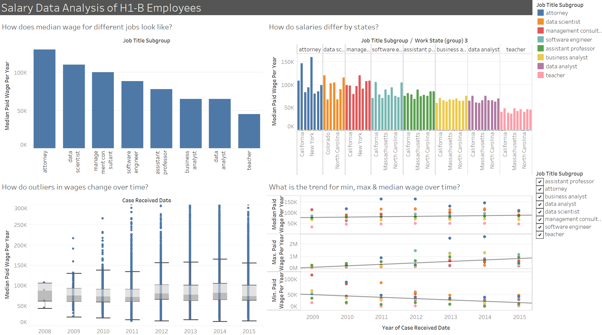
It shows various relationships between the variables in the H1-B salary data set obtained from OFLC website of United States Department of Labor.
How I built it:
I worked on identifying the major attributes, cleaning data and building relevant relationships using various charts in Tableau.
Challenges I ran into:
The outliers among the dataset had to be identified and depicted since they can significantly impacted the outcome of the analysis. Also, choosing the right visualizations for every relationship was a crucial part of the analysis.
Accomplishments that I'm proud of:
I was able to identify significant insights from this analysis. Have a look at the H1-B Salary Data story on the Tableau profile attached with this post to check them out.
What I learned:
I gained significant understanding business data, analyzing and transforming it and finally building a dashboard along with a story using Tableau.
What's next for H1-B employee salary data analysis:
I would work on improving the look and feel of the dashboard and add more visualizations as and when I identify new insights.

Log in or sign up for Devpost to join the conversation.