-
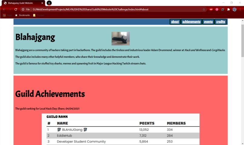
Screenshot 1 of my Blahajgang website
-
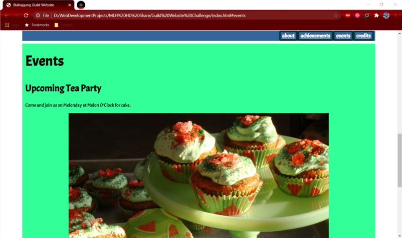
Screenshot 2 of my Blahajgang website


Inspiration
I was impressed with ideas I saw my other guild mates come up with and I thought I would try designing a website, too.
What it does
The web page displays sections describing the guild in an "about" section, the stats from LHD: Share in the "achievements" section, and a fun mock event posted in the "events" section. I included Creative Commons credits in a "credits" section.
The navigation system in the menu bar jumps the user to the corresponding section, whilst the menu bar stays fixed to the top of the screen for convenience.
How we built it
I wrote HTML, and CSS.
Challenges we ran into
Visually, I wanted to space out the coloured sections, and also maintain a bar of white space under the menu bar. This took some experimentation.
Accomplishments that we're proud of
I am really pleased with my use of white space and images and text alignment.
What we learned
I learned to use padding and borders to create the illusion of section division. I wanted to use bright colours to represent the shark and melon imagery and I found a way to separate them.
What's next for Guild Website
Some animation would be good fun to work into the page.

Log in or sign up for Devpost to join the conversation.