-
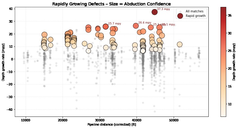
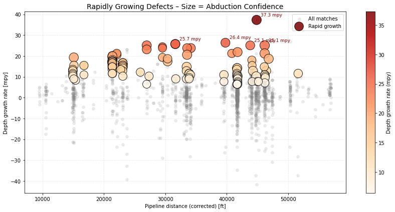
Q5 Visualization: Rapid Growth Defects
-
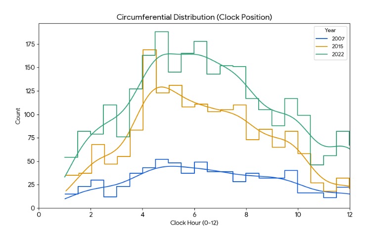
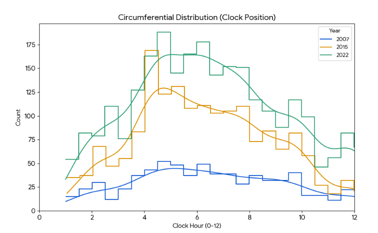
Q2 Clock position
-
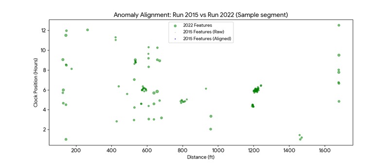
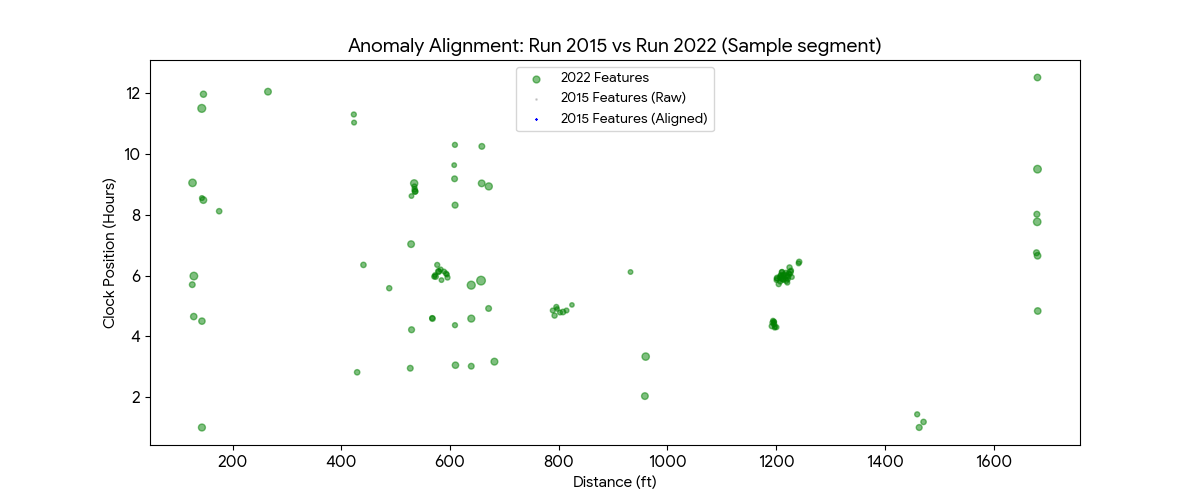
Q3 Anomaly Alignment
-
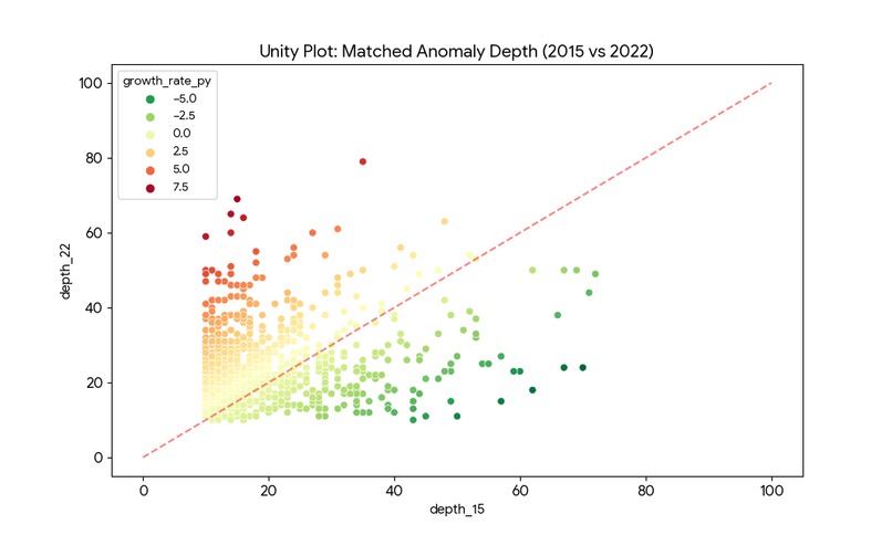
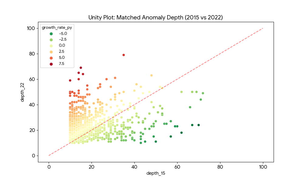
Q4 Match Anomaly
Inspiration
Pipeline integrity management is often reactive rather than proactive. Operators receive massive CSV files containing thousands of rows of In-Line Inspection (ILI) data, but visualizing how a specific corrosion defect has evolved over 15+ years is incredibly difficult in a spreadsheet.
We realized that simply seeing "current depth" isn't enough. Engineers need to see the trajectory. We were inspired to build a tool that doesn't just show you where the corrosion is, but mathematically predicts where it will be in the future, allowing operators to prevent leaks before they happen.
What it does
GrowSpot is a browser-based visualization engine for pipeline integrity data.
Multi-Epoch Visualization: It ingests and overlays inspection data from three distinct historical runs: the 2007 baseline, the 2015 mid-life inspection, and the current 2022 run.
Automated CGR Calculation: The app runs a linear regression algorithm on every single metal loss feature in real-time to calculate the specific Corrosion Growth Rate (CGR) (% per year).
Predictive Modeling: Based on the calculated growth rate, GrowSpot projects a "2030 Scenario" (visualized as purple stars), showing the predicted depth of anomalies if left untreated.
Trend Pathing: We implemented a custom visualization layer that draws connecting lines between the years, visually linking the "life story" of every corrosion pit so engineers can instantly spot accelerating growth.
How we built it
We prioritized a lightweight, client-side architecture to ensure the tool could run on field laptops without complex backend infrastructure.
Frontend: Built with HTML5 and Tailwind CSS for a responsive, dark-mode compatible UI.
Visualization: We used Chart.js for the scatter plot core.
Math Engine: We wrote a custom JavaScript linear regression function that iterates through the JSON history objects ({2007, 2015, 2022}) to calculate the slope (CGR) and intercept for the 2030 projection.
Custom Plugin: The standard Chart.js line chart couldn't handle "vector-like" connections between different datasets. We built a custom plugin (trendLinePlugin) that accesses the chart's canvas context directly to draw the gray and purple growth paths connecting specific defect IDs across time.
Challenges we ran into
Visual Clutter: Plotting four datasets (3 historical + 1 prediction) resulted in a "confetti explosion" of dots. We had to implement dynamic opacity handling and a "Growth Path" toggle to ensure the chart remained readable while showing complex history.
Data Alignment: In the real world, pipeline odometers drift (a defect at 100ft in 2015 might be at 102ft in 2022). Designing the data structure to group these disparate points into a single "Feature ID" object was crucial for the math model to work.
The "Impossible" Prediction: Some data points showed negative growth (due to tool tolerance errors). We had to add logic to clamp predictions so we wouldn't predict a hole healing itself or exceeding 100% wall thickness.
Accomplishments that we're proud of
Client-Side Prediction: We are successfully calculating linear regression models for pipeline features entirely in the browser with zero latency.
The "Growth Path" UI: The visual implementation of the trend lines (gray for history, dashed purple for future) is incredibly effective. It turns abstract numbers into a clear visual narrative of decay.
Single-File Portability: The entire application lives in a single HTML file, making it easy to share with stakeholders or deploy offline in remote field locations.
What we learned
We learned about Linear CGR models and how critical "time-to-failure" calculations are for the energy sector.
We deepened our understanding of the Chart.js plugin ecosystem, specifically how to manipulate the canvas context beforeDatasetsDraw to create custom visualizations.
We realized the importance of distinct color coding (Slate for baseline, Blue/Red for history, Purple for future) in user interface design for safety-critical data.
What's next for GrowSpot
Real-Time Uploads: Integrating SheetJS to allow users to drag-and-drop actual Excel reports instead of using simulated JSON data.
Geospatial Integration: Mapping these distance coordinates (dist: 52100) to GPS coordinates on a Leaflet map.
3D Tube View: creating a 3D cylinder visualization to show the "O'clock" orientation of the corrosion in a more immersive way.
Smart Matching: Implementing a "Nearest Neighbor" algorithm to automatically link features between years even if they don't share a unique ID.
Built With
- gemini
- gemini-canvas
- grok
- streamlit


Log in or sign up for Devpost to join the conversation.