Inspiration
Google Maps tracks how we travel, but it doesn’t show the environmental impact of those choices. We wanted to turn that hidden data into meaningful insights about carbon emissions.
What it does
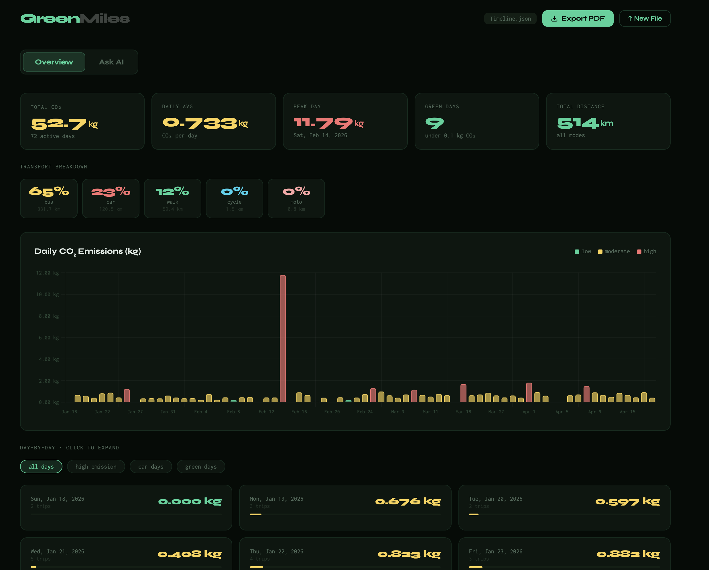
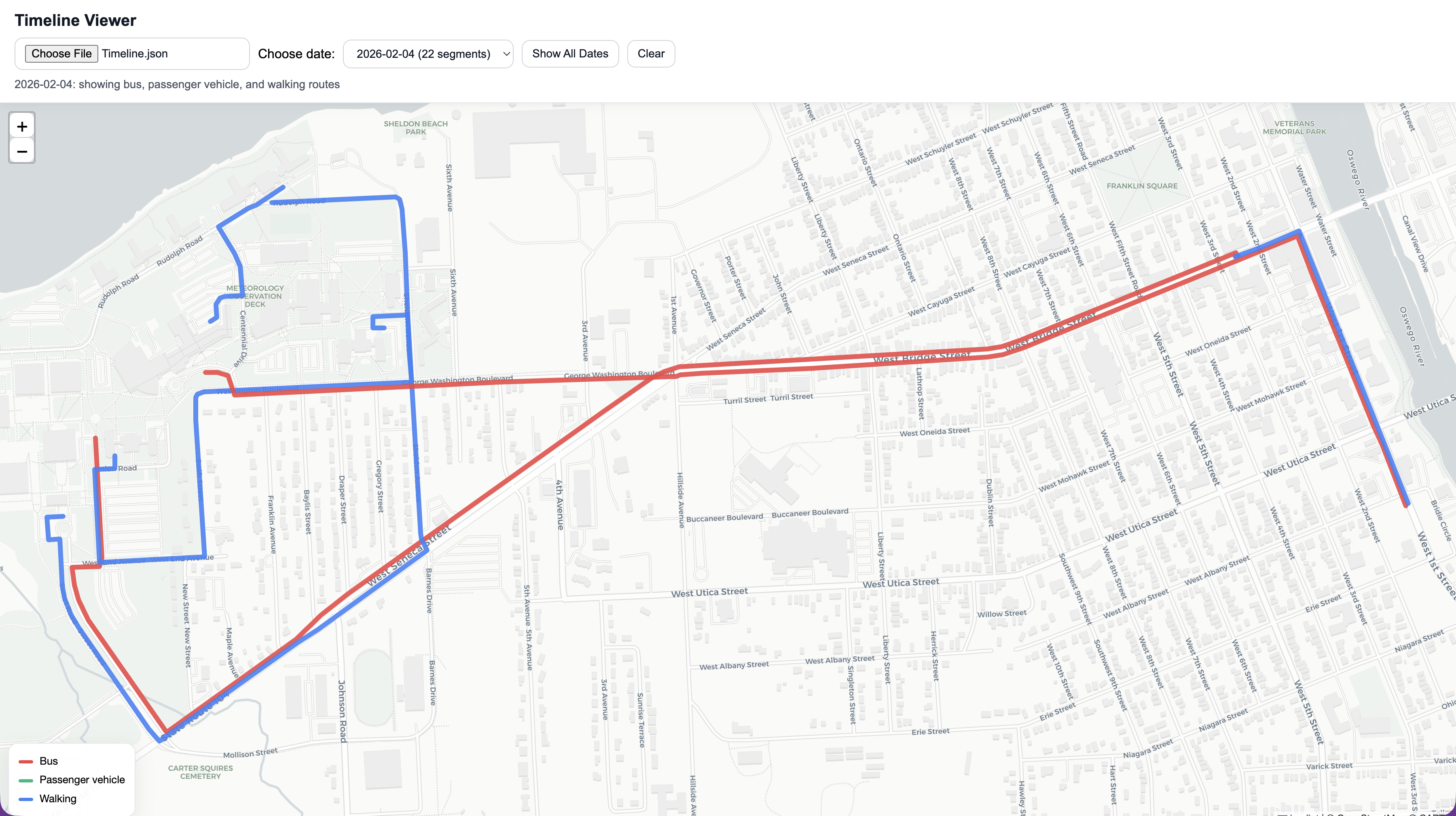
GreenMiles analyzes your Google Maps Timeline data to calculate your daily carbon footprint. By uploading a single file, users can visualize their emissions, understand their travel habits, and receive actionable suggestions to reduce their impact.
How we built it
We built a web application using JavaScript for the frontend and Python (Flask) for the backend. The app parses Timeline JSON data, calculates distances and emissions based on transport modes, and uses AI to generate personalized insights.
Challenges we ran into
-Parsing complex and inconsistent Timeline data -Accurately mapping transport modes to emission values -Converting raw location data into usable distance calculations -Integrating AI responses smoothly with real-time user interaction
Accomplishments that we're proud of
-Successfully transforming raw Timeline data into meaningful carbon insights -Implementing accurate carbon emission calculations -Applying mathematical concepts like coordinate-based distance estimation
What we learned
-How to work with real-world, messy datasets -Integrating AI APIs into full-stack applications -The importance of data visualization for user understanding
What's next for GreenMile - Carbon Tracker
-A leaderboard system to let users compete with friends and family -More personalized recommendations for reducing emissions -Prediction to recommend routes that emits less carbon using your past data
Built With
- chart.js
- css
- flask
- gemini-api
- html
- javascript
- render


Log in or sign up for Devpost to join the conversation.