-
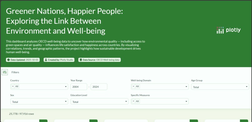
Introductory Page
-
Charts
-
Databases
Project Story: Greener Nations, Happier People
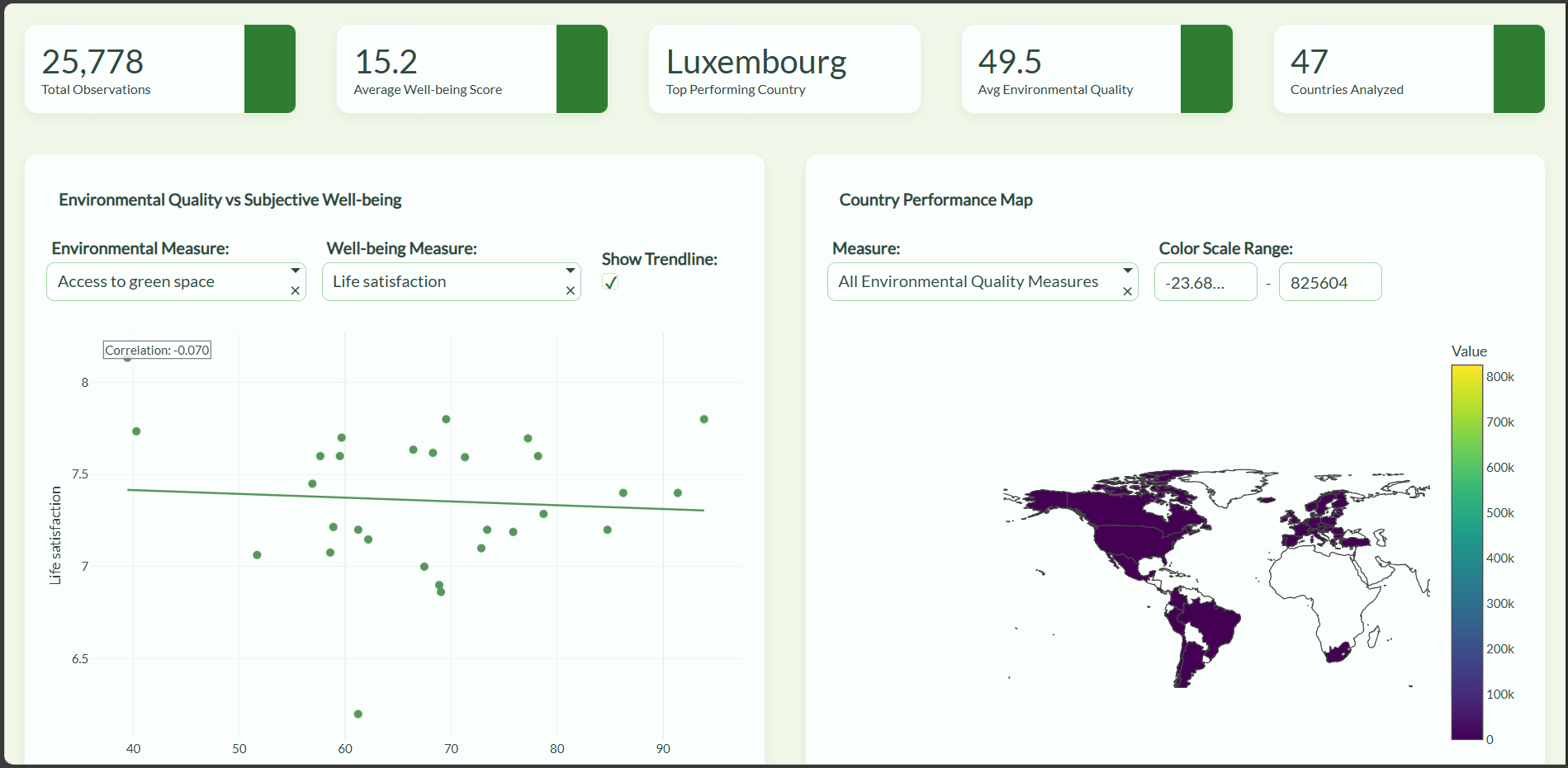
When I first explored OECD well-being data, I was fascinated by the subtle ways our environment shapes our happiness. I wanted to make these patterns visible and interactive, not just numbers in a spreadsheet.
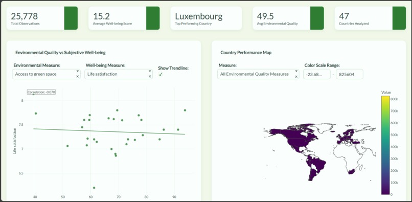
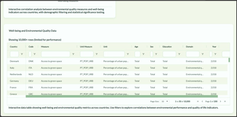
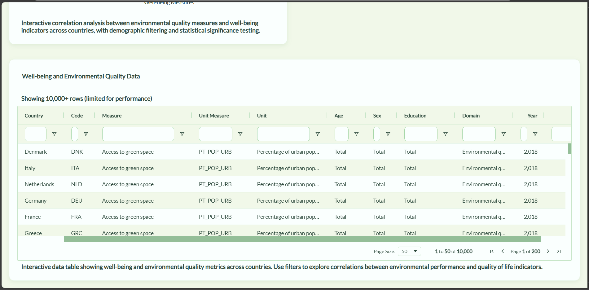
I built this dashboard using Plotly Studio, starting with cleaning and merging datasets on life satisfaction, access to green spaces, and air quality across OECD countries. I experimented with various charts, maps, and global filters to make the dashboard intuitive, engaging, and insightful. Users can explore correlations, trends over time, and geographic patterns to see, for example, how cleaner air or more green spaces often align with higher life satisfaction.
One of the biggest challenges was presenting complex, multi-dimensional data without overwhelming users. Balancing interactivity, clarity, and meaningful insights pushed me to explore Plotly’s advanced features like dynamic filters, time-series visualizations, and geographic mapping.
Through this project, I learned not only technical skills in data visualization but also how to tell stories with data. I realized that sustainable development isn’t just policy—it directly impacts human well-being. By turning numbers into actionable insights, this project highlights how environmental quality contributes to happier lives.
Optional LaTeX example: You could highlight a correlation metric like:
$$ r = \frac{\sum (x_i - \bar{x})(y_i - \bar{y})}{\sqrt{\sum (x_i - \bar{x})^2 \sum (y_i - \bar{y})^2}} $$
where (x_i) = environmental score, (y_i) = life satisfaction.


Log in or sign up for Devpost to join the conversation.