-
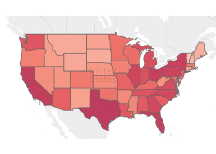
Electricity Consumption across the United States
-
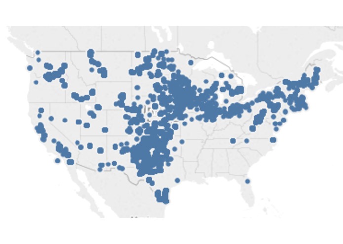
Wind Mill Clusters across the United States
Inspiration:
For many of us this was our first hackathon. We thought about TONS of different ideas, and worked on a couple of them.
What it does
It is an interactive demo that allows users to see US energy usage across the United States.
How we built it
We built it using Tableau
Challenges we ran into
It was difficult to find data that worked well with the Tableau software and translated well onto a map.
Accomplishments that we're proud of
We submitted our first project to a hackathon!
What we learned
We learned that we can do anything we set our mind to!
What's next for Graphing our Energy Use
We would like to add many more maps and datasets to our website.


Log in or sign up for Devpost to join the conversation.