-
-
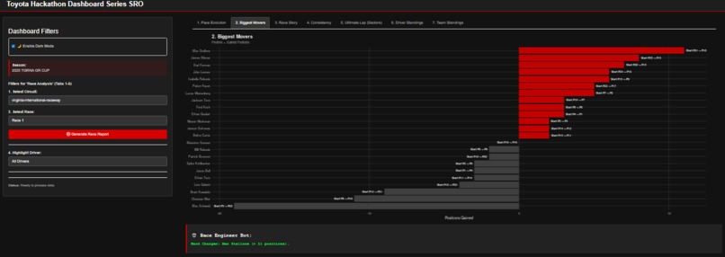
Position Efficiency Ranking overtaking efficiency by net position flux, isolating driver performance from grid advantage.
-
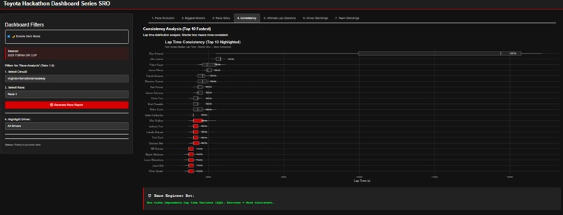
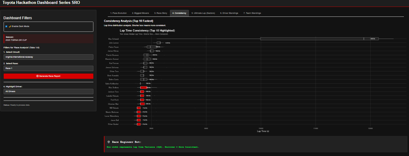
Statistical Variance Evaluating driver precision and repeatability using Interquartile Range (IQR) variance metrics.
-

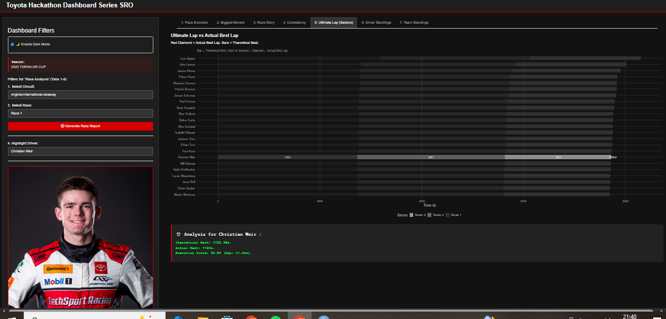
Performance Optimization Visualizing "Opportunity Loss" by contrasting Actual Best Laps against Theoretical Optimal Laps.
-
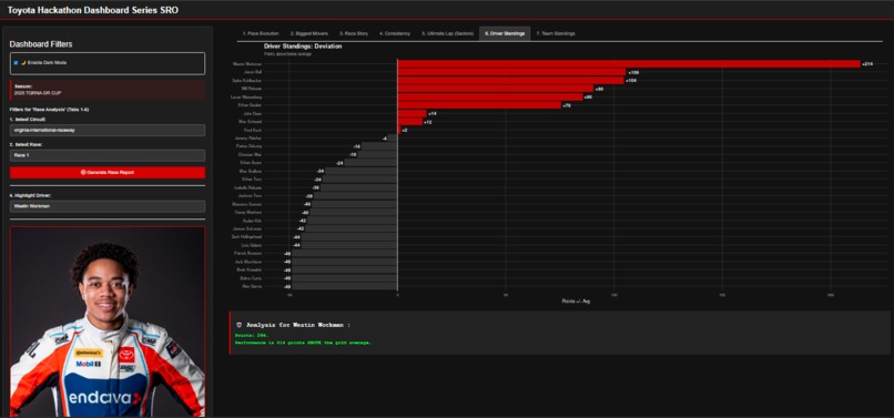
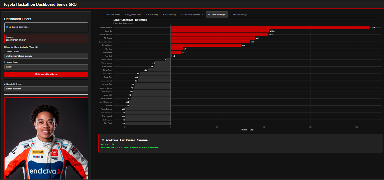
Relative Performance Normalizing championship standings via statistical deviation from the population mean to identify outliers.
-
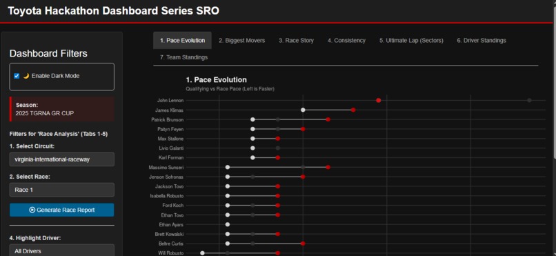
Pace Analysis Quantifying tire degradation and fuel load management via Qualifying-to-Race pace deltas.
-
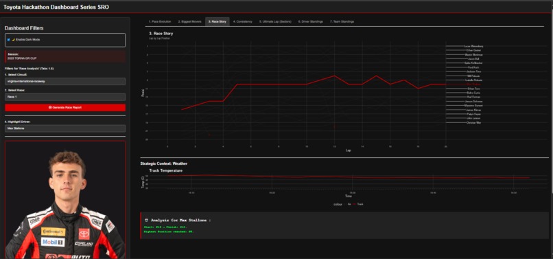
Temporal Telemetry High-fidelity tracking of positional evolution to identify pit windows and recovery drives.


Inspiration
Motorsport is often reduced to a final results table: who won, who lost, and the gap in seconds. But as data enthusiasts and racing fans, we know the real story happens between the starting lights and the checkered flag.
We were inspired by the challenge of "Post-Event Analysis": to go beyond the standings and reveal the why and how. We wanted to answer questions like:
- Did the winner have the rawest speed, or just the best consistency?
- Who was the "unsung hero" that climbed 10 positions despite a bad qualifying?
- How much pace does a driver lose from Qualifying to Race trim?
Our goal was to build a tool that doesn't just show numbers, but tells a data-driven story worthy of the Toyota Gazoo Racing spirit.
What it does
TGR Advanced Analytics is an interactive R Shiny dashboard that transforms raw CSV timing data into actionable intelligence. It features:
- 🤖 AI Analyst Insights: A rule-based logic engine that automatically generates textual analysis for every chart. It calculates metrics like pace degradation and consistency scores, acting as a virtual Race Engineer.
- 🦸 Hero Mode: Racing charts can be messy "spaghetti plots." Our "Hero Mode" allows users to select a specific driver to highlight in TGR Red, fading the rest of the field to grey. This brings focus to individual narratives.
- 📈 IBCS-Style Visualization: We moved away from standard charts to International Business Communication Standards (IBCS) principles:
- Pace Evolution (Slope Chart): Visualizing the drop-off from Qualifying to Race pace.
- Consistency Analysis (Boxplots): Ranking drivers not just by speed, but by lap-time variance (IQR).
- Biggest Movers: Identifying drivers with the best "race craft" (positions gained).
- Ultimate Lap Analysis: Comparing a driver's actual best lap against their "Theoretical Best" (sum of best sectors) to measure execution quality.
- 🌓 Dynamic Theming: A built-in Dark/Light mode toggle that automatically adjusts ggplot2 visualizations to match the TGR brand aesthetic (Red, Black, White, Grey).
How we built it
We built this application using R and Shiny, leveraging the Tidyverse for data manipulation.
- Data Engineering: We created a custom "Universal Data Reader" function. The provided datasets (2025) had significant inconsistencies (different delimiters, column names like
#vsNo.vsNUMBER, and varying time formats). Our robust ETL pipeline automatically detects the format, sanitizes column names, and parses time strings (handlingmm:ssvshh:mm:ss) into numeric seconds. - Visualization: We used
ggplot2for all charts. We implementedggrepelfor non-overlapping labels andthematicto synchronize plot styling with the UI theme dynamically. - UI/UX: We used standard Shiny layouts enhanced with custom CSS to strictly follow Toyota Gazoo Racing's color palette (
#c00000Red).
Challenges we ran into
- Data Inconsistency: The biggest hurdle was that the CSV formats changed between seasons and even between sessions (Practice vs. Race). Some files used semicolons, others commas; some had "Lap Time" while others had "BestLap".
- Solution: We wrote a defensive
read_smart_results()function that tries multiple reading strategies and maps varying column headers to a standardized schema (NUMBER,DRIVER_NAME,TIME_SEC).
- Solution: We wrote a defensive
- Visual Clutter: With 30+ cars on track, the Lap Chart (Race Story) was unreadable.
- Solution: We implemented the "Hero Mode" logic, using conditional formatting in
ggplot2to render non-selected drivers as transparent background elements.
- Solution: We implemented the "Hero Mode" logic, using conditional formatting in
- Infinite Values in Analysis: Calculating statistics on drivers who didn't set a time caused division by zero errors (
Inf).- Solution: We implemented strict data validation pipelines to filter out
NAor zero-value lap times before they hit the rendering engine.
- Solution: We implemented strict data validation pipelines to filter out
Accomplishments that we're proud of
- The "Universal Reader": Our code can now ingest almost any variation of the GR Cup timing sheets without crashing.
- The AI Logic: We are proud of the
generate_ai_text()function. It doesn't just print data; it interprets it (e.g., "Stability Rating: High Precision" if the Interquartile Range of lap times is low). - Professional Aesthetics: The dashboard looks like a tool a real race strategist would use on the pit wall, especially with the seamless Dark Mode integration.
What we learned
- Context is King: A chart without context is just lines. Adding the "AI Analyst" text box next to charts significantly improved the interpretability of the data.
- Defensive Programming: Never trust user input or file formats. Building robust error handling around
read_csvsaved us countless crashes. - Storytelling with Color: Using color semantically (Red for focus, Grey for context) is more powerful than using random colors for every driver.
What's next for TGR Advanced Analytics
- Predictive Strategy: Using the tire degradation data (implied from Pace Evolution) to predict optimal pit windows.
- Teammate Comparison: A specific mode to overlay two drivers from the same team to compare telemetry sector-by-sector.
- Live Data Ingestion: Connecting the dashboard to a live API stream instead of static CSVs for real-time pit wall decision support.
Built With
- css
- ggplot2
- ggrepel
- r-shiny
- rstudio
- shinyapps.io
- tidyverse


Log in or sign up for Devpost to join the conversation.