Inspiration
At Barber Motorsports Park, a tenth of a second can decide a race, but teams are buried under telemetry logs, lap‑time tables, and results CSVs.
We wanted to build a tool that:
- Uses the official TRD datasets directly
- Helps drivers understand where to improve, not just how fast they went
- Gives engineers and strategists real‑time answers instead of static reports
GR Cup Analytics is our response: a single place to go from raw data to race‑day decisions.
What it does
- Ingests TRD telemetry, lap‑time, best‑laps, and results data for Barber Motorsports Park.
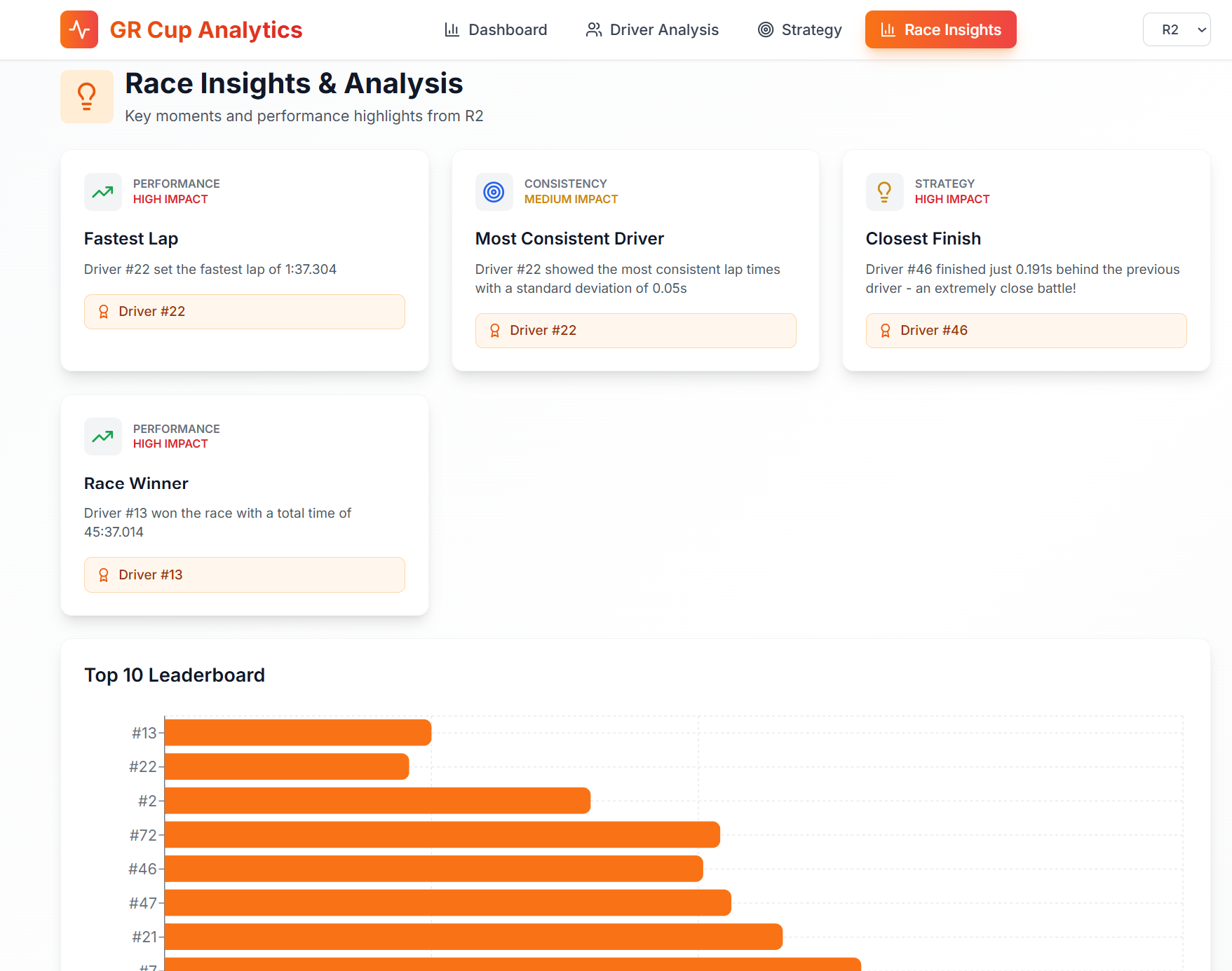
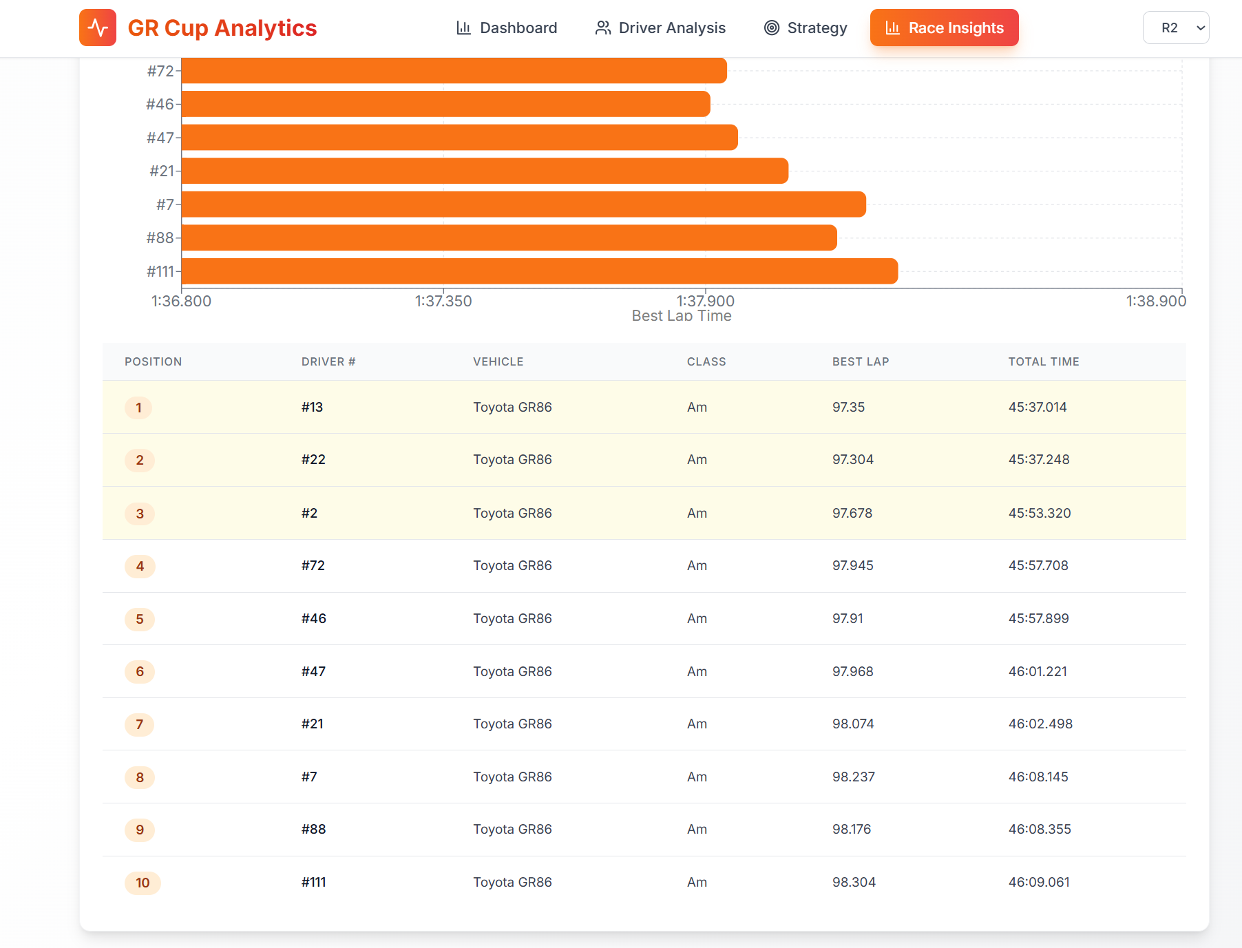
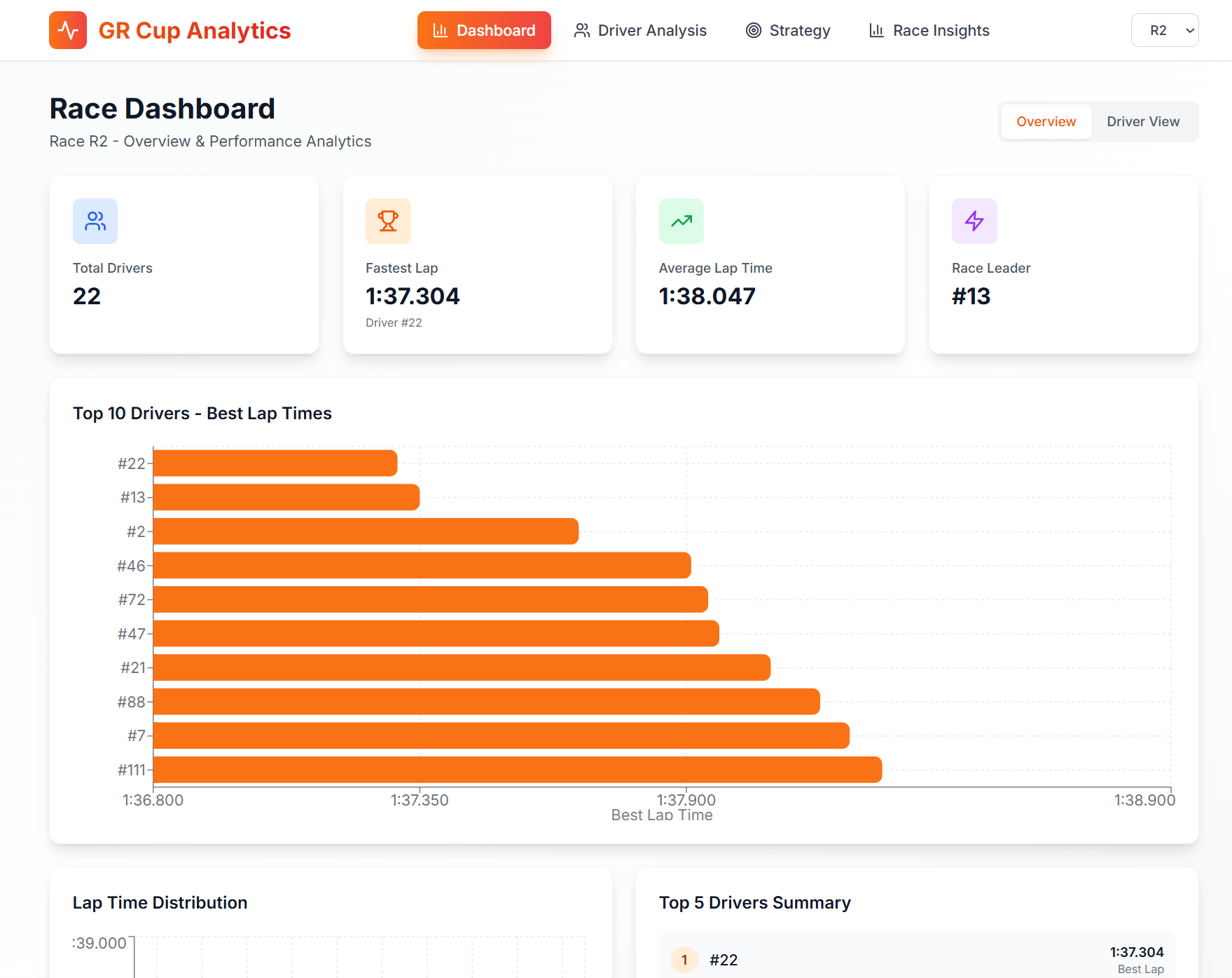
- Provides a Race Overview Dashboard with total drivers, fastest lap, average lap time, race leader, and a dynamically scaled top‑10 leaderboard.
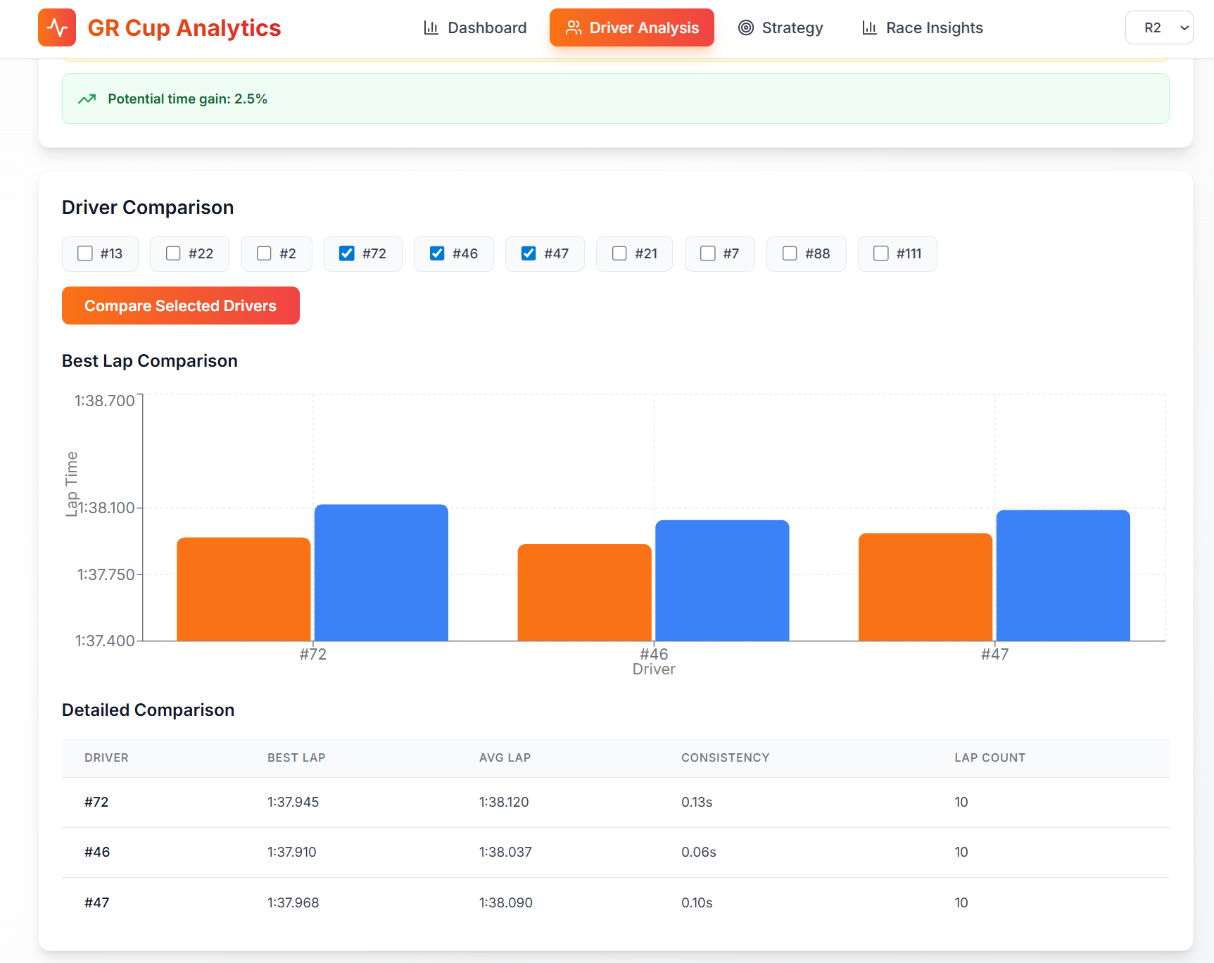
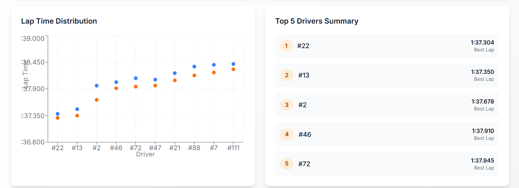
- Offers Driver Analysis with compares drivers on best lap, average lap, and consistency with charts.
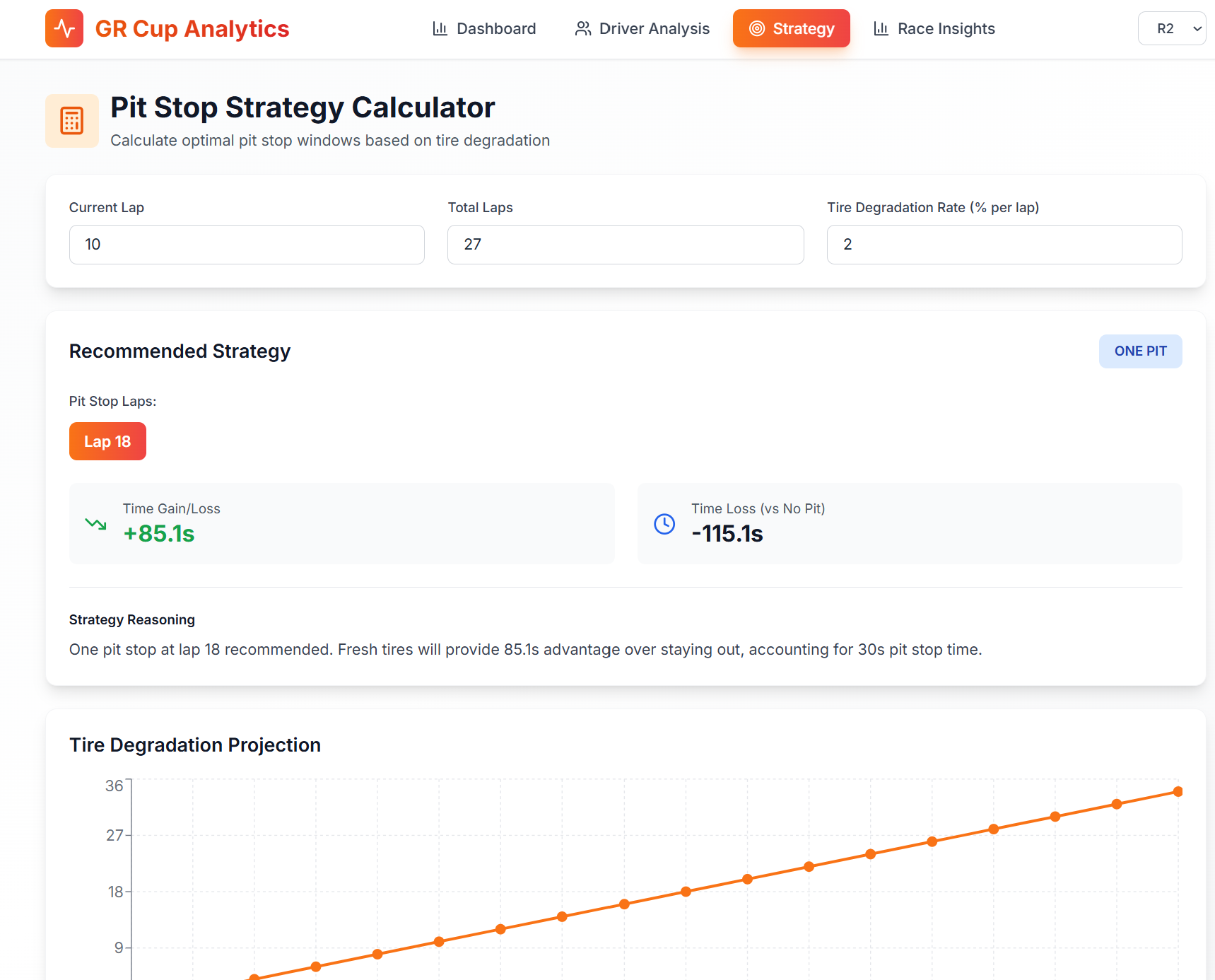
- Includes a Pit Stop Strategy Calculator that models tire degradation and simulates no‑stop, one‑stop, and two‑stop strategies with human‑readable reasoning.
- Generates Race Insights such as fastest lap, most consistent driver, closest finish, and race winner summaries for post‑event storytelling.
How we built it
- Backend (FastAPI, Python):
data_processor.pyloads and normalizes all Barber CSV files (telemetry, lap times, best 10 laps, provisional and official results).- Handles >200MB telemetry files with chunked reading and sampling to keep responses snappy.
analytics.pycomputes driver metrics, GPS‑based racing lines, sector weaknesses, and race‑level insights.strategy.pyimplements a simple but configurable tire‑degradation model and pit‑stop time simulation.- Exposes a clean REST API consumed by the frontend and documented via FastAPI’s OpenAPI docs.
- Frontend (React + Vite):
- Modern, responsive UI with a light theme optimized for at‑track use.
- Uses Recharts for dynamic charts (with auto‑scaling domains) and React Leaflet + OpenStreetMap tiles for the track map.
- Implements two main views: an Overview dashboard for teams and a Driver View for detailed telemetry‑driven coaching.
- Tailwind CSS (via CDN) and Lucide icons provide a clean, consistent visual language.
- Modern, responsive UI with a light theme optimized for at‑track use.
Challenges we ran into
- Huge telemetry files: The raw telemetry CSVs are large; naïve loading froze the app. We solved this with chunked reads, sampling, and column filtering in pandas.
- Inconsistent file naming: Some datasets used
R1, others usedRace 1, and there were separate “Provisional” and “Official” results. We added smart file‑name mapping and fallbacks to robustly locate the right files. - GPS data quality: Not every row had valid latitude/longitude, and coordinates needed to be filtered to the Barber region. We added sanity checks, bounds filtering, and a track‑accurate fallback racing line.
- Making tiny differences visible: With lap times all around 1:37–1:39, default chart scales hid meaningful gaps. We implemented dynamic chart domains that zoom into the actual data range so differences of tenths pop visually.
- Balancing depth with usability: It’s easy to overwhelm users with numbers. We spent time simplifying metrics and adding natural‑language summaries so engineers and drivers can act quickly.
Accomplishments that we're proud of
- Built an end‑to‑end pipeline from TRD CSVs to an interactive web app in a short hackathon window.
- Implemented a strategy calculator that not only computes times but also explains why a pit‑stop choice is good or bad.
- Created visually polished dashboards with smart scaling that make subtle performance differences easy to see.
- Designed a system that simultaneously serves drivers (coaching), engineers (telemetry and strategy), and analysts (race stories).
What we learned
- Motorsports data is messy: even official datasets require careful normalization and defensive coding.
- Visual design and axis scaling matter as much as algorithms when you’re trying to communicate tenths of a second.
- GPS‑based racing line analysis is extremely powerful for coaching, but it needs domain‑specific filtering and smoothing to be trustworthy.
- Building for multiple personas (driver, engineer, strategist) forces you to think hard about information hierarchy and UX.
What's next for GR Cup Analytics project
- Live streaming: Replace static files with WebSocket or MQTT feeds for live telemetry and timing during sessions.
- Predictive models: Use historical sessions to predict lap times, tire degradation, and undercut/overcut potential before the race.
- Multi‑track support: Generalize the Barber‑specific logic to work with other GR Cup venues like COTA, with per‑track racing‑line templates.
- Session comparison: Side‑by‑side comparison of practice, qualifying, and race runs for the same driver or car.
- Export & sharing: Generate PDF/HTML reports for debriefs and shareable highlights for social/media teams.

Log in or sign up for Devpost to join the conversation.