-
-
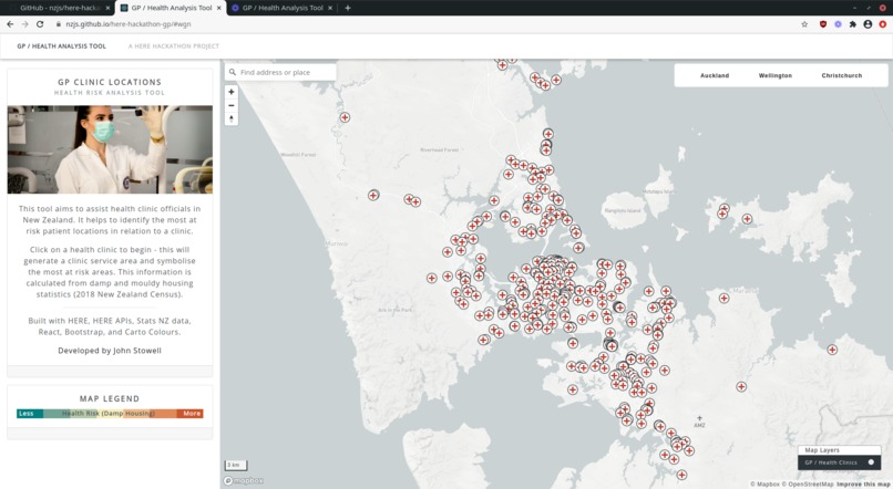
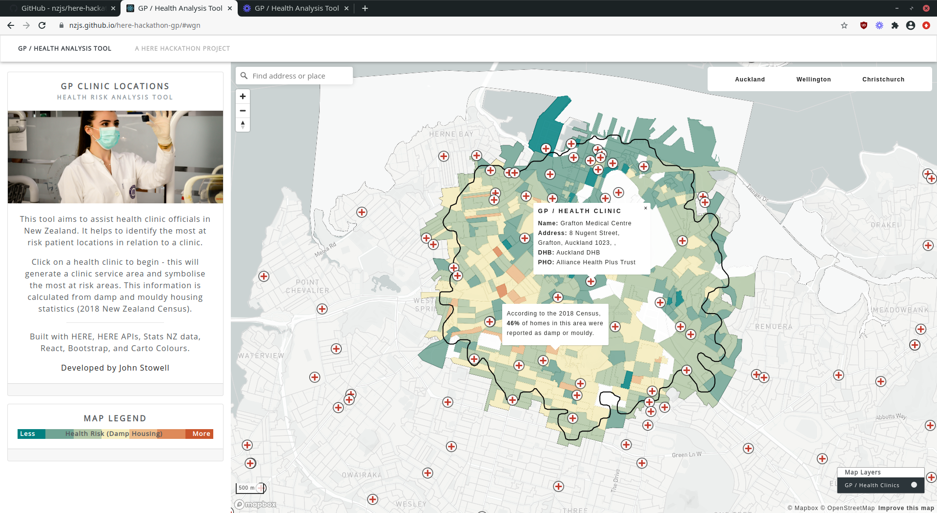
1. Initial view of Auckland
-
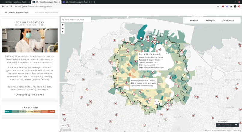
2. Selected clinic in Auckland
-
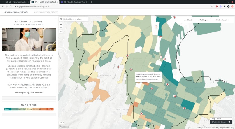
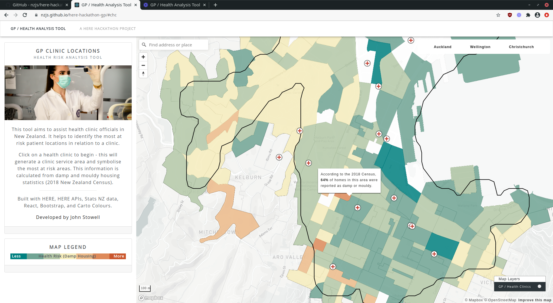
3. Selected clinic, highlight statistical area for damp/mouldy housing stats
Inspiration
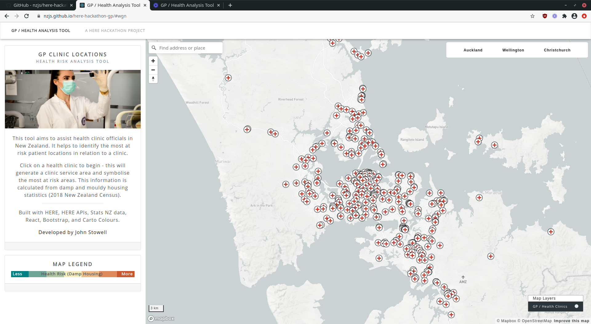
In New Zealand we have an issue with damp and mouldy housing, this affects peoples health and children get sick. I am passionate about improving this situation. My tool identifies the most at risk areas for better targeted funding/improvement of peoples overall health.
What it does
Uses GP/Doctor Clinic locations in New Zealand, allows user to select a clinic and identify rough service area using HERE Isoline and converts to polygon area. Then using a spatial intersection we query the underlying NZ demographics dataset for the given service area. Finally, calculate and dynamically symbolise the damp/mouldy housing statistics.
How I built it
I built the website using HERE, HERE APIs, Stats NZ data, React, Bootstrap and Mapbox (as I'm familiar with it), and Carto Colors for data driven symbology.
Challenges I ran into
It was a challenge optimising the speed of the application - when selecting a clinic it runs a number of fetch requests and symbolises on the fly, all client side.
Accomplishments that I'm proud of
I am happy with the entire application as a proof of concept, and managing to optimise the speed was rewarding. The initial load of the layers/dynamic fetching based on map bounding box is also an accomplishment for loading speed.
What I learned
It was interesting to learn to use the HERE Isoline API and HERE data, (although in my end case the HERE data for Auckland was not appropriate for my use case). It was also my first time doing client side intersect and data driven symbology.
What's next for GP Clinic / Health Analysis Tool
The tool as a proof of concept works okay, but next on the backlog would be adding charts/graphics with the statistics calculated for the session (not just a popup). It would also be beneficial to query/add grouped statistics for each city, region, and New Zealand as a whole, and display on the panel interface.

Log in or sign up for Devpost to join the conversation.