-

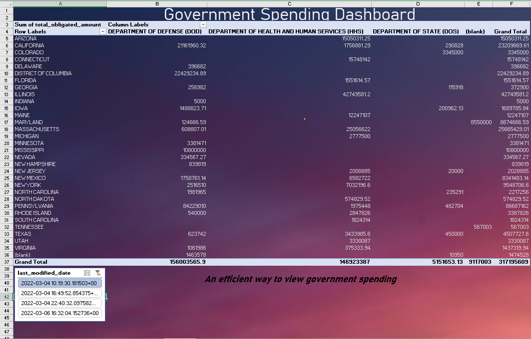
Table that represents the Government spending based on filters.
-
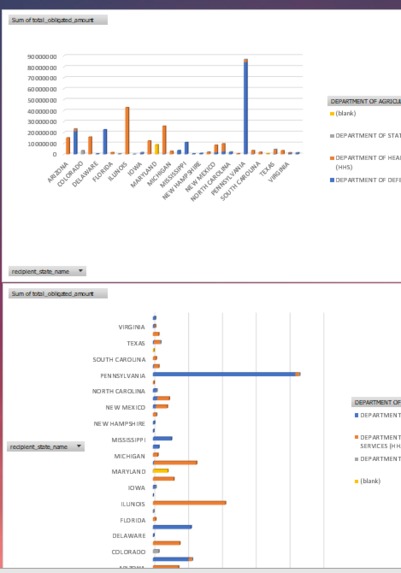
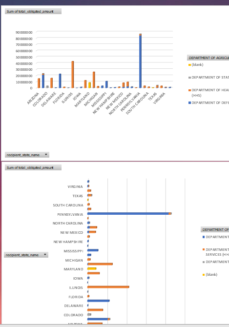
Charts Created with the Government spending data
Inspiration
Although government spending is made public, it's not shown in a digestible way. With that we decided to create a dashboard that shows all the information you need or want.
What it does
Displays government spending information in an efficient way. The dashboard contains two graphs representing the same data in a different manner. It also includes a table of the spending with respects to your personalized filters.
How we built it
Using excel we made a dashboard display. Cleaning and formatting the data was done using Python, which downloaded the condensed data into a csv file. With this, excel was able to pull the data from those files and display it.
Challenges we ran into
Our team is comprised of beginners who don't have a background in developing. Using excel for a dashboard made it somewhat difficult to connect it to code.
Accomplishments that we're proud of
Although none of us come from a developing/data analytics background, we managed to complete a working representation of the data using a Python script and an Excel spreadsheet.
What we learned
We learned how to make dashboards using excel and new ways to use Python to clean and format csv files with 15 gb of data.
What's next for Government Spending Dashboard
In the future, we would want this dashboard to contain more charts and the ability to select which country you are in. In addition to this, you would be able to change between the year of spending. An interactive map was also discussed.


Log in or sign up for Devpost to join the conversation.