About the Project
Meet Inventory Risk Monitoring Dashboard – your supply chain team’s new command center. This dashboard turns scattered inventory alerts into a single, actionable view — showing which SKUs, suppliers, and sites are at risk and letting teams take action faster.
In every complex supply chain, there’s a hidden problem: alerts come from multiple systems, risks get missed, and teams spend hours just figuring out where to start. This dashboard takes that chaos and turns it into clarity.
Our Inspiration
Every operations review meeting started the same way: analysts comparing spreadsheets, debating which SKUs were “really” at risk, and emailing suppliers manually. By the time the picture was clear, it was often too late to prevent a stockout.
That was our spark. We wanted a single, always-up-to-date view that made it easy to spot risk early, focus on the biggest problems first, and resolve issues before they hit customers.
We were inspired by real-world best practices in supply chain control towers — and we wanted to bring that same visibility to a lightweight, fast hackathon project anyone could reproduce.
How We Built It
We put ourselves in the shoes of a supply chain analyst and asked: “What would make risk monitoring simple, visual, and actionable?”
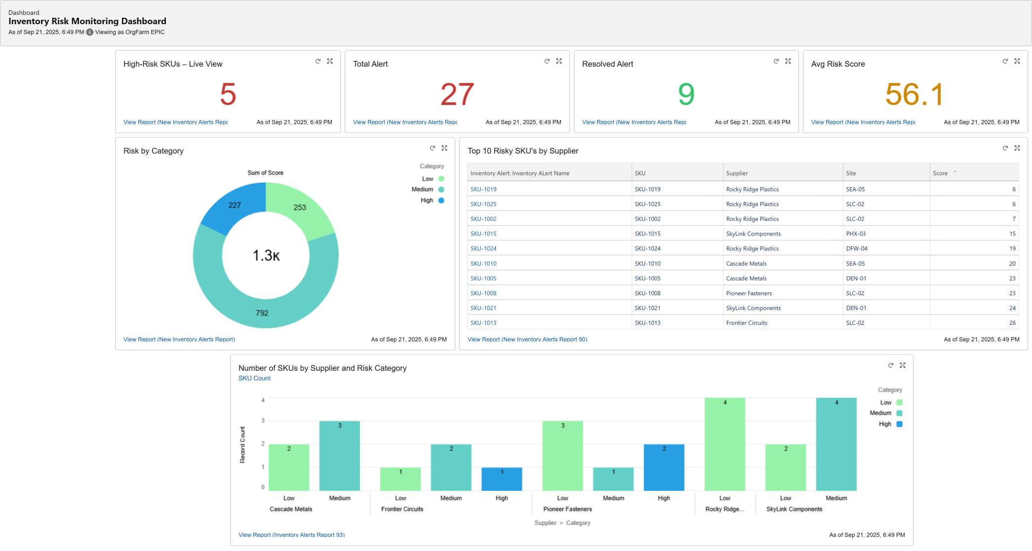
Here’s what we built:
Data Connection: Pulled SKU, Supplier, Site, Category (Low/Medium/High), Status (Open/Resolved), and Score into Tableau Next.
Native Aggregations: Used Tableau’s built-in grouping, filtering, and sorting — no calculated fields — so anyone can reproduce it quickly.
KPI Summary: Open Alerts, Resolved Alerts, High-Risk Count, and Average Score at the top for an instant health check.
Risk Distribution: Donut chart showing how many SKUs fall in each risk category.
Supplier View: Bar chart showing risk count by supplier and category so procurement knows where to intervene first.
Top-10 Table: Pre-sorted by Score so the most urgent items float to the top automatically.
Everything is arranged in a single, clean dashboard so teams can go from insight to action in seconds.
What We Learned
This project taught us that supply chain risk monitoring doesn’t have to be a manual spreadsheet chore — it can be visual, interactive, and live. We learned to:
Keep everything native in Tableau Next for maximum reproducibility
Design dashboards that are simple enough for leadership but detailed enough for analysts
Focus on clarity over complexity so users can act fast
Challenges We Overcame
Time Pressure: Building a polished dashboard in under 3 hours meant prioritizing the MVP over complex predictive models.
Data Hygiene: Some SKUs had incomplete data; we cleaned and filtered them so the visuals stay meaningful.
Simplicity vs. Detail: We resisted adding too many widgets — we focused on just enough information to drive action.
Why This Matters
This dashboard saves hours every week and keeps inventory teams focused on the right priorities.
For a network with hundreds of SKUs, it can:
Cut triage time by 40 % (5 hours → 3 hours per week)
Prevent stockouts by surfacing the riskiest SKUs first
Improve supplier collaboration by providing clear, actionable data
Analysts stop firefighting. Managers get visibility. Customers get better service. Everyone wins.
What’s Next
Live ERP/transactional data feeds for real-time updates
Cost-impact metrics to prioritize by dollar value
Trend tracking: week-over-week risk reduction progress
🎤 Our Promise
This dashboard isn’t just a visualization — it’s a decision-making tool for supply chain teams. When risk is visible and prioritized, teams act faster, prevent disruptions, and protect customer experience. That’s what modern operations excellence is all about.
Built With
- datasource
- extensions
- javascript
- permissions
- salesforce
- tableau

Log in or sign up for Devpost to join the conversation.