-
-
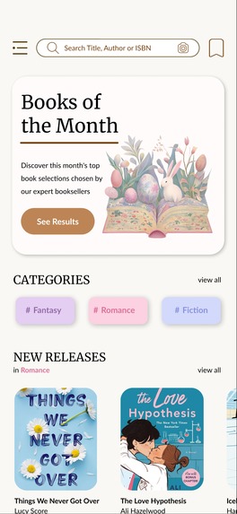
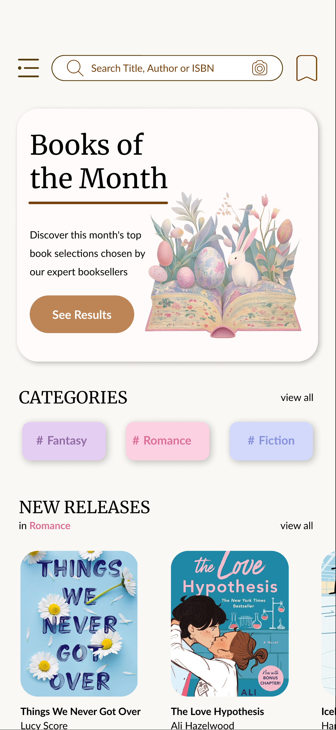
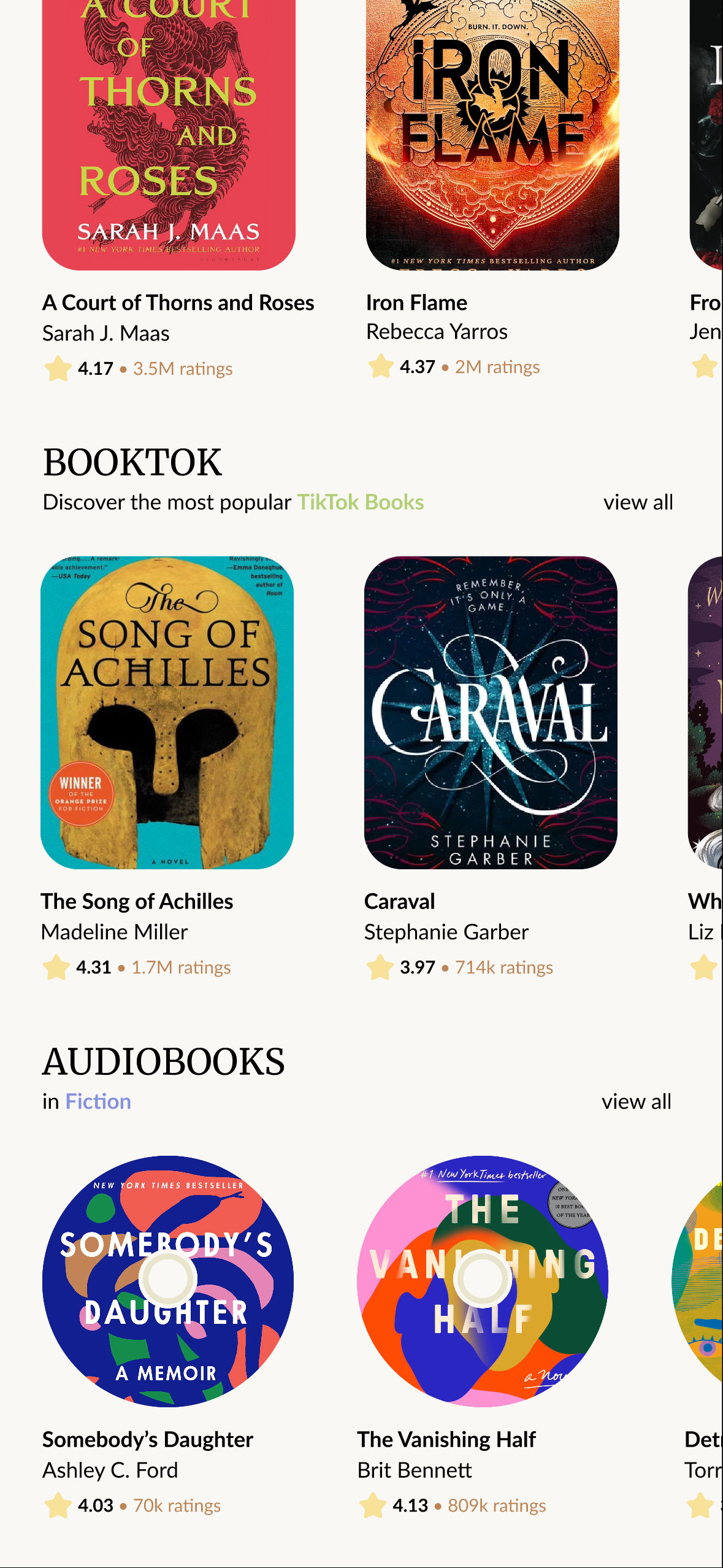
Home Page
-

Home Page
-
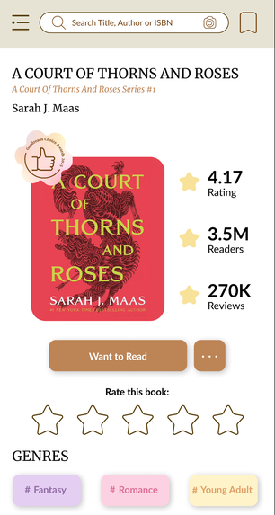
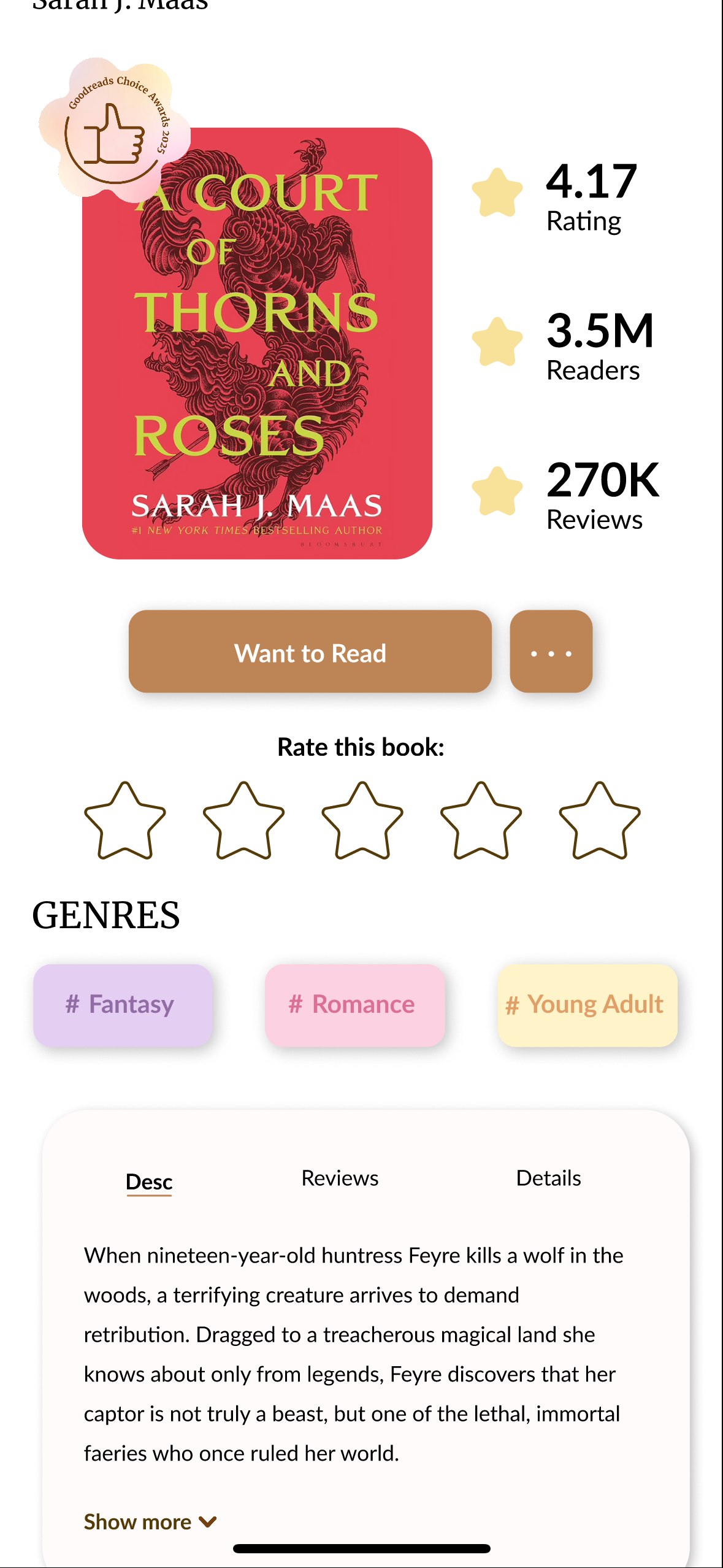
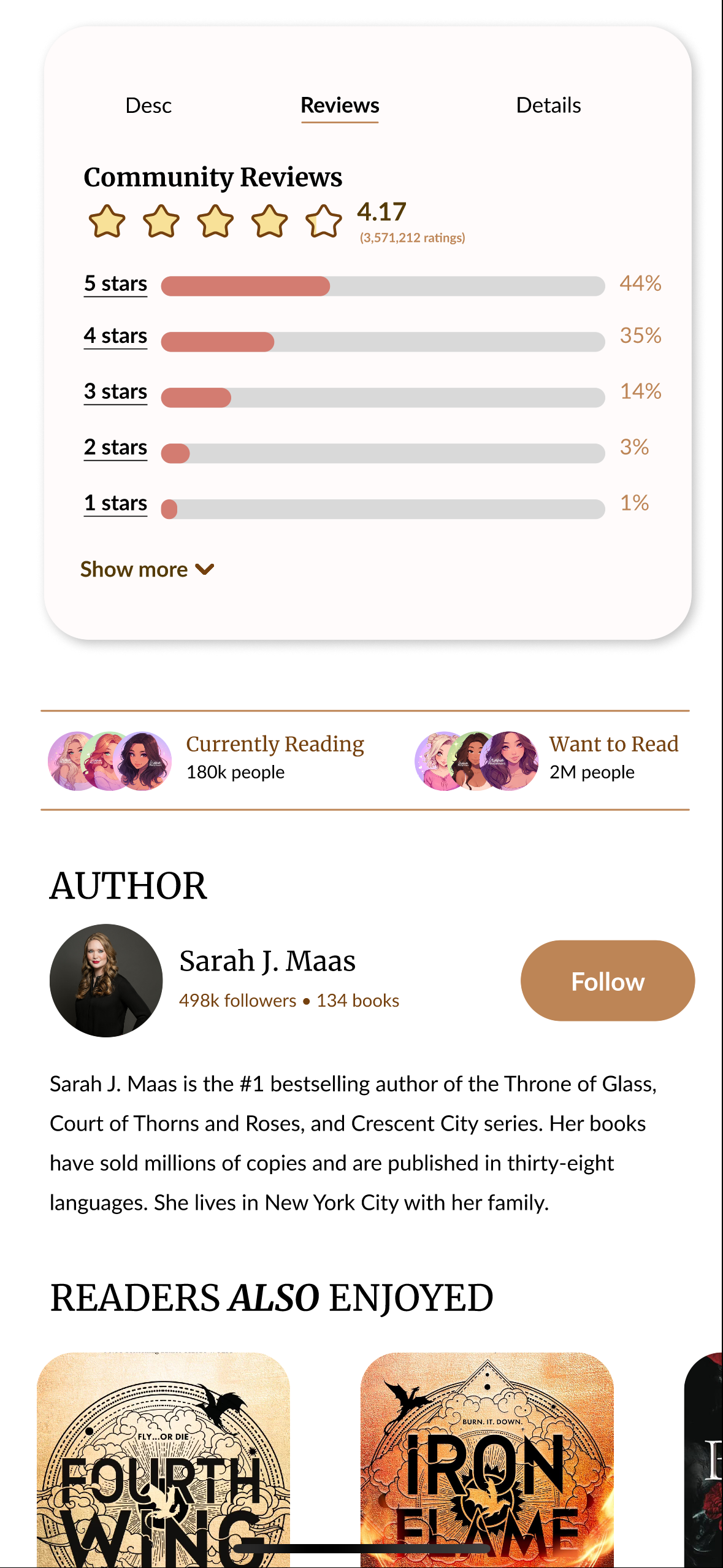
Book Page
-

Book Desc
-
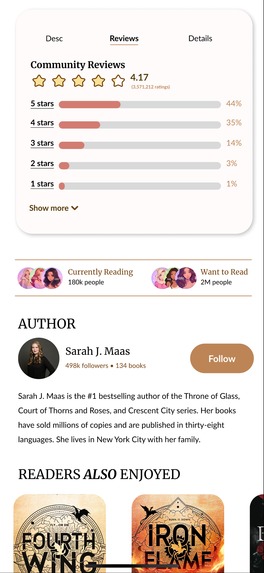
Community Reviews
-
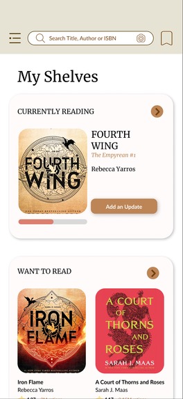
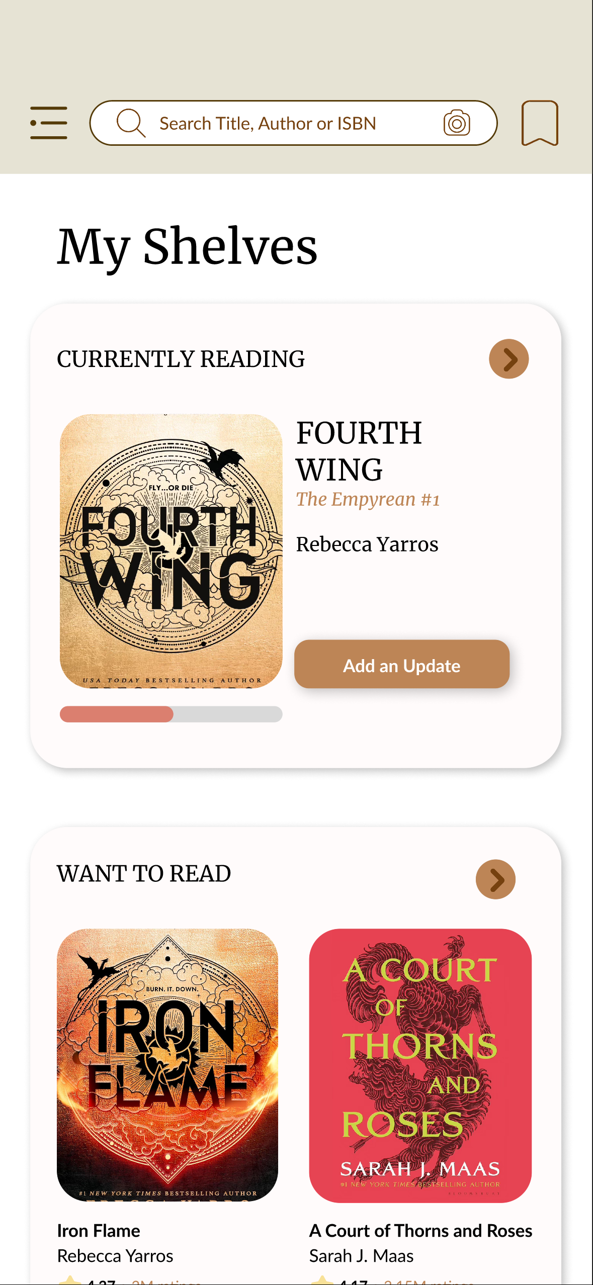
My Shelves Page

Inspiration
The inspiration for Goodreads Redesign: Chapters Reimagined stemmed from the need to transform the outdated and cluttered interface of the current Goodreads app into a more inviting and user-friendly experience. Many users struggle to navigate the overwhelming categories and find relevant book recommendations. This redesign focuses on simplifying discovery, enhancing community engagement, and making the app feel modern and approachable.
What it does
The redesigned app introduces a clean, minimalistic layout with rounded edges to create a welcoming look. The home page prominently features the Book of the Month to keep readers informed about top recommendations. A new bottom navigation bar includes a My Shelves button for easy access to saved books and a community group chat feature to foster connections among readers. Additionally, the design incorporates color-coded genre tags for quick recognition and allows users to explore trending books with a single tap. Labels for Goodreads Choice Awards appear on top of award-winning books, making them instantly recognizable.
How we built it
The redesign was created using Figma, focusing on clean typography, balanced spacing, and a user-centric layout. Wireframes were developed to test different navigation flows and ensure a seamless experience. The design process also included analyzing user feedback and pain points to refine features and improve usability.
Challenges we ran into
One of the main challenges was balancing the need for new features without overcrowding the interface. Ensuring that the additional My Shelves and community group chat buttons did not disrupt the minimalist design required careful planning. Another challenge was designing a consistent labeling system for the Goodreads Choice Awards without overwhelming the users visually.
Accomplishments that we're proud of
I'm proud for creating a more user-friendly interface that addresses the clutter and complexity of the original app. The introduction of color-coded genre tags, streamlined navigation, and Goodreads Choice Awards labels significantly enhance the browsing and discovery experience. These improvements make it easier for users to find relevant books quickly while enjoying a more organized and aesthetically pleasing interface.
What we learned
This project emphasized the importance of balancing new features with a clean design to prevent overwhelming users. We also learned that small details, such as labels and color-coded tags, can significantly impact user experience by making navigation more intuitive. Additionally, the process highlighted the value of user feedback in refining design elements to better serve the community.
What's next for Goodreads Redesign: Chapters Reimagined
The next steps include refining the three-dot menu next to the Want to Read button to serve as a navigation hub for options such as Currently Reading, Want to Read, Edit Start & End Date, Did Not Finish, and Owned. To enhance user experience, we plan to replace the current date-scrolling feature with a more intuitive calendar format, making it easier for users to log their reading progress. Additionally, we aim to conduct user testing to gather feedback and make further improvements. Expanding community features with personalized group recommendations and enhanced chat options is also a priority. Exploring dark mode and additional accessibility enhancements will ensure a more inclusive experience. Enhancing the Goodreads Choice Awards labels to include brief summaries or ratings could further enrich the discovery process.
Built With
- figma


Log in or sign up for Devpost to join the conversation.