-
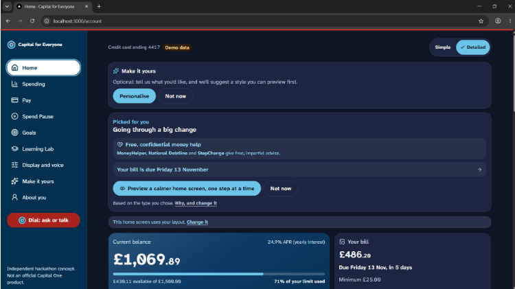
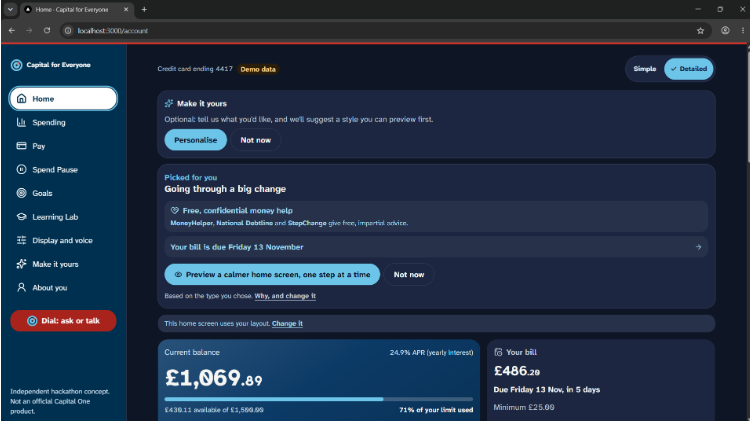
Dial tailors Home to someone going through a big change: free debt help first, bill date up front, and a calmer layout to preview.
-
-
-
Inspiration
Capital One says its mission is bringing simplicity and humanity to credit cards. We wanted to take that literally.
We started the weekend building a spending coach for students. A few hours in, we realised we were designing for people who already cope fine with banking apps. The people who don't are a much bigger group: 16.1 million disabled people in the UK, nearly 1 in 4, plus older customers and anyone who freezes in front of a wall of numbers.
At the same time, banking is moving out of the high street. Lloyds alone plans 232 branch closures in 2026. For a growing number of people, the app is now the only way in, and most apps are built for someone comfortable with dense screens.
The usual fix is a "simple mode" with bigger buttons. When those have been tried, the common complaint is that the simple version drops things people actually need. So we asked a different question: what if the simple screen kept all the information, and you could just ask for it?
What it does
Dial is a credit card app with a switch in the top right corner: Simple or Complex.
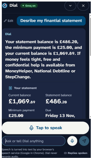
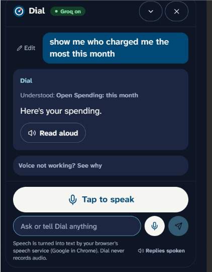
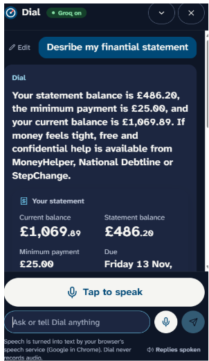
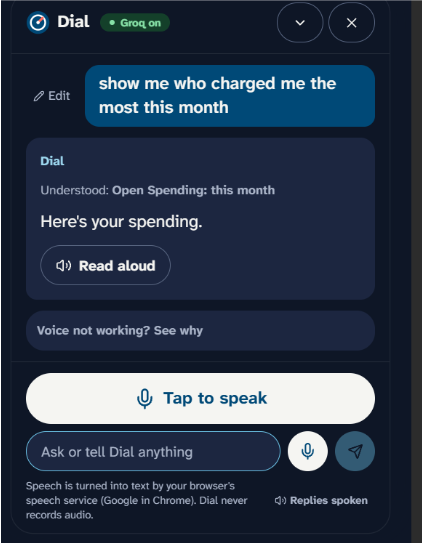
- Simple shows what you owe, when it's due, and one big button. Anything else, you ask. "Did I pay Tesco twice this month?" gets one sentence back, with the two charges shown underneath as proof, and it can read the answer aloud.
- Complex is the full view: balance, limit, APR, a spending chart, and a searchable transaction table. Ask the same question here and the same two rows light up.
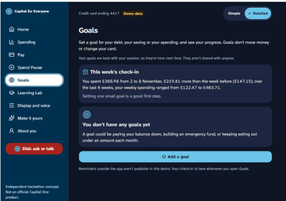
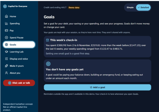
- Spend Pause is a check-in you set for yourself. Tell it to check anything over £100, and it steps in before the purchase, in plain words, with no countdowns or guilt trips.
- Pay my bill takes one step per screen, with a clear confirmation.
- Format suggestions. A machine-learning model looks at a person's characteristics and recommends a good format, such as larger text, a calmer layout or voice first. It only suggests, and nothing changes until you say yes.
You pick your view on the very first screen. We never change anything without asking.
How we built it
We used Next.js 15 with TypeScript, Tailwind CSS v4 and accessible headless components, and deployed on Vercel.
One app, not two. Every component reads its text size, spacing and touch target from design tokens. The Dial flips a single data-mode attribute on the page to swap token sets. Simple mode gets 64 px touch targets and large text automatically, and the two modes can never drift out of sync because there's only one of each component.
The AI never does maths. A tested TypeScript finance layer works out every total, due date, duplicate charge and price rise, along with the exact transactions behind each one. The model (Claude) only turns those facts into at most two plain sentences. If its reply mentions any amount or date that isn't in the facts, we throw it away and use a template sentence instead. Because the evidence comes from our code rather than the model, the highlighted rows are always the right ones.
A small ML model that suggests, never decides. A random forest trained on synthetic customer data recommends a format from a person's characteristics, and only when it is confident enough that most people would keep it.
It can't die on stage. With no API key, a timeout or bad wifi, cached and template answers take over, so the app works fully offline.
We deliberately left out a database and logins. A single seeded account sits behind an adapter, so Capital One's real API could replace it without touching the interface.
Spend Pause was inspired by ShopperONE, which won Capital One's SES Hackathon in 2020 by warning Amazon shoppers about their budget. We moved the pause from one shop's web page to the card itself. No code was reused.
Challenges we ran into
- Throwing away our first idea. We spent the first evening on a youth spending app and on an ML model that would tailor the screen to people's characteristics. We dropped the youth app, and we kept the model but changed its job. Silently guessing someone's needs felt unreliable and a bit insulting, so it now suggests a format and asks first.
- Trusting an AI with money. A model that sounds confident can still get a total wrong. That pushed us to the facts-first design and the number check.
- Four people, one repo, 24 hours. We split the build into stages with a written contract between the AI backend and the frontend, so we could work in parallel without breaking each other's code.
What we learned
Accessibility is mostly about what you leave on the screen, not how big you make it. And the most valuable thing the AI did in our app was the smallest job: writing one clear sentence from facts we had already checked.
We also learned that trust is a design decision. You build it by asking instead of guessing, showing proof for every answer, and keeping the switch in the same place so nobody gets lost.
What's next for Dial
- Connect to Capital One's hackathon API in place of our seeded data
- Test with screen reader users and older customers, and measure how long real tasks take
- Let a trusted family member help, with permissions the cardholder can see and switch off in one tap
- Voice input for every action, not just questions
Built With
- all-minilm-l6-v2
- base-ui
- eslint
- groq
- llama-3.3
- lucide
- machine-learning
- next.js
- node.js
- onnx-runtime
- playwright
- react
- sentence-embeddings
- shadcn-ui
- softmax-regression
- speech-synthesis
- tailwindcss
- transformers.js
- typescript
- view-transitions-api
- vitest
- web-speech-api
- webassembly
- whisper
