Project Story — Gold Price Explainer System
About the project
This project started from a simple observation: modern AI is good at summarising, but most finance workflows require something more specific—turning a noisy stream of market news into a structured, time-aligned explanation of “what moved the market and why.”
When I looked at typical “Gold news” pages (even good ones), they were often either:
- a chronological news feed (informative but fragmented), or
- an analyst narrative (useful but hard to audit and hard to reproduce), or
- a black-box “prediction” angle (high risk, low trust).
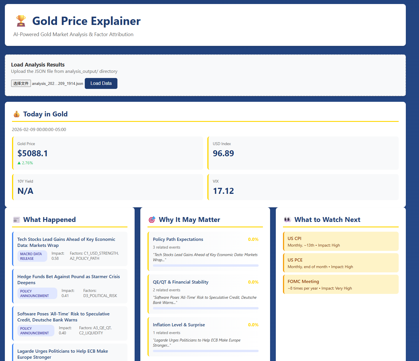
So I built a news-driven, factor-based gold market explainer that treats news not as disposable text, but as data—extracting events, mapping them into a factor ontology, and aggregating them into an interpretable time series I call the Impact Factor Curves.
The end product is a system that generates:
- a daily “Today in Gold” one-page market brief, and
- an interactive dashboard showing how different drivers rise and fall in explanatory weight over time.
What inspired me
The idea came from three threads that converged:
Personal growth journaling + AI review I was interested in how summarisation can become reflection and action, not just compression. That made me think: markets also have “daily logs” (prices + news), and what investors need is a consistent review loop.
Meeting minutes / one-page output Meeting summarisation works best when it outputs structured action items. I wanted the same for markets: not just “what happened”, but what matters, and what to watch next.
Quant research mindset In quant workflows, we care about reproducibility, structure, and time alignment. I wanted an explainability system that behaves like a research tool: stable schema, clear provenance, and auditable intermediate representations.
What I built
The system is a full pipeline that goes from ingestion → understanding → alignment → explanation → visualisation.
1) A factor ontology (6-domain framework)
I designed a structured “world model” for gold drivers, organised into six major domains:
- Monetary & Rates
- Inflation & Growth
- FX & Liquidity
- Risk & Geopolitics
- Physical Market (CB/ETF/jewellery/industrial/mining)
- Market Microstructure & Positioning
Each factor contains:
- mechanism (why it should matter),
- proxy variables,
- event types, and
- typical horizon/lags.
This ontology lives in factor_config.json and becomes the backbone for consistent tagging and explanation.
2) AI-driven event extraction (Gemini API)
Instead of summarising news into prose, I extract structured events with a strict schema:
- event type,
- actors,
- factor tags (with polarity/strength/confidence),
- mechanism path (a causal narrative template),
- uncertainty notes, and
- evidence links.
This is what allows the system to be auditable: outputs are grounded in identifiable event objects rather than free-form text.
3) Impact Factor Curves (the signature feature)
The core innovation is converting event streams into daily factor scores, producing curves that can be plotted against gold price. Conceptually:
Let (e) be an extracted event on day (d), and (f) be a factor. Then the daily factor score is:
[ S_{d,f} ;=; \sum_{e \in \mathcal{E}d} \Big( w{\text{src}}(e);\cdot; \text{strength}(e,f);\cdot;\text{conf}(e,f);\cdot;\gamma^{\Delta t(e)} \Big) ]
Where:
- (w_{\text{src}}) = source reliability weight
- strength/confidence = LLM-extracted structured values
- (\gamma^{\Delta t}) = recency decay to stop old news dominating
This gives me an interpretable time series (S_{d,f}) per factor, which becomes the “explanation layer” between news and price.
4) Daily market brief (“Today in Gold”)
Every day the system outputs a professional brief with a fixed structure:
- price snapshot and volatility context
- top events of the day
- top driving factors (based on (S_{d,f}))
- “why it may matter” explanation with traceable evidence
- “what to watch next” (macro calendar / upcoming risk)
5) Interactive dashboard
Finally, dashboard.html visualises:
- gold price vs factor curves
- factor dominance over time
- event timeline grouped by factor domains
- clickable drill-down to supporting news items
How I built it (technical architecture)
I implemented the system as modular Python components:
data_fetcher.py: pulls market time series (daily frequency for MVP)news_fetcher.py: collects and deduplicates market newsevent_extractor.py: uses Gemini to convert articles into structured eventsfactor_engine.py: aggregates events into factor score curves and computes simple analyticsgold_analyzer.py: orchestrates the end-to-end pipeline and produces daily outputs
A key design principle was separation of concerns:
- ingestion should not depend on the model,
- extraction should not depend on the visualisation,
- factor aggregation should be deterministic and testable.
Challenges I faced (and how I solved them)
1) News is ambiguous; markets are multi-causal
A single headline can map to multiple drivers, sometimes with conflicting directions. I handled this by forcing the extractor to output:
- top 1–2 primary factors (not unlimited tags),
- confidence scores, and
- mechanism paths that explain conditionality (e.g., inflation can be bullish unless it shifts rate expectations).
2) Stability and schema enforcement
LLMs drift. The same article can yield slightly different tags across runs. To reduce instability, I:
- used a strict JSON schema,
- implemented validation + retry for malformed outputs,
- constrained factor enums to the ontology file,
- and prioritised consistency over “cleverness”.
3) Avoiding false causality
It’s easy to accidentally claim “event X caused price Y.” For MVP, I focused on correlation and alignment, not strong causal claims:
- lag correlation checks (does (S_{d,f}) lead returns?),
- event-window analysis (T0/T+1/T+3 behaviour),
- and explicit uncertainty language (“historically tends to”, “suggests”, “may be consistent with”).
4) Engineering under a 3-week MVP constraint
As a solo builder, I had to aggressively cut scope:
- daily frequency only (no intraday)
- no trading signals
- no full causal inference stack
- maximum value per unit of complexity: explainability + traceability + usability
What I learned
Explainability is a system property, not a model property The biggest wins came from designing intermediate representations (events → factors → curves), not from “better prompts”.
A good ontology is a product feature Once factor definitions are explicit, everything becomes easier: tagging, aggregation, evaluation, UI.
Auditable outputs build trust Users don’t want only a narrative—they want the ability to check where it came from. Even simple evidence links dramatically improve credibility.
The “best MVP” is not prediction; it’s decision support By focusing on structured market understanding, the system becomes useful without overpromising.
What’s next (post-MVP)
If extended beyond MVP, I would add:
- macro calendar expectation vs actual (“surprise” modelling),
- regime detection (risk-on/off, liquidity stress),
- more robust causal tools (e.g., VAR/Granger, causal impact),
- multi-asset expansion (oil, FX, equity indices) using the same ontology-driven pipeline.

Log in or sign up for Devpost to join the conversation.