-
-
Open → Log → Close → See where your money went.
-
Intentional User Experience
Inspiration
GoFinancial started with a simple problem: I wanted to know where my money was actually going.
I tried tracking my daily expenses manually in a notebook. It worked when I remembered to write everything down, but once I missed a day or two, reconstructing those expenses became difficult. Banking apps helped with transfers and card transactions, but they couldn't tell the complete story—especially when cash was involved.
I realized the problem wasn't that I needed a more complicated budgeting system. I needed a faster way to stay aware of my spending.
That became the idea behind GoFinancial:
Open → Log → Close.
A lightweight expense tracker designed to make everyday spending visible without turning money management into another task you have to maintain.
What it does
GoFinancial helps users quickly record expenses and understand their spending patterns.
Instead of overwhelming users with complex budgets, financial terminology, and dashboards, the product focuses on a simple question:
Where is my money going?
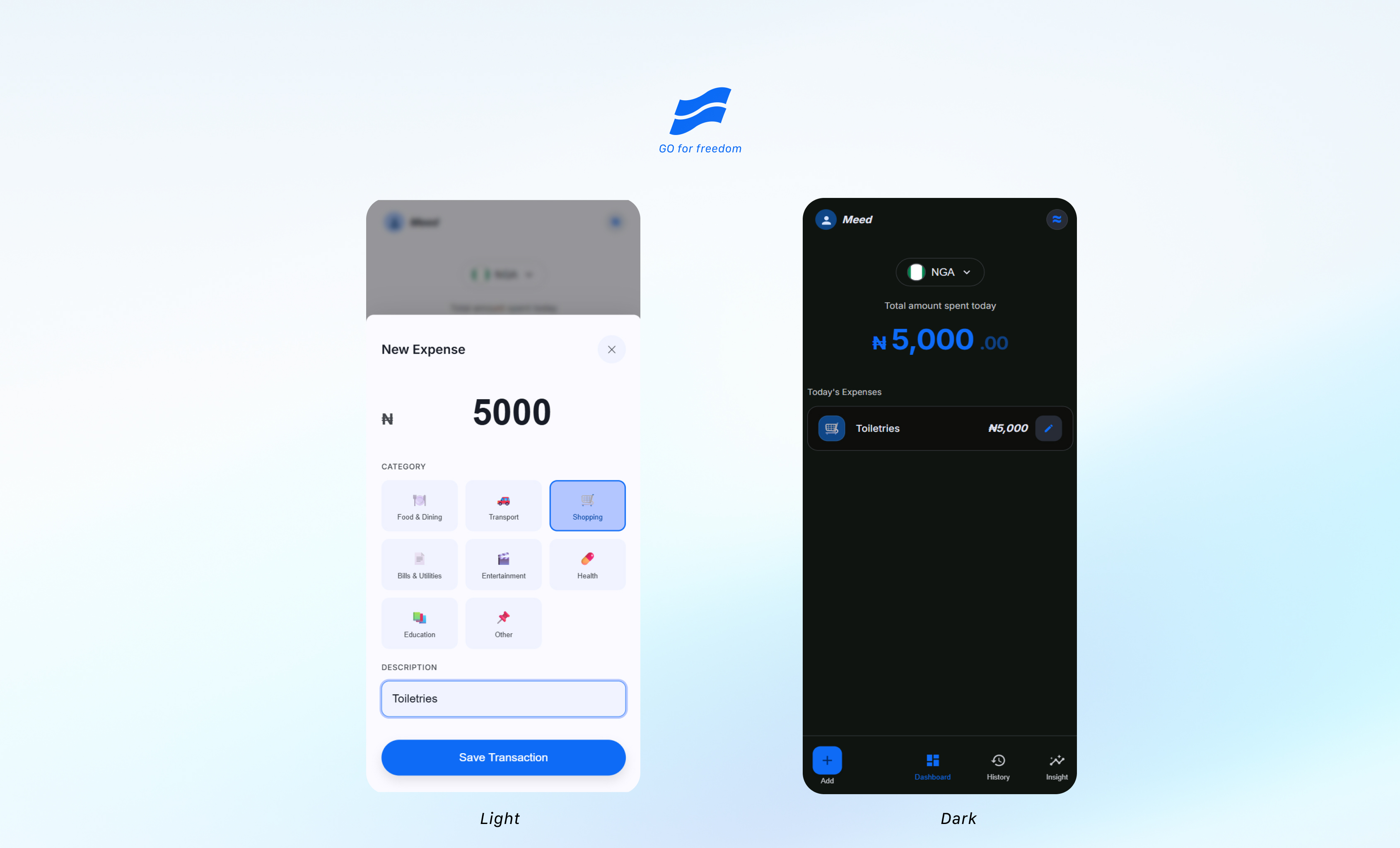
Users can log an expense in seconds, categorize it, and immediately see how it affects their daily spending.
The experience then expands that awareness across weekly and monthly views so users can understand patterns over time.
Key capabilities include:
- Quick expense logging
- Daily spending visibility
- Expense categories
- Weekly and monthly spending views
- Transaction history and calendar views
- Multi-currency support
- Expense editing and management
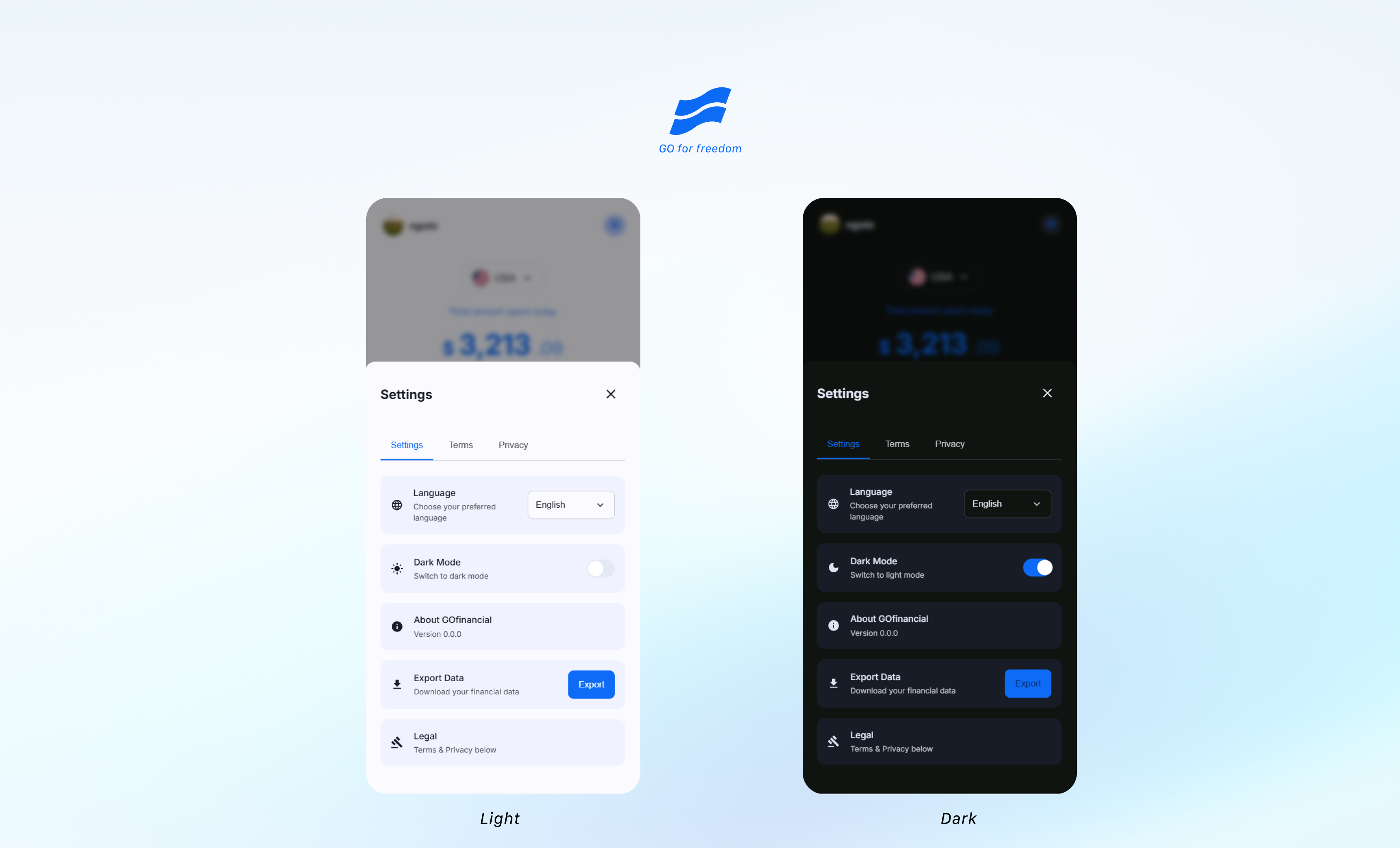
- Export functionality
- Responsive mobile-first experience
The goal is not to tell people how they must spend their money. It is to give them enough visibility to make better decisions themselves.
How I built it
I approached GoFinancial as both a product-design and engineering problem.
I first defined the core interaction around reducing the friction of recording an expense. That led to the Open → Log → Close principle: adding a transaction should require as little interruption as possible. I want it to feel more like taking notes on your phone.
As the product developed, I introduced categories so individual transactions could become useful spending patterns. Daily visibility expanded into weekly and monthly context, while history and calendar views made previous spending easier to revisit.
I also added multi-currency support because spending doesn't always happen in one currency, particularly for people who travel or manage expenses across different locations.
The application was built with technologies including:
- Next.js
- React
- TypeScript
- Tailwind CSS
- Zod
- Local-first browser storage
AI-assisted development tools also became part of my workflow. I used AI to help explore requirements, challenge implementation decisions, debug problems, and accelerate development, but I remained responsible for defining the product behavior, evaluating suggestions, and deciding what belonged in the experience.
Challenges I faced
One of the biggest lessons came from an early version of the product.
The first version expanded too quickly. I kept seeing useful features I could add, but every additional capability increased the complexity of a product whose original strength was supposed to be simplicity.
That forced me to reconsider the difference between what a product can do and what it actually needs to do.
I also encountered an important architectural problem while exploring multi-user functionality. An early implementation exposed the risk of one user's financial information becoming accessible in another user's experience.
For a financial product, that was unacceptable.
Rather than treating it as a small bug, I treated it as a product and architecture lesson: privacy and user isolation have to be designed into the system, not added after the experience is built.
That learning influenced the direction of later development and reinforced the importance of protecting the simplicity of the core product while strengthening its underlying architecture.
What I learned
GoFinancial changed how I think about building products.
I learned that adding more features does not automatically create more value.
Sometimes the better product decision is to remove friction rather than add capability.
I also learned to separate product truth from technical possibility. Just because I could build another feature didn't mean users needed it yet.
And building the product myself gave me a deeper appreciation for the relationship between design and engineering. A seemingly small UX decision can affect data structure, application state, performance, privacy, and future scalability.
Most importantly, I learned that useful products can begin with very ordinary problems.
GoFinancial started because I kept losing track of small everyday expenses, especially cash expenses.
That frustration became a product designed around one simple idea:
You cannot make informed decisions about spending you cannot see.
What's next
The next stage of GoFinancial is about making financial awareness more useful without sacrificing the simplicity of the core experience.
I am exploring how the product could eventually help users interpret their own spending patterns, not simply display charts.
For example:
- What changed about my spending this week?
- Which categories increased?
- Where am I consistently spending more than usual?
- What should I pay attention to next week?
Any future intelligence layer would be grounded in the user's actual transaction data rather than replacing financial facts with generated assumptions.
The long-term vision is simple:
GoFinancial should help people move from recording money to understanding it.
Built With
- css
- next.js
- react
- tailwind
- typescript
- vercel
- zod


Log in or sign up for Devpost to join the conversation.