-
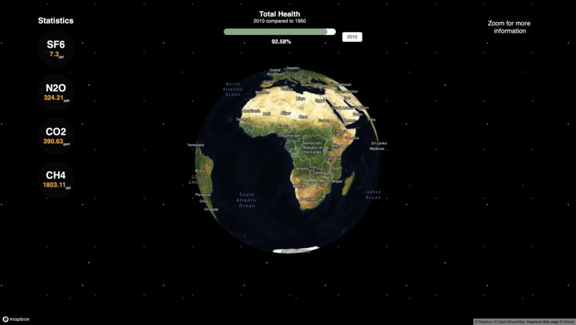
Primary Display of the Earth
-
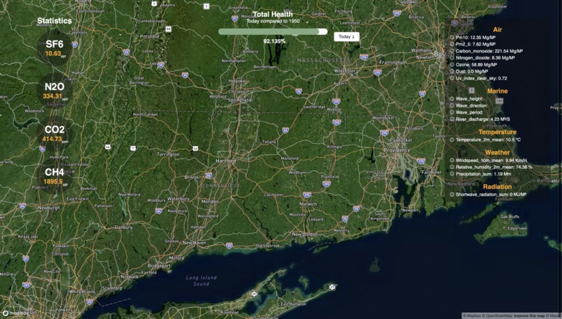
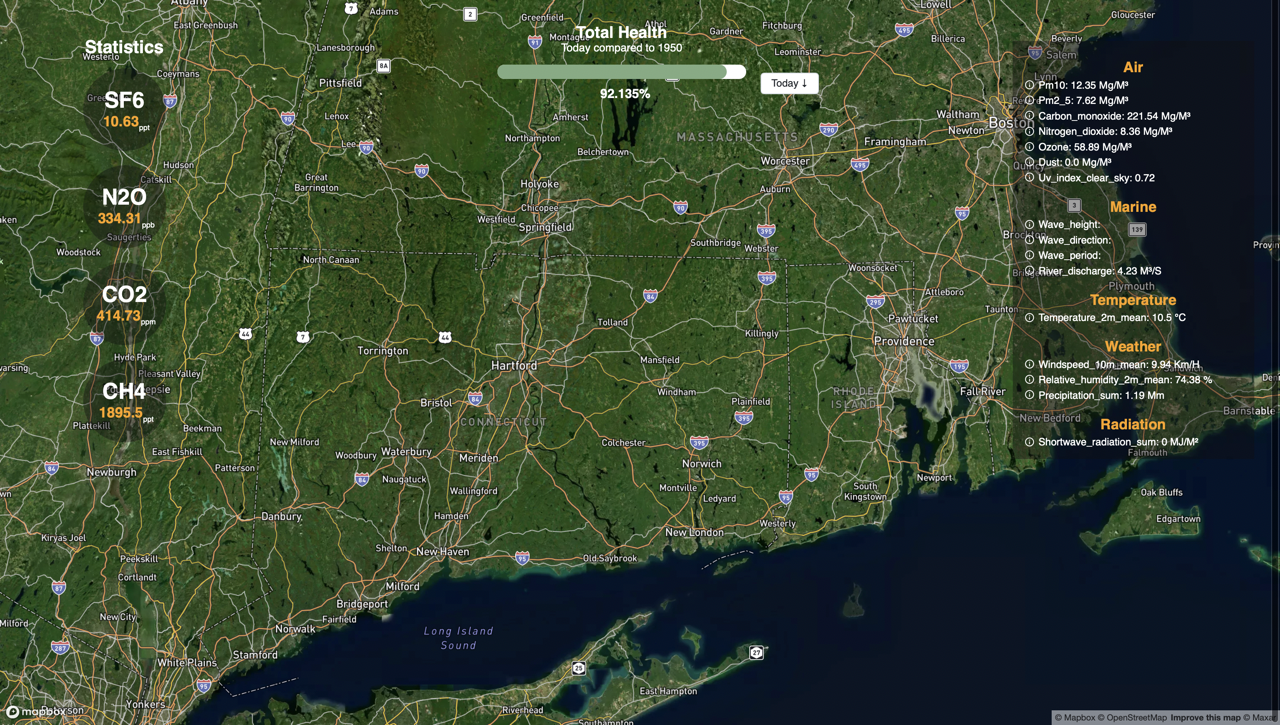
Zoomed-in Earth Display

Inspiration
While observing the vast amount of climate data available, we realized there wasn't a singular, user-friendly platform to visualize this data in real-time. We wanted to make global climate data accessible and understandable to everyone.
What it does
GlobeGlance offers an interactive 3D earth view, allowing users to zoom into regions and visualize climate impacts, from carbon emissions to tidal metrics. The data is updated in real-time, giving an accurate representation of our planet's health.
How we built it
Leveraging the power of React for the earth visualization, and integrating the lightning-quick FastAPI platform, aggregating multiple APIs from various global climate data sources, we built a seamless, real-time updating platform. The UI/UX was designed to be intuitive.
Challenges we ran into
Accurately aggregating diverse sets of climate data and presenting it in a unified format was challenging. Balancing the detail of data with user-friendliness was also a considerable hurdle.
Accomplishments that we're proud of
Successfully integrating real-time data from multiple sources into one platform. We're also proud of our user interface!
What we learned
The importance of data visualization in conveying complex information. We also learned how diverse the realm of climate data is, and the challenges of standardizing it.
What's next for GlobeGlance
We're planning to integrate more data sources, especially from underrepresented regions. We also aim to add a feature for users to contribute their local climate data and observations, making GlobeGlance a community-driven platform.
Log in or sign up for Devpost to join the conversation.