Description:
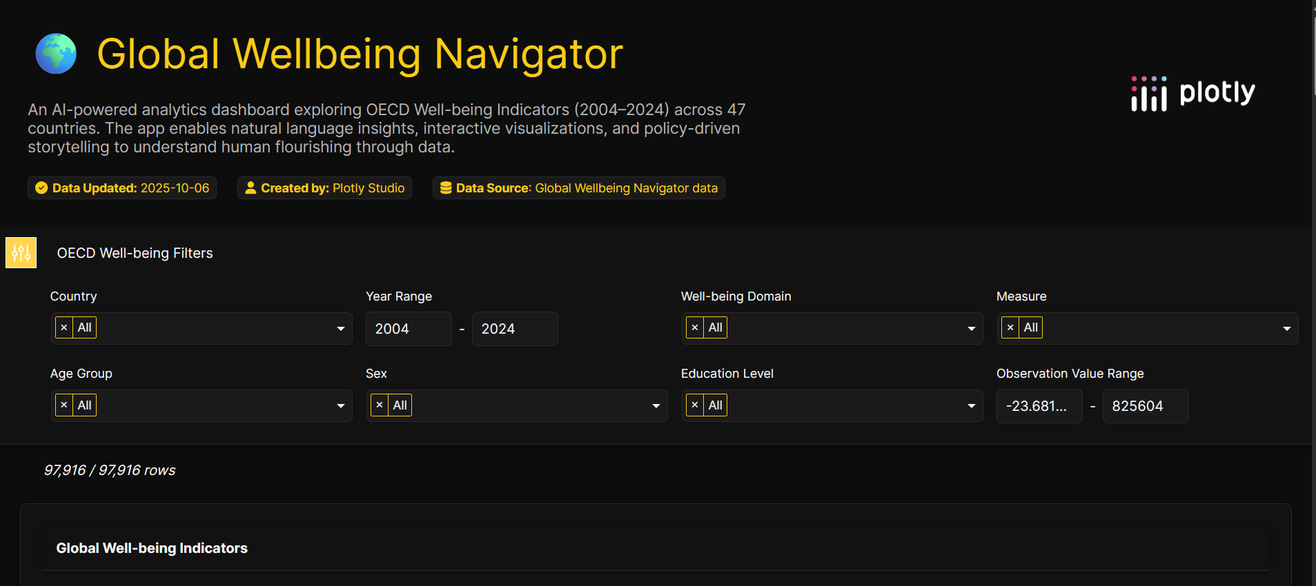
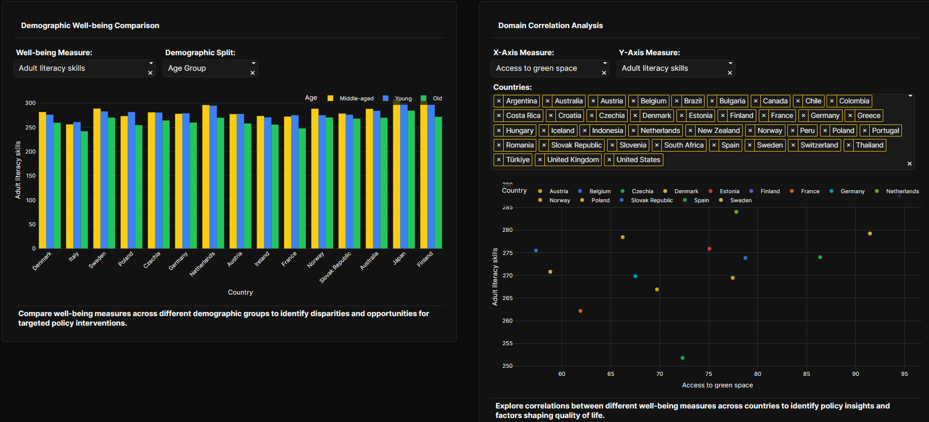
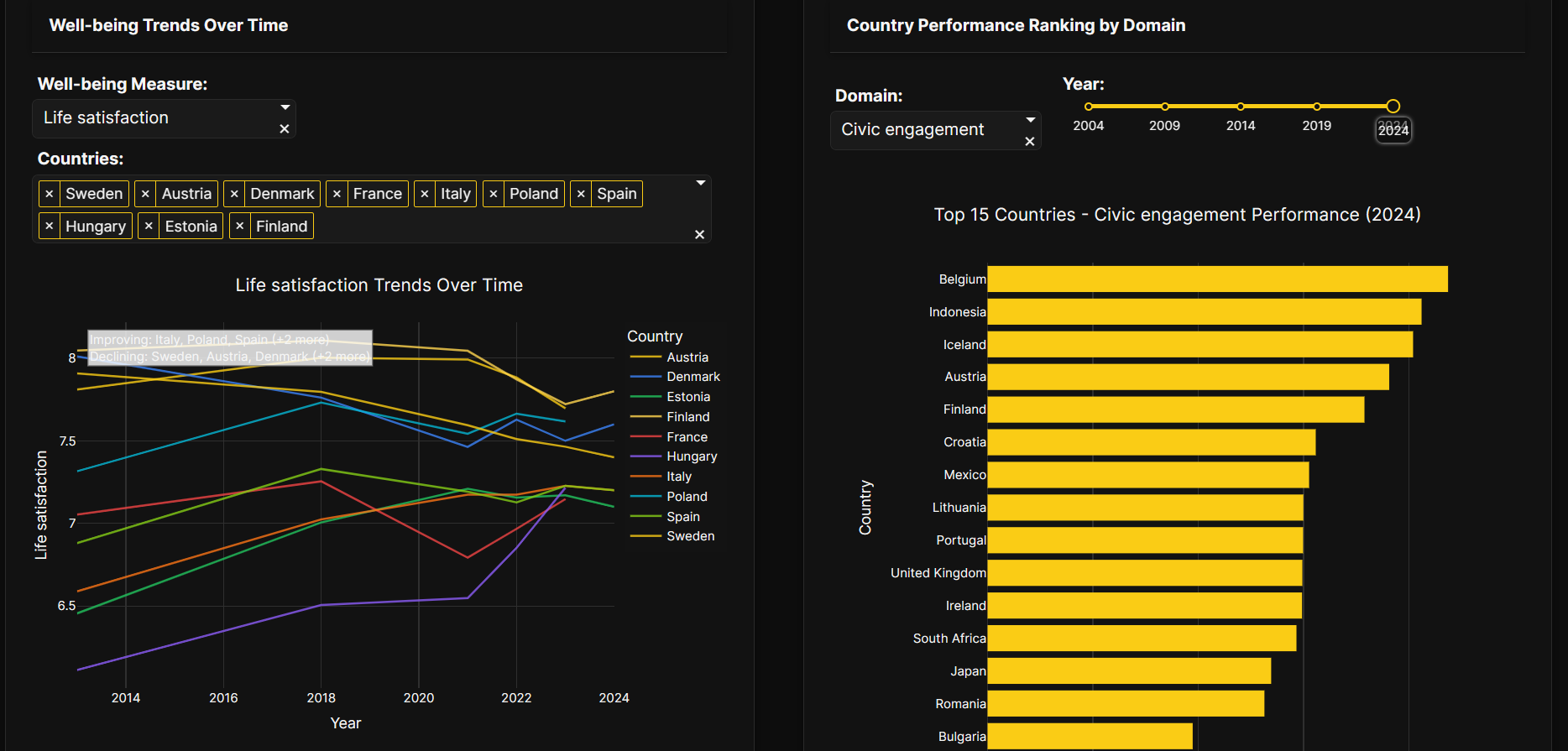
Global Wellbeing Navigator is an interactive Plotly Studio app built on the OECD Wellbeing dataset. The app combines a world choropleth, GDP vs. life satisfaction scatter, correlation heatmap, and animated trend chart with an agentic Ask AI input that turns natural-language questions into charts plus concise evidence-backed explanations. Key features include linked interactions (click a country on the map to filter all charts), rapid natural-language queries (e.g., “Compare Sweden vs Japan 2010–2020”), and an evidence-driven Story tab that highlights one validated, surprising finding and two practical policy recommendations.
Why it stands out:
The app demonstrates agentic analytics: judges can test the AI-driven query interface to generate new charts and narratives on the fly. It emphasizes reproducibility — transformations and derived fields are documented in-app — and focuses on a clear, policy-relevant narrative (education, health, and environment links to subjective wellbeing). Built entirely in Plotly Studio and published on Plotly Cloud for public access.
Tech & dataset:
Plotly Studio (Studio AI features), OECD-wellbeing.csv (provided dataset) + lightweight preprocessing for derived fields.
Built With
- oecd-wellbeing.csv
- plotly


Log in or sign up for Devpost to join the conversation.