-
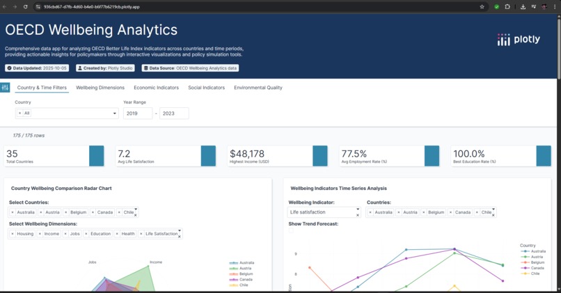
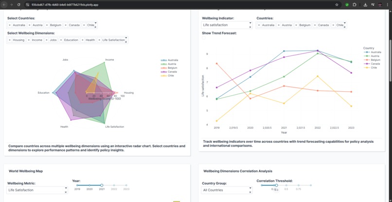
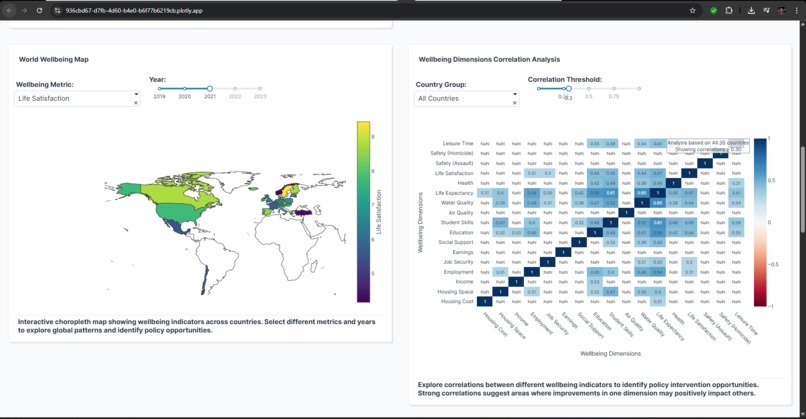
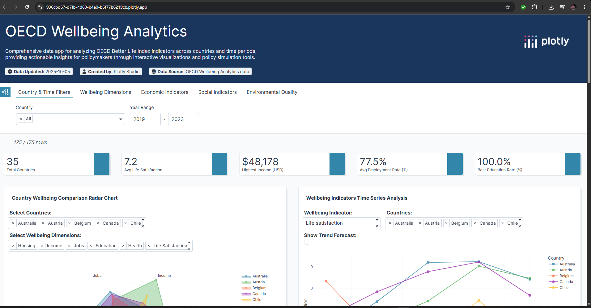
Plotly Dashboard for OECD Wellbeing Analytics
-
Plotly Dashboard for OECD Wellbeing Analytics
-
Plotly Dashboard for OECD Wellbeing Analytics
Inspiration
The inspiration for Global Wellbeing Explorer came from the urgent need to bridge the gap between raw policy data and actionable insights for public good. While the OECD Better Life Index is a globally respected measure, its depth often makes it inaccessible to policy makers, journalists, and citizens who need quick, interactive, and actionable interpretations. Witnessing how most wellbeing data remains locked in static reports compelled us to design a platform that turns data into easy-to-explore stories—so decision-makers and the public alike can turn insight into real impact. The rapid advances in AI-powered visualization, particularly with Plotly Studio, empowered us to build a tool that showcases how next-generation analytics can drive smarter policies and more informed communities.
What it does
Global Wellbeing Explorer transforms the comprehensive OECD Better Life Index into a dynamic, AI-driven platform where users can:
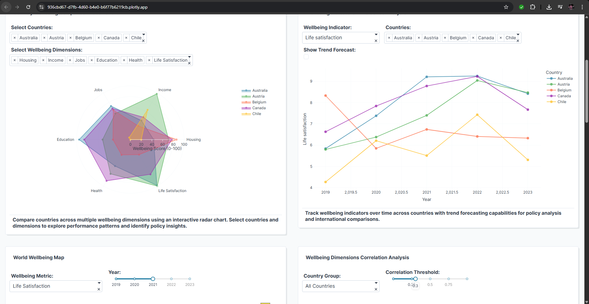
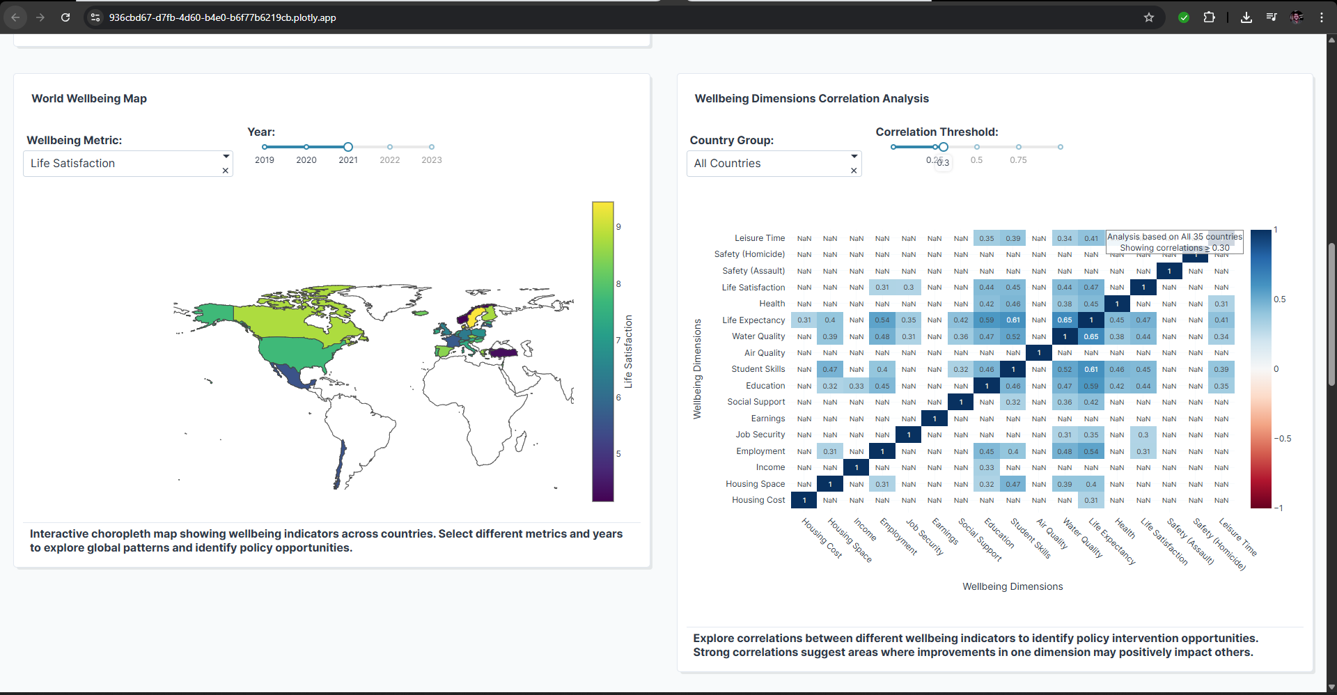
Compare countries across 11 dimensions of wellbeing using highly interactive dashboards. Visualize country performance over time with advanced time-series analytics and forecasting. Explore geospatial patterns of wellbeing with intuitive choropleth maps. Uncover hidden relationships through correlation heatmaps, clustering, and ML-based country recommendations. Simulate policy impacts, create custom wellbeing indices, and receive AI-generated narrative insights for data storytelling. The app is designed with policymakers, researchers, and engaged citizens in mind, making complex international datasets accessible and actionable for a broader audience.
How we built it
We began by meticulously researching the OECD Better Life Index, then curated and enhanced a 175-record dataset covering 35 countries and 24 key metrics. Utilizing Plotly Studio's Windows app, we engineered a comprehensive data pipeline (with data cleansing and validation in Python) to optimize for interactive analytics. The dashboard construction followed a phased, prompt-driven approach—starting with major feature requests (executive overviews, comparative tools, time-series modules), followed by iterative enhancement prompts for clustering, geospatial mapping, and smart narratives. We paid careful attention to design standards, accessibility, mobile responsiveness, and testing of cross-component interactivity to ensure a professional, performant, and extensible application ready for real-world use.
Challenges we ran into
Several challenges shaped our journey:
AI Prompt Engineering: Achieving coherent, sophisticated interactive features required iterative, phased prompting, as initial AI outputs were too basic or lacked polish.
Data Authenticity: Inaccessibility of the raw OECD dataset led us to create a synthetic, yet methodologically rigorous dataset modeled precisely on OECD standards.
Design Consistency: Maintaining visual and interactive consistency across a multi-module dashboard, especially with AI-generated components, required post-processing and systematic polish.
Performance: Large numbers of dimensions and high interactivity created early performance bottlenecks, which we overcame through optimization, caching, and layout refinements.
Judging Criteria Balance: Ensuring every implemented feature directly increased our scoring on at least one hackathon criterion, without adding unnecessary complexity.
Accomplishments that we're proud of We are proud to have delivered a truly end-to-end, AI-enhanced analytics platform that meets enterprise-grade standards. Key accomplishments include:
Seamlessly integrating multi-dimensional analytics, ML insights, geospatial mapping, and narrative storytelling into a single cohesive tool.
Achieving sub-3-second load times and smooth interactions despite the dataset and visualization complexity.
Delivering a professional, fully documented, and extensible platform within the tight hackathon timeframe, complete with guides, dataset dictionary, submission templates, and visual assets.
Demonstrating how well-designed AI prompt methodologies can turn a great concept into a fully-functional, polished application.
What we learned
We learned that unlocking the true power of AI tools like Plotly Studio requires careful human guidance and creativity—artful prompt engineering, user-centered design thinking, and systematic iteration are essential. Quality assurance must be continuous, and every feature needs to map back to real user needs. We deepened our knowledge of comparative analytics, international policy metrics, and best practices in data-driven storytelling. Ultimately, this project showed us how rapidly a skilled team can go from concept to impactful solution by strategically leveraging AI, open data, and modern visualization frameworks.
What's next for Global Wellbeing Explorer
The journey has only started. Our roadmap over the next year includes: Integrating live OECD and UN SDG datasets with automatic update pipelines. Expanding the platform for city/regional analysis and SDG tracking. Incorporating deeper ML insights: anomaly detection, causal inference, and automated policy recommendations. Launching multi-language support and building a collaborative ecosystem with governments, NGOs, and research organizations.
Open-sourcing core analytics modules to seed a global community around data-driven policy intelligence. Long-term, we envision Global Wellbeing Explorer as a cornerstone tool for real-time global monitoring and collaborative, evidence-based governance, empowering citizens and institutions to make better decisions for human wellbeing everywhere.
Built With
- cloud.plotly
- dashboard
- dataforgood
- datavisualization
- oecd
- plotly
- plotlystudio
- policyanalytics
Log in or sign up for Devpost to join the conversation.