🌍 Inspiration
In a world where data defines policy, I wanted to explore what truly shapes human wellbeing beyond numbers — how happiness, health, income, and education interconnect across the globe. The OECD Wellbeing Dataset offered the perfect foundation to visualize these complex relationships and uncover patterns that can inspire better decisions for global happiness.
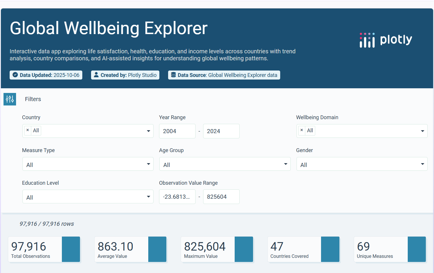
💡 What It Does
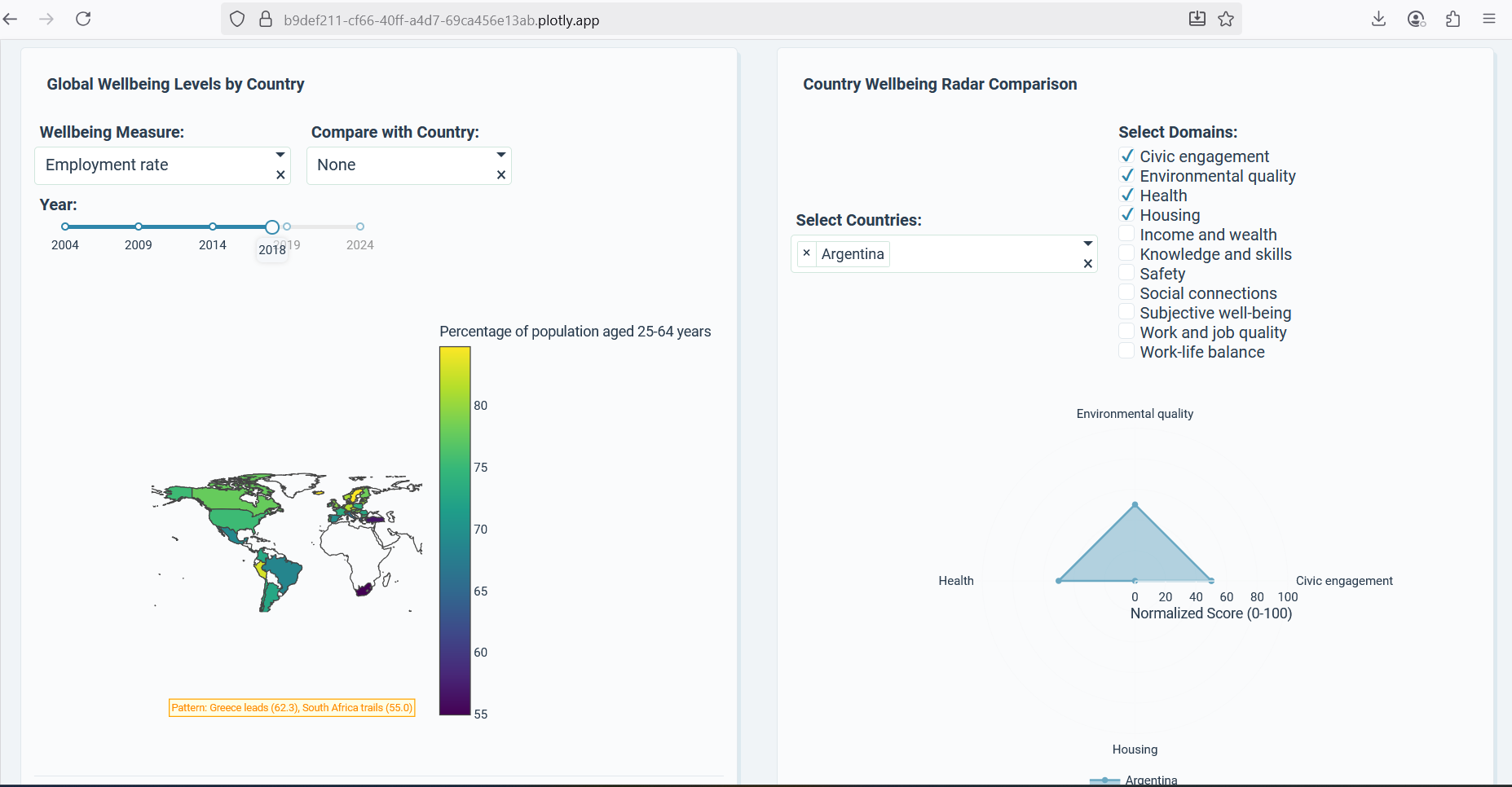
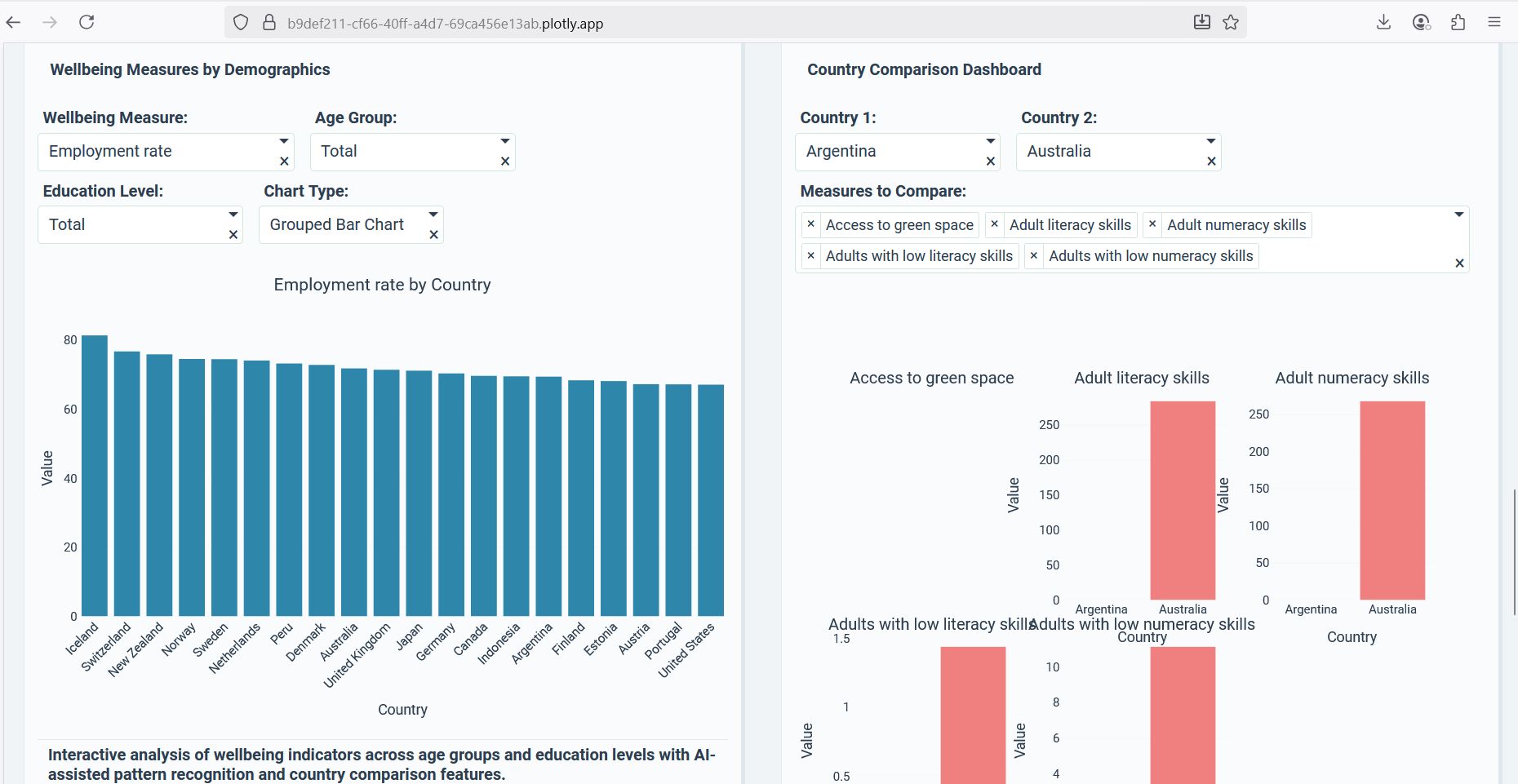
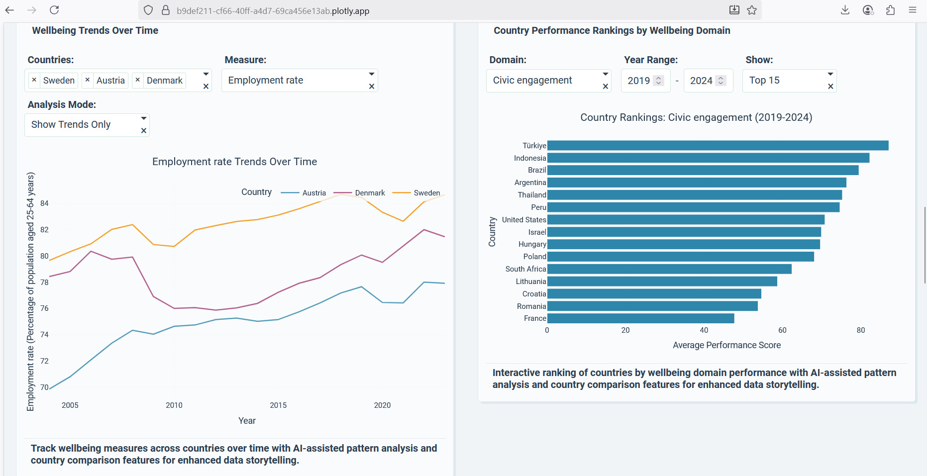
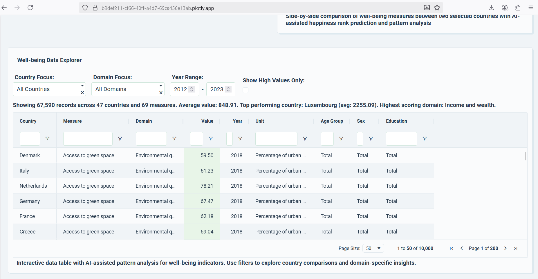
Global Wellbeing Explorer 2.0 is an interactive data storytelling dashboard built using Plotly Studio. It visualizes global wellbeing indicators across countries and years through beautiful, interactive maps, radar charts, and correlation plots.
Users can:
- Compare countries side-by-side on life satisfaction, education, and health.
- Explore wellbeing trends over time.
- Discover insights on how economic growth impacts happiness and inequality.
- Engage with an intuitive interface designed for exploration and learning.
🛠️ How I Built It
I used Plotly Studio to design, visualize, and deploy the entire project.
- Cleaned and processed the OECD Wellbeing Dataset.
- Designed multiple interactive visual components — map views, line charts, and radar plots.
- Created dynamic filters for country and year selection.
- Styled the layout for clarity, accessibility, and aesthetic appeal.
- Deployed the final interactive dashboard via Plotly Cloud for public access.
🚀 What I Learned
- Mastered the power of Plotly Studio for advanced visualization.
- Learned how to balance design and insight — making complex data understandable.
- Discovered how global indicators intertwine in surprising ways, revealing that wellbeing is more than economic growth.
🧩 Challenges I Ran Into
- Cleaning and normalizing diverse indicators from the dataset.
- Maintaining performance while keeping the dashboard interactive.
- Ensuring that visual storytelling felt smooth and intuitive rather than overwhelming.
🌟 Accomplishments That I’m Proud Of
- Delivered a visually engaging and meaningful data experience.
- Simplified complex global data into clear, relatable insights.
- Showcased how data visualization can drive awareness about real-world wellbeing disparities.
🔮 What’s Next
I plan to:
- Integrate AI-generated insights that summarize trends in natural language.
- Add predictive analytics for future wellbeing forecasting.
- Expand with real-time data updates from global APIs.
📊 Conclusion
Global Wellbeing Explorer 2.0 isn’t just a dashboard — it’s a story of humanity through data. It encourages people, policymakers, and researchers to see the bigger picture: how the pursuit of happiness connects us all.
Built With
- analytics
- data-storytelling
- data-visualization
- global
- insights
- interactive-dashboards
- oecd-wellbeing-dataset
- plotly-cloud
- plotly-studio
- python-(for-preprocessing)
- wellbeing


Log in or sign up for Devpost to join the conversation.