-
-

1
-
2
-
3
-
4
-
5
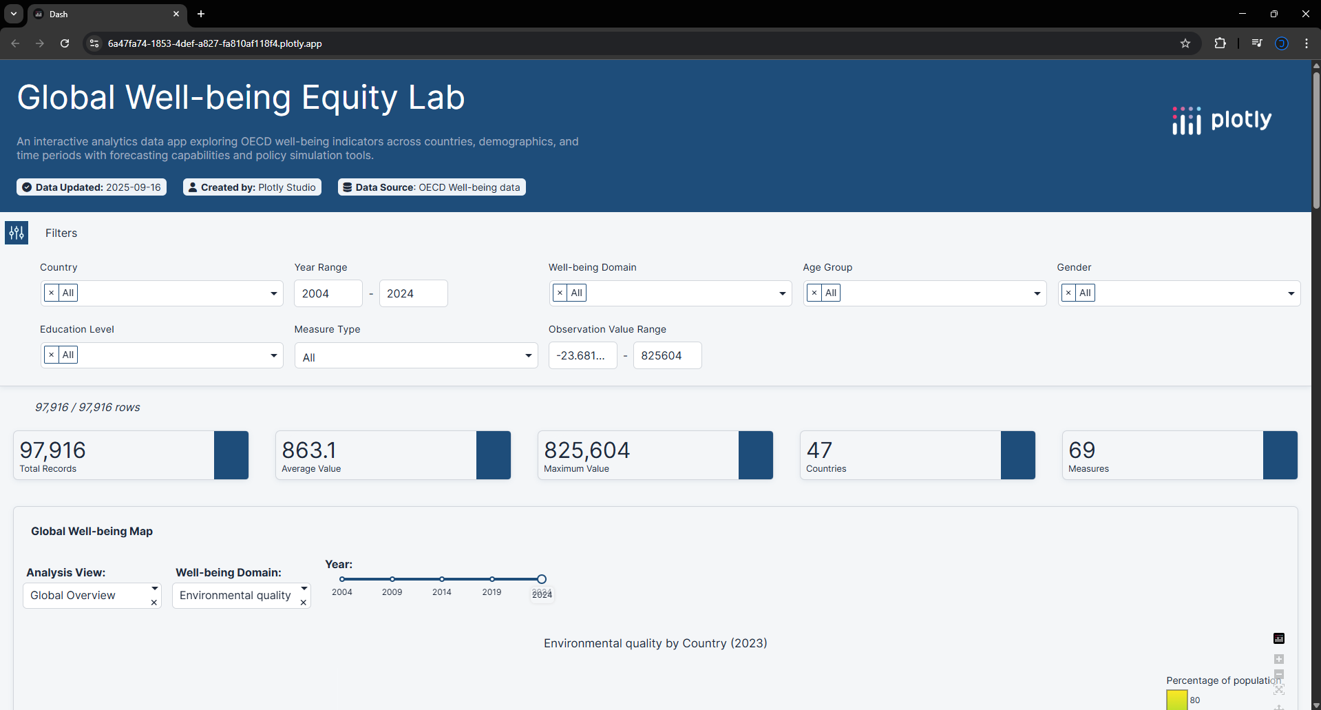

“Global Well-being Equity Lab”
- Theme: Global Policy Research
- Dataset: Pre-selected OECD Wellbeing dataset
- Demo: https://6a47fa74-1853-4def-a827-fa810af118f4.plotly.app/
- Core Value: A one-stop, AI-assisted global well-being insights dashboard that tells a story: 🌍 Where the world stands → 📈 How it’s changing → ⚠️ What’s at risk → ⚖️ Who’s left behind → 💡 How to fix it → 🧠 What it all means
📊 Final App Modules & Charts
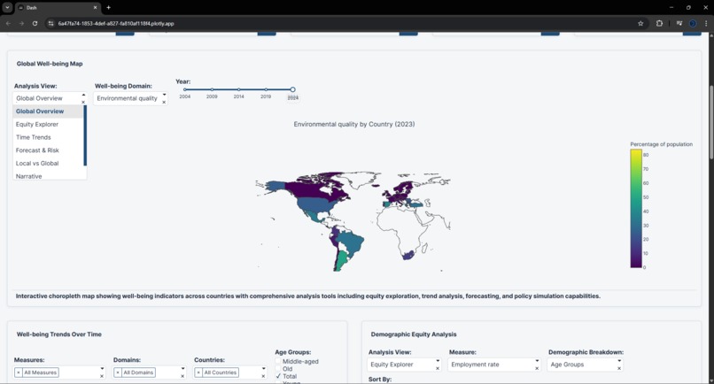
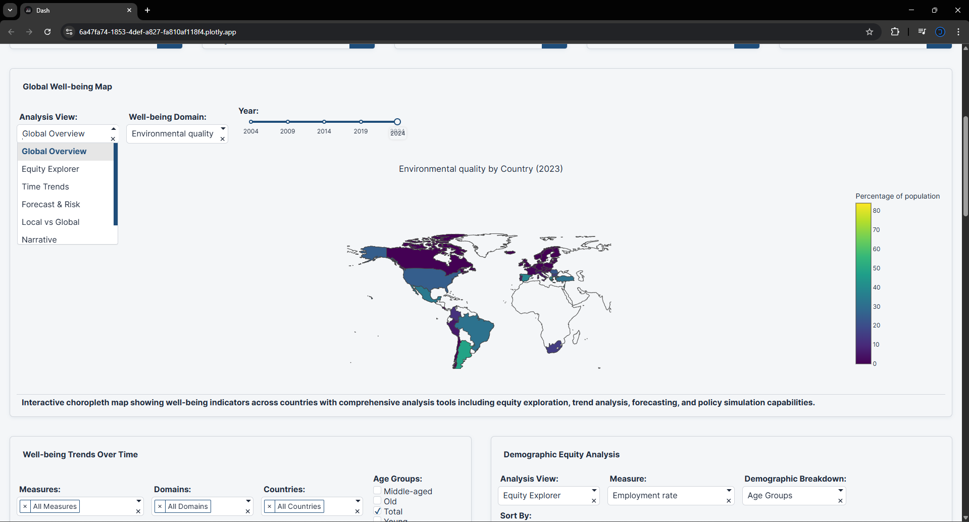
1. 🌍 Global Well-being Overview
Chart: Choropleth map
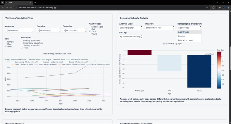
2. 📈 Trends & Events Over Time
Chart: Multi-line time series
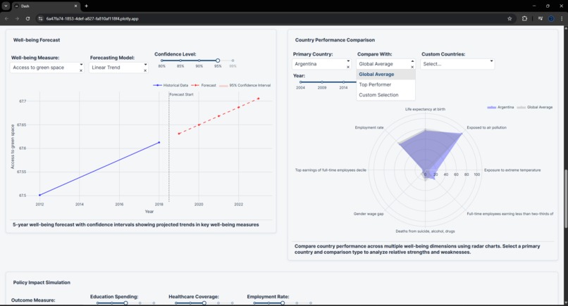
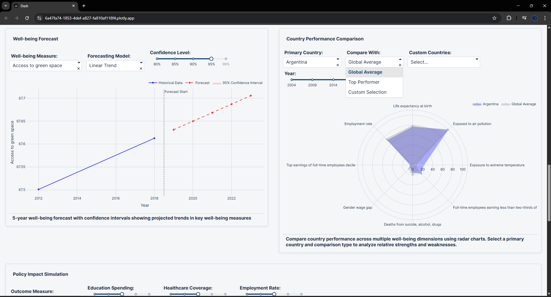
3. ⚠️ Risk Forecast Radar
Chart: Forecast line chart
4. ⚖️ Country Performance Benchmark
Chart: Radar chart
5. 🧍♀️🧍♂️ Equity Gap Trends
Chart: Slope chart (gap change)
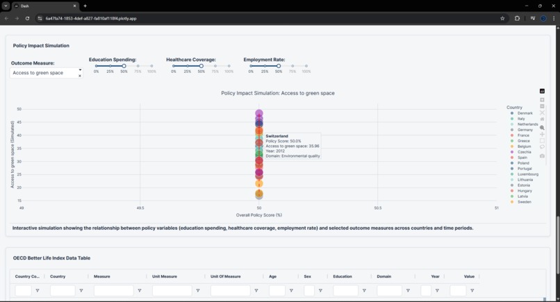
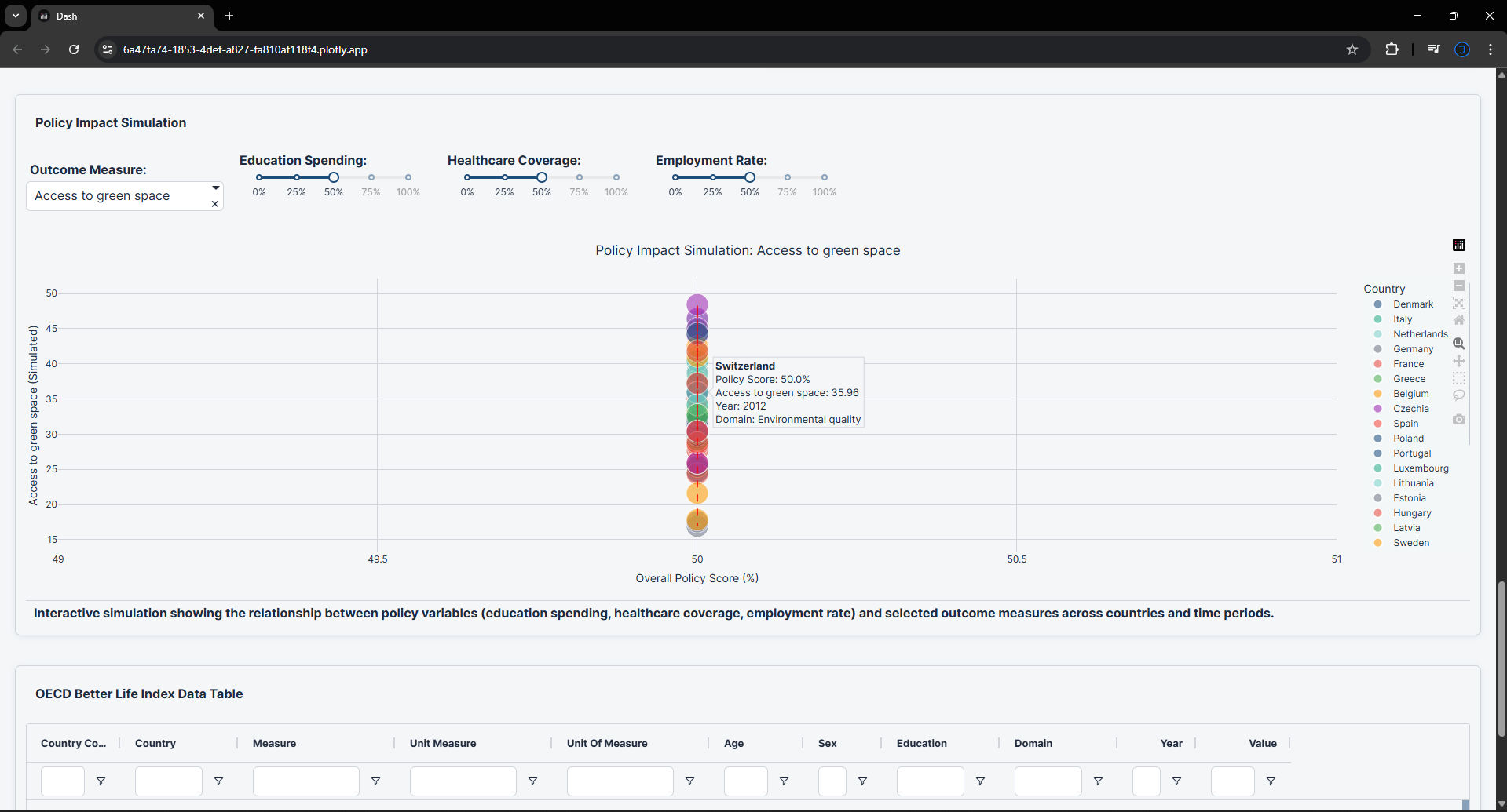
6. 💡 Policy Impact Simulator
Chart: Dynamic radar or gauge
7. 🧠 Narrative Insight Panel
Not in dashboard because ran out of tokens to reformat layout, and the app prevented me from manual edit, so it was impossible to add chart in.
Chart: Text panel (auto-generated)

Log in or sign up for Devpost to join the conversation.