-
Global well being
-
-
-

-
-
-
-


Inspiration
We live in a world overflowing with data — yet understanding what truly drives human well-being remains one of humanity’s greatest challenges.
The Global Well-being Data App was born from the idea of transforming complex global indicators into a single, interactive experience that tells the story of human progress. It’s not just about numbers — it’s about uncovering patterns of happiness, equity, and opportunity as they evolve across countries, generations, and communities.
💡 What It Does
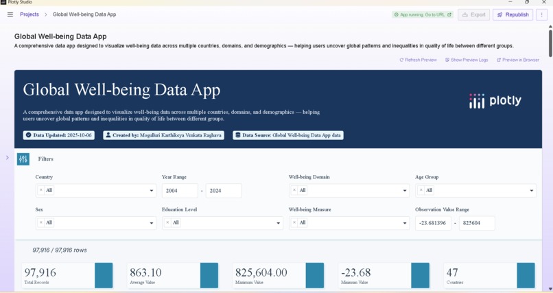
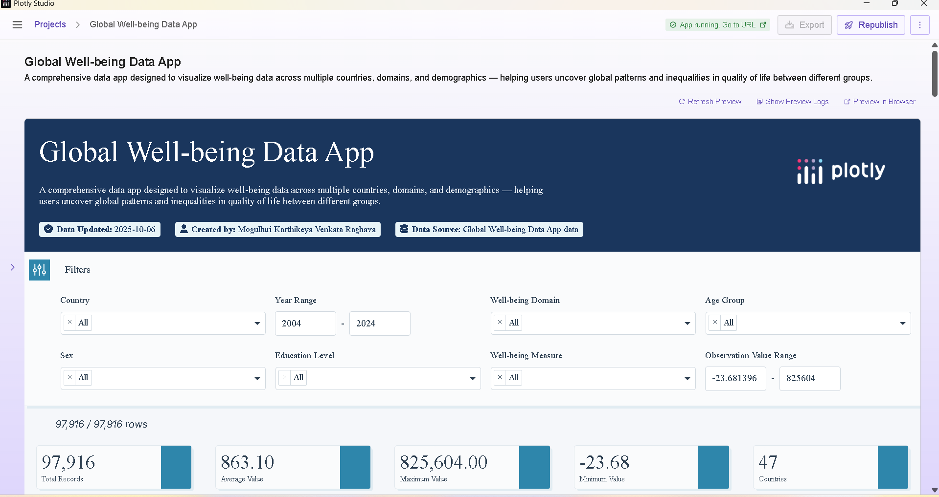
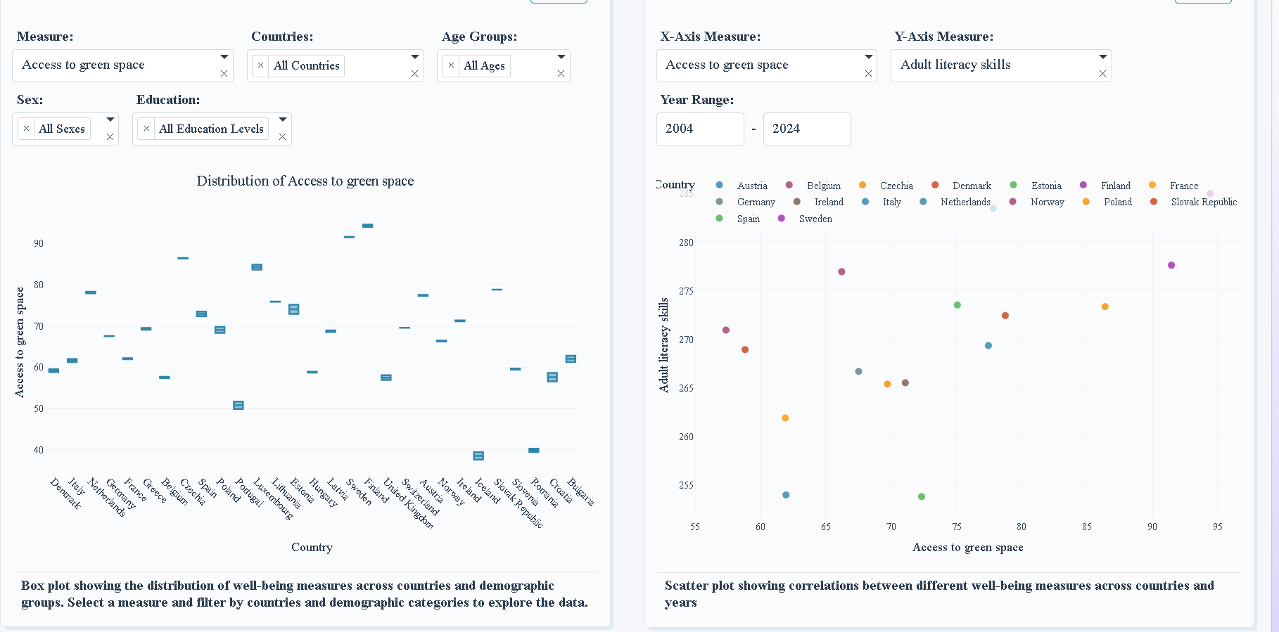
Global Well-being Data is an interactive analytics dashboard that visualizes key well-being indicators across 47 countries and multiple demographic dimensions such as age, gender, and education. It empowers users to:
- 🌍 Explore and compare well-being trends across time, regions, and nations
- 📊 Visualize relationships between domains like health, work, education, safety, and wealth
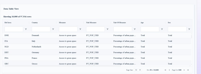
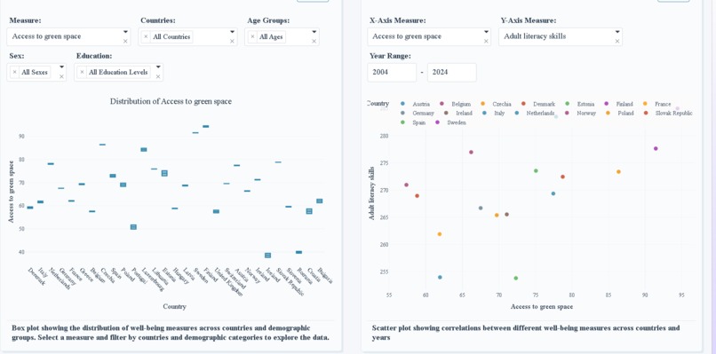
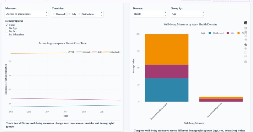
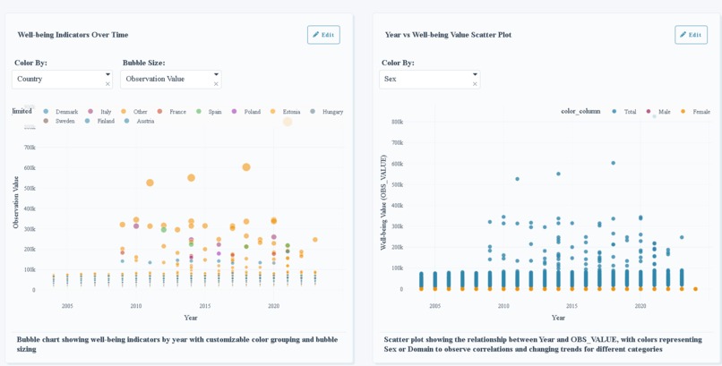
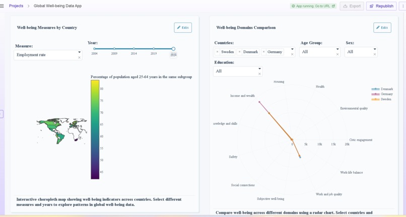
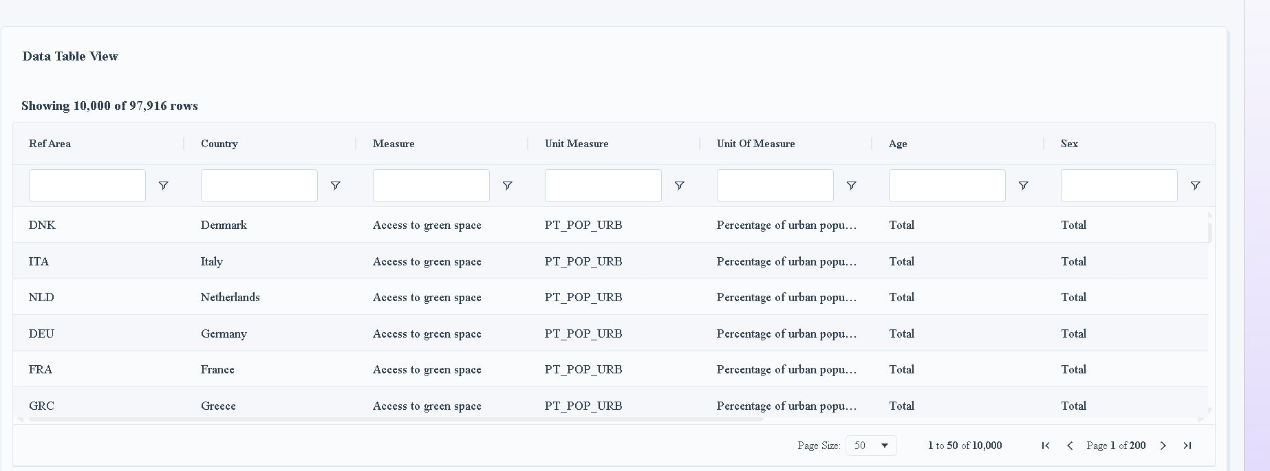
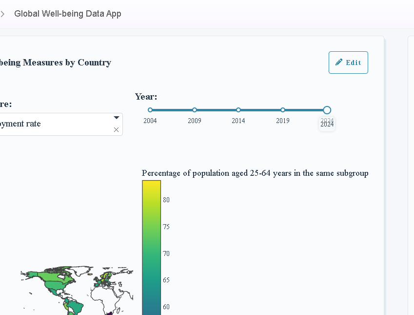
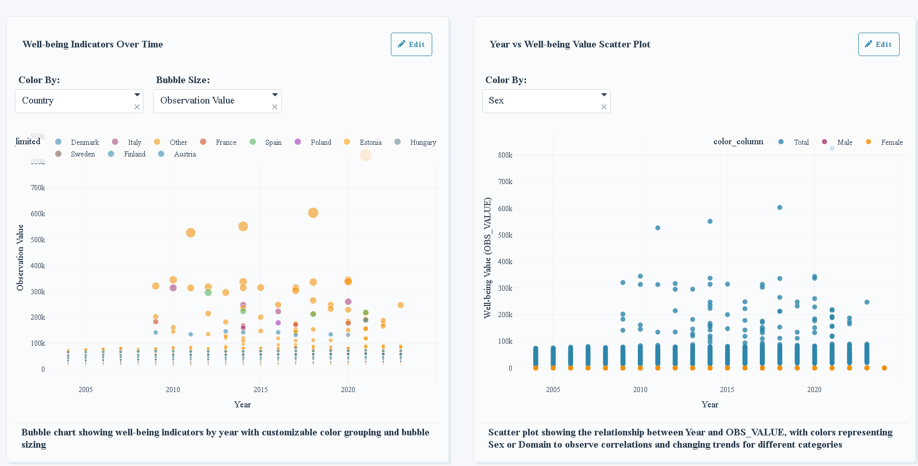
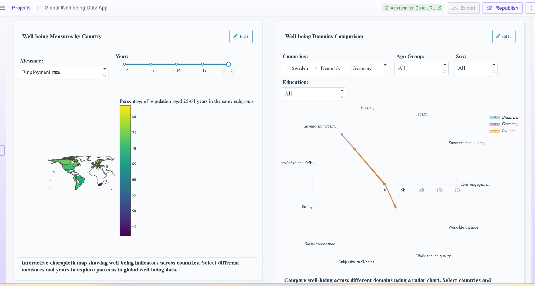
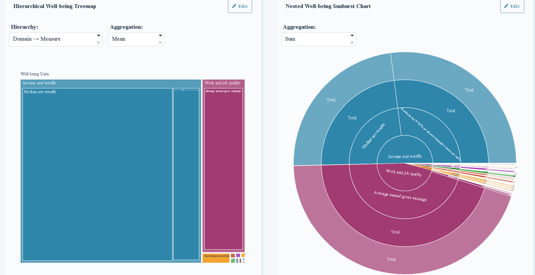
- 🔍 Reveal disparities and patterns in measures like access to green space, employment rates, or adult literacy The app transforms raw global statistics into meaningful, story-driven visuals through bubble charts, scatter plots, choropleth maps, box plots, radar charts, tree maps, and sunburst charts — all unified within a clean, modern, and responsive design. Researchers, policymakers, and citizens alike can use the dashboard to make data-backed decisions for a more equitable and sustainable future.
🛠️ How We Built It
Built with Plotly Dash, Python, Pandas, and Plotly Express, the dashboard processes nearly 100,000 global records into an intuitive, high-performance visualization system. The layout integrates dynamic filters, modular components, and responsive grids to deliver seamless, real-time insights. Every chart updates instantly when users adjust parameters such as Country, Year Range, Sex, Education, or Domain, ensuring a highly personalized data exploration experience. The design embraces a teal–navy–aqua theme, symbolizing trust, balance, and growth — achieving the perfect blend of analytical precision and aesthetic clarity.
⚙️ Challenges We Ran Into
- 🧩 Harmonizing diverse datasets with varying formats, measures, and demographic structures.
- ⚡ Optimizing performance and interactivity with nearly 100k+ records.
- 🎨 Designing a layout that remains both analytically powerful and visually intuitive for non-technical audiences.
🏆 Accomplishments We’re Proud Of
- 🚀 Developed a multi-visual, high-performance data app from the ground up
- 🎯 Delivered a visually consistent and professional UI that balances clarity with depth
- 🌐 Built a global storytelling platform that transforms complex well-being metrics into understandable, human-centered insights
What we learned
We discovered how powerful data storytelling can be when design and analytics work together. This project deepened our understanding of interactive dashboard architecture, data preprocessing, and user-centered visualization design in Plotly Dash. Most importantly, we learned how to make global data feel human, connecting numbers to narratives of progress, happiness, and equality.
🚀 What’s Next for Global Well-being Data
Next, we plan to expand the dataset to include real-time well-being indices, regional subcategories, and SDG-aligned metrics. We also aim to integrate machine learning models for predictive insights and trend forecasting — helping users anticipate well-being shifts based on economic, social, and environmental changes. Our next phase focuses on making the project smarter, richer, and more accessible:
- 🔄 Integrate real-time global well-being indices and SDG-aligned metrics.
- 🤖 Add AI-based forecasting and predictive analytics to project future well-being trends.
- 🌏 Launch a public data storytelling platform for researchers, educators, and policy leaders to explore and compare insights worldwide. Finally, the goal is to deploy the dashboard as a public data storytelling platform where anyone can explore, compare, and visualize well-being progress across the globe.


Log in or sign up for Devpost to join the conversation.