Inspiration
The project was inspired by the idea that data should empower better decision-making. Well-being is a complex concept, and we wanted to make it more accessible through intuitive maps, trend charts, and AI-powered insights.
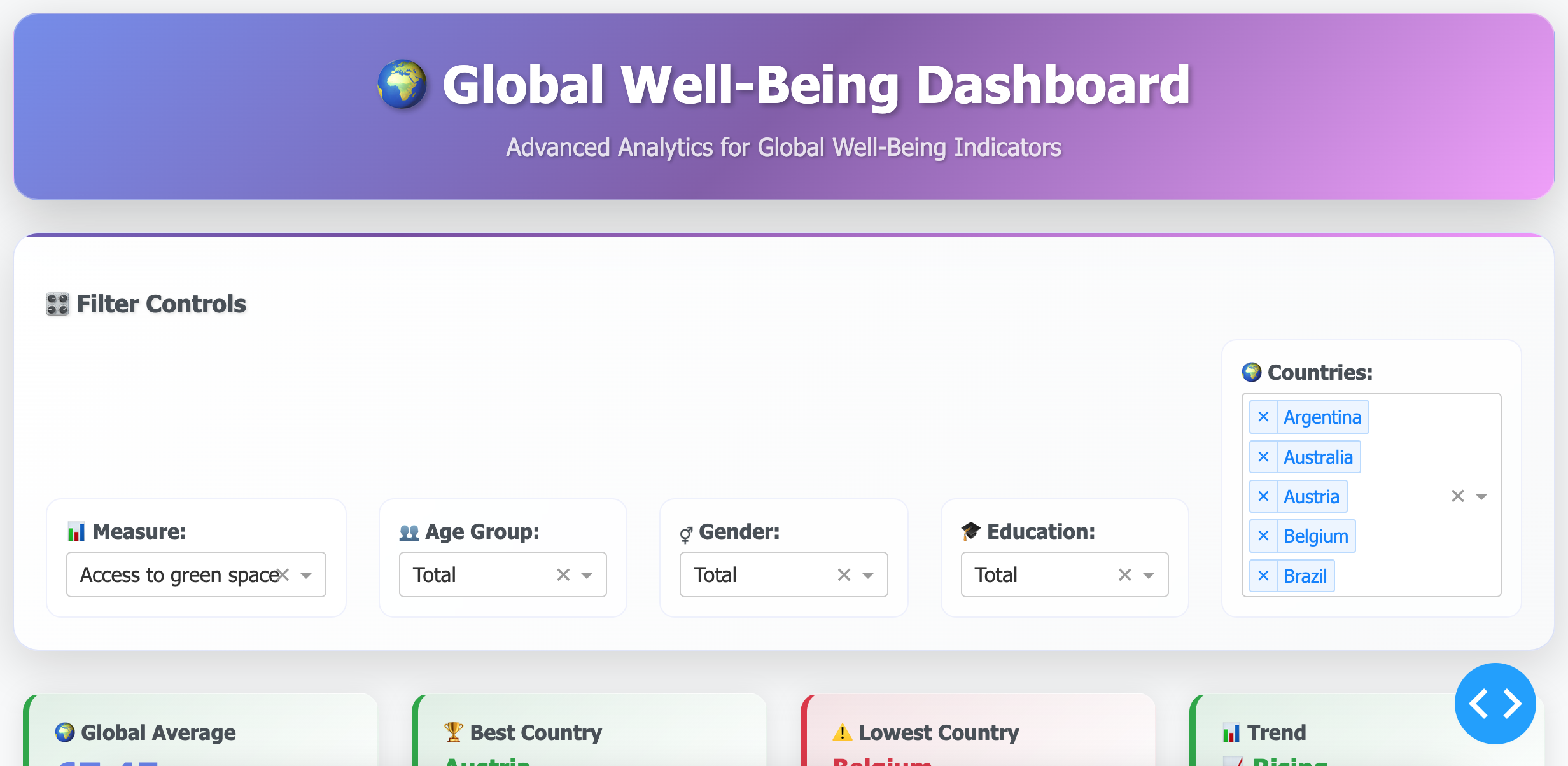
What it does
The Global Well-Being Dashboard was created to provide an interactive way to explore how different countries perform across well-being indicators such as health, income, education, and life satisfaction. We wanted to combine data storytelling with visualization so that users can quickly identify global trends and disparities.
How we built it
Data: We used global well-being datasets containing measures across multiple countries and years. Tools: Built with Dash, Plotly, Pandas, and deployed on Plotly Cloud.
Features: 🌐 Map Tab – visualize country-level indicators with choropleth maps. 📈 Trend Tab – explore time series trends for each measure. 📊 Correlation Tab – compare relationships between well-being dimensions (e.g., income vs. life satisfaction). 🤖 AI Insights – auto-generate summaries such as top-performing countries, global averages, and recent trends.
Challenges we ran into
- Handling large datasets efficiently while keeping the dashboard responsive.
- Ensuring proper deployment to Plotly Cloud (dependency management, app.py + requirements.txt).
- Designing a dashboard that balances data depth with ease of use.
Accomplishments that we're proud of
- Built a fully interactive dashboard with multiple views (map, trend, correlation, AI insight) in less than the challenge timeframe.
- Successfully integrated and cleaned a large global dataset (97k+ rows) into meaningful visualizations.
- Designed an AI Insight feature that automatically generates data-driven summaries — making the dashboard more engaging and user-friendly.
- Improved the user experience (UX) by using tabs for navigation, clear visual hierarchies, and intuitive dropdown filters.
- Learned how to deploy a Dash app to Plotly Cloud with proper environment setup (requirements.txt + app.py).
Transformed complex well-being data into a tool that could be used by policymakers, researchers, and students alike.
What we learned
-How to build modular Dash applications with multiple tabs and callbacks. -Techniques for cleaning and transforming large datasets for visualization. -The importance of UX/UI in data dashboards (simple, accessible, and informative).
What's next for Global Well-Being Dashboard
Add predictive modeling for future well-being trends. Enable user-uploaded datasets for custom analysis. Integrate with APIs (e.g., World Bank, UN data) for real-time updates.


Log in or sign up for Devpost to join the conversation.