Inspiration
The topics of the Embedded Systems were Eco Friendly or Visualization, and I decided to combine them. I chose climate change because I thought it would be very cool to see the actual change in temperature at each country, and I found a website called Our world in data and that kickstarted the whole project
What it does
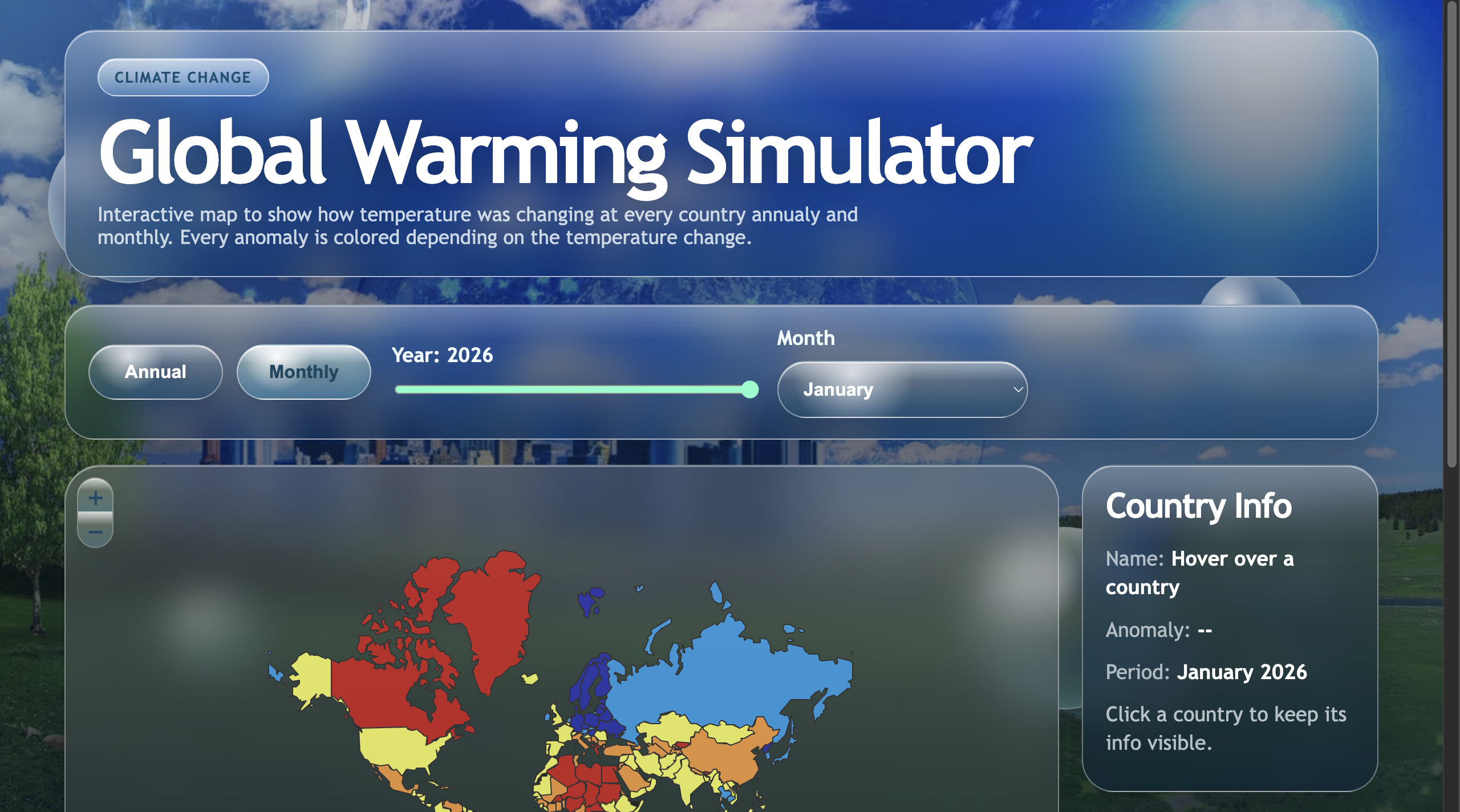
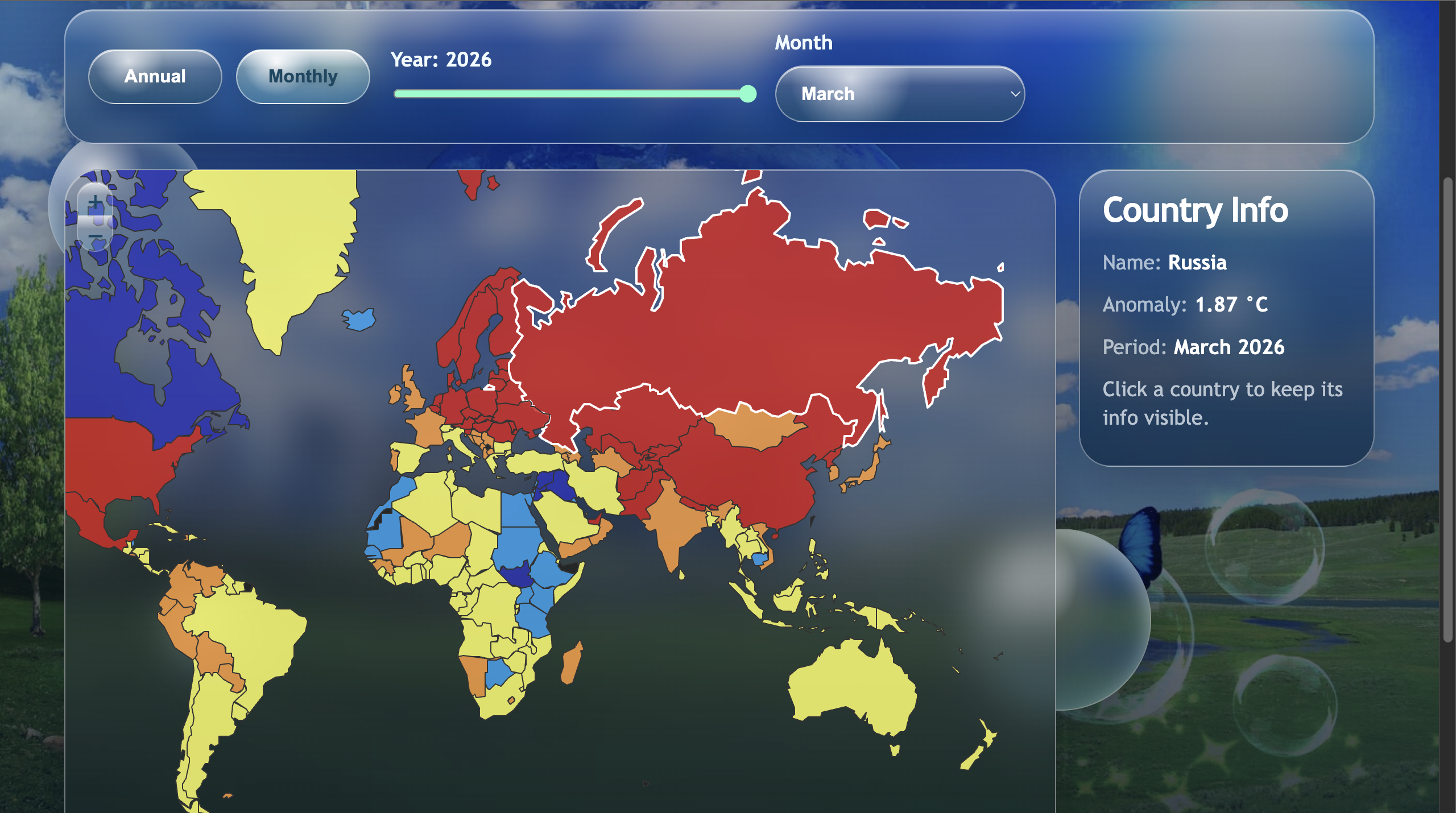
It shows temperature anomalies on an interactive map, where you can click on any country and fix that data on the screen. It's pretty simple, but I did focus mostly on the implementation of the visualization, so the website itself is just pretty, but not really functional.
How we built it
I built it using a leaflet interactive map, using a simple web app in Python to handle the backend that gets the data from a csv file downloaded from Our World In Data, and a simple frontend to wrap it up with a frutiger aero/eco friendly design.
Challenges we ran into
The hardest part was probably the backend. One specific problem was to divide everything into monthly and annually, because monthly has up to date data which is up to March 2026, although the Annual is only up till 2025.
Accomplishments that we're proud of
I'm proud of my visualization part. It turned out pretty and fun, even though I was working with Leaflet for the first time. The design was also a success, it looks very ecofriendly, and fun.
What we learned
I learned how to work with leaflet, learned some new backend logic, and also how to deploy the website with onrender.
Built With
- css
- html
- javascript
- python
- render

Log in or sign up for Devpost to join the conversation.