-
Dashboard

1. Inspiration
The inspiration for this project came from a desire to use data visualization for a purpose beyond typical business metrics. While we often see dashboards for sales or social trends, the complex data surrounding global security and conflict is often inaccessible to those who could benefit most from understanding it—researchers, journalists, students, and policymakers. Existing databases are often static or require expert knowledge to query. We were inspired to build a tool that could democratize the understanding of these critical global patterns, transforming a complex, high-stakes dataset into a clear, interactive, and insightful experience.
2. What it does
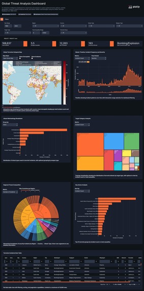
The Global Threat Analysis Dashboard is an interactive intelligence platform that allows users to explore the landscape of global terrorism from 1990 to 2021. It transforms a massive dataset of over 168,000 incidents into a cohesive analytical narrative. The app is designed to guide users through a funnel of exploration:
- High-Level Overview: Users immediately see the big picture with KPI cards showing total incidents and casualties, and a multi-layered world map identifying global hotspots.
- Temporal Analysis: The Master Timeline allows users to see how the frequency and severity of incidents have evolved over three decades, with a powerful range-slider that animates and filters the entire dashboard.
- Deep Dive into Methods: Interactive charts like horizontal bar charts, treemaps, and a hierarchical sunburst chart allow users to dissect the "how"—exploring attack methodologies, weapon types, and the most common target categories.
- Identify Key Actors: The dashboard makes it easy to see which groups have been most active, providing a crucial layer of insight into the data.
3. How we built it
This dashboard was built entirely within Plotly Studio, leveraging its full suite of features to move from raw data to a polished application.
Data Preparation: The first critical step was processing the Global Terrorism Database (GTD). The raw dataset exceeded the size limit and contained over 130 columns. We filtered the data to our target period (1990-2021) and performed aggressive column selection, reducing the dataset to just the 15 most essential columns. This resulted in a lean, 23MB CSV file optimized for performance.
AI-Powered Kickstart: After uploading the data, we used Plotly Studio's "Set Context & Goals" feature. By providing a clear prompt that defined our data and outlined our key analytical questions, the AI gave us a powerful head start by generating several relevant initial charts.
Iterative Design and Refinement: We treated the AI-generated charts as a starting point. From there, we took over, refining and customizing every aspect. This included upgrading basic charts to more advanced visualizations (like the Sunburst Chart), combining map layers for greater data density, and meticulously configuring every title, legend, and tooltip to fit our narrative.
Thematic Polish: Finally, we implemented our "Intelligence Analyst's Workstation" theme, creating a cohesive dark navy and high-contrast color scheme to ensure the entire dashboard felt like a single, professional, and purpose-built application.
4. Challenges we ran into
Data Overload: The primary challenge was the size and complexity of the initial dataset. Reducing it from over 100MB to just 23MB without losing the core analytical power required careful, deliberate decisions about which columns and timeframes were most critical to our story.
Avoiding "Rainbow Charts": An early idea for visualizing regional data was a stacked bar chart. We quickly realized this would become a cluttered and unreadable "rainbow chart." We overcame this by replacing it with the far more creative and exploratory Sunburst Chart, which turned a potential weakness into a major strength.
UI Polish: We ran into minor but important UI issues, like the map's copyright notice overlapping our description text. We solved this by carefully adjusting the component's internal margins, a small detail that made a huge difference in the final polish of the application.
5. Accomplishments that we're proud of
The Data Story Funnel: We're incredibly proud of the dashboard's narrative structure. It doesn't just display charts; it guides the user through a logical flow of analysis, from a high-level overview to specific, granular insights.
Advanced Visualization Mastery: Implementing the combined-layer map (Choropleth + Scatter Geo) and the hierarchical Sunburst Chart are accomplishments we're particularly proud of. These are complex, information-dense visualizations that showcase a deep understanding of data design principles.
Design Cohesion: We succeeded in creating a dashboard that feels like a single, purpose-built product. The consistent theme, custom-styled components (like the timeline buttons), and meticulous attention to detail result in a professional and polished user experience that stands far apart from a typical prototype.
6. What we learned
Data Preparation is Paramount: This project reinforced the lesson that the foundation of any great data app is a clean, well-structured, and appropriately-sized dataset. Our upfront work in data reduction was the key to the app's performance and clarity.
AI as an Accelerator, Human as the Storyteller: We learned that Plotly Studio's AI is a phenomenal accelerator for getting started. However, the true art of building a great dashboard lies in the human touch—refining the AI's suggestions, choosing the perfect visualization for the story, and polishing every detail to create a compelling narrative.
Design is Not Decoration: A consistent theme isn't just about making things look pretty. Our "Intelligence Analyst's Workstation" theme forced us to make clear, user-centric decisions at every step, resulting in a more intuitive, readable, and impactful final product.
7. What's next for the Global Threat Analysis Dashboard
We believe this dashboard is a powerful foundation with enormous potential for growth.
Predictive Analytics: The next logical step is to incorporate time-series forecasting models to identify regions with a statistically increasing threat level, moving from historical analysis to predictive insight.
Natural Language Query Expansion: We plan to enhance the "Analyst's Query" card to support more complex, multi-step questions and comparative analysis (e.g., "Compare the activity of the Taliban in Afghanistan vs. ISIL in Iraq between 2010 and 2015").
Integration of Correlated Datasets: We want to allow users to overlay other datasets, such as economic indicators (unemployment, GDP) or political stability indices, to explore the potential root causes and correlations behind conflict.
Automated "Intelligence Briefing" Generation: A future feature will allow users to export their current filtered view as a professionally formatted PDF report, turning a live analysis session into a shareable intelligence briefing.


Log in or sign up for Devpost to join the conversation.