Project Story: Global Manufacturing Quality Control Hub Inspiration The manufacturing world constantly battles defects, delays, and complexity across global supply chains. Our inspiration was the challenge of consolidating vast amounts of operational data—from product specifications and defect status to shipping logistics—into a single, intuitive control center. We wanted to build a dashboard that transforms complex manufacturing data into actionable intelligence, empowering operations managers to make rapid, data-driven decisions that immediately impact quality and efficiency.
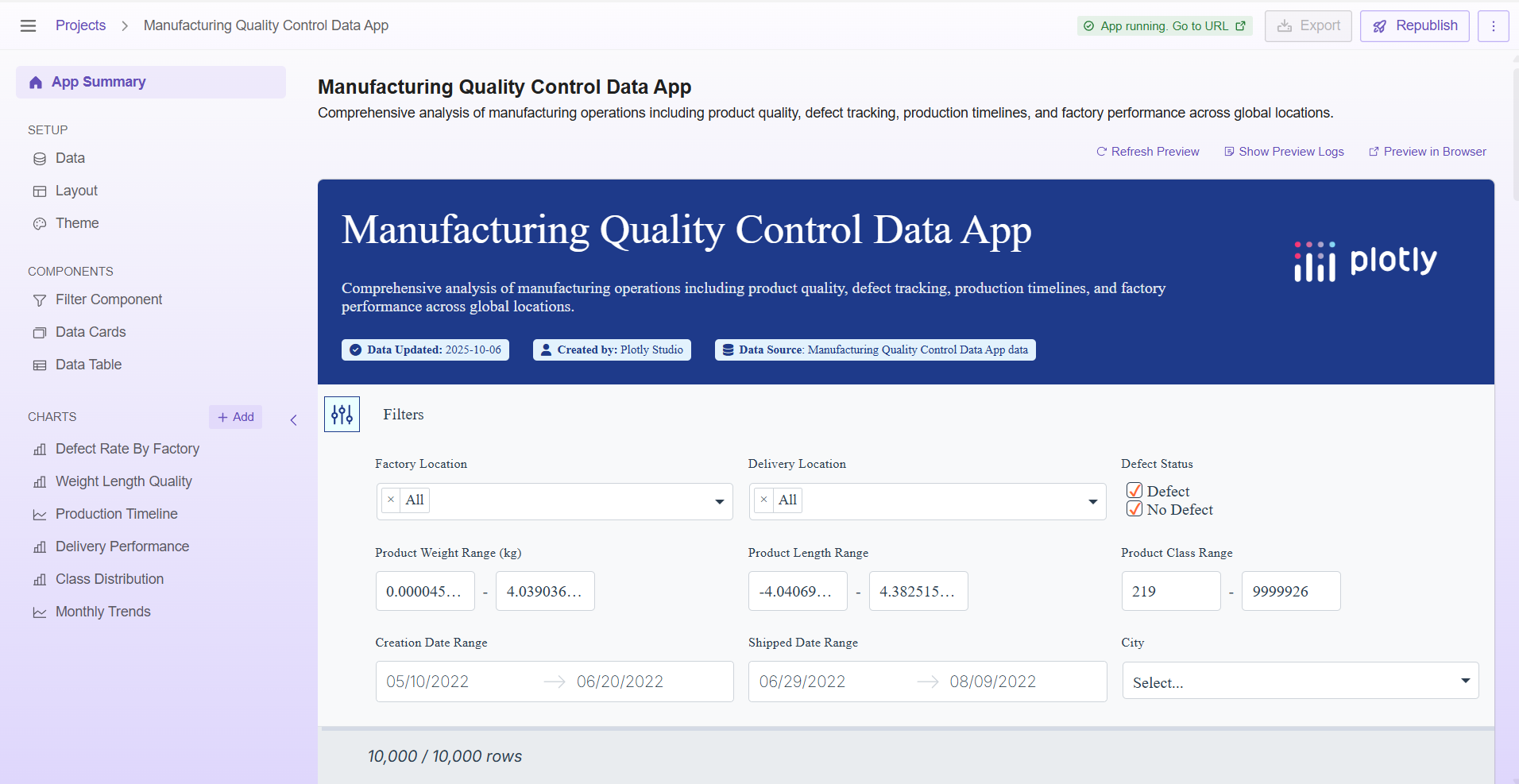
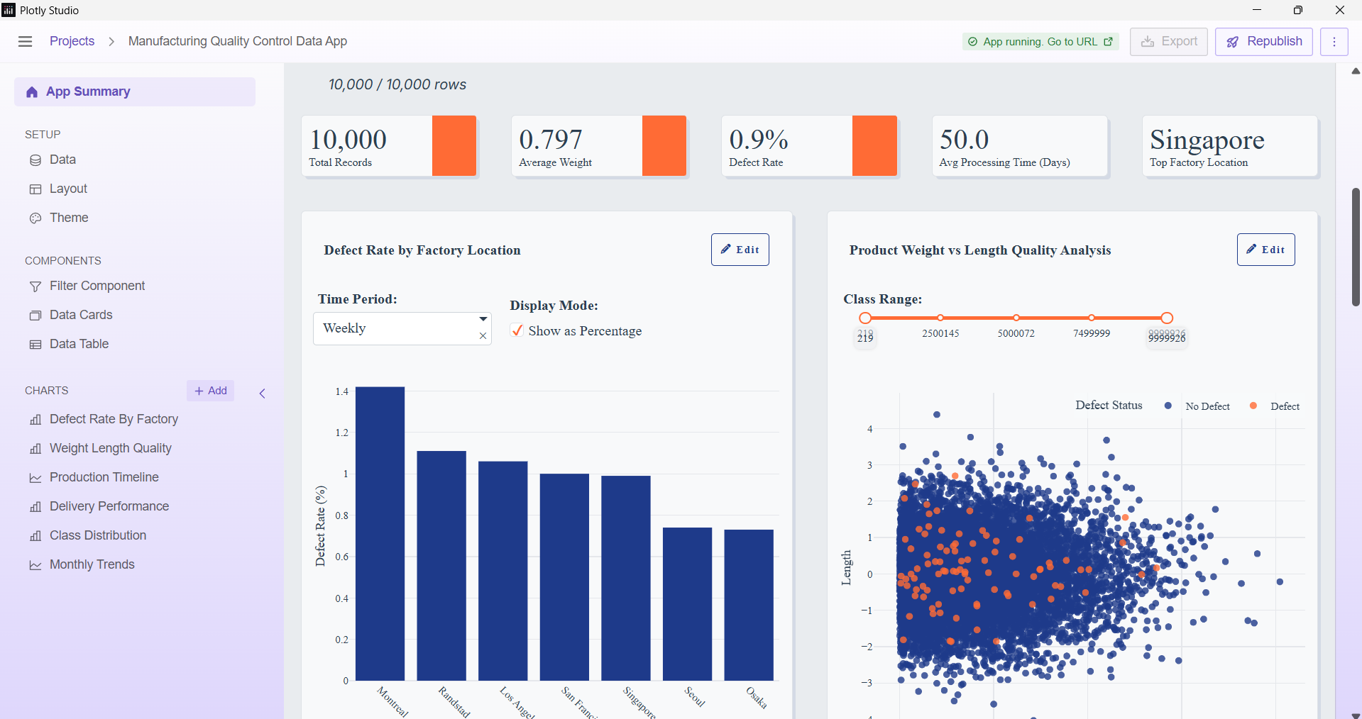
What it does The Global Manufacturing Quality Control Hub is a comprehensive, interactive data application that provides end-to-end visibility into a multi-location production network. It features six core charts and nine dynamic global filters that allow users to:
Pinpoint Defect Hotspots by location and time period.
Validate Product Integrity by analyzing relationships between physical attributes (weight, length) and defect status.
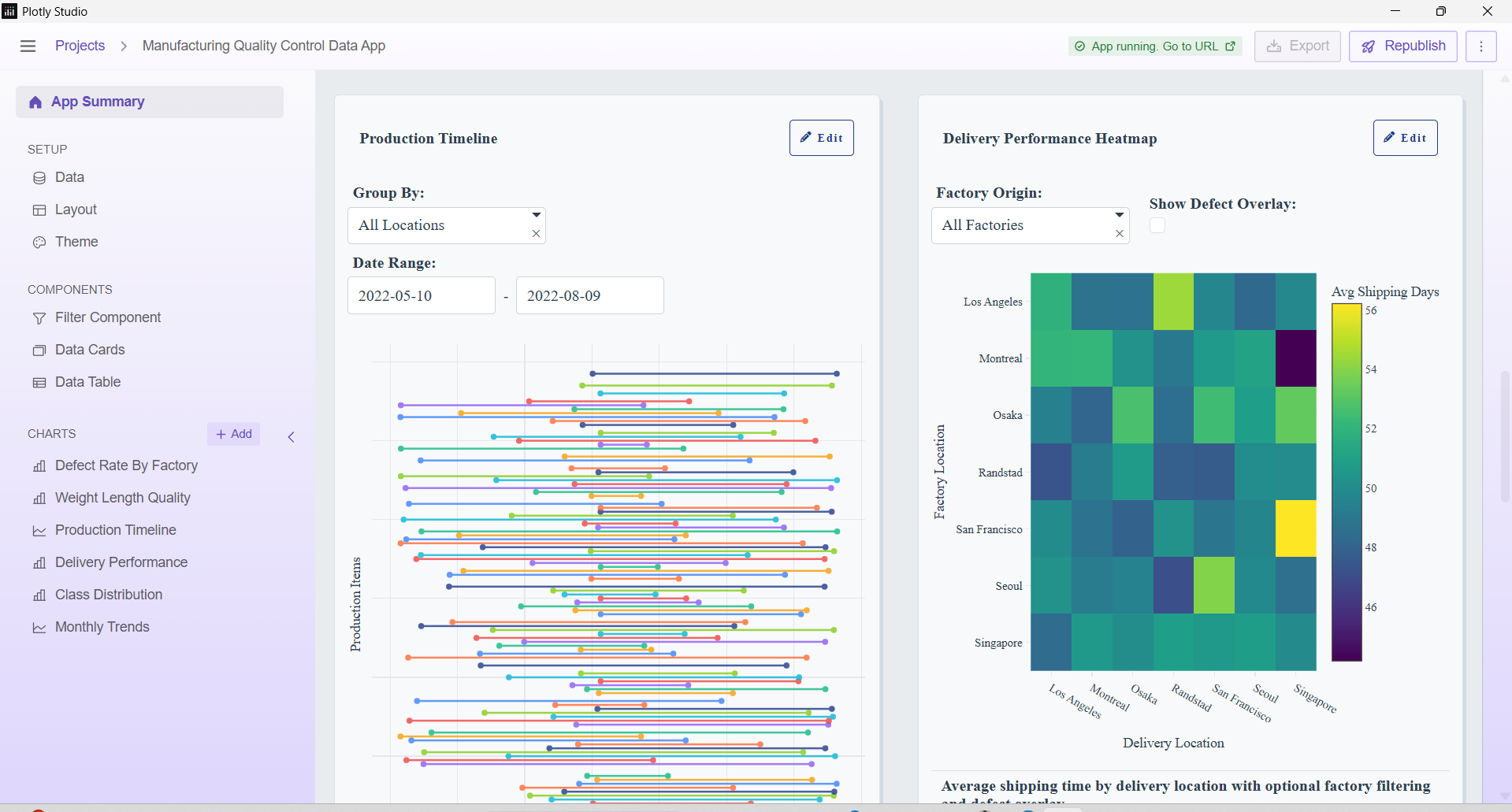
Optimize Logistics by analyzing shipping timelines and delivery performance across all factories.
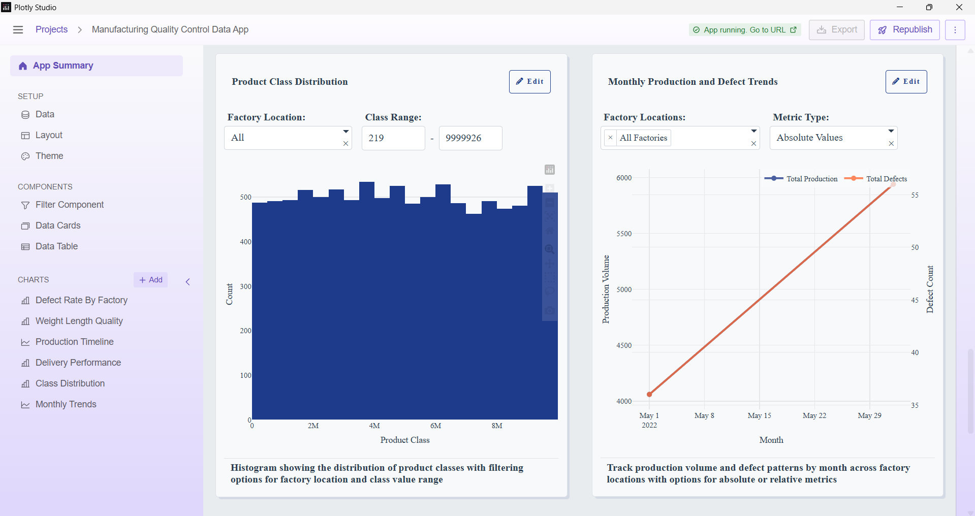
Forecast Trends by tracking monthly production and defect rates in both absolute and relative metrics.
How we built it This project was built entirely with Plotly Studio's AI App Builder and the integrated Plotly Cloud deployment system.
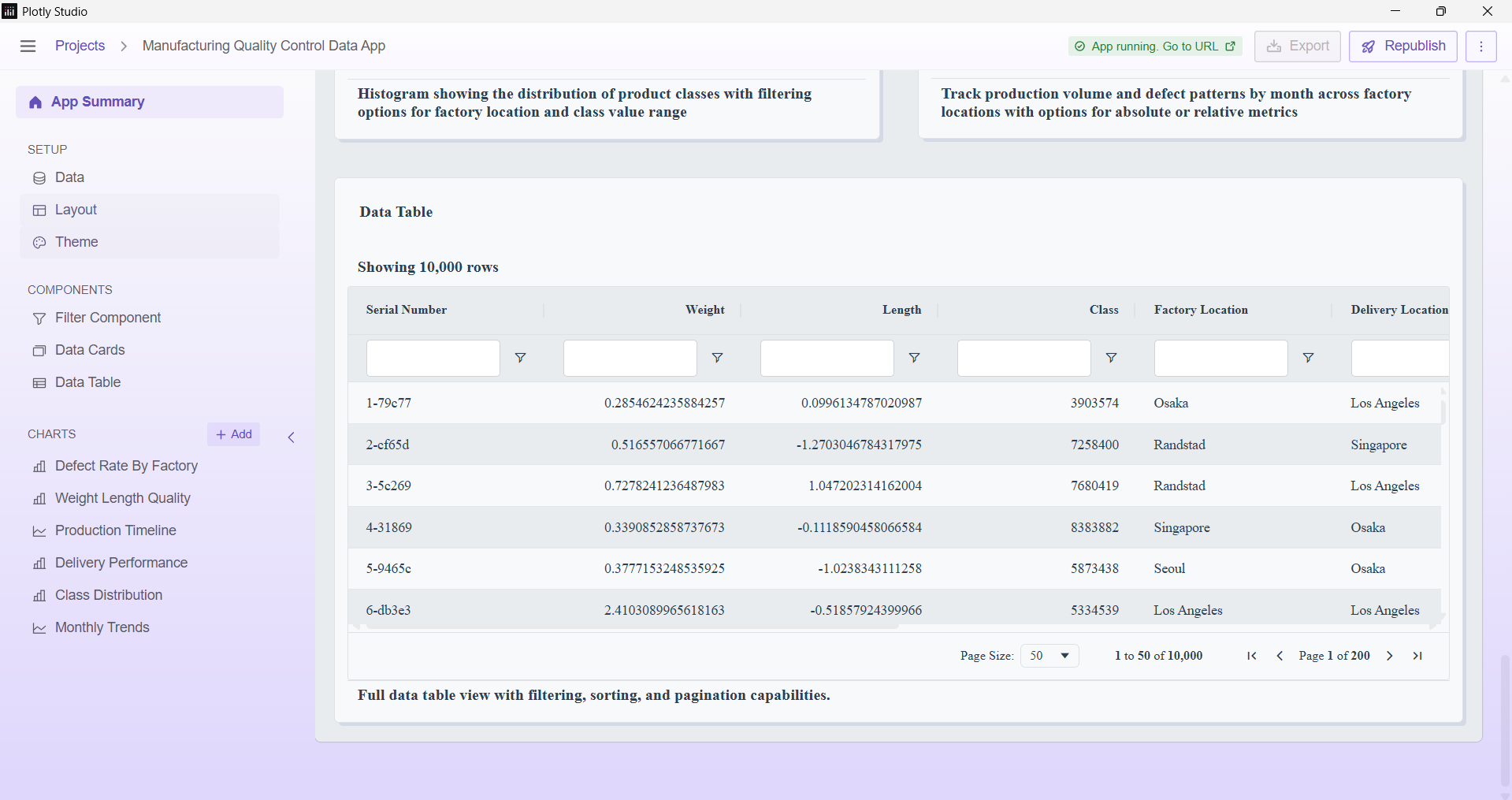
Data Ingestion: We used a relevant manufacturing sample dataset, ensuring it contained the necessary columns for operational analysis (Weight, Length, Defect Status, Factory Location, Dates, etc.).
AI Generation: The entire dashboard layout, including the six custom charts and nine dynamic global filters, was generated from a single, complex natural language prompt in the Plotly Studio AI App Builder.
Theming: The industrial look, using the blue and orange color scheme and a clean, technical typography, was specified in the initial prompt, demonstrating the AI's ability to handle specific design requirements.
Interactivity: Plotly Studio automatically created the necessary callbacks to connect all the charts to the nine global filters, ensuring a seamless, high-performance user experience without writing any code.
Challenges we ran into The primary challenge was crafting a single, robust AI prompt that could successfully capture the complexity of the required filters and chart interdependencies. We had to be extremely precise with naming conventions (e.g., specifying both "absolute counts vs. percentages" and "absolute vs. relative metrics") to ensure the AI correctly interpreted and implemented the complex toggles and dropdowns.
Accomplishments that we're proud of We are most proud of:
Successfully creating a high-utility, enterprise-grade dashboard using a single, cohesive AI prompt.
The effective implementation of nine deeply interconnected global filters which allow for granular investigation across all charts simultaneously.
The integration of the industrial theme, resulting in a dashboard that is not just functional but visually aligned with its operational purpose.
What we learned We learned the true power and efficiency of Plotly Studio's agentic analytics. The ability to translate a lengthy, detailed specification (six complex charts and nine global filters) directly into a fully functioning, interactive data app in seconds is a game-changer. It proved that complex data projects can move directly from concept to deployment without the traditional weeks of coding and integration work.
What's next for Global Manufacturing Quality Control Hub We plan to integrate real-time API endpoints to turn this into a live operational monitoring tool. Additionally, we would use Plotly Studio's AI Insight capability to automatically detect and flag unusual patterns (e.g., sudden spikes in defect rates or shipping delays) and auto-generate plain-language reports for shift managers.

Log in or sign up for Devpost to join the conversation.