-
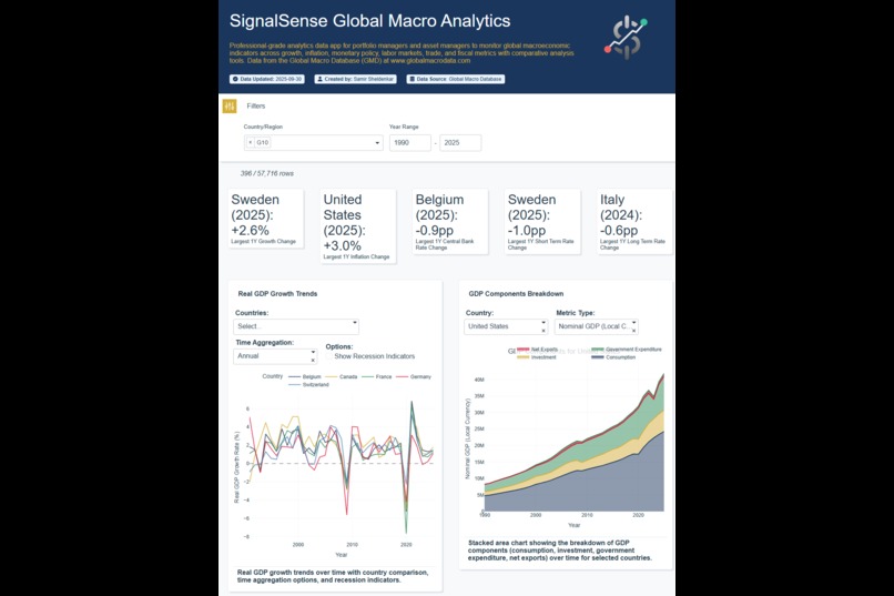
Heading with Country and Date Filtering. Top charts show Growth Metrics
-
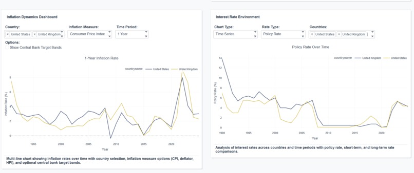
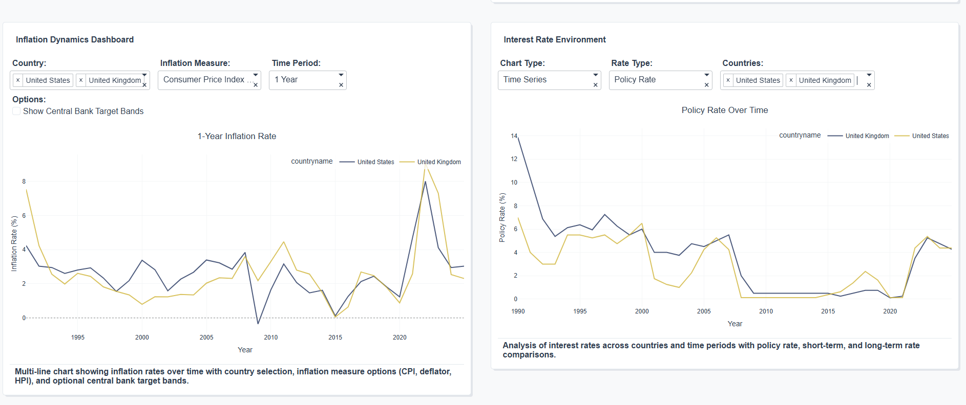
Analysis of Inflation and Central Bank Rates Between United States and United Kingdom
-

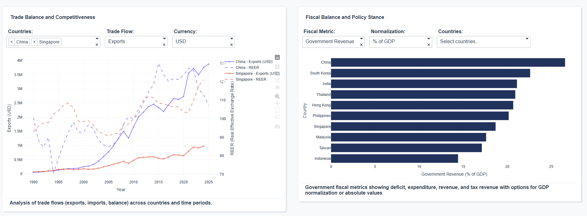
Comparisons of Trade Balance for China vs Singapore, and Analysis of Government Revenue across EM Asia countries
-
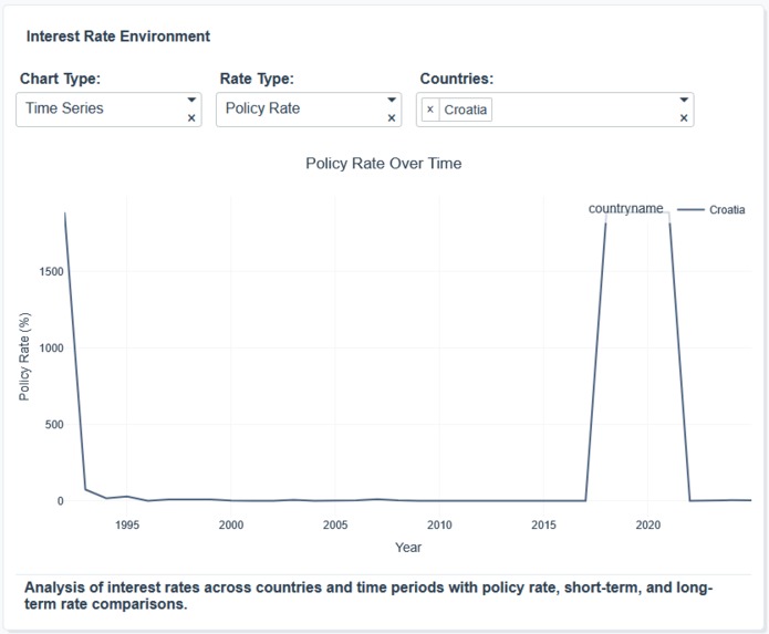
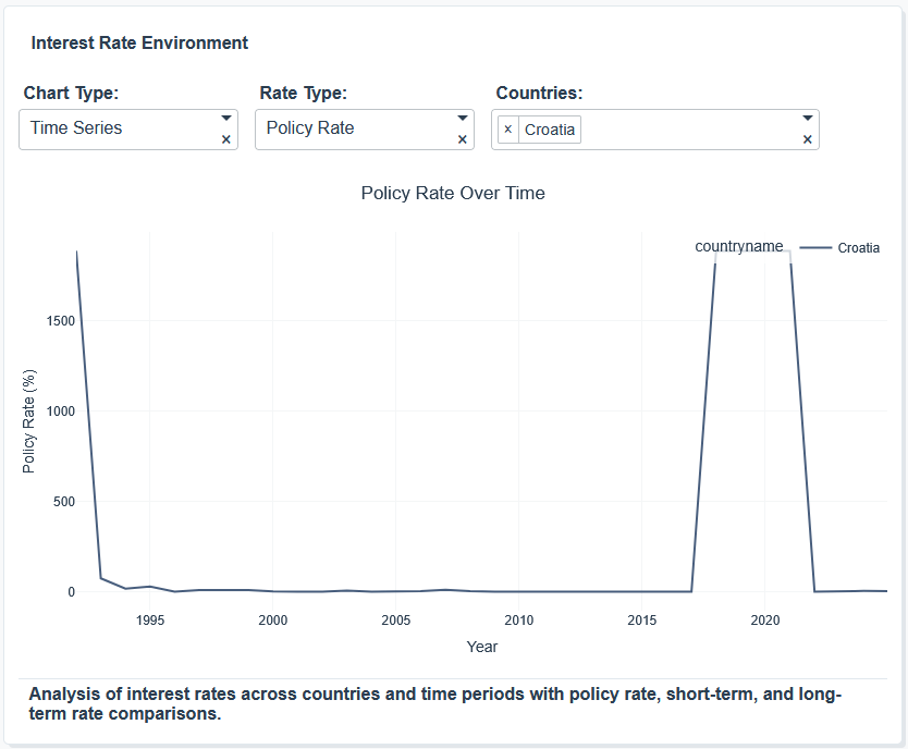
Visualisations helped identify errors in the dataset such as this incorrect jump in the Croatian CB Rate (reported to dataset creators)
Inspiration
I recently discovered the Global Macro Data dataset, a large and varied dataset of cross-country economic timeseries built for comparative analysis, licensed under the CC BY-NC-SA 4.0 license for non-commercial purposes. I wanted a quick way to visualise and investigate the data without spending a long time writing code to build charts for each data field in turn.
What it does
The app uses Plotly Studio to generate charts across growth, inflation, interest rate and fiscal indicators. Building from scratch would have required time-consuming effort writing specific code for each type of chart.
How we built it
Using Plotly Studio's AI functionality, I wrote a generic prompt requesting charts across the main economic indicators I was interested in with some simple transformations (e.g. converting indices into rate of change measures). I also prompted to allow the ability to filter regionally and across major country groupings (e.g. G10, EM). Individual charts were then adjusted with updated prompts to address minor changes required.
Challenges we ran into
Some of the functionality required multiple attempts to adjust prompts, and in some cases the final output still didn't perfectly match the request. A bug in the latest version of Studio meant that I was unable to make final changes for the last 3 days of the vibe-a-thon, leaving some charts with unfinished layout design artifacts.
Accomplishments that we're proud of
Developing a comprehensive dashboard in such a short time was challenging but the functionality of Plotly Studio meant that much of the required functionality was done in just one or two prompting passes for each chart. The app also helped quickly analyse the dataset and actually highlighted errors which were reported to the dataset creators and will be fixed in future editions.
What we learned
The ability to generate quick dashboards using Plotly Studio can immediate accelerate dataset analysis and visualisation, and help bring data insights to stakeholders from broad and varied datasets in very little time.
What's next for Global Macro Analytics
The app may be developed to further enhance and analyse other fields within the Global Macro Dataset.


Log in or sign up for Devpost to join the conversation.