

Inspiration
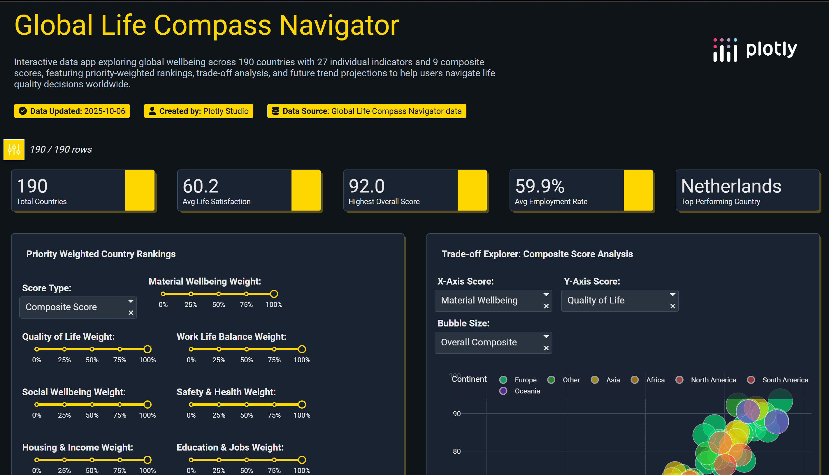
Most dashboards show facts, not decisions. The goal was to turn global wellbeing data into a personal compass that answers a real question: “Given my priorities, where could life feel best?” A single place to balance income, jobs, safety, health, housing, education, environment, social support, and work–life balance.
What it does
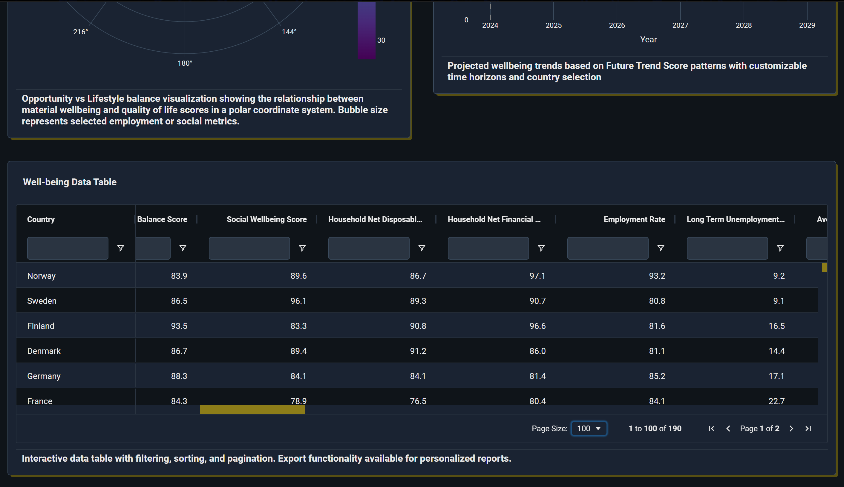
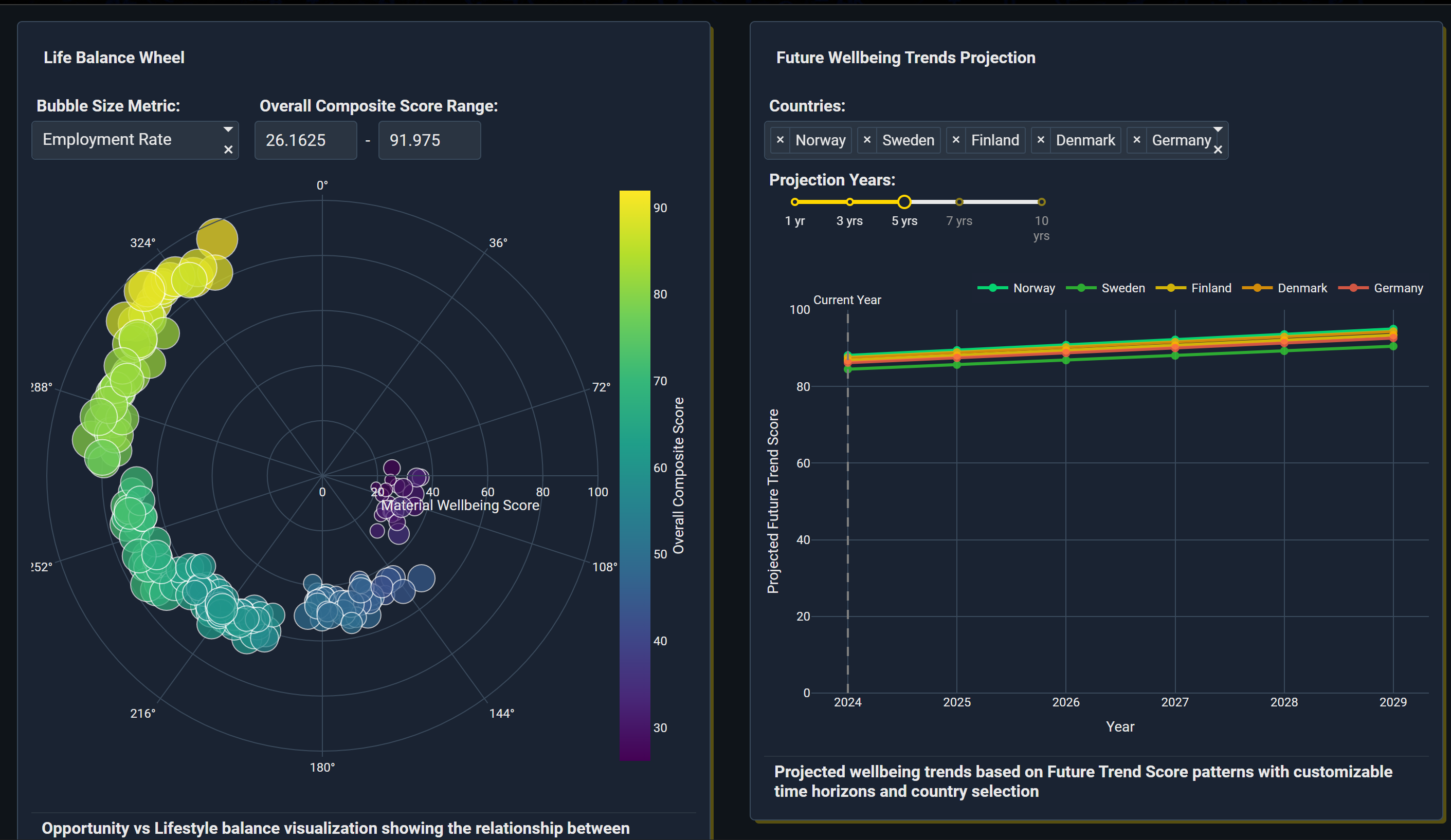
Global Life Compass Navigator lets anyone set weights for what matters most and instantly: Ranks 190 countries with a weighted score. Highlights trade‑offs on a scatter explorer (choose any two metrics). Maps global hotspots with a choropleth. Compares two countries on an 8‑axis radar. Shows safety–health, housing‑adjusted income, education–jobs, and environment–wellbeing composites. Adds a simple 5‑year trend projection to spot momentum.
How we built it
Data: A consolidated CSV with 27 indicators per country normalized to 0–100, plus 9 composite scores (material, quality of life, work–life, social, safety–health, housing–income, education–jobs, environment–wellbeing, overall). App: Built with Plotly’s app tooling for linked visuals (map, bars, scatter, radar), global filters, and cross‑highlighting. UX: “Compass” theme with smooth transitions, hover tooltips, animated rank shifts, and mobile‑responsive layout. Logic: Weighted composite = normalized indicators × user weights; all charts update from the same selection state.
Challenges we ran into
Unifying heterogeneous indicators on a common 0–100 scale without hiding trade‑offs. Keeping the UI fast and token‑efficient while supporting many linked components. Designing weights that feel intuitive but still produce meaningful rank changes. Handling sparse or noisy values while preserving regional comparability.
Accomplishments that we're proud of
A decision‑centric tool that translates complex global data into clear personal guidance. Cohesive UX: sliders → instant animated ranks → map/scatter/radar in sync. Rich yet simple composites that surface safety–health, housing‑adjusted income, and opportunity–lifestyle balance. A single CSV powering all visuals, making the app easy to reproduce and extend.
What we learned
Users think in trade‑offs, not single metrics; side‑by‑side visuals beat static rankings. Clear defaults (starter weight presets) help beginners explore confidently. Small UX touches—animated bar reorders, pulsing map highlights—greatly improve comprehension. Building from one tidy dataset accelerates iteration, testing, and publishing.
What's next for Global Life Compass Navigator
Regional and city‑level drill‑downs where data is available. User profiles to save/share weight presets and comparisons. Confidence bands and data quality flags on indicators and trends. Scenario “presets” (student, remote worker, family, retiree) and AI‑assisted narratives that explain why top picks match the selected priorities.
Built With
- chv
- plotly-studio
- python


Log in or sign up for Devpost to join the conversation.