-
-
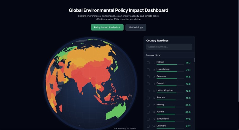
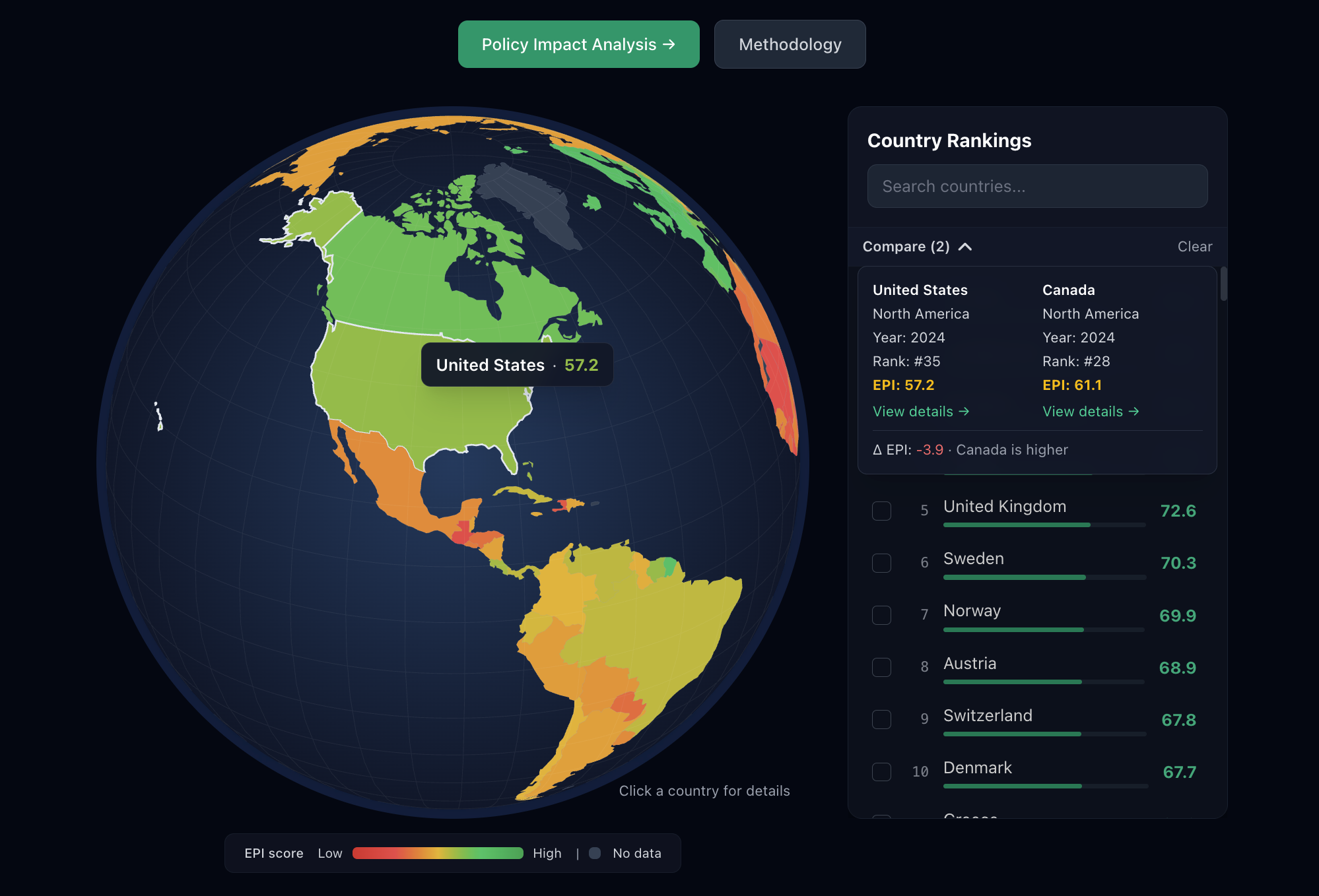
Homepage
-
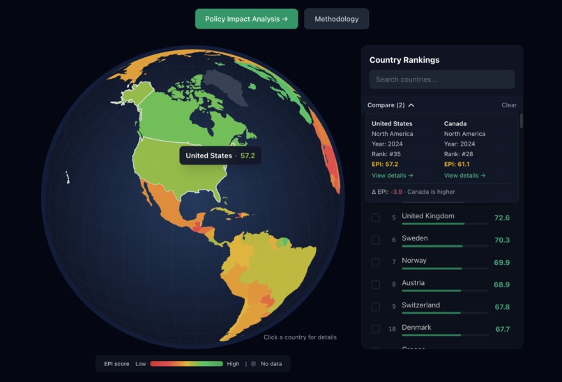
Easily compare two countries
-
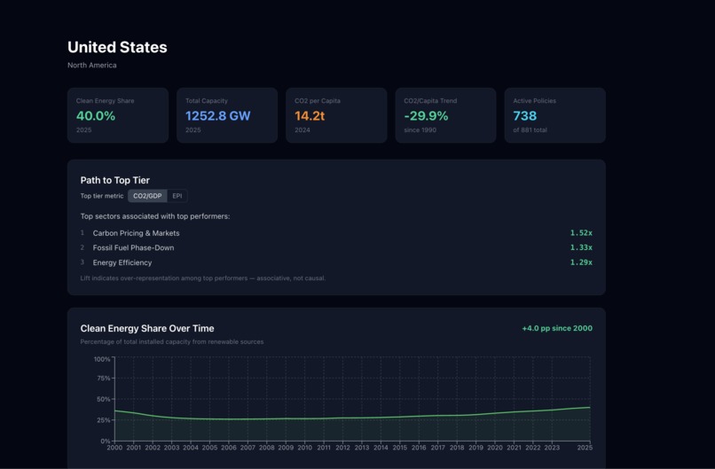
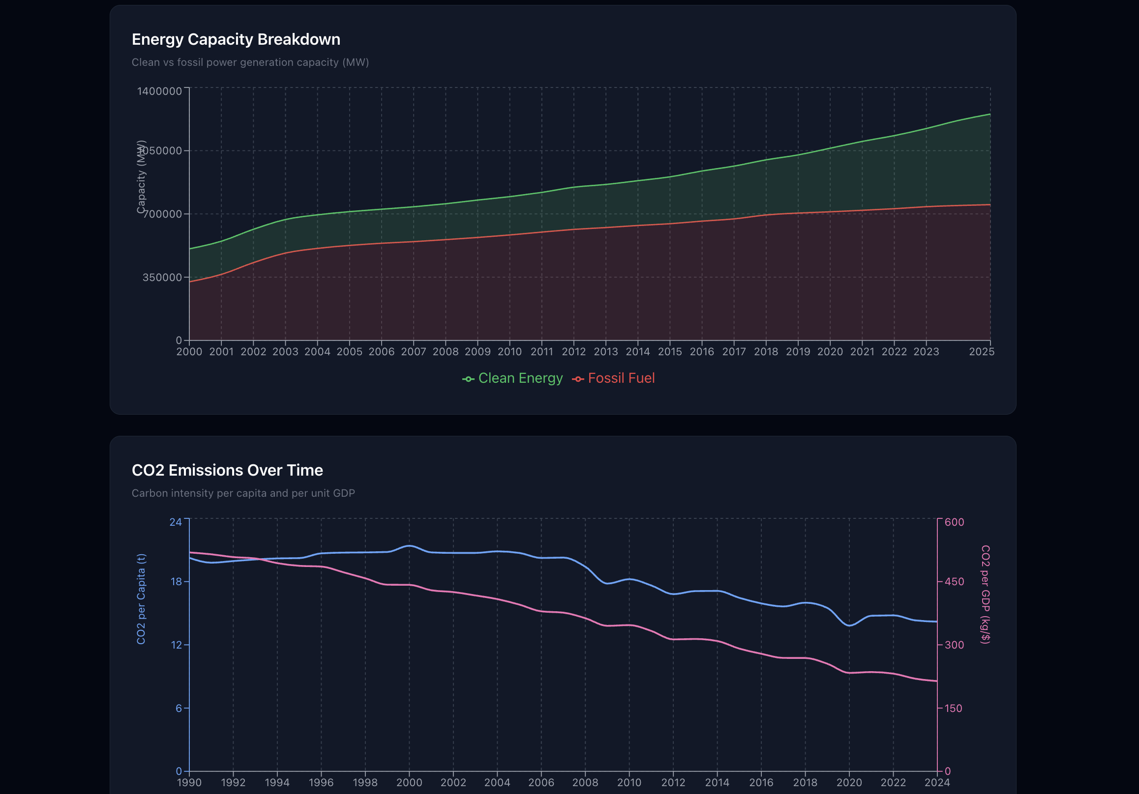
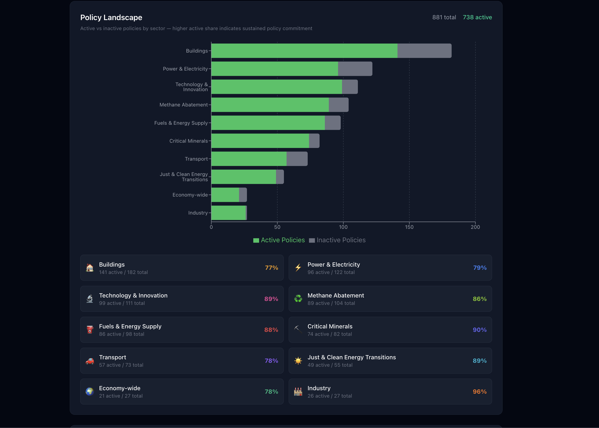
Country Page (pt. 1)
-
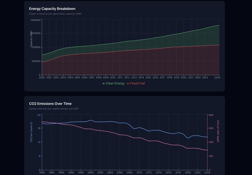
Country Page (pt. 2)
-
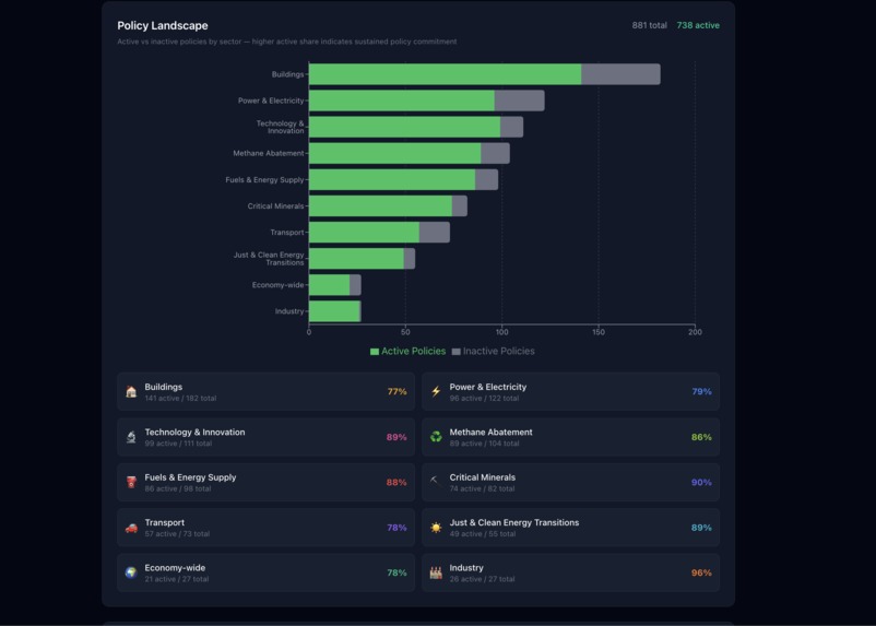
Country Page (pt. 3)
-
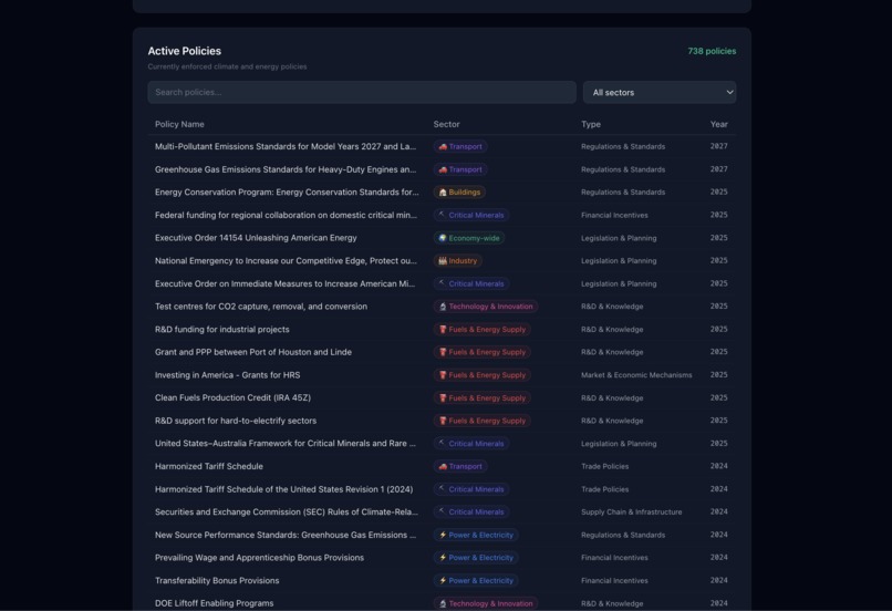
Country Page (pt. 4)
-
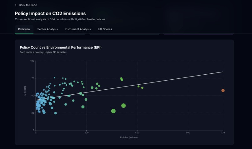
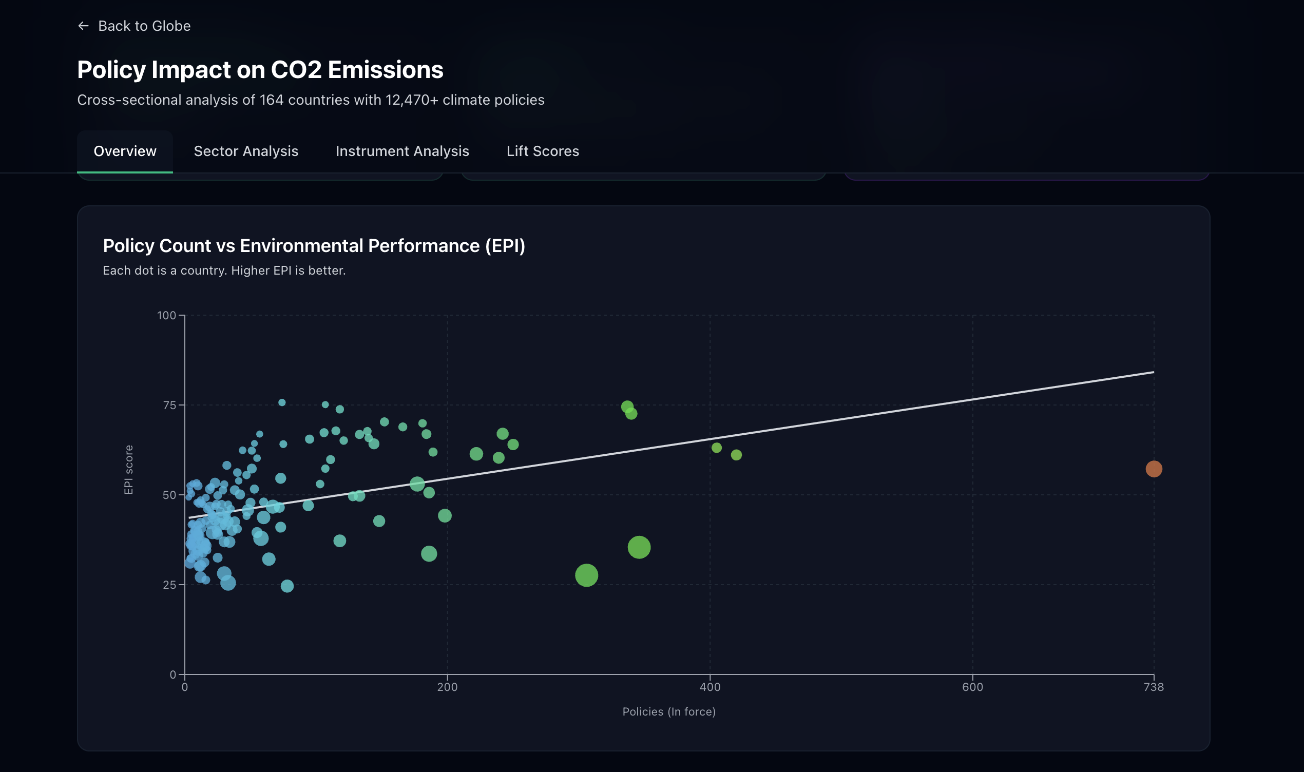
Policy Count vs Environmental Performance (EPI) Regression
-
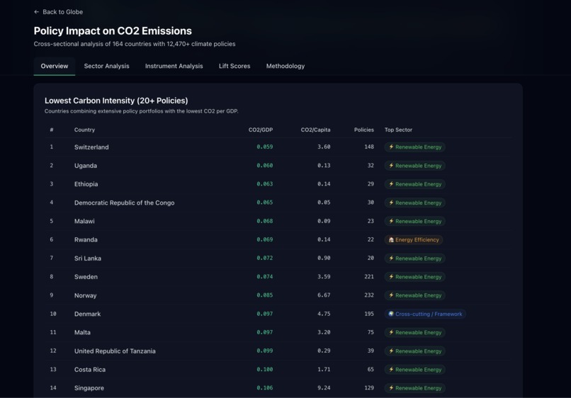
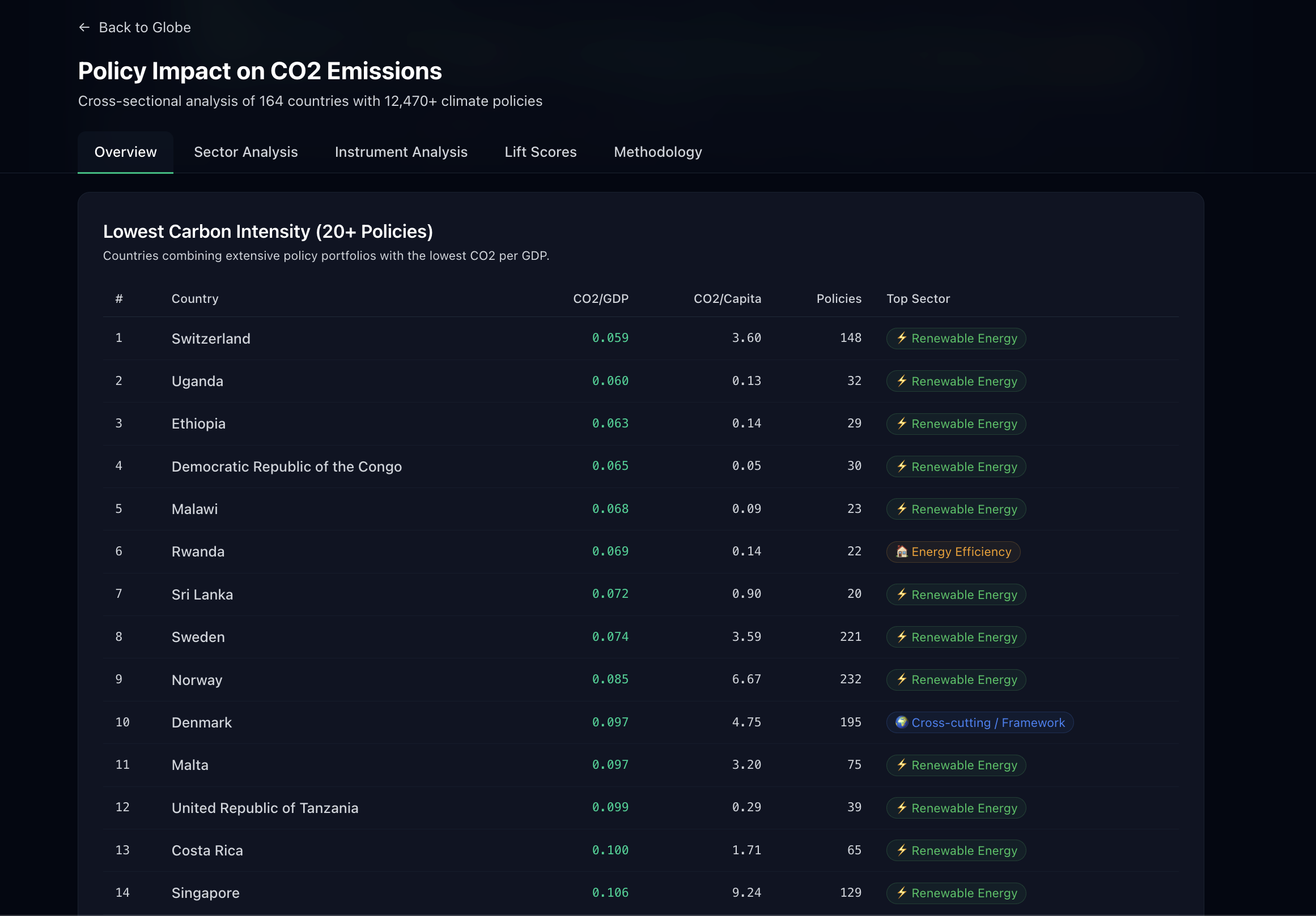
View top-ranked countries
-
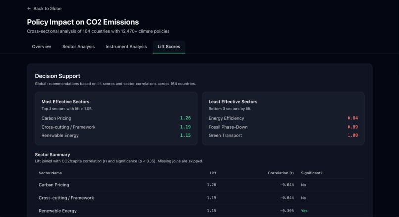
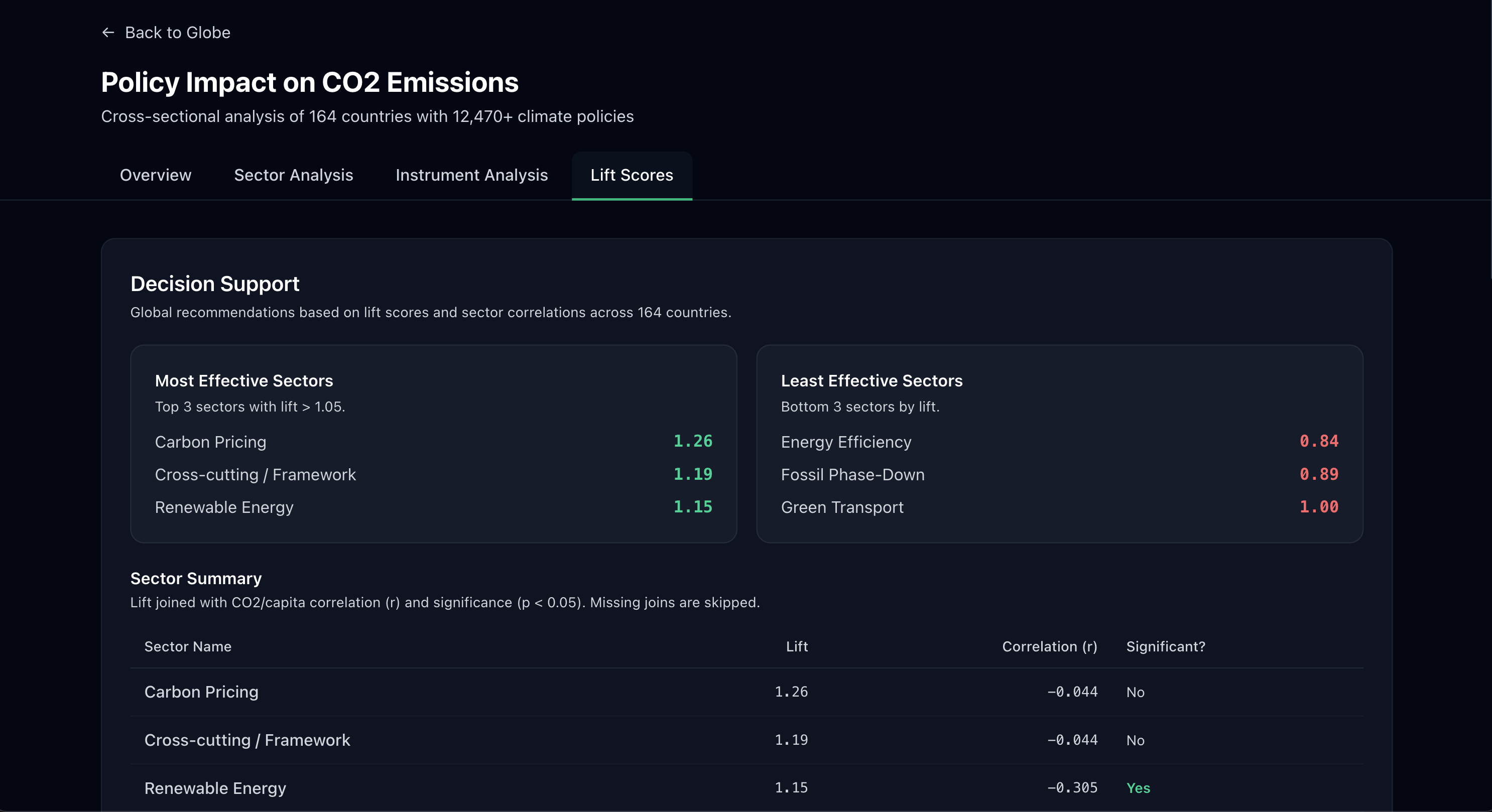
Sector Lift Scores
-
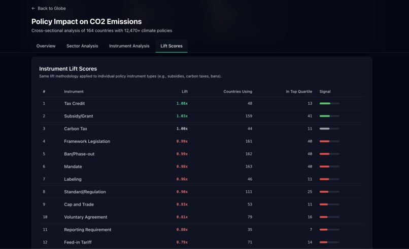
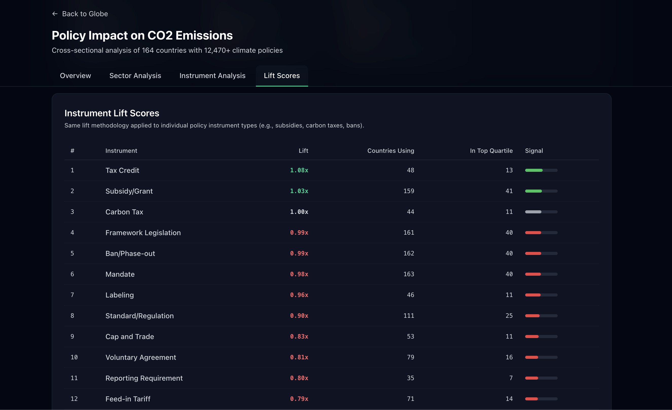
Instrument Lift Scores
-
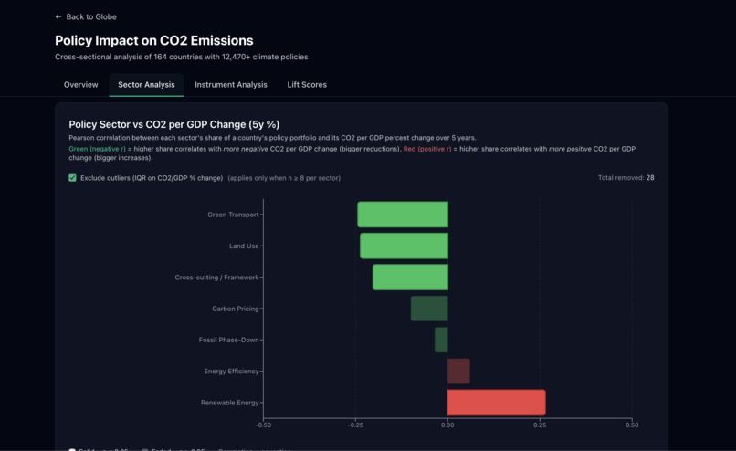
Policy Sector vs CO2 per GDP Change (5y %)
-
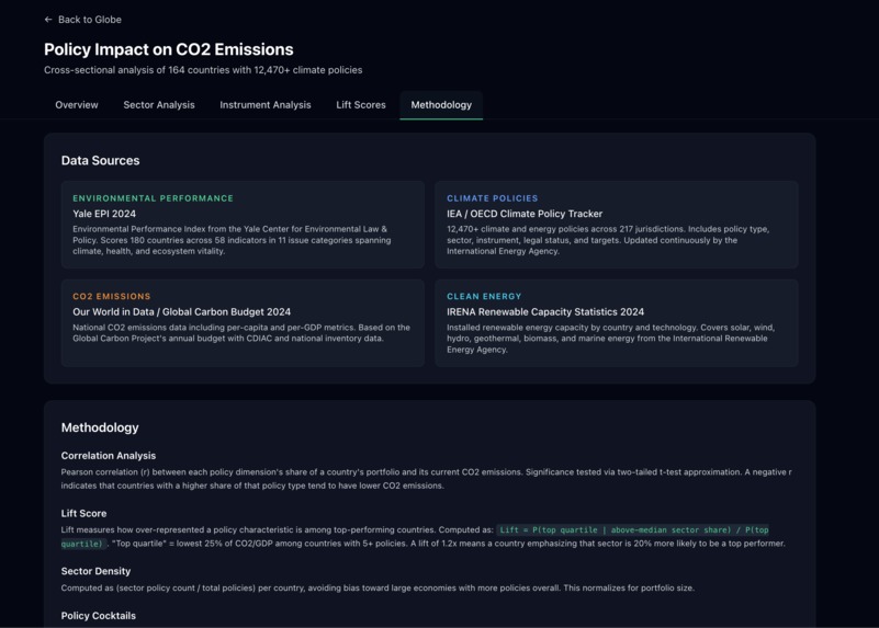
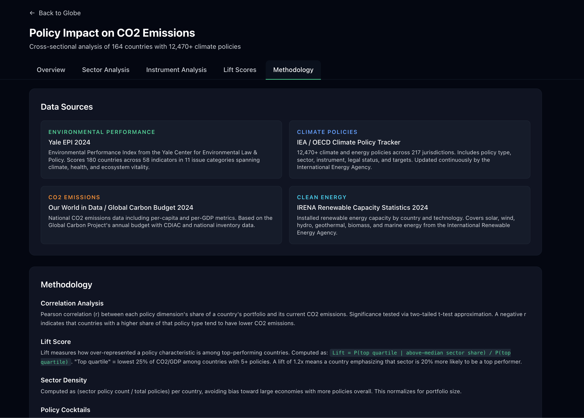
Comprehensive Methodology Page


Inspiration
Global climate policy is often a "black box." While thousands of policies are enacted yearly, it is difficult for citizens and lawmakers to see which specific strategies actually correlate with high environmental performance. Citizens see headlines, and lawmakers debate proposals, but the connection between policy and performance is rarely transparent. We were inspired to create a tool that moves beyond vanity metrics, instead focusing on outcome-based analysis: what are the top-performing countries actually doing differently in their policy portfolios?
What it does
The Global Environmental Policy Impact Dashboard is an end-to-end analytical tool that evaluates the effectiveness of climate interventions across 180+ countries.
- Global Performance Mapping: Visualizes the Environmental Performance Index (EPI) on an interactive 3D globe.
- Policy Mix Analysis: Uses radar charts to compare the "policy fingerprints" of countries with the lowest CO2/GDP ratios.
- Sector Lift Scores: Employs a statistical "Lift" metric to identify which policy sectors make a country most likely to enter the top quartile of environmental performers.
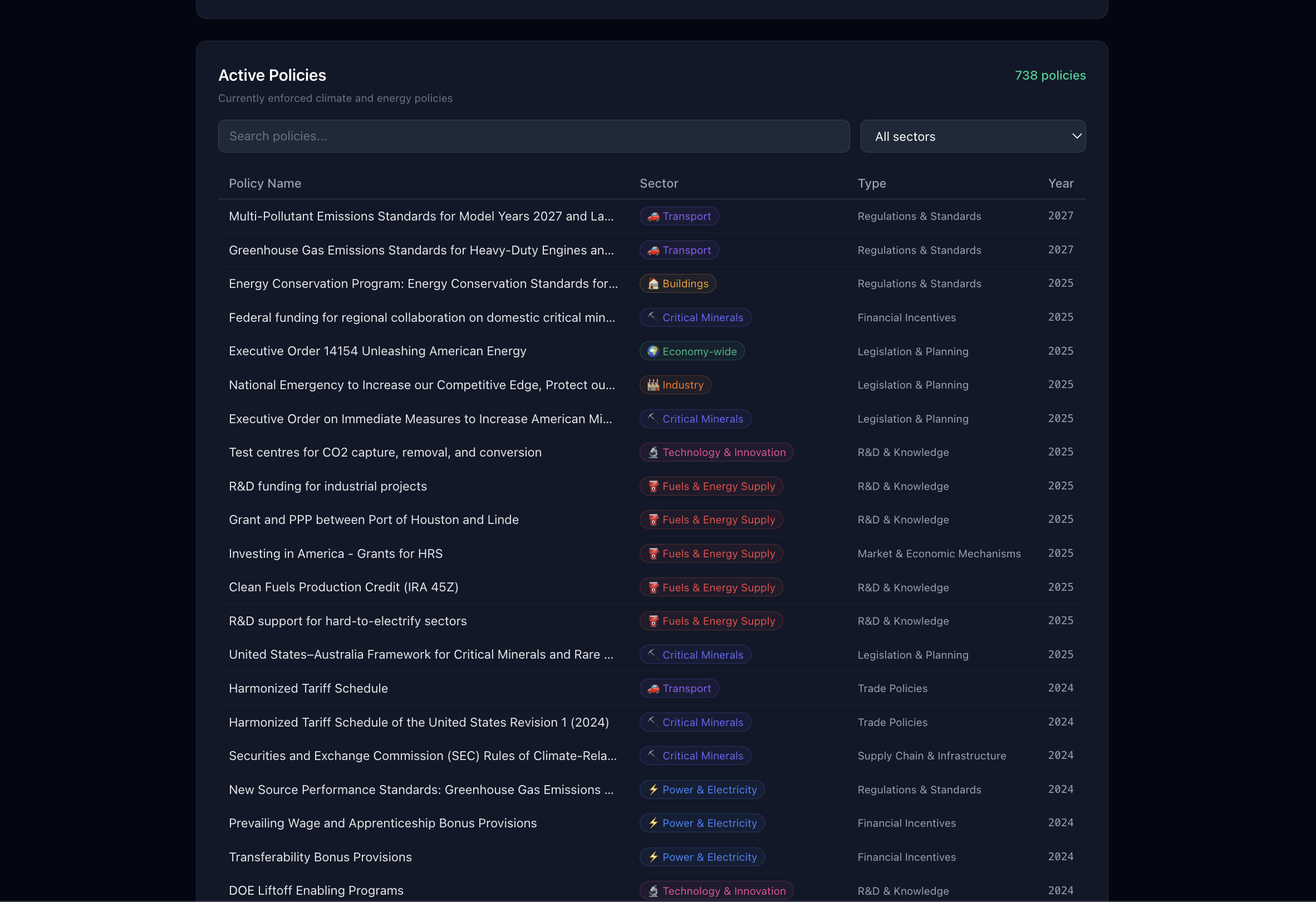
- Active Policy Repository: A deep-dive table tracking specific legislative acts, their sectors, and enforcement years.
How we built it
- Data Engine: We aggregated datasets from the Environmental Performance Index (EPI) and global climate policy databases, normalizing the data and using LLMs to place policy measures into easy-to-understand buckets.
- Frontend: We took json files directly from the analytics and data processing layers and displayed them in various charts and figures on the front end. The focus for the front end was being easy to use yet informative.
- Analytics: We did linear regression and statistics in javascript to determine and graph relationships between various elements such as policy instruments, policy sectors, EPI score, CO2 emissions, countries, and more.
- Visualizations: We used javascript to build the frontend and all the visualizations including the spinning globe and the charts. Node.js provided the framework for deployment and structuring the codebase.
Challenges we ran into
One of our biggest hurdles was data normalization. Comparing a policy in the Democratic Republic of the Congo to one in Switzerland requires accounting for different economic baselines. We addressed this by focusing on CO2/GDP and EPI scores rather than absolute emissions, allowing us to see which policies drive "green growth" effectively regardless of a country's size or output.
Accomplishments that we're proud of
- The Lift Metric: Moving beyond correlation to show that Carbon Pricing & Markets provides a 1.26x lift in the likelihood of being a top-tier environmental performer.
- UI/UX: Creating a complex data tool that feels intuitive and allows users to jump from a global view down to a specific directive in just three clicks.
- Actionable Insights: Identifying that "Cross-cutting Frameworks" are often more statistically significant than individual acts.
What we learned
We learned that more policies don't always equal better results. The data showed that "Energy Efficiency" and "Fossil Phase-Down" policies often have lower lift scores than expected, suggesting that without strong Carbon Pricing (1.26x) or Framework Legislation (1.19x) to anchor them, isolated policies struggle to move the needle.
What's next for Global Environmental Policy Impact Dashboard
- AI Policy Predictor: Using machine learning to suggest the "Next Best Policy" for a country based on its current portfolio and "Lift" gaps.
- Time-Series Animation: Adding a temporal slider to see how policy mixes have evolved from 1990 to today.
- Economic Impact Integration: Layering in GDP growth data to prove that high EPI scores can coexist with robust economic performance.
Our team is excited to continue working on this project, and hope to see it used by policymakers in the future!
Built With
- css
- d3.js
- next.js
- node.js
- python
- recharts
- tailwind
- typescript

Log in or sign up for Devpost to join the conversation.