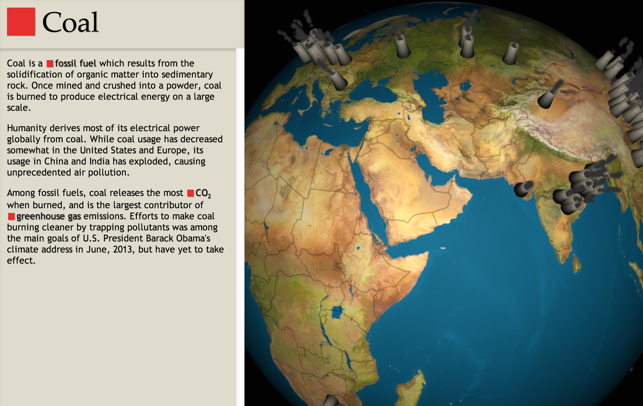
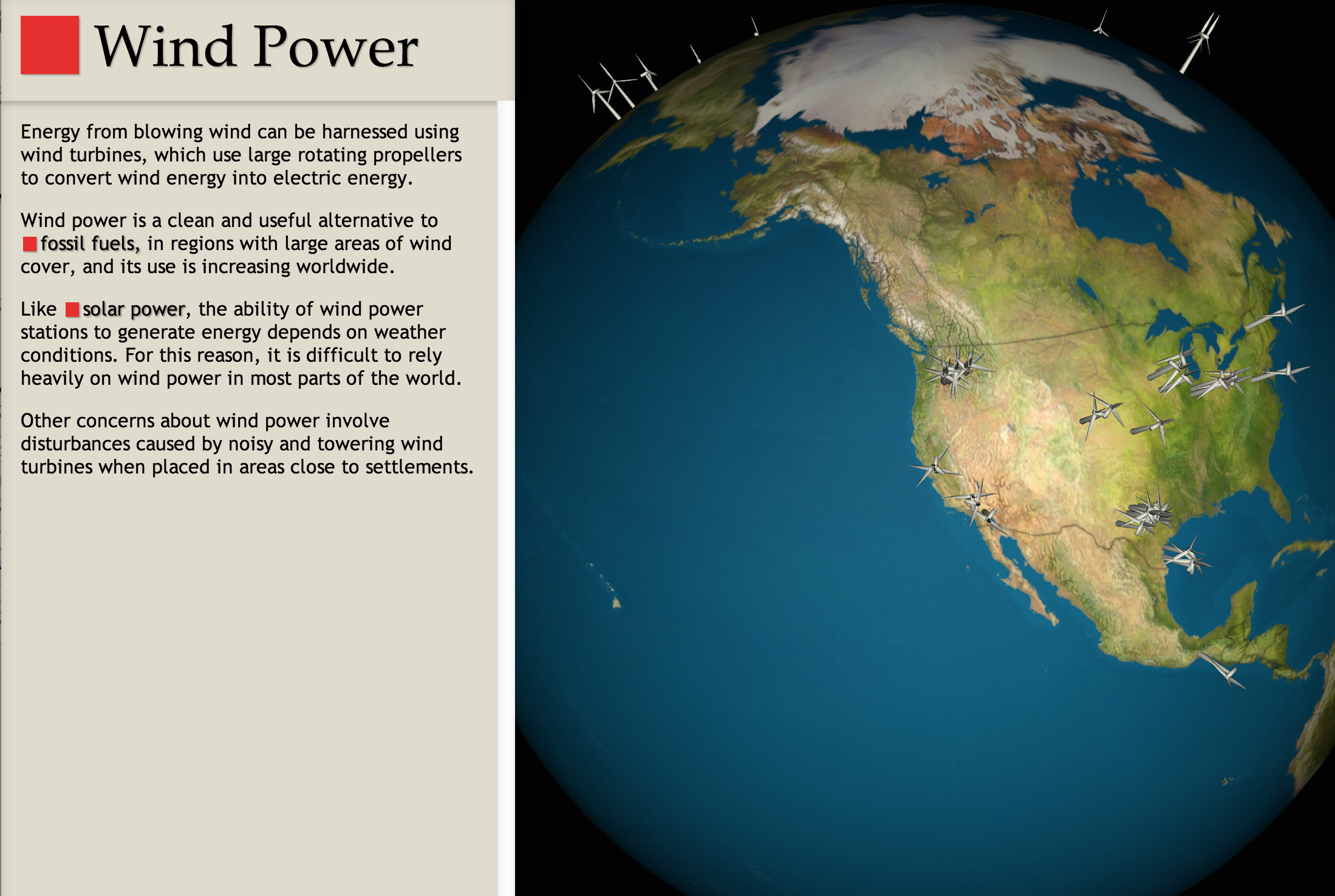
I added a feature to the website, wyrl.com, which displays global power stations as 3D markers on a globe, using data compiled on wikipedia.
I've also included brief descriptions of these various energy types, and hope to get people interested in the energy sources that are used in their areas, to understand which areas are heavy polluters and which use more clean energy. To drive this home visually, the coal plants emit gray smog, whereas the wind turbines are clean.

Log in or sign up for Devpost to join the conversation.