-
-

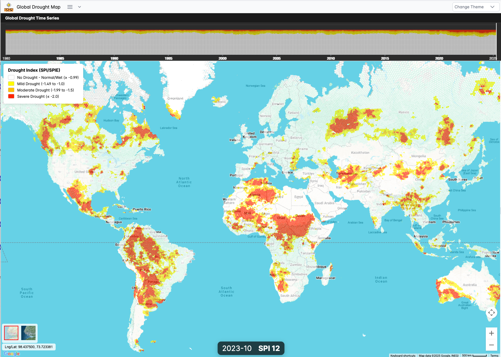
General View of the Application
Inspiration
My experience consulting for the UNDP on drought in Madagascar inspired me to create a tool that could support communities worldwide in the fight against climate change. Seeing firsthand how crucial timely, accessible drought data can be for vulnerable populations, I wanted to build a platform that democratizes drought intelligence and makes it available at a global scale, empowering people everywhere to make informed decisions.
What it does
Global Drought Map provides interactive, monthly drought maps from 1980 to today, using scientifically robust drought indices (SPI and SPEI -on next iteration). The platform visualizes drought conditions globally using Uber’s H3 Level 4 hexagonal grid, with plans to improve resolution for even more precise local insights. With a seamless interface powered by Google Maps JS API, users can easily explore historical drought patterns and trends anywhere in the world.
How we built it
We built Global Drought Map with scalability and performance in mind, centering the platform around Google Maps JS API for visualization and DuckDB WASM for in-browser analytics. We calculated global drought indices (SPI) from ERA5 climate data, then interpolated and aggregated these values into H3 hexagons for efficient mapping. All time series data—millions of records—are stored in cloud-optimized Parquet files, hosted on Cloudflare R2, enabling fast, scalable, serverless access to massive climate datasets.
Challenges we ran into
One of the biggest challenges was managing and serving large-scale, high-resolution climate data efficiently. Storing millions of rows in Parquet format and ensuring rapid, scalable access via browser-based DuckDB WASM pushed us to optimize both the data architecture and client-side querying. Integrating these modern technologies seamlessly with Google Maps JS API was also technically demanding, requiring careful engineering to maintain performance and usability.
Accomplishments that we're proud of
We’re proud to have delivered a visually engaging, highly scalable drought mapping solution that covers the entire globe. The use of H3 hexagons provides clear and meaningful spatial insights, while the combination of DuckDB WASM and Parquet brings unprecedented performance to in-browser analysis of massive datasets. This project sets a new standard for open, accessible climate analytics on the web.
What we learned
This project deepened our understanding of how to leverage Parquet and DuckDB WASM for real-time, browser-based publication and analysis of huge time series datasets. We learned valuable lessons about optimizing cloud storage, geospatial indexing with H3, and integrating diverse technologies into a seamless, user-friendly application.
What's next for Global Drought Map
Looking ahead, we plan to integrate seasonal forecast data from ECMWF, allowing the platform to provide predictive drought insights for upcoming months. We also aim to increase the resolution by moving from H3 Level 4 to Level 5 or 6, providing even more detailed and actionable drought information. Our ultimate goal is to empower decision-makers, researchers, and communities with cutting-edge tools for climate adaptation worldwide. Also we will plan to add CHIRPS dataset in addition to ERA5 to calculate drought indices.
Built With
- duckdb
- google-maps
- h3
- node.js
- parquet
- react


Log in or sign up for Devpost to join the conversation.