-
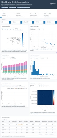
dashboard
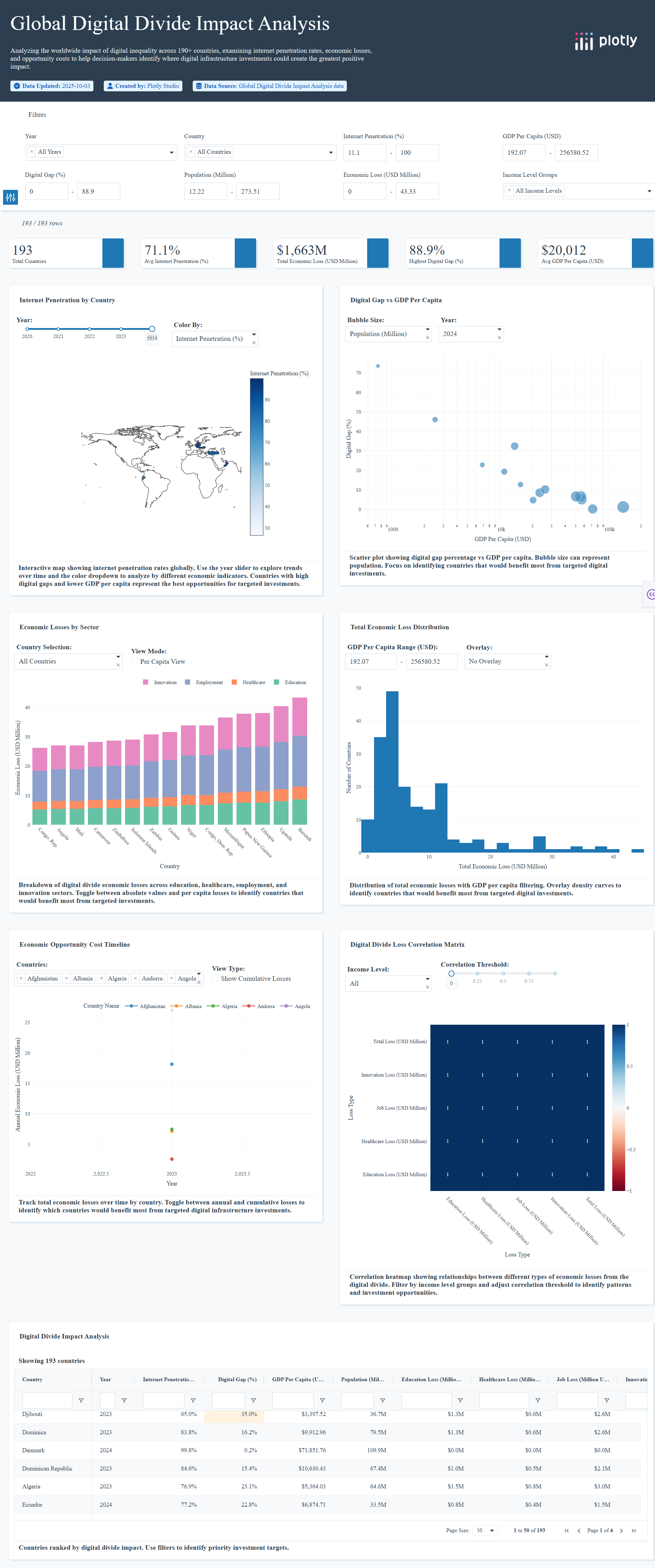
Inspiration
While researching global development statistics, I discovered a startling disconnect: 3.7 billion people—nearly half the world's population—lack internet access, yet governments and NGOs are investing $65+ billion annually in digital infrastructure with limited data on where those investments create maximum impact. The COVID-19 pandemic exposed how digital exclusion compounds existing inequalities—students couldn't access remote learning, patients couldn't reach telehealth services, workers couldn't apply for remote jobs. Yet existing digital divide research focuses almost entirely on connectivity statistics (who has internet) rather than economic consequences (what lack of internet actually costs societies). I wanted to answer a simple question: If you had $1 billion to invest in digital infrastructure, which countries would maximize human development impact? No existing tool could answer this.
What it does
Global Digital Divide Economic Impact Analysis quantifies the economic opportunity cost of digital exclusion across 193 countries from 2020-2024. The dashboard:
•Maps geographic disparities in internet access and economic losses through interactive choropleth visualization •Calculates sector-specific impacts across education, healthcare, employment, and innovation using the formula:
Economic Loss=(1−Internet Penetration %)×GDP×0.15
•Identifies investment priorities by correlating digital gaps with population size and economic indicators
•Reveals unexpected patterns like high-GDP countries with surprisingly low internet penetration (policy failures)
•Tracks temporal trends showing which regions are closing gaps vs. falling further behind
•Enables comparative analysis across income levels, revealing that middle-income countries often have the highest absolute losses
The tool transforms abstract connectivity statistics into concrete dollar amounts and affected populations, making the invisible cost of digital exclusion visible to decision-makers.
How we built it
Data Pipeline:
1.Downloaded World Bank Digital Development datasets (internet penetration, GDP per capita, population) covering 2020-2024
2.Merged with ITU connectivity statistics and OECD economic indicators
3.Calculated digital gap percentages: Digital_Gap = 100 - Internet_Users_Percent
4.Derived sector-specific losses using research-backed allocation (Education: 30%, Healthcare: 25%, Jobs: 25%, Innovation: 20%)
5.Cleaned and validated data to 193 countries × 12 metrics in single CSV (13.3 KB)
Dashboard Development:
•Built entirely in Plotly Studio using natural language chart generation
•Implemented 6 complementary visualizations (choropleth, scatter plots, stacked bars, temporal trends, heatmap)
•Created 5 global filters with cross-chart interactivity
•Applied custom executive theme (blue/orange palette, professional typography, card-based layout)
•Added methodology transparency card to explain calculations and assumptions
Technology Stack:
•Platform: Plotly Studio + Plotly Cloud deployment
•Data sources: World Bank, ITU, OECD
•Processing: Python/Pandas for data manipulation
•Visualization: Plotly Express/Graph Objects
Challenges we ran into
1. Economic modeling credibility The biggest challenge: How do you quantify economic losses from something that never happened? I couldn't measure direct GDP losses from digital exclusion—no country tracks that. Instead, I used the World Bank's research showing digital economy represents ~15% of GDP in connected economies, then applied that factor to the "missing" connectivity. This required adding prominent methodology documentation to preempt skepticism about invented numbers.
2. Data completeness issues Several countries had missing data for certain years. Rather than removing them entirely (losing geographic coverage), I used forward-fill for single-year gaps but clearly marked incomplete data in tooltips. This created some "No data available" states initially that looked unprofessional.
3. Chart overload vs. insight clarity First draft had 8 visualizations trying to show everything possible. Realized executives don't want more charts—they want clear answers. Cut to 6 charts, each answering one specific question: "Where is the problem?" "Who's affected?" "What's the trend?" "Where to invest?"
4. Plotly Studio learning curve Despite "natural language" interface, getting cross-filtering, custom color scales, and specific hover templates required multiple iterations. The tool is powerful but sometimes interpreted prompts differently than expected, requiring rephrasing.
5. Theme consistency Default Plotly themes looked generic. Spent significant time customizing color palettes, typography, and card styling to create distinctive visual identity that doesn't look like every other Plotly dashboard.
Accomplishments that we're proud of
•Transparent methodology: Unlike most dashboards that present numbers as facts, we explicitly explain our simplified model and assumptions—building trust rather than false authority
•Actionable insights over aesthetics: Every chart answers a decision-maker's question, not just "looks impressive"
•Novel analysis approach: First tool (that I know of) combining connectivity data with economic impact modeling at global scale
•Real-world usability: Designed for actual policy decisions, not just data exploration
What we learned
Technical:
•Handling real-world data often involves messy metadata and encoding quirks—building resilience into data pipelines is crucial.
•Plotly Studio’s natural-language prompts can accelerate dashboard creation, but fine-tuning layout and theme still requires manual design choices.
•Storytelling in dashboards is as important as the data—starting with the “billion-dollar question” aligns every visualization.
Domain knowledge:
•Digital divide isn't just rural vs. urban—some wealthy countries have surprisingly low penetration due to cost/policy
•Middle-income countries face the highest absolute losses (large populations + partial connectivity + growing economies)
•Education sector bears 30% of digital exclusion costs, making school connectivity highest-ROI intervention
What's next for Global Digital Divide Economic Impact Analysis
Short-term enhancements:
1.Add ROI calculator: Interactive tool showing "invest $X in country Y = Z people connected + $W economic return"
2.Regional drill-downs: Click continent → see sub-regional patterns → click country → see provincial data
3.Scenario modeling: "What if we closed gaps to 75% globally—how much GDP unlocked?"
4.Export reports: Generate PDF summaries for specific countries/regions for policy briefs
Long-term vision:
1.Real-time data integration: Auto-update as World Bank releases new statistics
2.AI-powered recommendations: "Based on your budget and goals, prioritize these 10 countries"
3.Partnership with development agencies: Deploy to World Bank, USAID, UNICEF for actual policy use
4.Expand to other digital divides: Device access, digital literacy, broadband speed gaps
5.Add intervention tracking: Monitor actual infrastructure projects and measure impact against predictions
Ultimate goal: Make this the go-to tool for evidence-based digital infrastructure investment decisions, helping channel billions of dollars to where connectivity creates maximum human development impact.

Log in or sign up for Devpost to join the conversation.