-
-
introduction
-
visualization


About the Project
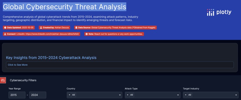
Comprehensive analysis of global cyberattack trends from 2015–2024, examining attack patterns, industry targeting, geographic distribution, and financial impact to identify emerging threats and forecast risks.
** Inspiration **
With two years of experience as a Data Analyst, I’ve spent countless hours transforming raw data into meaningful stories. My final-year project on the NSL-KDD dataset, which focused on intrusion detection, exposed me to the real-world gravity of cyber threats. Witnessing the growing wave of global cyberattacks from ransomware epidemics to large-scale data breaches, I felt compelled to combine my analytical expertise with visual storytelling to create something impactful. That became the motivation for “Global Cybersecurity Threat Analysis,” a dashboard that doesn’t just display data, but tells the story of how cyber risk evolves across years, industries, and geographies.
** How I Built It **
I initially gave a prompt to Plotly that created the entire project and set this project in motion, with nearly 75% of the work completed. Thereafter, I edited the page using the Python snippets, using my skills in Python, I added a collapsible box, interactive graphs with filters, and much more.
Lastly, Plotly is an expressive and lightweight charting interface. I’ve used it in previous analytics deliverables, and it remains one of the most intuitive tools for creating high-quality, dynamic visualizations.
** Challenges ** UI scaling: Ensuring uniform chart box sizes and responsive layouts across devices required advanced CSS grid tuning.
Chart clarity: Preventing axis labels and legends from being cropped inside dynamic containers was non-trivial. I had to implement adaptive margin correction.
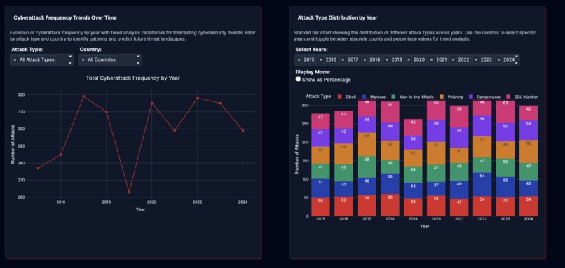
Information overload: Striking a balance between data density and readability was the hardest part, this inspired the collapsible “Click to See More” insights feature to keep the interface clean yet information-rich.
** What I Learned **
Building visual consistency is as important as data accuracy; users trust a clean design.
Effective dashboards are not just visuals but analytical narratives; the user should “feel” the trends.
** Reflection **
This project reaffirmed that data visualization is storytelling, and in the realm of cybersecurity, stories save systems.
** With the right combination of analytics, design, and purpose, we can bridge the gap between data and defense, one chart at a time. **


Log in or sign up for Devpost to join the conversation.