-
-
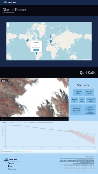
Glacast Map Screen
-
Glacast Home Screen

Inspiration
Bitcamp 2026's space theme got us thinking about satellite imagery: the kind that's been quietly photographing Earth from orbit for decades. Both of us care about sustainability, so we wanted to find a way to tie the two together, and glaciers turned out to be the perfect intersection: dramatic, measurable, and with 40+ years of freely available coverage that documents one of the most visible symptoms of climate change. We wanted to build something that made that data feel urgent and personal, using real satellite imagery to show what's already happened and machine learning/linear regression to show what's coming.
What it does
Glacast is an interactive web app that visualizes glacier retreat from 1984 to present using real satellite imagery, then forecasts future loss through 2050 using linear regression/scikit-learn machine learning. Users can scrub through every year of imagery for iconic glaciers, view historical area loss charts, and toggle between 1.5°C, 2°C, and 3°C warming scenarios to see how emissions choices reshape the forecast, complete with confidence intervals that widen as uncertainty grows further into the future.
How we built it
The frontend is built in React TSX with Tailwind CSS, Leaflet JS for the interactive glacier map, and Recharts for the forecast visualizations. The imagery timeline pulls from a curated set of Landsat images sourced via Google Earth Engine. On the data side, we processed historical glacier area measurements from WGMS CSVs and correlated them with ERA5 temperature reanalysis data from Copernicus. We trained a linear regression model per glacier using scikit-learn, layered in three IPCC aligned global warming scenario projections, and added confidence interval shading that reflects model uncertainty over time. The backend runs on FastAPI, with static JSON fallbacks for every endpoint.
Challenges we ran into
The hardest part was the data itself. Finding datasets with strong integrity across decades was tougher than expected: many sources had gaps, inconsistencies, or coverage that didn't align across glaciers. Representing complex, messy real world data in a way that was both honest and visually clear was a constant tension. Mapping that data meaningfully onto a linear regression model, and getting conclusions that were defensible rather than just dramatic, took the most time of anything in the build.
Accomplishments that we're proud of
Shipping all three ML components in 36 hours: the per glacier forecast, the temperature correlation model with IPCC global warming scenario projections, and confidence interval shading. The imagery timeline is something we're especially proud of: going from a planned before/after slider to a full 1984 to present scrubber that makes four decades of retreat viscerally real. The forecast chart tied it all together, and after everything that went into building it, we're genuinely happy with how it turned out.
What we learned
Real world climate data is rarely clean, and the gap between "data exists" and "data is usable" is enormous. We also learned how much presentation matters when communicating scientific uncertainty: confidence intervals aren't just a nice feature, they're what keeps a forecast honest.
What's next for Glacast
More and better data to improve model accuracy, and exploring polynomial or other regression approaches that may better capture non linear melt dynamics. We also want to expand the impact layer, looking at consequences like loss of marine ecosystems and land area changes as glaciers recede. Most importantly, we want to expand our model to eventually include all glaciers worldwide.
Built With
- copernicus
- css3
- fastapi
- google-earth-engine
- html5
- jupyter
- numpy
- pandas
- python
- react
- scikit-learn
- tailwindcss
- typescript
- wgms


Log in or sign up for Devpost to join the conversation.