-
GeoVisualizer
Inspiration
We were inspired by the idea of visualizing big data into something that was understandable to the everyday person and can be used to create correlations.
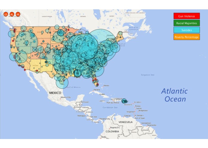
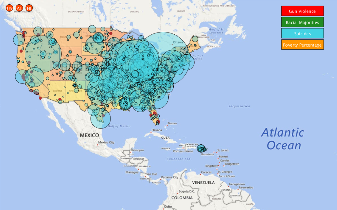
What it does
The GeoVisualizer allows for the overlaying of multiple layers of data on a map of the U.S. in order to visualize the relationships between them.
How we built it
We used the WolframAlpha API, Microsoft Map Engine, UnfoldingMap Library to turn the data into a beautiful visualization.
Challenges we ran into
We had challenges processing the data and also had some minor trouble with the APIs/Libraries.
Accomplishments that we're proud of
We are proud of using the WolframAlpha API to successfully determine data that was not in the data set and making use of various data sets which were found on the internet.
What we learned
We learned that using APIs was a powerful way to accelerate the production speed of your product. We also learned how to handle Map GUI and parsing tricky data.
What's next for GeoVisualizer
In the future we will add the correlation features in order to give further data about the correlations between different types of data. We would also like to expand the types of data that are shown on the GeoVisualizer.

Log in or sign up for Devpost to join the conversation.