-
Dashboard
-
Twitter Data
Inspiration
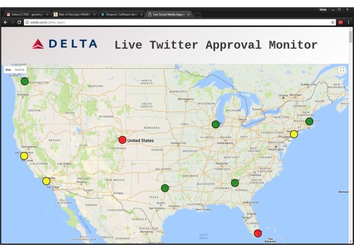
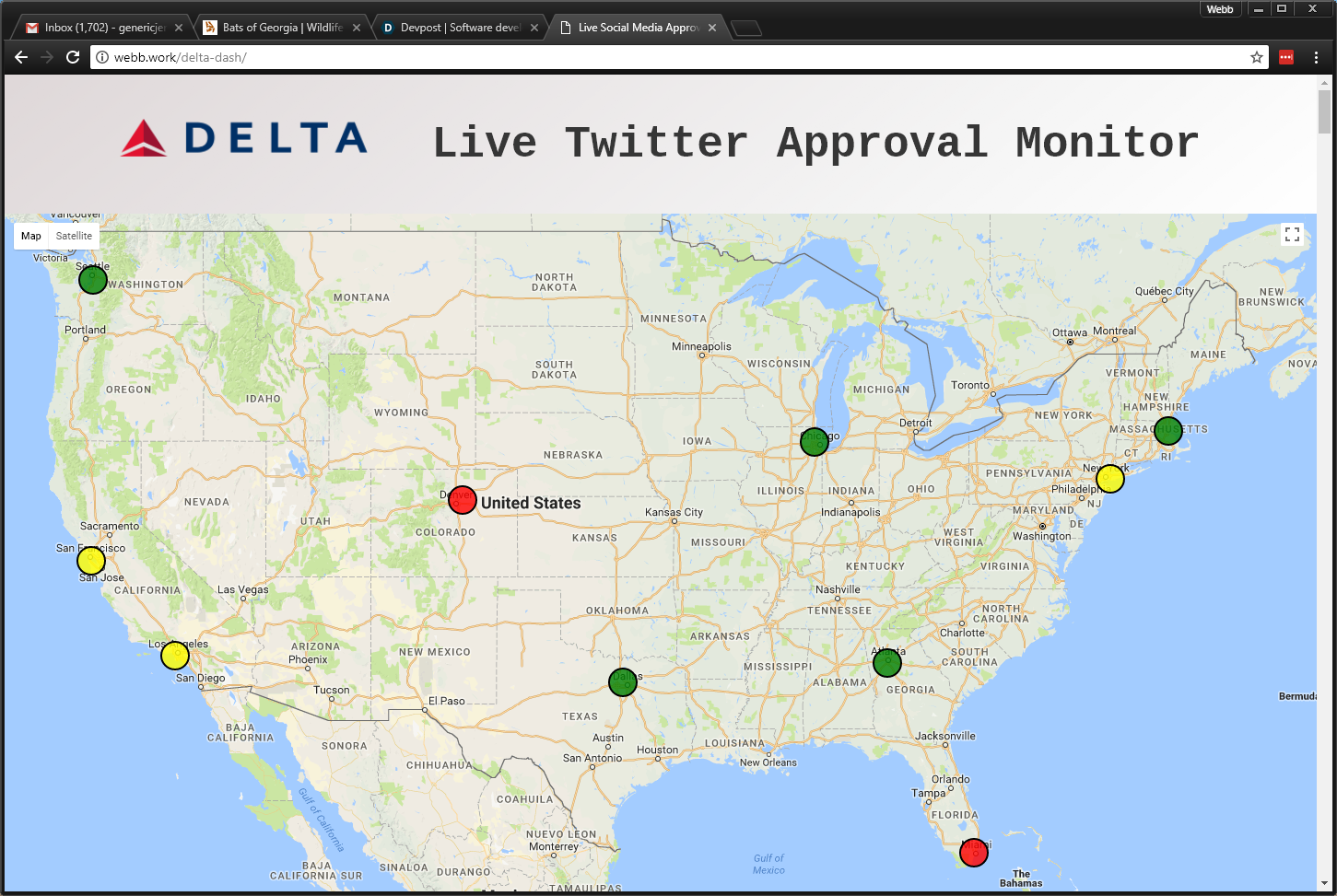
Maps are a practical and fulfilling way to analyze geospacial data. Delta's request for HackGT 4 was an application to help them improve customer experience. By having a visual to display the airports with a higher-than-average frequency of customer complaints, Delta will be able to prioritize resolving the more wide-spread issues, and hopefully, in real time. This tool is intended to supplement to the other metrics already recorded for customer satisfaction levels.
What it does
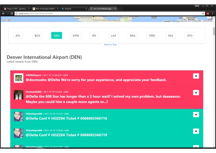
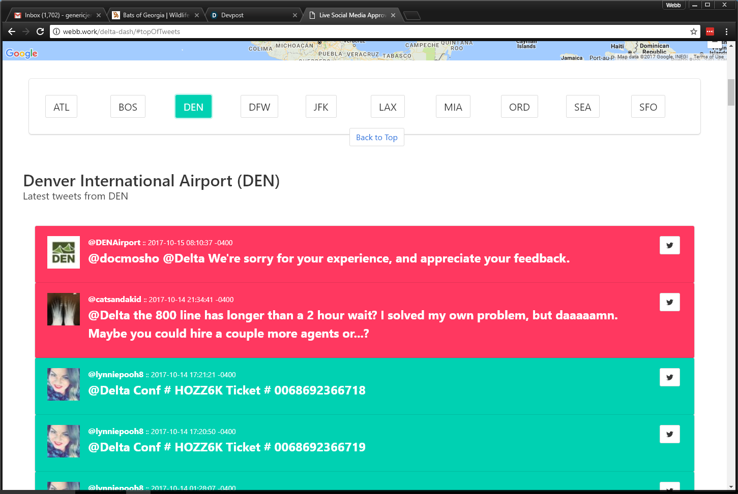
There are two backend services. One of them polls Twitter, via their API, filtering the results by the geolocation data of Delta's airports. For each Twitter status update involving Delta, the content is analyzed for negativity and cached. The other service hosts a REST service which retrieves the cached data as it's requested by the client service, the web application. High negativity at the same airport in a short period of time will result in a red indicator on the map. The Twitter data is also displayed underneath the map in either green, indicating no negativity was detected, and red for vaice-versa.
How we built it
The backend services were built using Java, Twitter4J (Java client for Twitter's API), Spring/Spring Boot for the web frameword, Jedis (Java implementation of a Redis client), and Redis for data storage. The front-end UI is composed of HTML, JavaScript, AngularJS, Google Maps, and Bulma as the CSS framework.
Challenges we ran into
The biggest challenge was coming up with a decent idea. Second to that, the user interface was brutal since our experience is mostly command line applications and backend services.
Accomplishments that we're proud of
Having this application running before the deadline :D
What we learned
Data visualization is fun. NodeJS, NPM, and Bower are terrible.
What's next for Geospacial Twitter Approval Monitor
Improving the negativity analysis algorithm, more flexibility with configuration, and hopefully some time for Refactoring... :)

Log in or sign up for Devpost to join the conversation.